• Hey, guest user. Hope you're enjoying NeoGAF! Have you considered registering for an account? Come join us and add your take to the daily discourse.

Graphical Fidelity I Expect This Gen

SlimySnake

Flashless at the Golden Globes
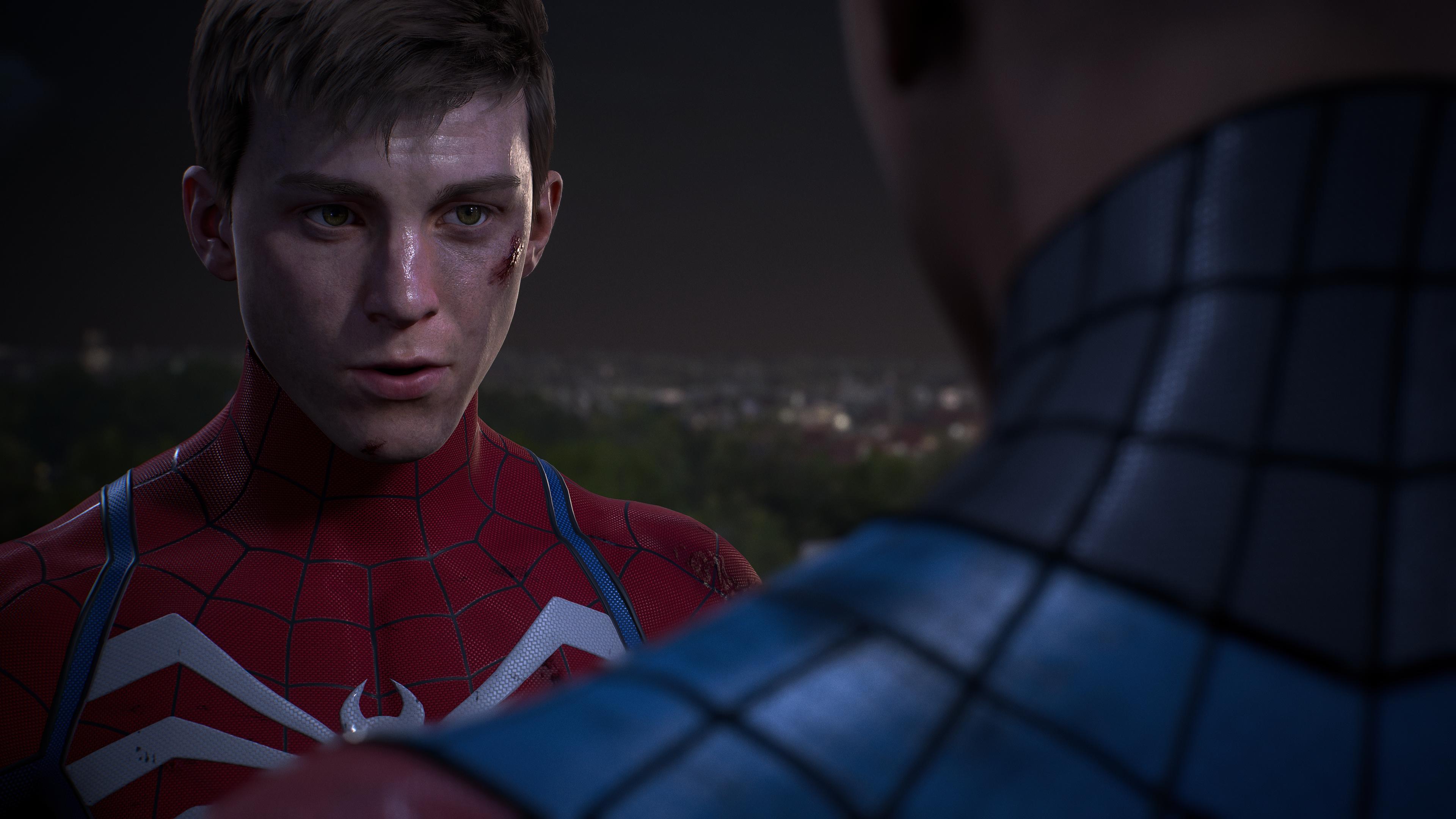
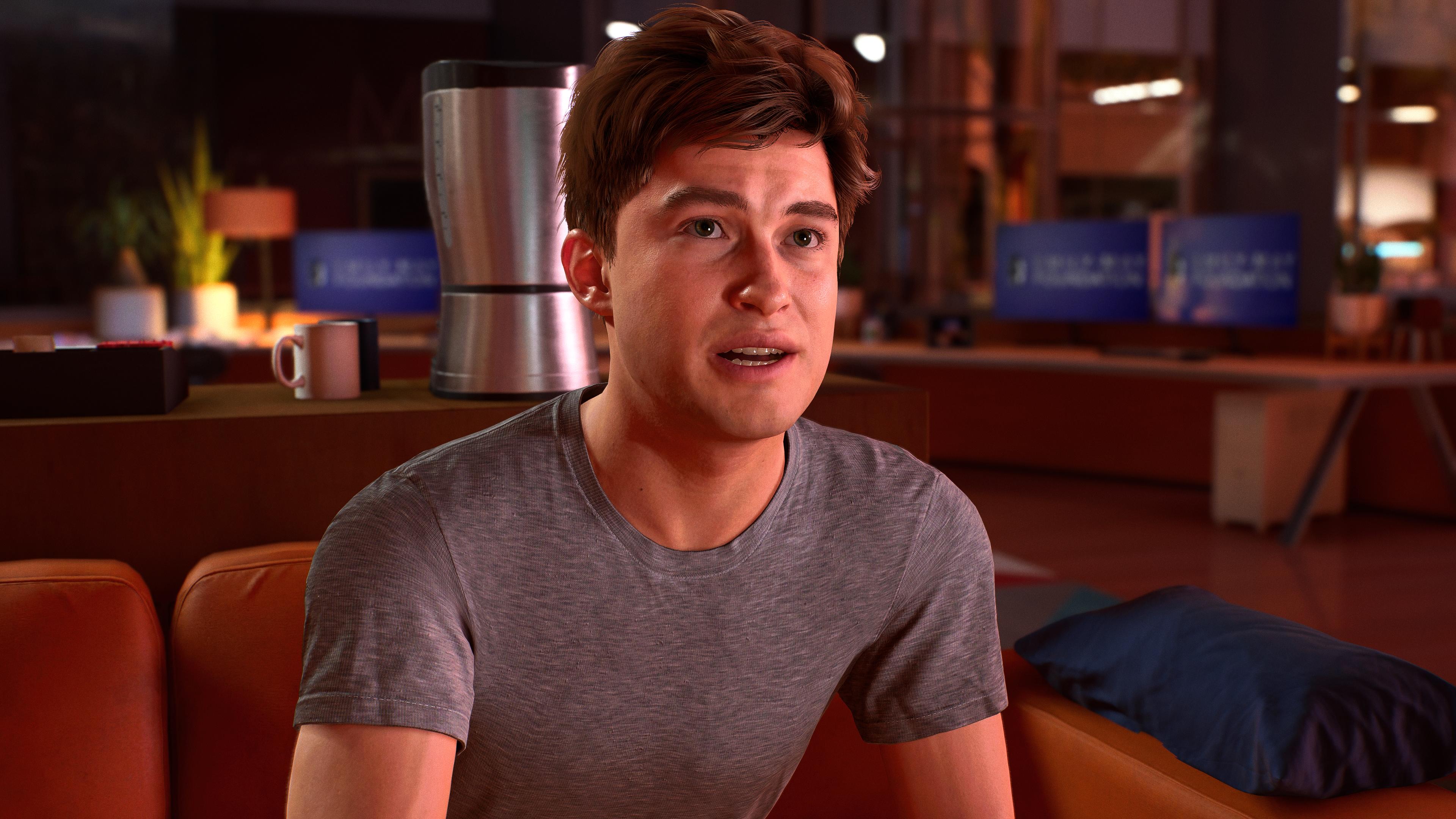
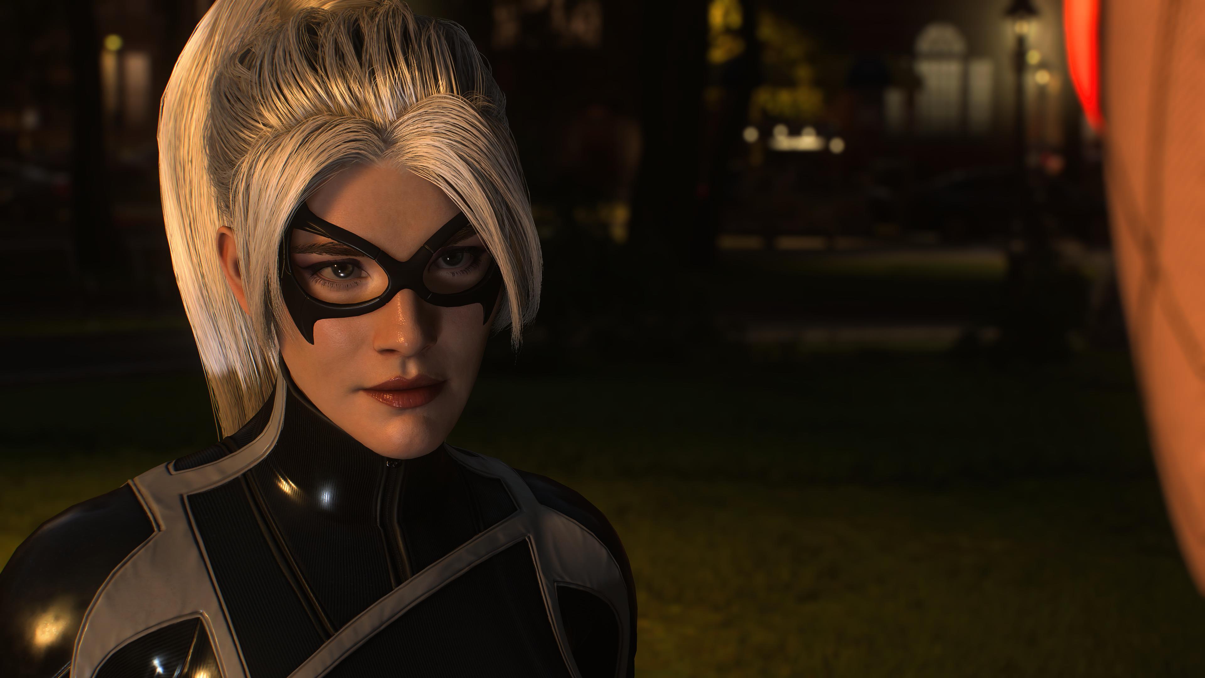
No idea what was going on with Peter's model in the first few cutscenes but its really improved in the last few missions. Finally some proper skin shading and lighting.

F9pstogXoAAOIas

F9psiOJWgAI6FB9


Sam Riami suit looks fire.
F9psh8KXwAA527Z
 

Imtjnotu

Member
No idea what was going on with Peter's model in the first few cutscenes but its really improved in the last few missions. Finally some proper skin shading and lighting.

F9pstogXoAAOIas

F9psiOJWgAI6FB9


Sam Riami suit looks fire.
F9psh8KXwAA527Z
Sometimes it's like the skin textures is too flat.

It feels like miles morales had better modeling
 
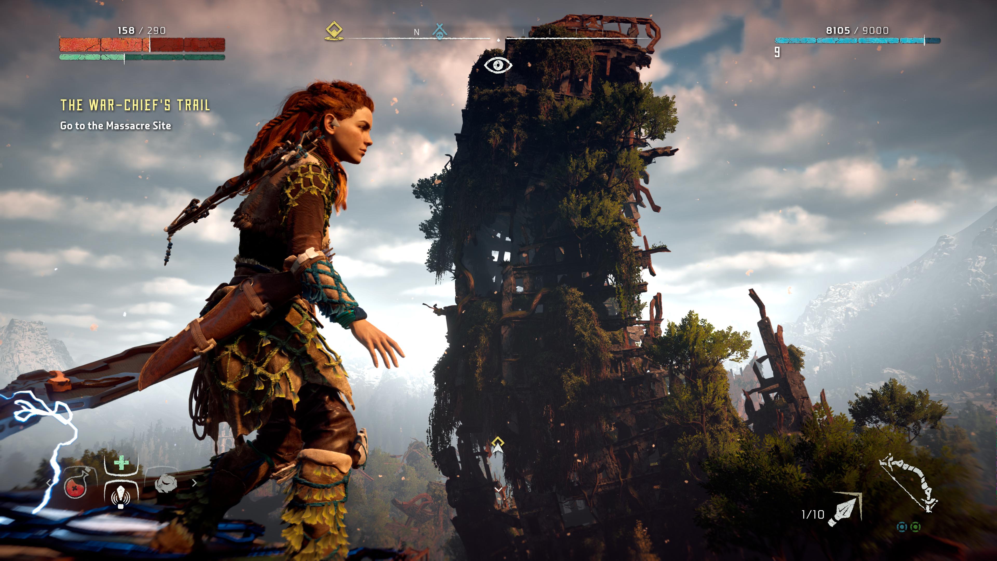
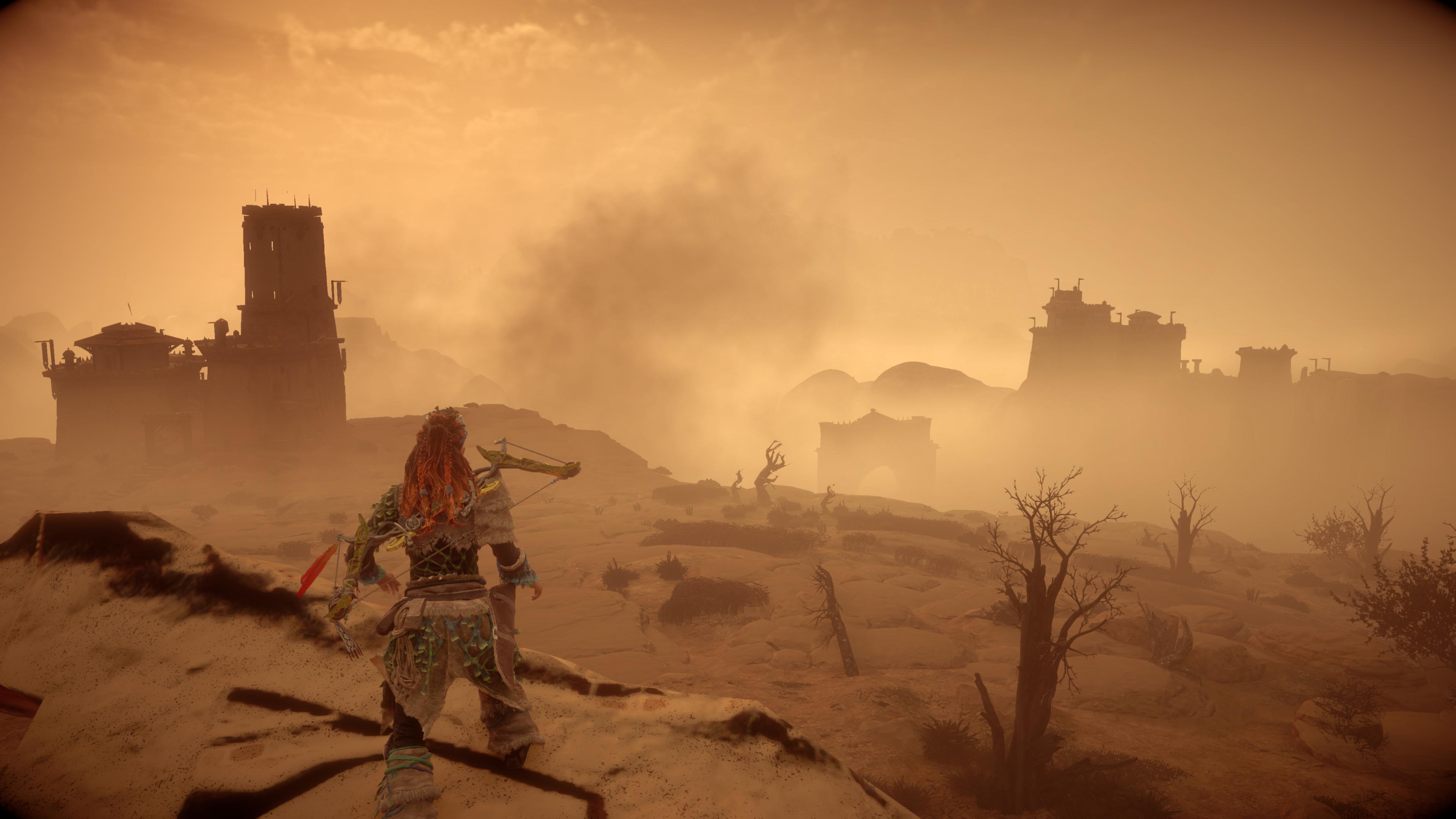
lol come on with the hyperbole. Uncharted looks good but pales in comparison to some of the shit released this year alone. Let alone cyberpunk, ratchet, demon souls and horizon fw.

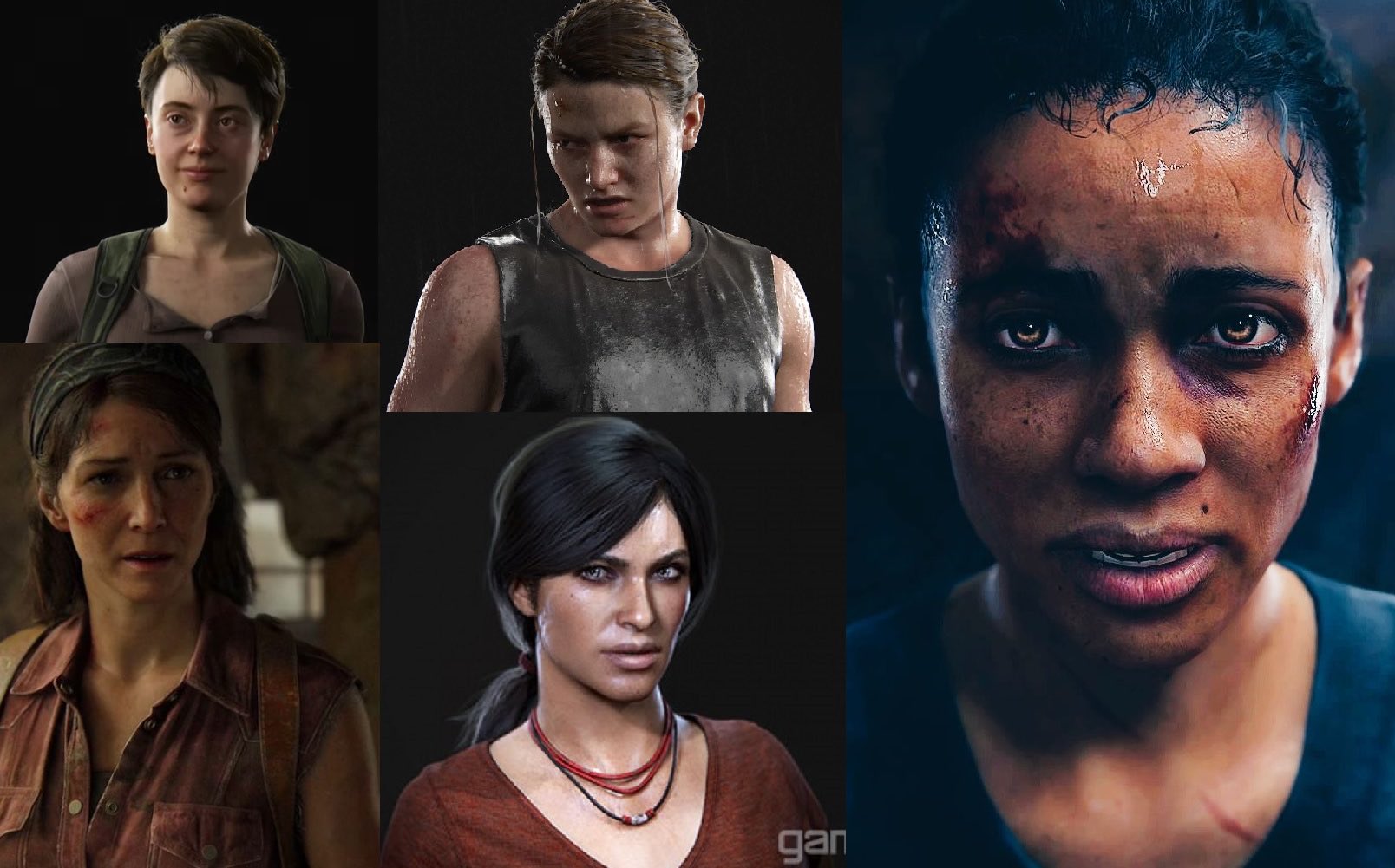
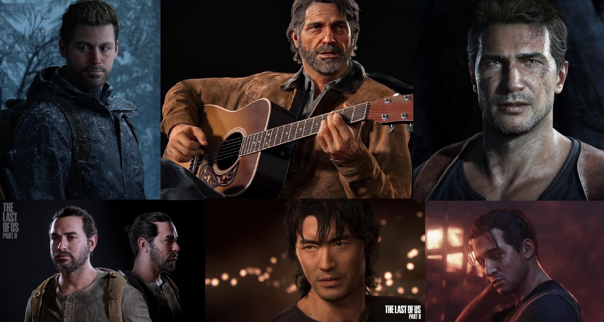
Uncharted 4 still looks good because of its art style. Pretty graphics fool people into thinking games are pushing technical boundries when in fact they are just pretty. TLOU2 looks better than Uncharted 4 in every single aspect. Better lighting, better animations, better cutscene models, better foliage, better water, rain, anything you can think of. HFW blows it out of the water. Foliage is a big one. uncharted foliage and trees, especially in open world areas like in Madcasgar and Lost Legacy are really a step behind horizon 1's trees, alone forbidden west. People are talking about character models. Well, in cutscenes they look fine, during gameplay? nah. They use really low LOD character models during gameplay which pales in comparison to HFW's amazing hero lit character models during gameplay.

Same is true for Arkham Knight. The art direction and rain is masking a lot of its technical shortcomings. I have talked about it numerous times here so I wont bother repeating myself here, but Far Cry 6 is a last gen game that is about to be obliterated by another ubisoft game called Avatar. So nah, im not going to cry about a 2021 ubisoft game looking worse than crysis when ubisoft is about to set a new bar for open world rendering and gameplay simulations.

I have brought this up before, but this thread ought to look at what the games are doing well instead of cherrypicking comparisons to show what other games in the past did better. Ratchet straight up looks cg. Alan Wake 2 has a pre-rendered movie look. FF16 had its moments. Starfield looks absolutely insane at times. Cyberpunk Phantom Liberty is just setting a new bar in urban area graphics rendering. And spiderman 2 is pushing many things we simply didnt see last gen from all these A tier developers like rockstar, GG, nd, ssm, cdpr etc.

Trust me you dont want me to post cherrypicked pictures of Barbara Gordon, Poison Ivy, Gordon and Bruce Wayne himself. Lets just appreciate Batman AK for the masterpiece it was and give due credit to recent releases.

P.S These are screenshots of uncharted lost legacy and HFW i posted in 2017 to show how incredible they looked. If I posted them today in this thread, i would get laugh out of the thread.

What are these trees lol.
DISiebdVoAAse_y


Why would i take this ugly screenshot?
C50NJeEXEAQqsqF


what the fuck is even happening here. where is the level of detail?
C6SbnEEWcAAXQUr


This is what ND was doing in 2017. Again, i captured this because i was wowed by this back then.
EJ2tTvQWoAUiA7l


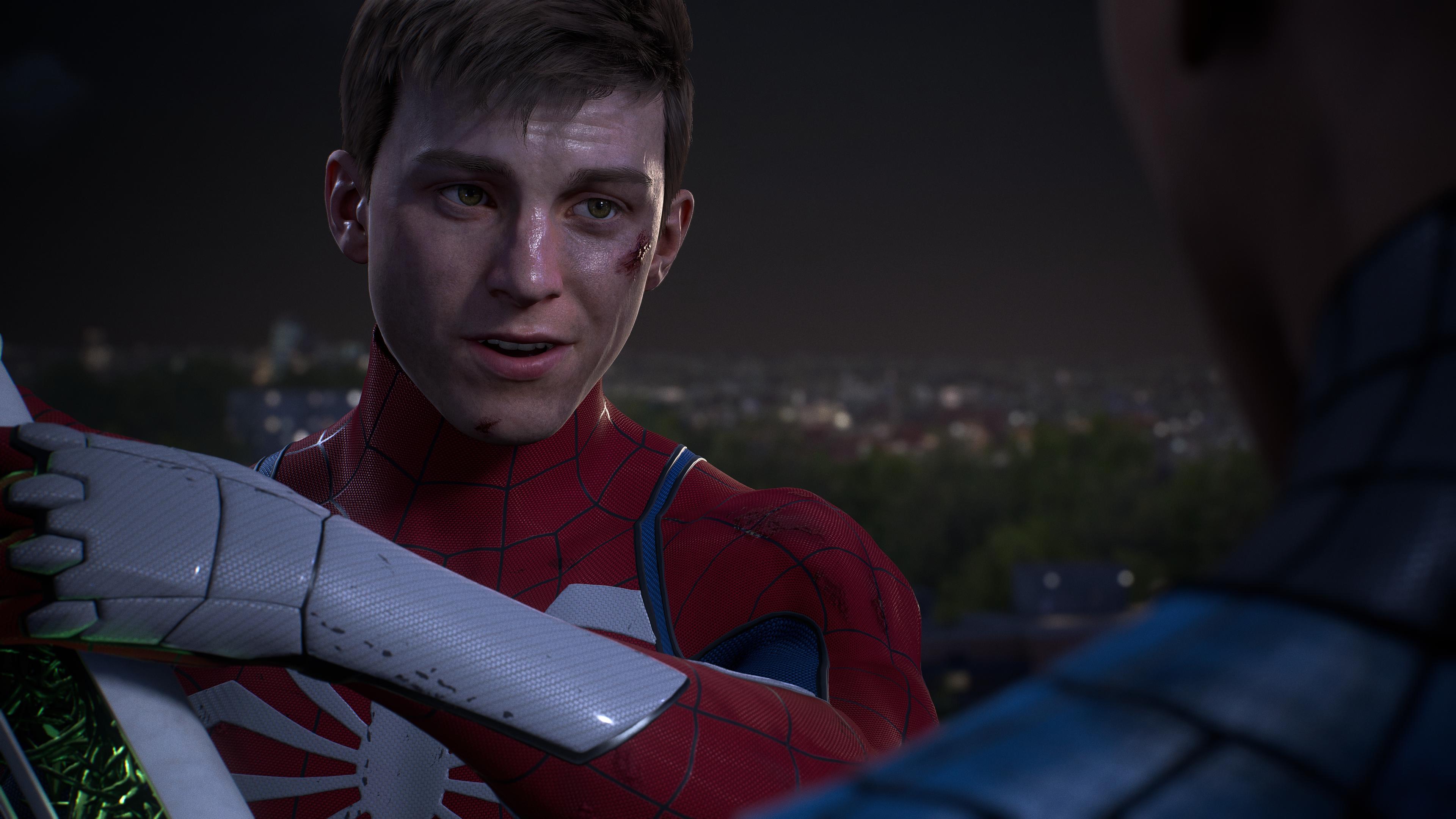
Meanwhile, These are the worst cutscenes in a game ever made by Sony first party. 2023.
F9VfKFoXQAAt5X0

F9GO3oLWEAAUalX
Entire argument rendered completely moot by me referencing those games against Spider-Man 2 not ya know, games that literally have the best graphics on the market (demon souls/cyberpunk PC/horizon 2) and nebulous “other games released this year”

Cmon brotha. This is what skimming my post gets you
 
Last edited:

RNK

Member
No idea what was going on with Peter's model in the first few cutscenes but its really improved in the last few missions. Finally some proper skin shading and lighting.

F9pstogXoAAOIas

F9psiOJWgAI6FB9


Sam Riami suit looks fire.
F9psh8KXwAA527Z
Which is why I've been saying the game is incredibly inconsistent. You can clearly see the scenes Insomniac put some effort into, and most of them are in the last 30 minutes. Even MJ looks passable in a few of them!
 

Represent.

Represent(ative) of bad opinions
No idea what was going on with Peter's model in the first few cutscenes but its really improved in the last few missions. Finally some proper skin shading and lighting.

F9pstogXoAAOIas

F9psiOJWgAI6FB9


Sam Riami suit looks fire.
F9psh8KXwAA527Z
I watched the entire Spoilercast interview with Kinda Funny. They had the creative director on the show and he basically made it clear there’s 2 teams…. The B team made Spiderman 2. The team that did the amazing looking Ratchet Rift Apart is doing Wolverine. They are the A team. At least when it comes to tech, they are the pioneers.

In the video he literally says “we got the Black Cat portal mission from the Ratchet team” and “Oh Wolverine, that teams doing an amazing job”. Thats how you know there’s 2 teams. The other guys being the A team is more subtle but if you listen closely it’s there.

Ratchet had amazing character models and cutscenes. Them being the same ones doing Wolverine bodes well for that game. I can almost guarantee now it’ll look way better than SP2

This’ll also explain why sp2 cutscenes look so much worse than ratchet, the other team knocked it out of the park with that game and this team didn’t.

Seems they put all the main talent on the new IP and the game that’s guaranteed to sell millions regardless gets the newer folk.
 
Last edited:

shamoomoo

Banned
I watched the entire Spoilercast interview with Kinda Funny. They had the creative director on the show and he basically made it clear there’s 2 teams…. The B team made Spiderman 2. The team that did the amazing looking Ratchet Rift Apart is doing Wolverine. They are the A team. At least when it comes to tech, they are the pioneers.

In the video he literally says “we got the Black Cat portal mission from the Ratchet team” and “Oh Wolverine, that teams doing an amazing job”. Thats how you know there’s 2 teams. The other guys being the A team is more subtle but if you listen closely it’s there.

Ratchet had amazing character models and cutscenes. Them being the same ones doing Wolverine bodes well for that game. I can almost guarantee now it’ll look way better than SP2

This’ll also explain why sp2 cutscenes look so much worse than ratchet, the other team knocked it out of the park with that game and this team didn’t.

Seems they put all the main talent on the new IP and the game that’s guaranteed to sell millions regardless gets the newer folk.
I doubt if wolverine is going to open world but that should contribute to it looking good.
 

Rheon

Member
No idea what was going on with Peter's model in the first few cutscenes but its really improved in the last few missions. Finally some proper skin shading and lighting.

F9pstogXoAAOIas

F9psiOJWgAI6FB9


Sam Riami suit looks fire.
F9psh8KXwAA527Z

The Peter shots are probably the best I've seen character models look in SP2 yet. Good stuff.

I watched the entire Spoilercast interview with Kinda Funny. They had the creative director on the show and he basically made it clear there’s 2 teams…. The B team made Spiderman 2. The team that did the amazing looking Ratchet Rift Apart is doing Wolverine. They are the A team. At least when it comes to tech, they are the pioneers.

In the video he literally says “we got the Black Cat portal mission from the Ratchet team” and “Oh Wolverine, that teams doing an amazing job”. Thats how you know there’s 2 teams. The other guys being the A team is more subtle but if you listen closely it’s there.

Ratchet had amazing character models and cutscenes. Them being the same ones doing Wolverine bodes well for that game. I can almost guarantee now it’ll look way better than SP2

This’ll also explain why sp2 cutscenes look so much worse than ratchet, the other team knocked it out of the park with that game and this team didn’t.

Seems they put all the main talent on the new IP and the game that’s guaranteed to sell millions regardless gets the newer folk.

Very interesting, and would explain SP2 being so up and down in terms of quality and consistency.

I was consistenly wowed by Ratchet, even playing it earlier this year. Can't say the same about SP2.
 
Last edited:

Trilobit

Member
No idea what was going on with Peter's model in the first few cutscenes but its really improved in the last few missions. Finally some proper skin shading and lighting.

F9pstogXoAAOIas

I don't get it. So according to Americans it's sexist to make MJ look young and hot, but perfectly fine to make the Peter model look ten years younger and more attractive(to some)? I don't think I'll ever get the mindset of the people left of the big pond. :messenger_dizzy:
 

SlimySnake

Flashless at the Golden Globes
I don't get it. So according to Americans it's sexist to make MJ look young and hot, but perfectly fine to make the Peter model look ten years younger and more attractive(to some)? I don't think I'll ever get the mindset of the people left of the big pond. :messenger_dizzy:
Yeah, they hate women.

I have posted this here before but men are allowed to be sexy while women must be ugly and 'realistic'.

FvDd74uWAAAxXNr


FvDd76PXgAAnEKV
 

SlimySnake

Flashless at the Golden Globes
If I'm not mistaken,there was an open world a Wolverine game on in the PS3/360 era.
It was linear.

I watched the entire Spoilercast interview with Kinda Funny. They had the creative director on the show and he basically made it clear there’s 2 teams…. The B team made Spiderman 2. The team that did the amazing looking Ratchet Rift Apart is doing Wolverine. They are the A team. At least when it comes to tech, they are the pioneers.

In the video he literally says “we got the Black Cat portal mission from the Ratchet team” and “Oh Wolverine, that teams doing an amazing job”. Thats how you know there’s 2 teams. The other guys being the A team is more subtle but if you listen closely it’s there.

Ratchet had amazing character models and cutscenes. Them being the same ones doing Wolverine bodes well for that game. I can almost guarantee now it’ll look way better than SP2

This’ll also explain why sp2 cutscenes look so much worse than ratchet, the other team knocked it out of the park with that game and this team didn’t.

Seems they put all the main talent on the new IP and the game that’s guaranteed to sell millions regardless gets the newer folk.
Thats nuts if true. From what I recall, they said wolverine is being done by the miles team while the ratchet team was doing spiderman 2. I figured the miles team was the b team since it was basically a DLC.

I want to know who did the first teaser and why that wasnt used as a basis for the graphics of the final game. Shame how john from DF never bothered asking them about the massive downgrades.
 

sinnergy

Member
Screenshots taken from various Alan Wake threads. That lake sunset is jaw dropping in HDR. Note to everyone, turn up game brightness to 100% in hdr settings.

F9oNaNkXoAASLFv


F9oNckUXQAAhsTK

alanwake2-2023_10_28-t7e61.png

QEWbBRW.jpg
Yeah I tried the same , I settled at 75%. But the explanation what it all does is non-existent, at least not helpful. Game does look better if you up , paperwhite .
 
Last edited:

SlimySnake

Flashless at the Golden Globes
Yeah I tried the same , I settled at 75%. But the explanation what it all does is non-existent, at least not helpful. Game does look better if you up , paperwhite .
GamingTech on youtube said it increases the maximum peak brightness. At 100% its still at around 400 nits, well below 800-1000 nits needed for proper HDR. So no point keeping it at 50% which is only 200 nits.
 

rofif

Can’t Git Gud
Screenshots taken from various Alan Wake threads. That lake sunset is jaw dropping in HDR. Note to everyone, turn up game brightness to 100% in hdr settings.

F9oNaNkXoAASLFv


F9oNckUXQAAhsTK

alanwake2-2023_10_28-t7e61.png

QEWbBRW.jpg
What. No. Don’t turn it up to 100. Why? You elevate the whole picture brightness. Enable dtm !

Peak brightness is only b
For bright light sources. Rest of the image is supposed to be dark
 
Last edited:

SlimySnake

Flashless at the Golden Globes
Avatar previews are out. Game looks its best during the day time. In the sky it can look rough with some really poor horizon at times. straight up unfinished.

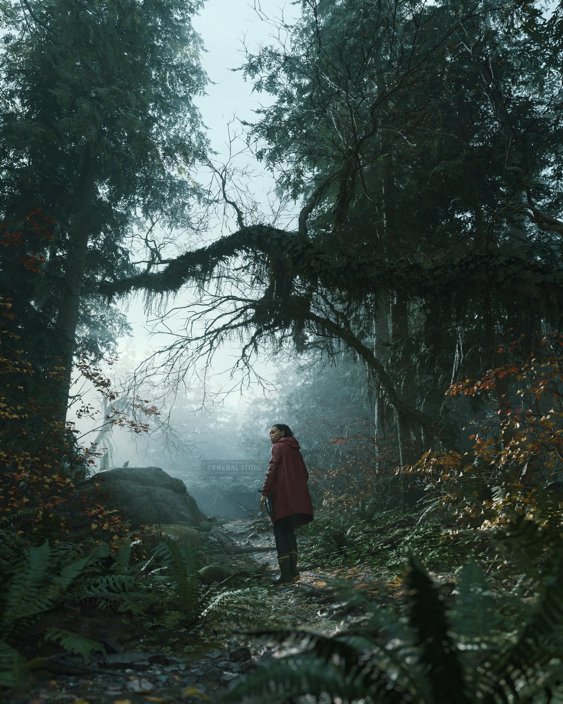
10 minutes in, the game's forests here look absolutely stunning. The most dense foliage and environmental detail ive seen in a game yet.


analog_future

Resident Crybaby
Avatar previews are out. Game looks its best during the day time. In the sky it can look rough with some really poor horizon at times. straight up unfinished.

10 minutes in, the game's forests here look absolutely stunning. The most dense foliage and environmental detail ive seen in a game yet.


On the whole it looks very bad IMO. TONS of pop-in as well.
 

rofif

Can’t Git Gud
He said keep HGIG on and max out ingame brightness instead.

Either way is fine.
I wouldn't listen to him. He just focuses on nits.
Brightness is just the usual in game thingy to help see in the dark. It changes the whole gamma of picture.
It's usually not to be touched.

if it was real "paper white" setting, then you should set it to what your tv can do full screen brightness but thats also not great
 
If you are making an Avatar game, you'd think developers would emphasize cutting edge graphics. Even before previews, I never thought it looked great. About the same as last-gen Far Cry. I feel like this game is the AC: Mirage for Far Cry. Lower budget, quick development time, and trying to grab casual audiences
 
Last edited:

ChiefDada

Member
With the exception of flying bit with traditional LOD issues, I am impressed with Avatar. The forest area in particular looks wonderful. This perfectly captures my longstanding issue with HFW/BS. Avatar's RT shadows provides the depth and realism that HFW couldn't. Both games aim for very similar art direction when it comes to jungle setting, but only one of them took shadows seriously enough.
 

ChiefDada

Member
I'm watching an Avatar Frontiers of Pandora impressions video and bruh

Ir5848b1-RKy-Dpy6y1g-LPEA.png


Wtf are these PS3 era LODs?

As I said with SM2, let's wait for the game to release. I don't expect anywhere near SM2-level LOD sophistication but I surely hope and assume it will look much better than this on release day.
 

rofif

Can’t Git Gud
Eh. I wouldnt call anything besides that one shot of the sky islands bad. it has its strong points and weak points. Im not sure how you looked at all this in the same video and say it looks very bad overall.

PwQxLSc.gif


WwhKzMI.gif


qxoG1Ll.gif
These graphics are so busy... like man. It looks great but I have the same issue as when looking at HFW. Alan Wake 2 can get very busy in forests too but well... forests are forests
There is beauty in simplicity.
 

Buggy Loop

Gold Member
Avatar previews are out. Game looks its best during the day time. In the sky it can look rough with some really poor horizon at times. straight up unfinished.

10 minutes in, the game's forests here look absolutely stunning. The most dense foliage and environmental detail ive seen in a game yet.


Wow, those mechs are made of papier-mâché? A few rounds and they're gone?

Sad Michael Scott GIF
 

analog_future

Resident Crybaby
Eh. I wouldnt call anything besides that one shot of the sky islands bad. it has its strong points and weak points. Im not sure how you looked at all this in the same video and say it looks very bad overall.

PwQxLSc.gif


WwhKzMI.gif


qxoG1Ll.gif

Yeah, you can definitely pick and choose scenes that look good but it's far too inconsistent IMO

This navi character model looks pretty good.

xRKS8EC.gif

Those shadows are awful; hopefully it looks better on the PC version.
 

SlimySnake

Flashless at the Golden Globes
Yeah, you can definitely pick and choose scenes that look good but it's far too inconsistent IMO
I agree it looks inconsistent. Night time especially looks like you are underwater with this bizarre hazy look that was not in the original trailers. but you said on the whole it looks very bad which i took an issue with.
Those shadows are awful; hopefully it looks better on the PC version.
its all PC footage. they said PC version will have rt shadows so thats what you are seeing here.
 
Last edited:

Buggy Loop

Gold Member
Eh. I wouldnt call anything besides that one shot of the sky islands bad. it has its strong points and weak points. Im not sure how you looked at all this in the same video and say it looks very bad overall.

Look at 3:32 sky and the culling of the clouds as he turns

barf GIF
 

Xtib81

Member
I'm watching an Avatar Frontiers of Pandora impressions video and bruh

Ir5848b1-RKy-Dpy6y1g-LPEA.png


Wtf are these PS3 era LODs?

Yeah, that's painfully embarrassing. And that's the PC version, I don't even want to think about the console version.
The game Can look great and downright ugly 10 seconds later. The HUD also looks awful. I managed to preorder the game for 48€ but I can I'm gonna cancel.
 
Last edited:

SlimySnake

Flashless at the Golden Globes
Watched several Avatar previews and only the jungle looks good. The draw distance is very disappointing because thats one of the things they said would handle gracefully due to the SSD and higher GPU requirements. There is A LOT of that HFW fog though not as bad, but again, the draw distance doesnt always hold up either. RDR2 handles it much better.

I dont notice much of a downgrade from the PS5 e3 demo, but its clear the trailers were cherrypicked to show off the best scenes. Only downgrade I noticed was in night time which looks washed out compared to the PS5 footage shown at E3. The rest looks mostly the same in terms of lighting, reflections and foliage. I am sure those cherrpicked areas in the previous trailers will still look mostly the same. Game is just inconsistent like most games this gen.

The previews had some really good praise for sound and game design, but nobody cares about that here lol
 

Msamy

Member

Here's 50 minutes of avatar pure gameplay , note , some youtubers said that most of captured footage have video quality and the game not actually have those problems, we really need official 1 hour gameplay video from ubisoft
 

Msamy

Member
Watched several Avatar previews and only the jungle looks good. The draw distance is very disappointing because thats one of the things they said would handle gracefully due to the SSD and higher GPU requirements. There is A LOT of that HFW fog though not as bad, but again, the draw distance doesnt always hold up either. RDR2 handles it much better.

I dont notice much of a downgrade from the PS5 e3 demo, but its clear the trailers were cherrypicked to show off the best scenes. Only downgrade I noticed was in night time which looks washed out compared to the PS5 footage shown at E3. The rest looks mostly the same in terms of lighting, reflections and foliage. I am sure those cherrpicked areas in the previous trailers will still look mostly the same. Game is just inconsistent like most games this gen.

The previews had some really good praise for sound and game design, but nobody cares about that here lol
Those washed-out areas may be due to capturing problems.
 

Edder1

Gold Member
Avatar looks worse every time they show it. At this point it looks like a last gen game through and through. I cannot name a single thing that stands out as next gen. Some people will say the scale is next gen, but after seeing Horizon 2 running on PS4 I would not say that this is the case. If I can describe it as anything on visual front then it would be Far Cry 6.5.
 
Last edited:
Top Bottom