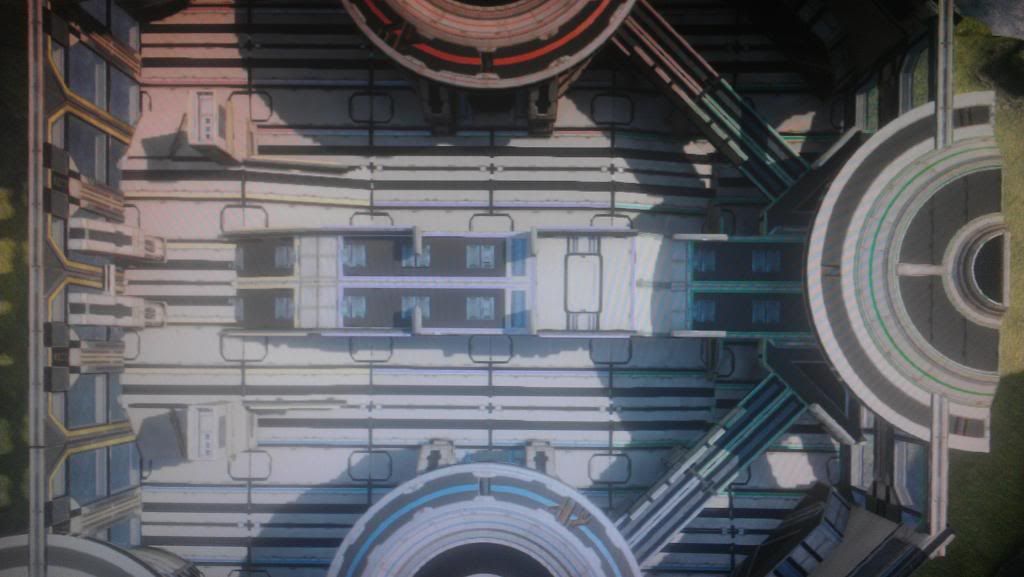
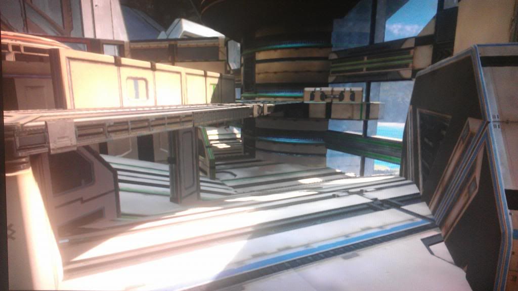
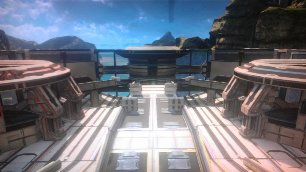
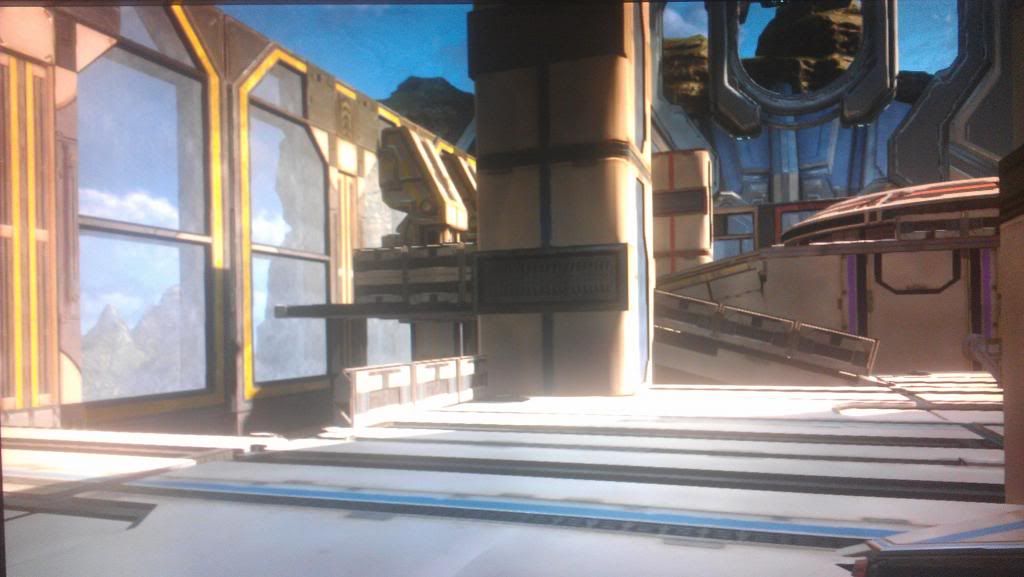
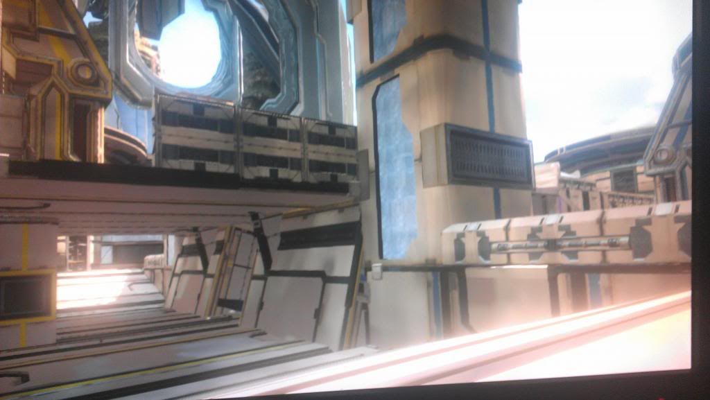
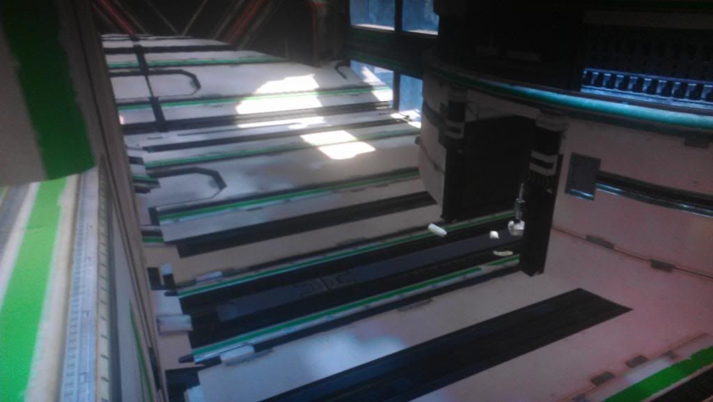
So, I went to go carve some Infection variants out of the developer maps. A bit disappointed that Ragnarok has so very few options, even for clutter. I was kind of hoping that being the second time for Valhalla post Forge-explosion, they'd at least add the Buildings category to it..
You are using an out of date browser. It may not display this or other websites correctly.
You should upgrade or use an alternative browser.
You should upgrade or use an alternative browser.
Halo 4 Forge |OT| Crafting a better tomorrow; one Brace, Large at a time
- Thread starter GodlyPerfection
- Start date
Might as well link this here as well. Would love some more people to make some noise about it and share your thoughts about where you want Forge to go.
nillapuddin
Member
Looks great dude! I hope we can see them in MM
Please tell me you uploaded Turf!
god I need these.
Can't wait to play this nilla... they look great.
Those look great, nilla!
wow, guys
thanks a ton
Ill have everything set up proper pretty soon and will make it available for playtesting, I happen to take my spawning setups very seriously
Im very pleased with my babies so far, and although they dont post here, my other friends in our little circle of remakes have some equally amazing work done
I will be sure to share all of it with yall soon
Yeah the hollow tubes are strangely missing.So the tube pieces aren't hollow... RIP High Ground
It's baffling how Forge in Halo 4 is a step back in so many ways.
Can't wait to play some good forge maps. Can you make a list of the maps you guys are working on so we know what to expect?wow, guys
thanks a ton
Ill have everything set up proper pretty soon and will make it available for playtesting, I happen to take my spawning setups very seriously
Im very pleased with my babies so far, and although they dont post here, my other friends in our little circle of remakes have some equally amazing work done
I will be sure to share all of it with yall soon
nillapuddin
Member
Can't wait to play some good forge maps. Can you make a list of the maps you guys are working on so we know what to expect?
dont quote me on this (bad forum pun) but including myself I know of 9 maps from Halo 2 currently being developed and are built upon similar versions dating back to Reach
those are turf, desolation, foundation, colossus, ivory tower, tombstone, midship, gemini and elongation
there are maps from other games, but Im not as involved with those yet
During Reach I created the strongest bonds with other authors working on Halo 2 Maps, so I have those contacts close to the chest
But no matter what game a remake is from I and the group will be supporting it and promoting as much as we can
------------------------------------------------------------------------------------
whenever the maps start coming in I will definitely highlight them to yall, and Id appreciate it if anyone here either makes or finds a great remake either lets me know directly, or posts it on our waypoint forum
it might not seem like much, but during Reach we really found some diamonds in the rough and I personally helped countless forgers polish their remakes and publish great work (some of them even got into matchmaking)
Since Waypoint doesnt have Groups our communication is a bit sloppy, but post your map, and I can promise you every map and author is given proper attention!
Gabotron ES
Member
Erosion's palette looks like crap, ugly as fuck.
Erosion's palette looks like crap, ugly as fuck.
Yeah, I much prefer the white or white/color with shadows than the ugly rust parts.
timetokill
Banned
Make sure you guys start posting your maps and things for ForgeGAF customs tomorrow!
Garrett 2U
Member
I just discovered something amazing, go try this nao!
Movement Speed: 300%
Unlimited Ability Usage: Enabled
Armor Ability: Thruster Pack
Movement Speed: 300%
Unlimited Ability Usage: Enabled
Armor Ability: Thruster Pack
RebornYeti
Member
Me and friends created a Forging challenge where you can only use three subsets of objects to make a map. In our case we did Bridges and Platforms, Buildings, and Building blocks.
You must use only one of each item within those subsets and you have to go in order. For example we started with Bridges and the first thing on the list is a bridge, small, then we just moved on down the list.
Once you place an item and move onto the next, you cannot touch that item ever again, not even for small adjustments.
Anyway, it was just a pretty neat challenge and I'll take some screens tonight to show you guys what I made. It's kinda ridiculous lol.
Lol, me and my friends did this about a week ago on haven and relay with energy swords and gravity hammers. Was hilariously amazing.I just discovered something amazing, go try this nao!
Movement Speed: 300%
Unlimited Ability Usage: Enabled
Armor Ability: Thruster Pack
External Memory
Neo Member
I suggest, if possible, to make a list of your maps on the first page for all those interested to play-test or check the maps.
For now such a list – each line being the author's gamertag, colon, that author's map(s) – will have to suffice unlinked, as there's no viewing fileshares on the web yet, and custom searches, or filtering by most downloads/recommendations aren't even up and running yet in game.
As such, you'd have to manually search in-game by gamertag to find the fileshare containing that map.
I just discovered something amazing, go try this nao!
Movement Speed: 300%
Unlimited Ability Usage: Enabled
Armor Ability: Thruster Pack
Not sure if troll
Some really interesting videos.
Also some interesting looking maps.
External Memory
Neo Member
If you don't set gravity, BTW, you can still move on the Z-axis; movement speed doesn't affect jump and jump doesn't affect jetpacks.
I was there when we first tested this; word of caution: you'll want a few fractional increments of overlap below the top of the structure to prevent people sprint + crouch jumping and jetpacking on top of a wall that they'll then get stuck on due to the fact you can only make mock soft ceilings that push down but not soft walls that push out. Well, invisible stacked gravity volumes turned on their side could potentially work that way, but they're expensive and shape-prohibitive. The former option is best.
nillapuddin
Member
Attention to all Playtester peoples!!
I have work from 6 to 10 EST, so Im not sure what I will miss, but! I have all 3 of my maps playable with all gametypes!
check my fileshare if your interested
Nillapuddin626
I will designate them BETA so that is very clear
Also, and probably more importantly
my forge partner in crime
CenturionOmegaI
also has 3 maps finished for all gametypes, (Colossus, Ivory Tower and Tombstone!)
and he would love to join in the playtesting, if anyone gets a lobby going please invite/FR him!
I have got to run but I hope to see yall on later tonight
*Again, all the maps you will see are 100% structurally and gameplay supported, but because it is their first play sessions (outside of me running around in customs) stay alert! and give feedback!
Only works if you enter the zone on your own power. Mancanon, being bumped out by a vehicle, launched by Gravity Hammer, etc. will all bypass the zone.
I can see it being used on small competitive maps which do not feature any of the above.
User 73706
Banned
I just figured something out trying to work on a gametype. The Mantis stomp counts as a weapon like its guns or missiles rather than a melee/splatter. I was trying to make a minigame where only the mantis stomp worked, and I figured out a solution; you have to set a player trait zone on the floor which allows damage, and then either a trait zone above it or modify base player traits so that you do no damage. I don't know the actual number off the top of my head (I think it's either .7 or .8) but you just have to make sure the elevation is modified so that when you're on foot, the trait zone activates. However, because the Mantis stands up high enough, it can bypass it. Meaning you can only do damage when you stomp (because you go low enough to enter the damage zone) or while crouching. The only issue is being able to use your guns if you crouch, but if you got precise enough with elevation you might be able to fix that too.
I'd like to run through some Flood maps.
When: Wednesday November 21 2012
Time: 8pm CST 9pm EST 6pm PST, running for an hour or until we run out of maps
If you have a map that you've made for Flood on ANY map (version of a dev map or Forge canvas), please bring it, regardless of the state it's in. Beta, finished, Alpha, as long as a game can be completed on it then bring it.
Each map will be run through once. Party leads will be switched off, limit of 3 maps per person and you run up to all 3 of your maps in a row, then hand off. We will be testing using the matchmaking/default Flood variant only, so no maps that need a custom Flood variant.
nillapuddin
Member
Wow, Im disappointed CustomsGAF
not a single person expressing interest,
I guess Ill just have to give Waypoint the exclusives now
anywho, if anyone did DL, let me know what you think, Ill be removing them from my fileshare again for awhile, dont want to many early versions leaking their way out
Ill bring Foundation

... minus the pallet
:'(
not a single person expressing interest,
I guess Ill just have to give Waypoint the exclusives now
anywho, if anyone did DL, let me know what you think, Ill be removing them from my fileshare again for awhile, dont want to many early versions leaking their way out
-testing icky flood maps-
Ill bring Foundation
... minus the pallet
:'(
just kidding btw
Honestly if I was running matchmaking, even if a Team Classic list wasn't ready to go I'd put classic remakes in Infection. It would at least battle test them for map escapes and such before hitting mainstream matchmaking.
There was multiple attempts to submit Foundation for Infection for Reach.
There was multiple attempts to submit Foundation for Infection for Reach.
Cross Posting this:
There are some real amateur-hour mistakes that shipped with many of the forge pieces.
Aside from the old poorly matched non-grid-standard size differences as there where in Reach with a lot of pieces, there are misplaced/mis-aligned pivot points , which are sometimes aligned/placed at a completely illogical point (not even the usual point, at the centroid, as it was in Reach and 3, which I maintain was a bad choice for modular assets) and magnets (that are placed on edge centers, again instead of the potentially more logical corner for ideal modular piece alignment).
There are also improperly unwrapped/sized lightmap UVs, some even appear to have overlapping UVs, so if one small part of your object is in shadow, a whole 'nother portion of the piece will have the same lighting, even if it is supposed to be lit the polar opposite way. This would explain why some pieces change lighting drastically when you come near them (Because they are Lerp'ing from the low-res/improperly-unwrapped baked shadow to real-time shadows). Some good examples of this are the entire set of Ravine unique forge pieces, especially the side bases. If this is the case, and it seams to be, it can in some ways be worked around, but I have yet to find the perfect solution.
The instant radiosity they have is also kind of disappointing in terms of completely enclosed interior maps without windows; as it only does one pass.
Any more passes would be prohibitively expensive and time-consuming. Although, it seems like they could have easily adjust a value or two under the hood and have it spend a little longer generating the lighting and in the process render out more shadow maps, which would contribute more samples making their radiosity far smoother.
They have the lightmap resolution for it in most places, and it would just take a bit more time to get the higher quality result. (e.g. 2x longer light generation time = 2x smoother gradients for indirect lighting and so on, linearly, if Im not mistaken)
Their single pass radiosity only subtracts lighting, and their method has a very short reach. It does not add any ambient light through diffuse interreflectance, or recursivly bounced light, so this is where you get the effect where there is no ambient lighting to give you depth cues and the walls and the floors are indistinguishable similar to that example that I posted screenshots of, back when they showed off that forge map on impact.
So, moving on to
Some tips for forgers:
If you have an interior or enclosed map, add some transparent windows, holes in the ceilings/walls, or open-topped high ceilings.
Most importantly, do this even if this doesn't shine any direct/bright sunlight onto your playable sections, since this will still contribute (in a potentially splotchy, low-res and ugly way if done carelessly) to the map's indirect lighting and add some depth and directionality cues.
This should help mitigate the inevitable eye-cancer that we will all develop when forge maps start to make their way into MM as they did in Reach.
It may help to actually block just the direct sunlight hitting parts of your map by using far-off floating coliseum wall pieces. Because the ambient lighting works subtractively,
if your map has good visibility of the sky/surroundings and some complex geometry, this will allow you to play with indirect lighting which can contribute a lot of interesting color.
I can post examples after I play around with it some more, so far I am still brainstorming ideas.
In addition, the color of your indirect lighting somewhat obviously is controlled by the immediate/directly-visible surroundings. So if your pieces are directly over the oceans on Ravine, the under-sides will receive the blueish green indirect light, and if their over the forerunner parts they will receive grey blue indirect lights and so on and so forth. What's funny is that this even works with things that should definitely not contribute indirect light, like completly shadowed/surrounded patches of grass. This means you might have to place forge pieces outside/bellow your map just to block indirect light coming from illogical sources.
Definitely put some time into deciding on the location of your map, don't just put it all over the ocean way outside of the bounds of ravine like most people do when they start, but experiment with putting half of it over the grassy sections and half over the ocean for the best possible indirect lighting color-range. Remember that to get indirect light your piece needs to be shadowed from the sun, but also at least partially exposed to the sky or other bright surroundings, so don't go making completely enclosed, underground flood type maps that end up with completely flat, grey-brown ambient lighting like I keep seeing on YouTube.
SatansReverence
Hipster Princess
nillapuddin
Member
not too shabby guy above me
--------------------------------
Well I ended up finding my way into a buncha custom lobbies anyways tonight and had a blast on our remakes so far, found a few chinks in the armor so it was a good night of first testing
talked over some plans with more members/contributors of the remake community and Im very excited for whats to come
Dont forget if you find or make any remakes, let me know here or here
Digital Limit
Member
I wonder how these work when it comes to Banshees.
Gabotron ES
Member
Something I've been working on when I have no motivation to play matchmaking.
hey I saw that at Blueprint, looking good.
timetokill
Banned
Wow, I know I'm out of the loop and everything, but I posted some screenshots of my new map to my file share! Let me just grab them online and... oh, 343 doesn't have that feature ready yet? what?
Am I missing something here?
Am I missing something here?
Nope.Am I missing something here?
timetokill
Banned
Way to fucking go, 343i.
No wonder nobody has been posting their maps in here for me to download
No wonder nobody has been posting their maps in here for me to download
External Memory
Neo Member
Way to fucking go, 343i.
No wonder nobody has been posting their maps in here for me to download
There's ways around this for the time being.
First post on the OT, if it can be edited and our resident OP Cartographer is willing, could include a list of forger GT's who have maps in their shares for testing, followed by name of map:intended party size & gametype (/custom gametype, also uploaded in share if it's not vanilla).
Obviously the share can only be navigated to in-game via the fileshare search, with the slow-ass guide button keyboard, so gamertag spelling is important. I suppose if you want to keep it in the family (not the best way to get your map out there IMO) some tags could be "quote to see".
Of course if forgegafbros & forgegafhos are already on your friends list that expedites things.
EDIT: NM, just read the OT. Keep up the good work, Crow.
SatansReverence
Hipster Princess
hey I saw that at Blueprint, looking good.
I thought blueprint was completely dead.
There is hope for it yet.
Digital Limit
Member
I ran out of building blocks but I still have over half of my budget. Why is this limitation in the game? Wouldn't the most optimal situation be we only use one block type? How does me replacing one simple block with say, two ramps allow for any graphical optimizations? This seems dumb.
timetokill
Banned
Any customs going on tonight?
I'm happy to play customs tonight if anybody is game. If you guys are playing and want to try my map "Corvus" on Slayer, let me know and save the film!
SaltyDoughnut
Member
the lack of the Falcon in this game really makes me sad - my friends and I have had so much fun with that vehicle in the past
Dynamic lighting on Forge maps stops being generated after an ambigous amount of complexity is added to a Forge map
It's not a certain amount of budget. If you follow the ForgeHub link in that post, it's the complexity of the objects placed.
If you have a screenshot you could show me that would help. I have seen several Youtube videos where the Dynamic shadows work fine, but anything past 15 feet in front of the camera is not baked in and thus not affected by shadows. So if this is the case you are describing, it is most likely not the Dynamic lighting (Really, we are referring to shadowing if we want to be pedantic) that is being turned off. It sounds like what people are describing only effects the baked-in static shadows.
The reason for the lighting turning off after you go over a certain budget is almost certainly due to them running out of Lightmap memory. But because the UV unwrapping was done pretty poorly on quite a few pieces, it is not as simple as saying that more 'complex looking' items take away more memory from the limited budget as is commonly suggested. I see people recommend avoiding window pieces (These don't receive shadows so this has no effect, and the complexity of the cast shadow is highly unlikely to effect the budget unless their doing some fancy compression) and map specific pieces like the Revine base pieces (But those were very poorly unwrapped and have extremely low res lightmap and take away very little.)
Instead, most likely the biggest burdens on the lightmap budget are biggest and (not necessarily) simplest pieces with the highest-resolution lightmaps, such as the coliseum wall pieces and some of the forge pallet buildings found under structures.
timetokill
Banned
anywho, if anyone did DL, let me know what you think, Ill be removing them from my fileshare again for awhile, dont want to many early versions leaking their way out
I tried to get them but Halo 4 kept telling me "no files found" when I searched. Maybe I got there late.
Anyway, sharing maps in Halo 4 is a bitch. Fix this shit, 343!
I tried to get them but Halo 4 kept telling me "no files found" when I searched. Maybe I got there late.
Anyway, sharing maps in Halo 4 is a bitch. Fix this shit, 343!
Same.
SatansReverence
Hipster Princess
weird thing happened, one of my maps which I made on Exile is now listed under Impact, as a variant of Exile, and the map I was working on on Impact is now gone.
It returns...
Rare glitch carried over from Reach.
Not much you can do but save multiple versions of your maps.
Small = 1.5
Medium = 2
Large = 2.5

Ughhh. Why do they make these things for a half of a unit tall? I swear they don't understand what Forge has become and they're just making Lego blocks for the fun of it.
I designed something in SketchUp over about 20 minutes. Haven't added any cover aside from a tower-to-tower LoS blocker. Dunno if I want to try and make this with Forge or just let it sit in my folder until a competent map editor becomes available...

Link to larger image.
Finally got in the mood to remake one of my old maps. Just doing the layout for an old map that got the unlucky ForgeGAF name of Jonestown, since everyone just spawned and died instantly (Found out I had put a hard kill box around the map instead of outside of it.)
Using the space stuff and its looking interesting. Some tweaks here and there, plus is does not auto-kill you. Will try and get some shots up somehow.
Just as a question, there is no point putting in weapon right? Or does the initial Ordinance work in a similar way?
Using the space stuff and its looking interesting. Some tweaks here and there, plus is does not auto-kill you.
Just as a question, there is no point putting in weapon right? Or does the initial Ordinance work in a similar way?
Digital Limit
Member
Finally got in the mood to remake one of my old maps. Just doing the layout for an old map that got the unlucky ForgeGAF name of Jonestown, since everyone just spawned and died instantly (Found out I had put a hard kill box around the map instead of outside of it.)
Using the space stuff and its looking interesting. Some tweaks here and there, plus is does not auto-kill you.Will try and get some shots up somehow.
Just as a question, there is no point putting in weapon right? Or does the initial Ordinance work in a similar way?
Initial Ordnance works initially in the same way, lol. Then you need Random Ordnance to repopulate the map with weapons.

