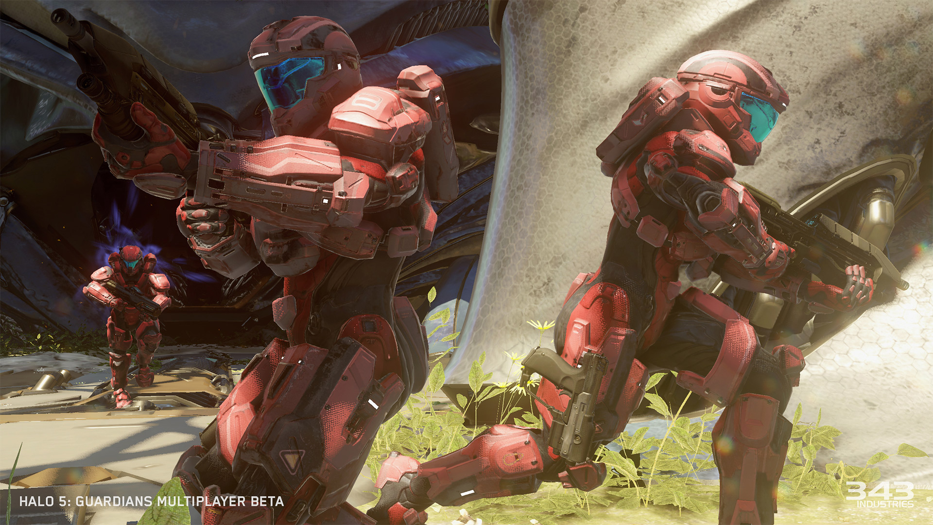
I get they couldn't give us the exact Spartan above like they showed, but I was excited when I first saw the model, because I thought, finally, we'll be able to see Spartans easier, that they would be bright and sharp, loaded with color. But in the bullshot below, you can see how the lighting washes them out a bit.
Visual clarity is perhaps my biggest issue with this game. It's probably just me, but I don't really like the look of the game. Maps are dark, too cluttered, there is weird lighting, glows, tints, washed out colors.
I need a crisper image, clean maps, clean sight lines, clarity and more color. It's something I talked about so much with Halo 4 as well. I dislike that next gen lighting look.


