• Hey, guest user. Hope you're enjoying NeoGAF! Have you considered registering for an account? Come join us and add your take to the daily discourse.

Halo |OT12| Last One Out, Get the Lights

zlatko

Banned
when I first started up halo 4 I was pleased with the more blue theme similar to halo 3.

then after a minute I realized how backwards it is compared to pretty much every previous halo.

the singing (wailing?) has gotten kinda creepy now too.


the invisble sticky detonator lol

Yeah haha. So stupid. :p
 
What's this about the current SpOps episode being a mid-season finale? A rumor or is there something I missed? If so, I hope that it's for making some very necessary changes/additions to the mode to make it more enjoyable.
 
Words cannot describe my anger at the loss of the e Dorian theme at the menu. It's what made Halo IMO. So memorable... Halo 4 doesn't have a theme or memorable tune at all :/

Agreed.

They also changed the multiplayer menu sound effects (bubbly echoy sounds while searching for players). Were the same from H2-Reach.
 

Aggrotek

Member
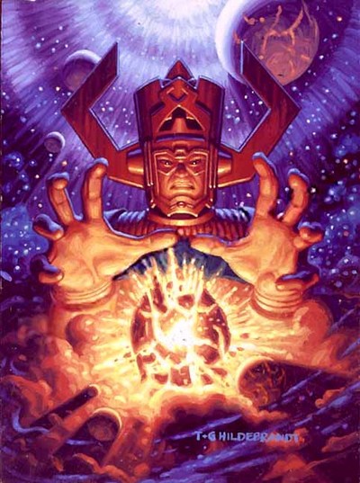
Looks like a crappy 80s comic book cover. I swear I've seen that exact pose before.

Closest I could find:

galactus.jpg
 

Very disappointed at the sudden shift away from Sparth's covers.

I can understand it from a marketing standpoint, but even then it's still a bit sloppy: the three elements of that image just don't seem to fit with each other. It looks like a bad photoshop job with multiple art styles and misaligned camera angles.
 

TheOddOne

Member
Now we know who did the CGI series.

Axis Creates CGI Episodic Content For “Halo 4” Spartan Ops: Season One
The series is being directed by Axis co-founder Stuart Aitken, on the heels of other recent high-profile game-related projects, including the much-acclaimed and award-winning Dead Island announcement trailer.

Aitken and Axis Producer Debbie Ross worked hand-in-hand with Halo 4developers 343 Industries to creatively develop the content, including casting, script development, art direction, sound design, with the clear goal that eachSpartan Ops episode should be as engaging as the best feature film or television drama.

“Spartan Ops was an absolutely unique project, with a unique schedule and unique challenges,” said Frank O’Connor, Franchise Development Director at 343 Industries. “Axis stepped up to those challenges with imagination and energy, and more importantly, a wonderfully collaborative vision of the story we wanted to tell. Working with our writers, our cinematics team, and a dizzying plethora of tools and assets, they became a seamless extension of our narrative group – and we look forward to continuing our relationship and creative partnership in the future.”


“What makes this such an incredible opportunity is that this is full CGI movie-style storytelling and character development within the rich and exciting world of Halo,” said Stuart Aitken. “We’ve collaborated at every level with 343 Industries throughout the process to create a truly immersive cinematic experience.”

The team at Axis was clear that they wanted each Spartan Ops episode to be as engaging as the best feature film or television drama. To achieve this Axis built a layout and editorial team that shot and edited episodes in a way more akin to live action than typical CGI. After the motion capture was complete, Axis would create a performance edit from the reference cameras at the shoot. The layout team then shot the CG cameras providing coverage for all scenes, allowing editorial to have as much flexibility in shot selection as possible.

Director Aitken immersed himself in the “Halo” canon, taking in everything that could provide insight into previous story elements, given that Axis would be creating never-before-seen moments in the “Halo” universe.

During the project, a range of production challenges were met, including Axis’ animation department having to work with motion capture across a range of character scales from 5.5ft to 14ft. However, the most demanding task was to create convincing facial animation. In order to maintain every nuance of the actors performances when applied to the CG characters, Axis in-house rigging and animation team developed a special facial motion capture solution in conjunction with Giant studios and Cubic Motion, a world leader in solving this difficult problem. The result is some of the most realistic and expressive CGI facial animation to date.

Axis also had to deal with the daunting level of environmental detail that is evident in the “Halo” world. The studio’s shading team developed a series of procedural approaches in Side FX Houdini, which enabled them make the world feel alive and “lived in.” Additionally, the lighting team was tasked with creating lighting set ups that matched the look of “Halo 4” but also developed a tone and approach that gave a signature look to the Spartan Ops episodes. The lighting had to be quick to iterate across multiple shots and artists, whilst maintaining the highest quality being demanded by Aitken and the team at 343 Industries.

As with any cinematic project, sound is an integral part of creating a believable world. Axis turned to Savalas, a previous partner for Dead Island,for all of Spartan Ops’ sound design as well as the final mix.

Spartan Ops was on a scale unseen on any prior project for Axis. The 10 episodes will contain 45 minutes of content, more than 30 characters, 23 sets and 1200-plus shots.
 

Tawpgun

Member
Very disappointed at the sudden shift away from Sparth's covers.

I can understand it from a marketing standpoint, but even then it's still a bit sloppy: the three elements of that image just don't seem to fit with each other. It looks like a bad photoshop job with multiple art styles and misaligned camera angles.

As if you need any more marketing help other than Halo in the title. There was a nice cryptum in the original one too.

Im not sure who has final say with these things, but Frankie is the franchise development director and I think even he would prefer the old one, considering he doesn't have the artistic taste of a 12 year old making his first forum signatures.
 
Very disappointed at the sudden shift away from Sparth's covers.

I can understand it from a marketing standpoint, but even then it's still a bit sloppy: the three elements of that image just don't seem to fit with each other. It looks like a bad photoshop job with multiple art styles and misaligned camera angles.
I think Sparth did collaborate on it.

Can't believe they that
a) they did such a radical change at all
b) they did a poor job of it

Mind blowing.

:(
Please Frankie, pls.
----------------------------------

Actually that's enough.
I won't buy it if that's going to be the cover.

Sick of this bullshit.
 

Crucio

Member
I think the cover looks cool. Anyone have a link to the old one?
Also I'd like to ask of HaloGaf if I understand the current state of the Didact. Cryptum, Primordium and Halo 4 SPOILERS ahead:
Having read the books and played through Halo 4 this is how I understand the story of the Didact. Bornsteller releases Didact 1.0 who proceeds to apparently dies by the hands of he master builder. (But was actually imprisoned by the Librarian?) Then Bornstellar becomes Didact 2.0 apparently helping the Librarian. So which Didact is in Halo 4? If its 1.0 then what happens to Bornstellar. Thanks!
I would appreciate any clarification.
 
I think Sparth did collaborate on it.

Can't believe they that
a) they did such a radical change at all
b) they did a poor job of it

Mind blowing.

:(
Please Frankie, pls.
----------------------------------

Actually that's enough.
I won't buy it if that's going to be the cover.

Sick of this bullshit.

Don't judge a book by its cover :)

Besides, just do what Gaming Side Gaf does, create your own cover and replace it.
 

TheOddOne

Member
Most hyperbolic reason to not buy a book :lol

It could have the shittiest cover ever, I would still want to find out what happens after reading the first two.
 
I guess we can't be happy about anything, huh? :p
This one is easier to complain about because the first Silentium cover was perfectly fine (for fans like me).

As if you need any more marketing help other than Halo in the title. There was a nice cryptum in the original one too.

Im not sure who has final say with these things, but Frankie is the franchise development director and I think even he would prefer the old one, considering he doesn't have the artistic taste of a 12 year old making his first forum signatures.
Having "Halo" on there certainly sells copies, but directly including imagery from Halo 4 tells people unfamiliar with the book trilogy that it's deeply connected to the game. The Sparth concept art covers for book 1 and 2 were gorgeous, but didn't obviously scream "Halo 4".

I can't blame them for wanting to have more recognizable art on the cover - if it made any sense at all for Master Chief to be on there you know they wouldn't hesitate to include him.

I just wish they had found a more... realistic composition to the cover. What angle is the Librarian hologram being projected from?
 

ElRenoRaven

Member
Most hyperbolic reason to not buy a book :lol

It could have the shittiest cover ever, I would still want to find out what happens after reading the first two.

Um where did you see anyone say they wouldn't buy it because the cover? Now I'm not buying it but that's only because of how much the first 2 in the series sucked but that's certainly not due to the cover.
 
CG has been fantastic. Id love to see a feature length movie later on.

Too bad art design and dialogue suck balls.

I can't say it often enough: Bungie, come back pls!
not happening, ever, I know :(

Reach was a misstep, but I'm sure they'd have delivered a better Halo 4 than this mess.
 
Um where did you see anyone say they wouldn't buy it because the cover? Now I'm not buying it but that's only because of how much the first 2 in the series sucked but that's certainly not due to the cover.

scroll up, brah.

I don't blame him though. If something is that important to you, you certainly should vote with your wallet and not support it.
 

TheOddOne

Member
Um where did you see anyone say they wouldn't buy it because the cover? Now I'm not buying it but that's only because of how much the first 2 in the series sucked but that's certainly not due to the cover.
Here. Fine and all to stick by your principle, but at the same time it kind of laughable. I've bought books for their content, not their covers.
 
Um where did you see anyone say they wouldn't buy it because the cover? Now I'm not buying it but that's only because of how much the first 2 in the series sucked but that's certainly not due to the cover.
I did. I get angry and indignant every time I've seen the new cover.
Last thing I need is to see that on coffee table every day (where Cryptum and Primordium currently sit coincidently).
 

FyreWulff

Member
Ow. They overbooked my flight and I got bumped from leaving at 8:30 to 3pm.

Luckily my family is awesome and came back and got me for a bit because fuck sitting in an airport for 6 hours just waiting for the first flight.

CG has been fantastic. Id love to see a feature length movie later on.

They've almost made enough cgi content now that you could just concievably edit a movie out of it.
 

ElRenoRaven

Member
Here. Fine and all to stick by your principle, but at the same time it kind of laughable. I've bought books for their content, not their covers.

Oh I agree. Not buying a book due to the cover is a bit childish I think. After all there is that old saying for a reason. I didn't see him say flatout he wouldn't buy it though. More of a case of him blowing off steam due to how bad it is. Course I could be wrong. I can see how others can see what he said as him saying he wasn't going to buy it.

I did. I get angry and indignant every time I've seen the new cover.
Last thing I need is to see that on coffee table every day (where Cryptum and Primordium currently sit coincidently).

Ah ok then. See I didn't take it was you saying you flatout weren't going to. I was wrong then. I myself if I was to buy it wouldn't care about the cover mainly because I buy my books for the Kindle anymore. Hence I never really see the cover except on my home screen and as a small thumbnail.
 
Ok, I mentioned this on mastrbiggy's stream last night but I figured I'd put it here because I actually found it so ridiculous.

The information delivery from/in lobby is atrocious. You click on a person's name from the roster and hit party details and you'll know who they're with, if they're in a game, and if their lobby is open. If you want to know how much time is remaining, not only does the party have to be open, but you then have to enter the join queue for their game. Did I mention only the party leader gets this information when waiting to join? Then if you decide that's too much time to wait and want to back out, you can't just cancel the join like before. Everyone in your lobby has to quit separately and rejoin together.

After all this, say you actually want to wait, but you're curious as to the playlist the other party is in. Guess what, nowhere to get this information directly! However, you can at least see what map they are playing and make some sort of inference as to the playlist. But guess what? You have to view their gamer profile in the guide to see the map name! God forbid it actually be built into the game.

This is just the latest revelation for me about how shitty the UI is for this game. I wasn't even aware of the map info until last night and I literally just starting laughing at how ludicrous it was.

We can debate weapon balance, AA's, playlist configurations all day but just about everyone agrees that the UI is shitty in Halo 4.
 

u4iX

Member
Ok, I mentioned this on mastrbiggy's stream last night but I figured I'd put it here because I actually found it so ridiculous.

The information delivery from/in lobby is atrocious. You click on a person's name from the roster and hit party details and you'll know who they're with, if they're in a game, and if their lobby is open. If you want to know how much time is remaining, not only does the party have to be open, but you then have to enter the join queue for their game. Did I mention only the party leader gets this information when waiting to join? Then if you decide that's too much time to wait and want to back out, you can't just cancel the join like before. Everyone in your lobby has to quit separately and rejoin together.

After all this, say you actually want to wait, but you're curious as to the playlist the other party is in. Guess what, nowhere to get this information directly! However, you can at least see what map they are playing and make some sort of inference as to the playlist. But guess what? You have to view their gamer profile in the guide to see the map name! God forbid it actually be built into the game.

This is just the latest revelation for me about how shitty the UI is for this game. I wasn't even aware of the map info until last night and I literally just starting laughing at how ludicrous it was.

It seemingly gets more and more ludicrous; these small but glaring deficiencies, when you learn Spartan Ops CGI was outsourced, just as Forge, and who knows what else.
 
Top Bottom