Why do you guys think Active Roster with X doesn't work, in already running MP lobbies/custom game lobbies, I mean? It clears up screen space that would otherwise look very busy with it there. I'm thinking about making a fully animated UI concept, I've already got some good ideas that I've sketched out. But, it borrows a lot from a lot of other games and previous Halos. Problem is, I don't know what software to use to make it a reality, that fact probably says I shouldn't be trying anyway. My school offers a full Adobe suite, though.
You are using an out of date browser. It may not display this or other websites correctly.
You should upgrade or use an alternative browser.
You should upgrade or use an alternative browser.
Halo |OT19| 793 Posts, And None Worth Reading
- Thread starter Ozzy Onya A2Z
- Start date
- Status
- Not open for further replies.
Syphon Filter
Member
remember the old rumor pre e3 game reveals? what are the chances the logo was real?


Exploring stores, bathrooms, theaters, and other attractions didn't feel linear to me. Most of that goes away during the second half of Infinite.
This. Bioshock and Dishonored did a really great job of turning a linear game into an open world like game. Absolutely amazing game. Anyone else blown away by Dishonored? I'l pick up the sequel day 1.
remember the old rumor pre e3 game reveals? what are the chances the logo was real?
Close to 0
aHebrewMenagerie
Member
The logo has technically already been revealed, and i thought it was confirmed that was a fake?
Exploring stores, bathrooms, theaters, and other attractions didn't feel linear to me. Most of that goes away during the second half of Infinite.
But exploration in Bioshock is mostly about finding audio diaries and random loot. Considering that you're prevented from traveling in straight directions by plot I'd say it's still fairly linear.
Syphon Filter
Member
The logo has technically already been revealed, and i thought it was confirmed that was a fake?
Isnt that a reflection of the sky? Not sure if it is the official one yet.
But she needs to be naked and fully sexualized then you wonder where it comes from?
I never expressed any wonderment. On the contrary I fully understand.
The logo has technically already been revealed, and i thought it was confirmed that was a fake?
Not sure if that's the actual screengrab, but Axis Animation's demo reel had the trailer with Halo 5 at the end. It *exists*, whether or not they'll finally call it Halo 5 is another matter.
FUNKNOWN iXi
Member
I never expressed any wonderment. On the contrary I fully understand.
http://www.youtube.com/watch?v=WzV6mXIOVl4
xxjuicesxx
Member
Why do you guys think Active Roster with X doesn't work, in already running MP lobbies/custom game lobbies, I mean? It clears up screen space that would otherwise look very busy with it there. I'm thinking about making a fully animated UI concept, I've already got some good ideas that I've sketched out. But, it borrows a lot from a lot of other games and previous Halos. Problem is, I don't know what software to use to make it a reality, that fact probably says I shouldn't be trying anyway. My school offers a full Adobe suite, though.
A mockup menu UI? Illustrator? Indesign? Photoshop? They'd all work. mspaint too.
How come nobody ever mentions powerpoint, but they mention paint? I guess people just don't think of a presentation tool being something to use for making visual stuff. Powerpoint actually works very similar to paint, just with way more options, and without the whole "Oops, you just clicked outside this shape. Now you can't pick it up and move it again unless you very carefully select it with the square selection tool. Oh, was it more complicated than a square? Too bad! You're outta luck. Guess you'll have to control + Z and make it again so you can put it where you really wanted it." Plus, paint doesn't have transparency settings, which is actually more important than people may realize.
I'm Office 365 right now for my mockup, and when I post it your minds will be BLOWN.
To be serious though powerpoint really is very easy and simple to use, and you can do a ton with it. It's no photoshop, but the stuff being done in a lot of these mockups is easily done in powerpoint.
I'm Office 365 right now for my mockup, and when I post it your minds will be BLOWN.
To be serious though powerpoint really is very easy and simple to use, and you can do a ton with it. It's no photoshop, but the stuff being done in a lot of these mockups is easily done in powerpoint.
Prinz Eugn
Member
How come nobody ever mentions powerpoint, but they mention paint? Powerpoint actually works very similar to paint, just with way more options, and without the whole "Oops, you just clicked outside this shape. Now you can't pick it up and move it again unless you very carefully select it with the square selection tool. Oh, was it more complicated than a square? Too bad! You're outta luck. Guess you'll have to control + Z and make it again so you can put it where you really wanted it." Plus, paint doesn't have transparency settings, which is actually more important than people may realize.
I'm using it right now for my mockup, and when I post it your minds will be BLOWN.
To be serious though powerpoint really is very easy and simple to use, and you can do a ton with it.
Ummmmmmmmmmmmmmmmmm
no.
Powerpoint's actually not a bad idea, but getting the slide the right raster size to export might be tricky though.
I still think it was originally intended as Halo 5 at the time Axis made the animation, but it has since devolved into a bridge game between 4 & 5 instead. Thus allowing 5 to have more development time on par with previous main entries in the series. The idea of them holding out on the Halo 5 reveal because they haven't come up with a good subtitle yet sounds silly to me because they could've just announced it as Halo 5 (creating more buzz for the Xbox One) and added the subtitle later.
A mockup menu UI? Illustrator? Indesign? Photoshop? They'd all work. mspaint too.
Probably will use Illustrator, sounds good.
edit: yeah, that's what I did mean, thanks Ozzy. I'll look into Director.
Ozzy Onya A2Z
Member
A mockup menu UI? Illustrator? Indesign? Photoshop? They'd all work. mspaint too.
I think he means the animating portion of his mock up, which would be director or windows movie maker. After all you're mock up is just going to be animated scaling, transparency or fading so just use the easiest tools. EDIT: Chettlar has the right idea with powerpoint.
Also this B.net post by Lord of Admirals is a solid read regarding John & Didact in Halo 4 and beyond.
The Didact’s character has been subject to lots of controversy in the Halo community. Many fans have tried to prove that he is given a proper explanation while others argue the opposite. Given that the Didact is the Master Chief’s first true nemesis, I’m intrigued by the fact that very little of the community appears to care about the Chief and the Didact’s relationship given they are direct adversaries. On my first few playthroughs I didn’t recognize their relationship’s development at first. When I started looking at the quotes, I realized that their relationship dynamically changes throughout the course of the game. I hope this will be an enlightening experience as it gave new life and context to quotes I largely misunderstood in Halo 4 for a while.
In the first part of Halo 4, we see a lot of strange occurrences happening when the Chief and Cortana activate and access Forerunner tech causing them to follow a very specific path. After the Didact is released, Cortana makes the comment on how he had been leading them on.
“Chief, please! We've got to go! That...Didact. He manipulated Infinity's signal to get us to release him! Get up!"
-Cutscene, Forerunner, Halo 4
It definitely gives you the feeling that the Chief was used. A means to an end. A tool. The Didact felt the same way. His prejudice against humanity blinded him, and because of that, he treated the Chief accordingly and discarded him when the Chief had finished his usefulness.
"The Forerunners... have returned. This tomb… is now yours."
-Cutscene, Forerunner, Halo 4
However, the Didact never expected the Chief to survive. When he had discovered his survival, he had no such time to address that matter as he needed to focus on the big picture: Infinity. I think it can be inferred that during the Didact’s absence of direct involvement in the story, his views of Chief had changed as he no longer saw the Chief as a discarded tool. It didn’t change much though, as the Didact still didn’t see the Chief as a threat.
He was simply intrigued that the Chief refused to give up in the face of impossible odds.
"Your actions tread between honor and foolishness."
-Gameplay, Shutdown, Halo 4
Regardless, the Master Chief pushed on, ignoring the Didact’s comments on his progress. By this point, the Didact had become personally affected that the Chief blindly continued his crusade. He would try and persuade the Chief with logic and reasoning that his actions were futile. He knew there was no way Chief could win, and tried to talk some sense into him as a fellow warrior.
"Do you truly believe these theatrics can prevent my departure? Embrace your sad fate and retain your nobility. I am already beyond you."
-Gameplay, Shutdown, Halo 4
The Master Chief knows his priorities though. Ever since he was a kid, he refused to lose at anything. This gave the impression to many who knew the Chief that he was incredibly stubborn.
"Crazy fool! Why do you always jump? One of these days, you're gonna land on somethin' as stubborn as you are! And I don't do bits and pieces!"
-Cutscene, Arrival, Halo 3
And he was. Towards the end of the level Shutdown, the Didact was beginning to realize that. He still thought he persuade the Chief with logic and reasoning. So he proceeded to issue an ultimatum to him: Stop now and live. If you continue, you will suffer the consequences.
"You will relent, human, or you will perish. All in life is choice. And your day to choose has come."
-Gameplay, Shutdown, Halo 4
For the Master Chief, giving up on humanity was not an option, so he pushed forward and stared death in the face, refusing to look away. Choosing to go to his death in an attempt to defeat the undefeatable impressed the Didact greatly. The next time we hear from him, he confirms that, but also confirms the Chief will die.
"You impress me, human. Your singular valor will be preserved and studied, once your Composition has been completed."
-Gameplay, Composer, Halo 4
The Didact had never accounted for what the Librarian’s imprint could have done. Despite facing extreme brutality and atrocities, the Chief still continued on. It is at this point that the Didact’s views of the Chief makes a colossal shift. He finally recognizes the Chief as a direct threat, and considers him unbeatable by indirect means. So, he would stall him until he could address him personally.
"Where reason does not stop you, perhaps force can at least delay you."
-Gameplay, Midnight, Halo 4
The Didact succeeds in stalling the Chief and fires the Composer on New Phoenix. Knowing he has won, he directly notes the Chief’s stubbornness to win.
“You persist too long after your own defeat.”
-Cutscene, Midnight, Halo 4
But now that he has completed his task, he is free to address the Chief directly. This scene is very telling of the current status of their relationship. Whereas before, he simply called the Chief ‘human’, he now calls him ‘warrior’. The great thing about the Didact’s actions and word choice at this point is that it shows he consideres Chief as a worthy adversary. An equal. When he prepares to attack the Chief, he waits until he is turned around before making his move.
“Come then, warrior. Have your resolution.”
-Cutscene, Midnight, Halo 4
Again though, the Didact fails to account what the Librarian could have done, and did do. This ends up resulting in his defeat as Cortana shackles him in hardlight. Something that is very obscure though, is that the Chief and Cortana both failed to take into account the Didact’s own stubbornness. Just as Johnson predicted back in November of 2552, it was only a matter of time when John ran into someone as stubborn as him.
Just as he predicted, John would be fragmented emotionally as he would suffer extreme losses. He failed to completely safeguard humanity, and most importantly he failed to save and protect Cortana.
“One of these days, you're gonna land on somethin' as stubborn as you are! And I don't do bits and pieces!"
-Cutscene, Arrival, Halo 3
The next time around, the Chief and the Didact are going to be treating each other very differently as both have proven their worth to each other. The Didact will no longer just be shrugging off the Chief as he has had intimate experience with how resourceful the Master Chief is. It’s personally hard to say how the Chief will act towards the Didact now. One thing’s for sure, things will be different next time around.
My reply was:
Great post mate, thanks for annotating the sources too. It makes me think of the HX1 trailer and their next encounter where John must already be thinking or forward planning how he can defeat the Didact without Cortana.
Given your post and closing paragraph it seems John already knows he has to gain something akin to Cortana...Mendicant Bias replacing Cortana?
Ummmmmmmmmmmmmmmmmm
no.
Powerpoint's actually not a bad idea, but getting the slide the right raster size to export might be tricky though.
I should have clarified. I mean the whole, make a shape, move it around, change it's color, etc. works more similar to paint than it does photoshop. It's not overly similar, just more close to one than the other.
Also, the best way I've found of making pictures out of powerpoint is kind of...inception-y, but not really:
1. Make slide.
2. Open presentation in full screen view.
3. (After waiting for mouse and commands in the bottom corner to disappear) press "Print Screen" on your keyboard.
4. Make a new slide, right click, and select paste.
5. Right click on picture and save as picture.
Boom, you're done, and it will be as full and noncompressed as possible. Actually, exporting a slide the traditional way is a bad idea, because it tries to mess with it and polish it up artificially, and sometimes that can skew how you had things originally.
Syphon Filter
Member
I still think it was originally intended as Halo 5 at the time Axis made the animation, but it has since devolved into a bridge game between 4 & 5 instead. Thus allowing 5 to have more development time on par with previous main entries in the series. The idea of them holding out on the Halo 5 reveal because they haven't come up with a good subtitle yet sounds silly to me because they could've just announced it as Halo 5 (creating more buzz for the Xbox One) and added the subtitle later.
The idea was to let people know Halo is coming to xbox one officially. It will be Halo 5.
"It definitely gives you the feeling that the Chief was used. A means to an end. A tool. The Didact felt the same way. His prejudice against humanity blinded him, and because of that, he treated the Chief accordingly and discarded him when the Chief had finished his usefulness."
Oh my goodness. That fits perfectly with what I was talking about earlier with Cortana if she went evil. Have the Didact "use" her for his own means, while still convincing her she holds the ultimate power, appealing to her desire to "be like a human" but more than that -- to have power over them. Have the Didact convince her she's been wronged. Then have something like kittens suggested earlier about Masterchief trying to save her, but also stop her madness before she does something terrible.
Idk, just a thought.
User 73706
Banned
I know this is offtopic but does anyone here own or have tried the Oculus Rift devkit 1?
If so, is it tolerable when playing let's say Portal 2? If I just slap it on my friend who doesn't really play games, will she get immersed and all that?
That sounds like a surefire way to induce headaches and vomiting.
^ It doesn't actually. Not with the new versions anyway.
I don't think Defect literally meant just "slap it it on her."
I have not, but I will say that many people, gamers or not, have expressed nothing but wonder and amazement when trying it out. I have heard nothing but praise for it no matter the use, which makes me super stoked to try it myself.
I mean, didn't you see that Grandma video?
I don't think Defect literally meant just "slap it it on her."
I know this is offtopic but does anyone here own or have tried the Oculus Rift devkit 1?
If so, is it tolerable when playing let's say Portal 2? If I just slap it on my friend who doesn't really play games, will she get immersed and all that?
I have not, but I will say that many people, gamers or not, have expressed nothing but wonder and amazement when trying it out. I have heard nothing but praise for it no matter the use, which makes me super stoked to try it myself.
I mean, didn't you see that Grandma video?
nillapuddin
Member
Okay heres the thing about this UI business, making the best UI we can think of is wonderful, however the Microsoft design language is moving in a very clear direction (Metro) and there is no stopping it.
Metro is not all bad, it has some nice elements to it, readability, lack of pop-ups, and a distinct flow (horizontal).
It also clearly has downsides, the horizontal nature of movement isnt instantly natural to the predominately scroll based world we live in, and the large space grabbing inputs can seem too dumbed down.
While at the prelaunch event I was able to play both Ryse and Forza, so Ive seen some first party UI's in person. The Ryse interface, is excellent in my opinion, there isnt a lot to the game in terms of flexibility, so it can shine in a straightforward manner. Forza is a much larger game than its demo, so I cannot comment on its longevity.
Anyways, I tried my best to take down some of the key things I notice in the language, Interwoven Geometry, Using a single foundation shape with increments taken out, and the unified display of whats being "highlighted".
I do not claim this prototype is perfect, complete nor as efficient as Id like it to be.
(Also, Ive always fancied myself an architect, not a painter, color choice is decent)
*There are some distinct areas I have left out/dont know how to include properly, most significantly, "button prompts" there are always guides on the bottom of the screen to help you navigate, I havent gotten that far yet
I urge you to click the picture or use this link to go to the album and I walk through a few scenarios that play out

I really wanted to sit on this early mock up longer, but I have to go to sleep for now.
I expect to flesh this out and refine it tomorrow after work, hopefully yall enjoy and/or have some good critiques
Metro is not all bad, it has some nice elements to it, readability, lack of pop-ups, and a distinct flow (horizontal).
It also clearly has downsides, the horizontal nature of movement isnt instantly natural to the predominately scroll based world we live in, and the large space grabbing inputs can seem too dumbed down.
While at the prelaunch event I was able to play both Ryse and Forza, so Ive seen some first party UI's in person. The Ryse interface, is excellent in my opinion, there isnt a lot to the game in terms of flexibility, so it can shine in a straightforward manner. Forza is a much larger game than its demo, so I cannot comment on its longevity.
Anyways, I tried my best to take down some of the key things I notice in the language, Interwoven Geometry, Using a single foundation shape with increments taken out, and the unified display of whats being "highlighted".
I do not claim this prototype is perfect, complete nor as efficient as Id like it to be.
(Also, Ive always fancied myself an architect, not a painter, color choice is decent)
*There are some distinct areas I have left out/dont know how to include properly, most significantly, "button prompts" there are always guides on the bottom of the screen to help you navigate, I havent gotten that far yet
I urge you to click the picture or use this link to go to the album and I walk through a few scenarios that play out
I really wanted to sit on this early mock up longer, but I have to go to sleep for now.
I expect to flesh this out and refine it tomorrow after work, hopefully yall enjoy and/or have some good critiques
there is no room accounted for scroll bars, no buttom guides, poor colors, so much wrong, ugh
Tonight's DestinyBungieOrg episode starred rising popstar Dan Hammill and our very own heckfu, who just happened to be locked in his house on snow alert because of the 1 inch of snow Alabama got! (Just a random photo off twitter of it, apparently)
Awkward laughing galore!

Awkward laughing galore!
Okay heres the thing about this UI business, making the best UI we can think of is wonderful, however the Microsoft design language is moving in a very clear direction (Metro) and there is no stopping it.
Metro is not all bad, it has some nice elements to it, readability, lack of pop-ups, and a distinct flow (horizontal).
It also clearly has downsides, the horizontal nature of movement isnt instantly natural to the predominately scroll based world we live in, and the large space grabbing inputs can seem too dumbed down.
While at the prelaunch event I was able to play both Ryse and Forza, so Ive seen some first party UI's in person. The Ryse interface, is excellent in my opinion, there isnt a lot to the game in terms of flexibility, so it can shine in a straightforward manner. Forza is a much larger game than its demo, so I cannot comment on its longevity.
Anyways, I tried my best to take down some of the key things I notice in the language, Interwoven Geometry, Using a single foundation shape with increments taken out, and the unified display of whats being "highlighted".
I do not claim this prototype is perfect, complete nor as efficient as Id like it to be.
(Also, Ive always fancied myself an architect, not a painter, color choice is decent)
*There are some distinct areas I have left out/dont know how to include properly, most significantly, "button prompts" there are always guides on the bottom of the screen to help you navigate, I havent gotten that far yet
I urge you to click the picture or use this link to go to the album and I walk through a few scenarios that play out
I really wanted to sit on this early mock up longer, but I have to go to sleep for now.
I expect to flesh this out and refine it tomorrow after work, hopefully yall enjoy and/or have some good critiques
there is no room accounted for scroll bars, no buttom guides, poor colors, so much wrong, ugh
I can dig it.
This is one of the better ones ive seen. Wahrers were absolutley terrible but he did have one good idea, of having a sort of "tactical" option of viewing the map/gametype.
LIke if you hover over the gametype in a matchmaking menu and press it a little side menu pops up with the settings.
If you click on the map it gives you a top down version with weapon spawn locations.
NobleGundam
Banned
I knew all of which he pointed out so very constructive his post was. But the part that really caught me off guard was Johnson's "And I don't do bits and pieces". Fuck. That hit me...I think he means the animating portion of his mock up, which would be director or windows movie maker. After all you're mock up is just going to be animated scaling, transparency or fading so just use the easiest tools. EDIT: Chettlar has the right idea with powerpoint.
Also this B.net post by Lord of Admirals is a solid read regarding John & Didact in Halo 4 and beyond.
My reply was:
Great post mate, thanks for annotating the sources too. It makes me think of the HX1 trailer and their next encounter where John must already be thinking or forward planning how he can defeat the Didact without Cortana.
Given your post and closing paragraph it seems John already knows he has to gain something akin to Cortana...Mendicant Bias replacing Cortana?
Dude that looks real nicely done, puddin.Okay heres the thing about this UI business, making the best UI we can think of is wonderful, however the Microsoft design language is moving in a very clear direction (Metro) and there is no stopping it.
Metro is not all bad, it has some nice elements to it, readability, lack of pop-ups, and a distinct flow (horizontal).
It also clearly has downsides, the horizontal nature of movement isnt instantly natural to the predominately scroll based world we live in, and the large space grabbing inputs can seem too dumbed down.
While at the prelaunch event I was able to play both Ryse and Forza, so Ive seen some first party UI's in person. The Ryse interface, is excellent in my opinion, there isnt a lot to the game in terms of flexibility, so it can shine in a straightforward manner. Forza is a much larger game than its demo, so I cannot comment on its longevity.
Anyways, I tried my best to take down some of the key things I notice in the language, Interwoven Geometry, Using a single foundation shape with increments taken out, and the unified display of whats being "highlighted".
I do not claim this prototype is perfect, complete nor as efficient as Id like it to be.
(Also, Ive always fancied myself an architect, not a painter, color choice is decent)
*There are some distinct areas I have left out/dont know how to include properly, most significantly, "button prompts" there are always guides on the bottom of the screen to help you navigate, I havent gotten that far yet
I urge you to click the picture or use this link to go to the album and I walk through a few scenarios that play out
I really wanted to sit on this early mock up longer, but I have to go to sleep for now.
I expect to flesh this out and refine it tomorrow after work, hopefully yall enjoy and/or have some good critiques
there is no room accounted for scroll bars, no buttom guides, poor colors, so much wrong, ugh
gAg CruSh3r
Member
Okay heres the thing about this UI business, making the best UI we can think of is wonderful, however the Microsoft design language is moving in a very clear direction (Metro) and there is no stopping it.
Metro is not all bad, it has some nice elements to it, readability, lack of pop-ups, and a distinct flow (horizontal).
It also clearly has downsides, the horizontal nature of movement isnt instantly natural to the predominately scroll based world we live in, and the large space grabbing inputs can seem too dumbed down.
While at the prelaunch event I was able to play both Ryse and Forza, so Ive seen some first party UI's in person. The Ryse interface, is excellent in my opinion, there isnt a lot to the game in terms of flexibility, so it can shine in a straightforward manner. Forza is a much larger game than its demo, so I cannot comment on its longevity.
Anyways, I tried my best to take down some of the key things I notice in the language, Interwoven Geometry, Using a single foundation shape with increments taken out, and the unified display of whats being "highlighted".
I do not claim this prototype is perfect, complete nor as efficient as Id like it to be.
(Also, Ive always fancied myself an architect, not a painter, color choice is decent)
*There are some distinct areas I have left out/dont know how to include properly, most significantly, "button prompts" there are always guides on the bottom of the screen to help you navigate, I havent gotten that far yet
I urge you to click the picture or use this link to go to the album and I walk through a few scenarios that play out
I really wanted to sit on this early mock up longer, but I have to go to sleep for now.
I expect to flesh this out and refine it tomorrow after work, hopefully yall enjoy and/or have some good critiques
there is no room accounted for scroll bars, no buttom guides, poor colors, so much wrong, ugh
I really enjoy this one the most so far. It's not to empty but yet it's not to much for the screen.
You don't know that.In other news, Ghazi is no closer to getting the Fu D.
Ozzy Onya A2Z
Member
Okay heres the thing about this UI business, making the best UI we can think of is wonderful, however the Microsoft design language is moving in a very clear direction (Metro) and there is no stopping it.
Metro is not all bad, it has some nice elements to it, readability, lack of pop-ups, and a distinct flow (horizontal).
It also clearly has downsides, the horizontal nature of movement isnt instantly natural to the predominately scroll based world we live in, and the large space grabbing inputs can seem too dumbed down.
While at the prelaunch event I was able to play both Ryse and Forza, so Ive seen some first party UI's in person. The Ryse interface, is excellent in my opinion, there isnt a lot to the game in terms of flexibility, so it can shine in a straightforward manner. Forza is a much larger game than its demo, so I cannot comment on its longevity.
Anyways, I tried my best to take down some of the key things I notice in the language, Interwoven Geometry, Using a single foundation shape with increments taken out, and the unified display of whats being "highlighted".
I do not claim this prototype is perfect, complete nor as efficient as Id like it to be.
(Also, Ive always fancied myself an architect, not a painter, color choice is decent)
*There are some distinct areas I have left out/dont know how to include properly, most significantly, "button prompts" there are always guides on the bottom of the screen to help you navigate, I havent gotten that far yet
I urge you to click the picture or use this link to go to the album and I walk through a few scenarios that play out
http://i.imgur.com/Y7rc0oD.jpg[IMG][/URL]
I really wanted to sit on this early mock up longer, but I have to go to sleep for now.
I expect to flesh this out and refine it tomorrow after work, hopefully yall enjoy and/or have some good critiques
[spoiler]there is no room accounted for scroll bars, no buttom guides, poor colors, so much wrong, ugh[/spoiler][/QUOTE]
Throw in some bumper button whole screen swiping (just like Ryse as you mention or the X1/360/H4 interfaces do), quick mockups of what those other screens would be and also add colour buttons that are context sensitive for pop-ups with greater detail.
Warher's ideas have some good unique points like quick group lobby or party invites, which are useful but clutter things up too much. He also had the playlist idea in the original mock up centre for the party's next games coming up. It was a good idea but a vote on each as they highlight (context sensitive) would work better and be far less clutter; this could also work far better as a context sensitive pop-up. Imagine an automatic playlist creation from the party leaders custom maps+gametypes+official ones and each party member quickly votes on the playlist options one by one (opt-in obviously and party leader can just pick any to overrule). The more votes the higher up the playlist it goes, could be interesting and would be some really nice additions to party sessions or customs or ad-hoc tournaments etc.
I like the idea of the baseball card from H4 [B]BUT[/B] only for one player that is highlighted, imagine a single large box above the small icon boxes below horizontally for the current lobby/party list. A simple group highlight around which/who/how many are in each party or going solo and you can cycle through them individually with the upper larger box being the active one. A cleaner baseball card version that the H4 one. You could also fit far more details in there, such as rank, campaign completion, highest medals, TOD's etc. Also these queries should be faster with the dedis being implemented so we should be able to poll more info in this summary fashion.
I have a few ideas but once I have the survey infographic out of the way I'll mock up something for the various UI screens. No one is really tackling the post carnage report, which would be cool to see the stats we want prevalent, seeing as though we've bitched about those so much. Also maybe while this mock up stuff is happening some might feel like mocking up stats for the web or app devices?
I didnt read anything you wrote, but I would honestly be fine with this. It looks really nice, and a really nice step that would fit Halo's menus. Maybe when you are choosing a Forge variant, it pops out to the left in the empty space, instead of moving the camera out to the right? I'd have to see it in order to judge it.
Also make a main menu mockup now. I'd like to see what you'd think would fit with this sort of design
Speedy Blue Dude
Banned
I can't see what armor everyone is wearing tho. That's very important.
I can't see them doing a cool pose either. That's the most important thing of all.
I can't see what armor everyone is wearing tho. That's very important.

Here
User 73706
Banned
Here
:lol
Looks like I need to invest in a multi-monitor console setup.
Tonight's DestinyBungieOrg episode starred rising popstar Dan Hammill and our very own heckfu, who just happened to be locked in his house on snow alert because of the 1 inch of snow Alabama got! (Just a random photo off twitter of it, apparently)
Awkward laughing galore!
Saved.

Looks very similar to this mockup Nilla. My only issue is that I hate the big boxes and Metro look. I'd still prefer Halo 3/Reach/Destiny. I mean if it's not touch based, why does "start matchmaking" have to be so huge.
Who made this mockup?
Also Nilla - That is great design there. Takes some stuff from Halo 4 (like the one above) but gives it a Reach feel.

And this is a fantastic idea. Nice job Nilla.
I'm interested in what Juan has to say.
-- Well, the Gravemind's statements in Silentium are hardly hero material.Sympathy for the Gravemind:
only galactic protagonist who expressed a desire for universal preservation of life, intelligences and universal equality.
methods questionable.
I was going down internet-memory lane and found a rendered H3 video of myself ruining a perfectly good Fiesta VIP game making the best of an unfortunate gametype.
[URL="http://halo.bungie.net/Online/Halo3UserContentDetails.aspx?h3fileid=76558611" ]http://halo.bungie.net/Online/Halo3UserContentDetails.aspx?h3fileid=76558611[/URL]
[URL="http://halo.bungie.net/Online/Halo3UserContentDetails.aspx?h3fileid=76558611" ]http://halo.bungie.net/Online/Halo3UserContentDetails.aspx?h3fileid=76558611[/URL]
I never got to play Fiesta VIP... sounds fun. ")
Also yes... Rendered videos need to make a return. I don't have an Xbox One yet so I don't know how it's video capture stuff is.
edit:
@randomrosso
I have that fear. I really don't want it to go, because I love being able to flythrough and stuff. However, if it means they put more time into MP or something than I guess I can understand/deal with it.
Will be interesting to see if 343i does away with theatre altogether in Halo [5] now that the Xbox has that recording feature
I doubt it since Waypoint thrives on a lot of the community created screenshots and videos which wouldn't be possible with the Game DVR. The GDVR is stuck to what happened on screen and you can't go through and position the camera like you can with Theater. I wonder if they will be able to integrate Theater uploads with the overall Upload app though.
Ozzy Onya A2Z
Member
I never got to play Fiesta VIP... sounds fun.
Also yes... Rendered videos need to make a return. I don't have an Xbox One yet so I don't know how it's video capture stuff is.
edit:
@randomrosso
I have that fear. I really don't want it to go, because I love being able to flythrough and stuff. However, if it means they put more time into MP or something than I guess I can understand/deal with it.
http://m.neogaf.com/showpost.php?p=92328538
Here is two quick rendered videos stock standard X1 features with no editing. It's there but going over 30 secs or 5 mins caps would be nice. The editing is easy and upload studio is quite good for what it is.
http://m.neogaf.com/showpost.php?p=92328538
Here is two quick rendered videos stock standard X1 features with no editing. It's there but going over 30 secs or 5 mins caps would be nice. The editing is easy and upload studio is quite good for what it is.
Decent quality, I suppose. You can just upload it right from your Xbox onto that site, and then download it to your computer? Or do you have to do a bunch of crazy stuff to get it off the Xbox?
Speedy Blue Dude
Banned
Decent quality, I suppose. You can just upload it right from your Xbox onto that site, and then download it to your computer? Or do you have to do a bunch of crazy stuff to get it off the Xbox?
Upload straight from your Xbox to Skydrive, and from Skydrive to your computer. Pretty fast and easy, quality is... eh though.
Devolution
Member
Not trying to be mean but I really hate the huge buttons for shit. It's a waste of screen space.
Zeouterlimits
Member
Nice, congrats, keeping it within the family.Shoutout to duncan for gifting me a $20 MS point code.
Shoutout to zeouterlimits for giving duncan the code to gift
Shoutout for a random guess winning me the code
Don't spend it all in one place now

Devolution
Member

Halo 2 should be a template not Reach, Reach UI is bad news.
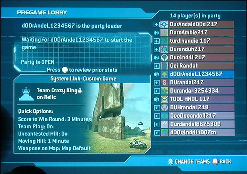
While I'm not a fan of that huge space taken up with "waiting for blah blah to start" you have an image of the map, map details and the full list of people in the lobby. If 2 more joined they'd still fit on screen.
Halo 2 should be a template not Reach, Reach UI is bad news.
While I'm not a fan of that huge space taken up with "waiting for blah blah to start" you have an image of the map, map details and the full list of people in the lobby. If 2 more joined they'd still fit on screen.
Oh I agree, I didn't make that mockup, I was just telling NillaPuddin that the mockup he made looks like one someone made a while back for Halo 4.
Im not a fan of the big buttons either. Though I'm guessing you are a UI/UX designer as well? Why is Reach necessarily bad? What about Halo 3? And have you seen the UI for Destiny?
Devolution
Member
Oh I agree, I didn't make that mockup, I was just telling NillaPuddin that the mockup he made looks like one someone made a while back for Halo 4.
Im not a fan of the big buttons either. Though I'm guessing you are a UI/UX designer as well? Why is Reach necessarily bad? What about Halo 3? And have you seen the UI for Destiny?
Halo 3 started the "fuck details about the game" UI that I've been pissed with for a while now. Reach had the awkward turn the stick to browse between windows. Was not a fan of those angles. I do UI/UX and I'm always annoyed with a lack of consistency between menus and a proper hierarchy based on what people want to see and do.
- Status
- Not open for further replies.