• Hey, guest user. Hope you're enjoying NeoGAF! Have you considered registering for an account? Come join us and add your take to the daily discourse.

HaloGAF |OT: Anniversary| So fades the great harvest of our betrayal.

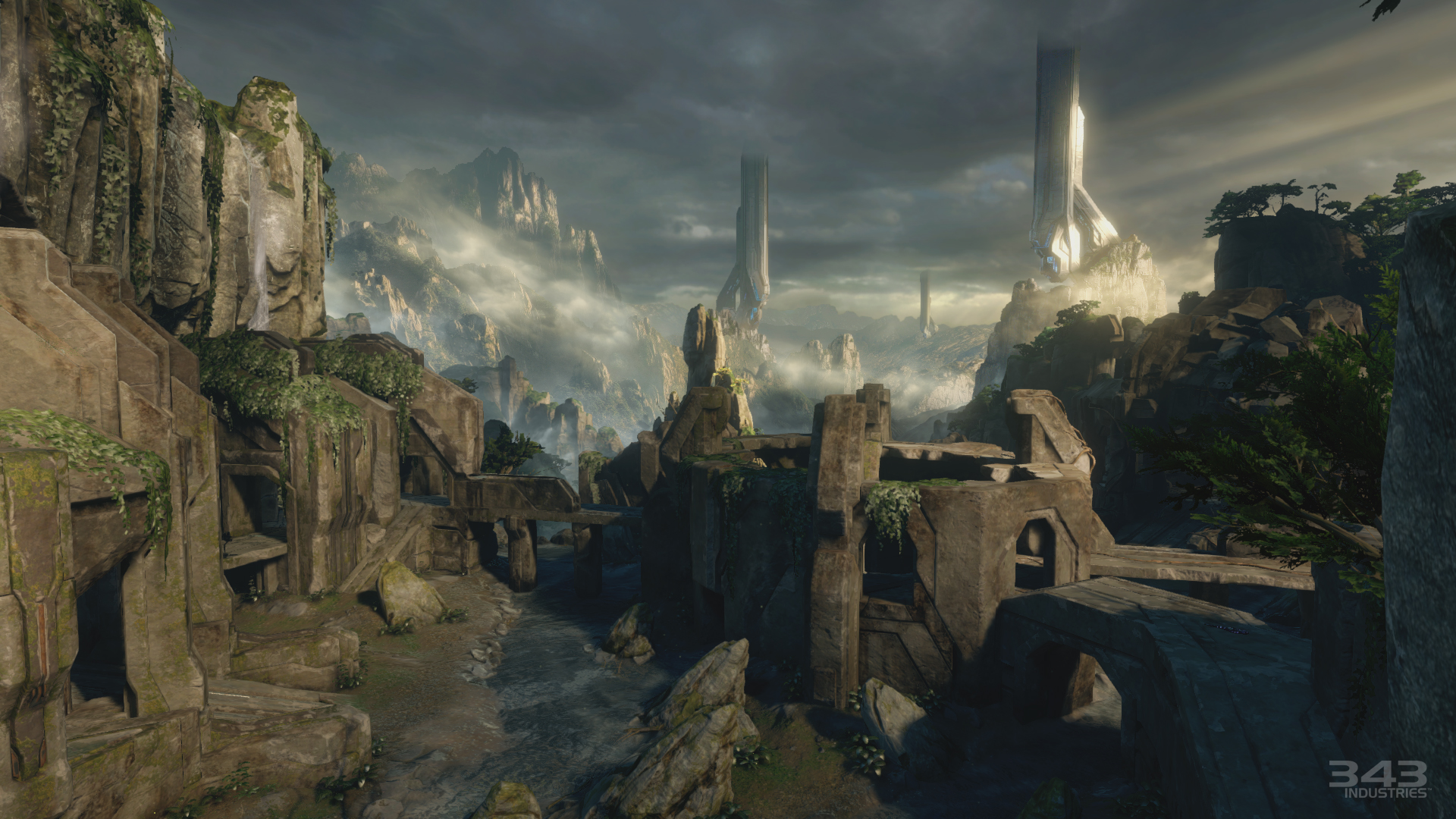
I need a walkthrough of bloodline before I can judge it. That picture looks like the map is slapped together IMHO. The random metallic floor/paneling on the left, the strange junkyard looking structure where the rocks use to be, the glowing orbs above each base, the man cannons instead of teleporters... I don't buy it yet.

Maybe I just don't like the aesthetic. No biggie, I'm sure it will play well enough. =)
 

Mix

Member
looks like the teleporters on Coag are mancannons now.
for reference I'll post it on this page
halo-master-chief-collection-coagulation.jpg

There seems to be a structure in the middle of Bloodline now.
yeah, like I said, if you go into it you fall into Waterworks a la Sandbox in halo 3.
 

Sephzilla

Member
looks like the teleporters on Coag are mancannons now.
for reference I'll post it on this page

i cant pinpoint why but i dont think i like that change. granted it will probably make it a tad more difficult to lock a team down at one of their bases
 
K

kittens

Unconfirmed Member
Wow that shotty had 24 slugs! I hope they tune it down for the final release, but I know Certain Affinity really likes high ammo counts for power weapons.
Oh god. 343/CA, please change that. Map looks amazing otherwise!

Edit : I think the giant blue beam on Bloodline might be part of it's interactive element thing. I have a hunch the giant colored orbs above each base are part of it, too.
 
No. Even the concept art had more than a muddy texture (obviously not a texture, but you know what I mean)


And let's look at the original

Which looks so much better because the artists knew that there were more colours that aren't brown.

I'm very disappointed with these maps. Thank god the original multiplayers are in because I don't see myself playing any of Anniversary now.

I'm sure I will play it and have fun, but I'm with ya...the most I'm going to spend time is Halo CE/Halo 2 classic.
 

AlStrong

Member
Gameplay designer maybe needs to communicate a bit more with the art director or something.

Something, something, something.... visibility.

*shrug*
 
How did we go from maps that look as good as these

To... mud filters and dull colour schemes

They're so boring to look at. Though Warlock looks pretty cool, admittedly, it's still a lot more muddy than I would have liked

They aren't badly done artistically speaking, but it seems developers nowadays love their post-processing effects. The old maps still "pop" because they are for the most part clean and sharp looking. Haze/fog and deep dark shadows with blinding sun rays might look cool, but they don't lend themselves to competitive gameplay. During the Gamescom/Pax coverage they were bragging about how the sunlight can "blind you" in the Santuary remake "Shrine." That's...just stupid. Plus, master chief has a tinted visor...shouldn't happen. Classic case of artists going overboard and getting in the way of solid design. *Sigh*

Counter Strike Global Offensive had the same problem when it came out...tons of fog, clutter on maps and post-processing/vignette all over the place. Was removed because of justified griping.
 
I can stomach Warlock purely because the original (warlock, not wizard) was even more colorless. Wizard was pretty bland visually, too. I like the minimalist idea behind the design, but I think there are more effective ways to go about it. I'm picturing Wizard set in a Mirror's Edge interior, basically.
 

Kampfheld

Banned
Sanctuary is the best looking map of them all imo. It just looks gorgeous in motion. I can't believe you put this map on the "bad" side.
 

Mix

Member
Sanctuary is the best looking map of them all imo. It just looks gorgeous in motion. I can't believe you put this map on the "bad" side.

No, it's not that it looks bad, he's saying that the color palette leaves a lot to be desired. The map doesn't look bad by any means, it just could use more color.
 
Sanctuary is the best looking map of them all imo. It just looks gorgeous in motion. I can't believe you put this map on the "bad" side.

Look at all the deep/dark saturated shadows. Also watch some footage and the sun is oversaturated in some places making it hard to see anyone. For example: when looking up at someone on a turret between the Flag and sniper spawn...so much for a reflective tinted visor. Design > Artistic direction.
 
Look at all the deep/dark saturated shadows. Also watch some footage and the sun is oversaturated in some places making it hard to see anyone. For example: when looking up at someone on a turret between the Flag and sniper spawn...so much for a reflective tinted visor. Design > Artistic direction.

Didn't encounter this problem once in my time playing it.
 
Didn't encounter this problem once in my time playing it.

Well that's good news...Hope it remains that way. Screenshots can be deceiving. There was a walkthrough interview that was insisting on blinding sunrays as an artistically impressive feature. Didn't make me a happy boi.
 
Yeah, the new maps look cool but the color palettes are too bleak. I would have preferred a night-time Terminal with tons of lights over a post-nuclear fallout Coagulation.
 
Look at all the deep/dark saturated shadows. Also watch some footage and the sun is oversaturated in some places making it hard to see anyone. For example: when looking up at someone on a turret between the Flag and sniper spawn...so much for a reflective tinted visor. Design > Artistic direction.

Additionally it looks like they aren't following some basic map design rules very closely. One base on Coag was in shadow to differentiate it, but instead of just doing that again we get those cheesy Eye of Sauron towers. Warlock looks even more confusing than before, too, when the bases really should look very different.

I mean, the details look great but the overall design is a little disappointing.
 

belushy

Banned
I don't think the rumor that Bloodline is a forge world is true, judging by geometry but idk.

Yeah, it seems that way... I'm disappointed if that ends up being how it is. I hope they have some forge environments with terrain, other wise all the extra budget they gave us for forge in H2A will just be spent using rock and tree blocks to make our own terrain.
 

Sephzilla

Member
Yeah, I'm on #TeamNeedsMoreColor as well

Ascension and Zanzibar look fantastic. The other maps need to taste the rainbow a little bit more. Wizwarlocklord is fine as it is though, that map was never that colorful to begin with.
 

uwdanman

Neo Member
The bleak, dingy maps in Halo 4 genuinely impacted my enjoyment. Even maps with a little color like Solace were dull and depressing.

Same, I enjoyed the simple color/texture pallet of Halo 1 the best. Halo 2 comes in second, but everything after Halo 3 has too much texture/colors for me.
 

Calm Killer

In all media, only true fans who consume every book, film, game, or pog collection deserve to know what's going on.
The bleak, dingy maps in Halo 4 genuinely impacted my enjoyment. Even maps with a little color like Solace were dull and depressing.

Wow really? That is my favorite Halo 4 map. So good.
 

singhr1

Member
How did we go from maps that look as good as these

To... mud filters and dull colour schemes

They're so boring to look at. Though Warlock looks pretty cool, admittedly, it's still a lot more muddy than I would have liked

Not every map needs to be sunny, bright, and happy. The lighting should reflect the mood of the map. I'm willing to hold off judgment of Bloodline until I see more. The rest look spectacular.

BTW, new medal found the gameplay: "I see you" for killing an invisible enemy.
 
K

kittens

Unconfirmed Member
Wow really? That is my favorite Halo 4 map. So good.
It was the map I was most excited about in Halo 4 and -- much to my excitement and eventual disappointment -- the first map I played when I got Halo 4. The crates and asymmetrical bases are what bothered me the most. Other then that, it was just nothing special. A solid 6 out of 10 map.
 
Eh, interactive stuff is fine as long as it's obvious, predictable, and in control of the players. I'd rather have more interactive map features than bizarro perk combinations when it comes to making gameplay interesting.
 

dwells

Member
I'm good with Warlock being remade (MLG CTF 5 awwww yeeee), but I'm not feeling the color scheme either. Everything blends into itself and the base colors don't seem particularly prominent which is a problem given the symmetry.

Hit markers and grenade indicators continue to make me sad, as does the addition of mancannons to Coag. If we could just go back to pretending they don't exist and return to using teleporters, that would be great.
 

Deception

Member
I'm good with Lockout being remade (MLG CTF 5 awwww yeeee), but I'm not feeling the color scheme either. Everything blends into itself and the base colors don't seem particularly prominent which is a problem given the symmetry.

Hit markers and grenade indicators continue to make me sad, as does the addition of mancannons to Coag. If we could just go back to pretending they don't exist and return to using teleporters, that would be great.

Per Frankles their will be a version of Coag with the mancannons swapped for teleporters.
 
Top Bottom