CopperPuppy
Member
Thread was over before it started.
Holy shit, OP. That font is unreal.
Holy shit, OP. That font is unreal.
Final Fantasy mobile remakes. Looks very amateurish and cheap.


I'm kind of triggered because I absolutely adore the menus on the XIII series because they look so stylish and it's incredible functional and the fonts were very readable in my old TV.nah that font is hideous. which font? all of them.

Not the look, but the size:

Modern Warfare 2 was a nightmare with so many fonts being used on the hud.


The font in most of the AD&D Goldbox games was pretty difficult to read. I do find it dramatically easier on the eyes using an HQ upscaler, though it's still pretty gnarly. All caps and too much pizzazz. I suggest actually clicking the first image to get a full-sized view, since the garishness of it is minimized when scaled down and filtered.
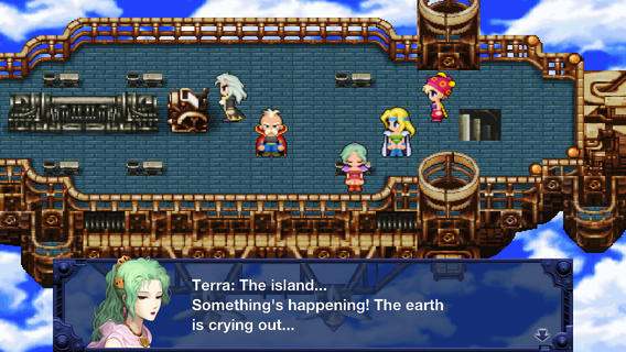
Tales of Symphonia


I've seen some hideous fonts in games throughout my years, specially for japanese games that have been localized, but today I've found one that really grinded my gears:


The game is Stranger of Sword City, for the Vita. It's coming out March 2016 and it's been one of my most anticipated games, but when I saw that font... Who thought that was a good idea?
I hate how so many Japanese games use Times New Roman for their menus.
Japanese games tend to use a ridiculous number of different fonts at dofferent sizes on intrusive and overbearing UI's. Generalising here though.
Most of the japanese games have awful fonts. (MGS, FF etc.)
Forgot the Moutain Dew garbage can..
EDIT:Beaten

I hate how so many Japanese games use Times New Roman for their menus.
Tales of Symphonia

"FAST GLIDE"

I really hate this font.
Japanese developers love this font.
Chrono Trigger DS had terrible UI issues because of the font.

Just another reason that the SNES OG cart is the best.

.
EDIT:Beaten
While I'm at it, what was the name of this hellbeast of a font and why did second stringers like it so much in the early aughts?
Modern Warfare 2 was a nightmare with so many fonts being used on the hud.
Modern Warfare 2 was a nightmare with so many fonts being used on the hud.

why is there so much space between the characters.....
Why is it that Japanese games always use such unusual fonts?
Like, you can instantly tell if a game's Japanese or not just by looking at some text.
Wild Arms 2
They often use the alphabet characters from Japanese fonts, which is why you wouldn't see them normally.
Not the look, but the size:
Not the look, but the size:
Tales of Symphonia

Final Fantasy mobile remakes. Looks very amateurish and cheap.


Sonic Adventure 2's infamous Comic Sans font in the Dreamcast and Gamecube versions.
They changed it for the HD port.
Mount&Blade - the thread.
The game is fun, but EVERYTHING is really really ugly. I do hope it gets some serious improvements in the sequel.


