You are using an out of date browser. It may not display this or other websites correctly.
You should upgrade or use an alternative browser.
You should upgrade or use an alternative browser.
Indie Game Development Discussion Thread | Of Being Professionally Poor
- Thread starter chubigans
- Start date
- Status
- Not open for further replies.
Hey GAF!
I'm stoked to share the newest game that me and the other folks at Samurai Punk have been working on! It started at Global Game Jam 2014, and has evolved from a prototype into a fully fledged game!
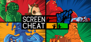
The game is Screencheat, a split-screen FPS shooter where everyone is invisible, and you have to screencheat to win!
We just went up on Steam for pre-order, and by signing up at the game's community page you can get access to the free beta! Also, please chuck us a like on Facebook to keep up with what we're working on.
Steam: http://store.steampowered.com/app/301970/
Community page: http://community.surpriseattackgames.com/screencheat
Facebook: https://www.facebook.com/samuraipunkgames
Thanks guys, and hope to see you in the beta!
I'm stoked to share the newest game that me and the other folks at Samurai Punk have been working on! It started at Global Game Jam 2014, and has evolved from a prototype into a fully fledged game!
The game is Screencheat, a split-screen FPS shooter where everyone is invisible, and you have to screencheat to win!
We just went up on Steam for pre-order, and by signing up at the game's community page you can get access to the free beta! Also, please chuck us a like on Facebook to keep up with what we're working on.
Steam: http://store.steampowered.com/app/301970/
Community page: http://community.surpriseattackgames.com/screencheat
Facebook: https://www.facebook.com/samuraipunkgames
Thanks guys, and hope to see you in the beta!
Yeah I was just talking to my wife about this and saying it feels like there needs to be at least 2 classifications of indie devs - the "serious" indie devs and the casual hobbyist indie devs, to use your terms. At least for stuff like this salary report... I don't want to sound pretentious and say dev x is "better" than dev y but lumping all "indie" devs together makes this data not very useful for those looking seriously into getting into indie game development as a potential career path. Its very skewed due to how much the hobbyist devs outnumber the serious ones.
Hi devs and others! Im new here.
I kinda felt compelled to post here to agree that there should be maybe 'pro pro' indies but I think everyone would like to hit the big time but can't because reasons x and y. I myself choose to be more lax on the title of my occupation since I don't wan't to come of too serious since Ive always gotten the 'oh great another person that wants to be a gamedeveloper reply' so I say instead that I do this on the side after my other job to not annoy the allready overcrowded ship. Although I would like to be as commited as possible to a project. I think I will be targeted with more hate from other devs because Im saying Im too serious about it so I would like to be thought of as a casual dev for now but that dosen't mean I have to be all the time. Weren't 'Independant Game developer' the title for people that work full time on games?
gundalf
Member
Ahh the memories! The first complete indie game I released was also loosely based on that Mario Paint Fly Swatter game, though I deviated quite a bit in the long run (for one thing its all about little robots rather than fly swatting). The main thing I took from the original game was the idea of dodging attacks using the accuracy and speed of a mouse device rather than a game controller, which I've seen so very few games capitalize on (plenty use the mouse to aim, but not many to dodge).
Its ancient now but if you want to check it out to see if there's any ideas you can pull from it, its called Minebot Arena and is freeware. I know the art is crap, but it was a solo effort and I'm not an artist.
http://www.zauron.net/minebot/


Lot of people liked Minebot Arena so I bet they'll like Klatsche as well!
What have you done! Now i am addicted to your Game and can't continue work on my own now
 If Crazy Viking Studios ever become a WiiU Developer, you really should consider releasing Minebot there, it seems to translates really well to the Wiimote Pointer Input style.
Purple Cheeto
Member
Thanks - I have an idea, one that I've wanted to do for years. But GM can't do it because it doesn't really do 3D stuff. A 3rd person action game would be the best description of my project.
There's a reason you don't see a lot of small shop 3d action games, they're pretty complicated.
That being said, my favorite Unity tutorial videos are the ZergBurg videos:
http://www.burgzergarcade.com/
https://www.youtube.com/user/BurgZergArcade

Iteration on the fight, doom for the Scrolr!
mwahahahha
I have always loved horror themed levels, can i suggest you to save these enemies for a horror themed level? Imo they would look way better in a level with dark colors and decadent look.
Awesome work anyway
")
anonymous_abc
Member
could need some advice here:

which HP-Bar do you find better? I tend to the left aligned one
and what do you think about the colour coding? (it's currently 100% =green, >40%<60%=yellow, >20%<40%=orange, <20%red)
thanks ~
I too prefer the left aligned one. The yellow is hardly visible on the white background, so if the background is staying as is you might want to add a little more contrast.
Jacksinthe
Banned
Time to Frame, how long it takes to fully complete a frame.Stupid question, what's TTF?
I too prefer the left aligned one. The yellow is hardly visible on the white background, so if the background is staying as is you might want to add a little more contrast.
the background (and everything else) will definitely change, but as I don't know what it will look like later (currently only the gameplay is worked out, and no graphical direction), I'll keep that with the yellow in mind. Thanks!
On my computer, which is sort of medium desktop, it runs fine. I also test it on my brother's computer, which he built as cheaply as possible in 2012. it has this for a gpu and this for a cpu. in other words, it's pretty unimpressive. and the game seems to work just fine on it (I haven't tested it thoroughly enough to say it NEVER drops a frame, but it seems just fine).
the important thing for the stand alone projects stencyl exports seems to be having some form of GPU with some form of dedicated GPU memory. in other words, integrated graphics = bad. I tested it on my cheap laptop (integrated graphics) and it runs pretty poorly. same story with my mom's cheap laptop with integrated graphics. I don't know yet that I can do anything about it, so for now I accept it.
Hmm that could be a problem since most laptops default to integrated graphics even when they have a dedicated card, and there's no easy way to get on Nvidia's list of 'games that default to using a real GPU'. The Intel HD4k+ series of integrated cards is also super common in mid range pcs and laptops these days, when you say integrated doesn't work so well just how low spec integrated are you talking about?
As you said it's not something you can really do anything about right now, but worth thinking about / talking to the Stencyl people if it's a real issue.
a lot of it's based on my own speculation since that seemed to be the common factor - so far based on the testing I've been able to do, the game runs fine on low spec desktops, but hasn't run very well on either low spec laptop I've tried it on, and the most notable difference between them is that the low spec pc had a graphics card with 1 gig of graphics memory, and both low spec laptops had integrated graphics.
Jacksinthe
Banned
I've never used Stencyl so blast my question if dumb: does Stencyl have any option to defer processes?a lot of it's based on my own speculation since that seemed to be the common factor - so far based on the testing I've been able to do, the game runs fine on low spec desktops, but hasn't run very well on either low spec laptop I've tried it on, and the most notable difference between them is that the low spec pc had a graphics card with 1 gig of graphics memory, and both low spec laptops had integrated graphics.
I've never used Stencyl so blast my question if dumb: does Stencyl have any option to defer processes?
I'm not sure what you're asking so probably no.
Jacksinthe
Banned
The ability to defer various processes to the CPU to lighten the load on the GPU.I'm not sure what you're asking so probably no.
The ability to defer various processes to the CPU to lighten the load on the GPU.
ah, gotcha. keep in mind I'm primarily an artist and designer. It's why I'm using stencyl to begin with.
As far as I know I haven't seen preconfigured options to do stuff like this, but if it's possible to do by way of the underlying framework (haxe/open FL/other stuff) then it may be possible to do somehow in a stencyl project.
once I get into more of a testing phase of the game I expect the stencyl people will be helpful in trying to figure out this stuff and get it optimized to the extent that it can be.
Jacksinthe
Banned
Love the look of this tree, man. Would love to see him animated and walking around doing things. Too good of a model to leave planted in the ground, IMO. Your artist does a great f-ing job and there's a huge opportunity here for unique AI and mechanics if you go deep enough with some Sam Raimi. A change of lighting and minor (minor because i like what you have here) level aesthetic would go along way to cement the vibe he's throwing. EX: our first boss is a Sound Blaster type (since our game takes place in a computer) and its only fitting he is in a discothèque of sorts. Pulling more of the Boss' aesthetic (just a tiny bit) into the level/boss room would do a lot to pull everything together.
mwahahahha
This is just my thoughts tho, without seeing a complete level or completed boss encounter I have no idea what you plan on doing. So I could be dead wrong without knowing every detail of your intentions and I'd rather keep it that way because I'd like to be surprised when I play it
I just know I want to play this because it looks ace.The left aligned is better, imo an outline(or even a simple energy bar container that would make it easier to understand how much energy is lost) would be good to make the bar visible in any situation.could need some advice here:
which HP-Bar do you find better? I tend to the left aligned one
and what do you think about the colour coding? (it's currently 100% =green, >40%<60%=yellow, >20%<40%=orange, <20%red)
thanks ~
Colors are good, maybe 25% for each color could be better for the player to understand how much energy he has and has lost.


The left aligned is better, imo an outline(or even a simple energy bar container that would make it easier to understand how much energy is lost) would be good to make the bar visible in any situation.
Colors are good, maybe 25% for each color could be better for the player to understand how much energy he has and has lost.
thanks for the feedback. I like the idea with the outline and the 25% for each sector seems the logical solution, thanks for that!

Mystic River
Member
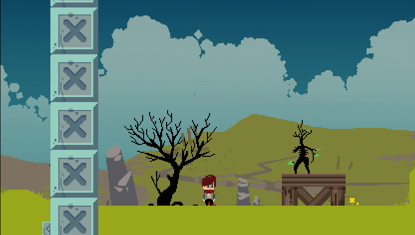
mwahahahha
love that tree... hopefully it won't eat you...or maybe teleport you to the tree world?

More menu progress : now you can store/take out your suit from both your room, and the school locker. It's nothing too complex, basically a lot of variable checks in the background... the difficult part is not forgetting any possibility :-D
This talk of lifebars reminds me of something I've been mulling on for a while, on which I'd be interested in your opinion as well, fellow indie-GAF :
I'm in the mindset of showing as little statistical information to the player as possible, to create an experience based on the feeling of uncertainty and of "winging things" rather than carefully devising plans based on raw maths.
However, I'm concerned this can prove too frustrating for some players which could enjoy the game otherwise, and while I'm pretty confident the experience as I intend it can stand on its own, I'm wondering if it would be an interesting option to allow the player to play in a more "informative" mode, still without clear stats but with more visual cues to help know your general standing - and yes, that brings me back to the lifebar thing.
As it stands, during the fights I'm not using a lifebar system, rather a temporary health/status portrait that appears when you're hit, like so :

My question is this :
-do you think it's a good idea to offer the option to toggle more traditional health bars on/off during the fights, or is it diminishing the potential impact/interest of not proposing health bars in the first place?
-in that same spirit, is it a good idea to offer the option to toggle an overview bar during the VN segments, with graphical hints as to where you are stat-wise (no raw numbers, though) ? Right now I'm showing the date/location by default, but if I go this way, I might show this and said cues in the "informative" mode, and nothing in the "no info" mode, so the screen can stay clutter free.
Some additional musings : if I go the way of offering choice, I could either offer it at the beginning of the game only, attached to specific difficulty settings, or offer full customization at any point. I could even make something like an achievement if you play the game the way I originally intend it, using vague information and memory/guesswork.
So then, what are your thoughts on all this? (hopefully I managed to make this clear enough!)
I have always loved horror themed levels, can i suggest you to save these enemies for a horror themed level? Imo they would look way better in a level with dark colors and decadent look.
Awesome work anyway
Love the look of this tree, man. Would love to see him animated and walking around doing things. Too good of a model to leave planted in the ground, IMO. Your artist does a great f-ing job and there's a huge opportunity here for unique AI and mechanics if you go deep enough with some Sam Raimi. A change of lighting and minor (minor because i like what you have here) level aesthetic would go along way to cement the vibe he's throwing. EX: our first boss is a Sound Blaster type (since our game takes place in a computer) and its only fitting he is in a discothèque of sorts. Pulling more of the Boss' aesthetic (just a tiny bit) into the level/boss room would do a lot to pull everything together.
This is just my thoughts tho, without seeing a complete level or completed boss encounter I have no idea what you plan on doing. So I could be dead wrong without knowing every detail of your intentions and I'd rather keep it that way because I'd like to be surprised when I play it
love that tree... hopefully it won't eat you...or maybe teleport you to the tree world?
Hey thanks guys, most likely I'll be adding some sort of dark overtones to the level when the fight starts, for sure!

I got confused by the name until I realized the game I was thinking of was "Too Human".
Hey GAF!
I'm stoked to share the newest game that me and the other folks at Samurai Punk have been working on! It started at Global Game Jam 2014, and has evolved from a prototype into a fully fledged game!
The game is Screencheat, a split-screen FPS shooter where everyone is invisible, and you have to screencheat to win!
We just went up on Steam for pre-order, and by signing up at the game's community page you can get access to the free beta! Also, please chuck us a like on Facebook to keep up with what we're working on.
Steam: http://store.steampowered.com/app/301970/
Community page: http://community.surpriseattackgames.com/screencheat
Facebook: https://www.facebook.com/samuraipunkgames
Thanks guys, and hope to see you in the beta!
Ah, you're working on this? I saw that in the store and smiled when I read the description. Best of luck!
What have you done! Now i am addicted to your Game and can't continue work on my own now
Ha ha, sorry about that!
I think I'm addicted to my own game. It's a simple game, but might work...
Always a good sign that you are on to something
.Maybe use this as reference: http://spritedatabase.net/files/neogeo/834/Sprite/Shotgun.gif
But instead of hand-drawing every possible shotgun blast, have the artist draw a small fireball that turns into a puff of smoke and dissipates. Then, have the shotgun shoot out a cone of these overlapping fireballs/smoke that only travel as far as a wall or as far as the collision box. Maybe you have some way to scale and rotate sprites, and a way to control which frames pop up first for variation. Pellets would be to hard to represent at that size, so go with flashy fire and smoke-- maybe tiny pixels to represent fragments. You could give the fireball sprites single pixel hitboxes so they done't get stuck/disappear on corners as easily.
edit: Another good reference: http://www.sprites-inc.co.uk/files/X/X4/Misc/Effects/X4Explosion.gif
An explosion from Megaman X4. The artist drew an animated puff of smoke and then strung a bunch together using varying frames rather than drawing each entire frame from scratch. The animation plays very quickly so no one notices the repetition.
This is pretty close to the solution we decided to go with, except we used 2 animations in tandem instead of a single animation. The artist didn't like the look of a multitude of single-pixel pellet sprites at this pixel resolution.
Keep in mind that the artwork is still a work in progress but the code technique is working now:

The above shows how the effect looks without interference and then how it deals with walls and corners.
It was done by having the artist draw 2 animations - the fireblast that comes out of the shotgun and dissipates, and then a single particle effect of a brief flash of fire that quickly turns to smoke and then eventually dissipates.
When shot I spawn the first animation with a collision box around it, but also spawn 3 invisible yet collide-able "bullets" a short distance away (just past the visible range of the initial blast animation) with the center bullet set to go straight and the other 2 to move at slight angles to either side of it. These invisible bullets then immediately each spawn one of the particle effect animations at their current position, which serves to extend how much blast you see on the first frame. For the next few frames the invisible bullets move forward quickly, dropping a new particle effect at each new location they reach. If they hit a wall and can't go any further, they drop a particle effect at that final position and then die (which may happen on the first frame if right up against a wall).
Since none of the individual component pieces of art are large enough to poke through a 1-tile-thick wall, and with the particles not being spawned any more once an invisible bullet hits a wall, none of the effect ends up on the other side of a wall either visually or in collision, but without wall interference the overall graphic still kinda sorta looks like the Metal Slug style shotgun blast example. As a bonus, with this technique I can easily tweak the range of the shotgun later without having to make the artist redraw any of the art for the blast.
I wouldn't say its going to turn out to be the best looking shotgun blast by any means but it does give the player a visual indication of the range of the shot and doesn't poke through walls like a single large animation would so hopefully this will do.
solid.
is this a ROGUELIKE?
Technically no, but the content is randomly generated each time you play (not to the level of variety that a typical Roguelike would have though). It also has a true Game Over/You Lose state but you have multiple lives and can get 1-ups, so its more like a classic arcade game than a Roguelike's typical single-life perma-death system.
EDIT: Here's an earlier .gif of our game mechanics prototype shown at the Seattle Retro Gaming Expo demonstrating how the default Pistol weapon works, to give more of an idea of the gameplay:

Ah, you're working on this? I saw that in the store and smiled when I read the description. Best of luck!
Yup! I'm leading the UI side of the game and am working alongside a group of super talented folks from Melbourne. This is only our second major game (the rest have been little jam titles), but I'm super proud of what we've been able to learn and achieve so far. Thanks for the support!
Yup! I'm leading the UI side of the game and am working alongside a group of super talented folks from Melbourne. This is only our second major game (the rest have been little jam titles), but I'm super proud of what we've been able to learn and achieve so far. Thanks for the support!
why do I keep running into (so to speak) devs and related industries in Australia? seems to be a nice scene there.
Dynamite Shikoku
Congratulations, you really deserve it!
Haven't done a screenshot saturday in ages. Here's a render of a beaten up ship for my new game. It's really low polygon/low detail, but apart from the select screen, in-game it's going to be seen from really far away.
Sorry, large picture.
Sorry, large picture.

Ha ha, sorry about that!
Always a good sign that you are on to something
This is pretty close to the solution we decided to go with, except we used 2 animations in tandem instead of a single animation. The artist didn't like the look of a multitude of single-pixel pellet sprites at this pixel resolution.
Keep in mind that the artwork is still a work in progress but the code technique is working now:
The above shows how the effect looks without interference and then how it deals with walls and corners.
It was done by having the artist draw 2 animations - the fireblast that comes out of the shotgun and dissipates, and then a single particle effect of a brief flash of fire that quickly turns to smoke and then eventually dissipates.
When shot I spawn the first animation with a collision box around it, but also spawn 3 invisible yet collide-able "bullets" a short distance away (just past the visible range of the initial blast animation) with the center bullet set to go straight and the other 2 to move at slight angles to either side of it. These invisible bullets then immediately each spawn one of the particle effect animations at their current position, which serves to extend how much blast you see on the first frame. For the next few frames the invisible bullets move forward quickly, dropping a new particle effect at each new location they reach. If they hit a wall and can't go any further, they drop a particle effect at that final position and then die (which may happen on the first frame if right up against a wall).
Since none of the individual component pieces of art are large enough to poke through a 1-tile-thick wall, and with the particles not being spawned any more once an invisible bullet hits a wall, none of the effect ends up on the other side of a wall either visually or in collision, but without wall interference the overall graphic still kinda sorta looks like the Metal Slug style shotgun blast example. As a bonus, with this technique I can easily tweak the range of the shotgun later without having to make the artist redraw any of the art for the blast.
I wouldn't say its going to turn out to be the best looking shotgun blast by any means but it does give the player a visual indication of the range of the shot and doesn't poke through walls like a single large animation would so hopefully this will do.
OH MY GODLIKE
updating some old placeholders. #fridaynightanimation
I made a new animation where the walk cycle sort of stumbles along.

the way I typically move enemies is to just set their speed or push them along, in this case that wasn't good enough due to how particular his walk cycle looks.
what I did was set his walk speed to a variable and then update that variable depending on what particular frame of animation is playing.
took a few minutes to try and get it dialed in, but the result is pretty good -- certainly much better than if it were a constant speed.

I made a new animation where the walk cycle sort of stumbles along.
the way I typically move enemies is to just set their speed or push them along, in this case that wasn't good enough due to how particular his walk cycle looks.
what I did was set his walk speed to a variable and then update that variable depending on what particular frame of animation is playing.
took a few minutes to try and get it dialed in, but the result is pretty good -- certainly much better than if it were a constant speed.
why do I keep running into (so to speak) devs and related industries in Australia? seems to be a nice scene there.
Oh yeah, the indie scene is fantastic over here. I think Australian devs have moved towards the indie games out of necessity (after the AAA industry kind of went kaput over here), but it's resulted in a really thriving indie community and some great games.
Also, loving the sprite work that you shared!
Good and bad news, we were prepping our Beta for today but unfortunately we ran into a few issues with deploying some music and other items. THOUGH, we do still have a playable build, and I'll give you awesome folks a first chance to play Shwip. This has been a few years in the making, and I'm incredibly nervous of how people will react to it. We hope everyone has fun!
Have at it guys/gals, be gentle!! Music will be in the next update
https://www.dropbox.com/sh/q79lvqczrfie3id/AAA6bwh5C7t0TWOAthS2Tz_Za
Have at it guys/gals, be gentle!! Music will be in the next update
https://www.dropbox.com/sh/q79lvqczrfie3id/AAA6bwh5C7t0TWOAthS2Tz_Za
mwahahahha
I freaking love that creepy tree and its minions, but I agree that it needs to be in a slighly creepier area.
My question is this :
-do you think it's a good idea to offer the option to toggle more traditional health bars on/off during the fights, or is it diminishing the potential impact/interest of not proposing health bars in the first place?
-in that same spirit, is it a good idea to offer the option to toggle an overview bar during the VN segments, with graphical hints as to where you are stat-wise (no raw numbers, though) ? Right now I'm showing the date/location by default, but if I go this way, I might show this and said cues in the "informative" mode, and nothing in the "no info" mode, so the screen can stay clutter free.
Some additional musings : if I go the way of offering choice, I could either offer it at the beginning of the game only, attached to specific difficulty settings, or offer full customization at any point. I could even make something like an achievement if you play the game the way I originally intend it, using vague information and memory/guesswork.
So then, what are your thoughts on all this? (hopefully I managed to make this clear enough!)
While I'm all for more role-playing and less fixation on numbers and stats, I think most players like relying on all that stuff. You should honestly look into what you're doing differently from commonly established tropes and analyze on a case-by-case basis whether it's better to keep your artistic vision (ie: less numerical representation of game systems), stick to already defined conventions and tropes or create a compromise between the two.
I'd say giving too many options to the players could cause more harm than choosing a single way of showing stuff and running with it, since having to design everything around both raw numbers and more stylistic ways to depict the game's underlying architecture would probably be a lot of work. If you end up doing both, then perhaps you could let the player toggle between both modes (like I heard the Batman Arhkam games have a detective vision mode that makes some things easier to do).
I like it! The only thing I feel might be off in that scene is that it looks really nice and organic, but the floor and ceiling are both perfectly flat and straight. I feel like making subtle elevation changes (even if the collision mask is kept as a line) could help alleviate it, or perhaps making the rocks a bit larger like in Jobbs' game.
or maybe it's just me
EDIT: Here's an earlier .gif of our game mechanics prototype shown at the Seattle Retro Gaming Expo demonstrating how the default Pistol weapon works, to give more of an idea of the gameplay:
That shotgun blast looks wicked! It's great when you're able to figure out a way to do what you originally envisioned. Also, the game looks really interesting and charming even in that prototype gif.
For some news regarding Quark Storm, it looks like I might end up getting a spot at this year's Tokyo Game Show after all! It's going to take a bit more time to talk things out with the event's management, arrange any and all payments, book my airplane tickets and all that, but I think I might make it in time!
Also, I've finally formed a small development team alongisde a concept artist and a level designer! We've been meeting bi-monthly at a local games workshop, and we'll probably be meeing up by ourselves tomorrow to try and settle some basic design concepts so we can begin implementing stuff right away. We've even been told by a composer that he'd give us a hand with the game's soundtrack, so things are definitely shaping up!
I feel bad for kind-of abandoning the game's programming in order to manage all things related to the TGS, but I guess it's a good time as any to get started in all this exposition stuff, since I'd have had to learn how to do this eventually, anyway.
NIGHT TIME MOTHERFUCKERS
2spooky4me
That giant red tree face looks badass!
Very nice!
NIGHT TIME MOTHERFUCKERS

How do you progress so fast? You show off something new everyday.
While I'm all for more role-playing and less fixation on numbers and stats, I think most players like relying on all that stuff. You should honestly look into what you're doing differently from commonly established tropes and analyze on a case-by-case basis whether it's better to keep your artistic vision (ie: less numerical representation of game systems), stick to already defined conventions and tropes or create a compromise between the two.
I'd say giving too many options to the players could cause more harm than choosing a single way of showing stuff and running with it, since having to design everything around both raw numbers and more stylistic ways to depict the game's underlying architecture would probably be a lot of work. If you end up doing both, then perhaps you could let the player toggle between both modes (like I heard the Batman Arhkam games have a detective vision mode that makes some things easier to do).
Thanks a lot for your imput!
Indeed, you're right, I'm a bit afraid of the design and feeling impact of proposing choice - otherwise, I'd go choice all the way.
Your example of Batman is interesting to think about. I suppose a similar instance would be from The Last of Us, with the hearing mechanic being togglable and the game playable with, or without, at the discretion of the player. I can't remember if there's a trophy attached specifically to playing the game with minimal HUD, though, or if it's comprised into those for beating harder difficulties where this HUD is off by default - that kind of thing could make a good incentive/reward, I think?
The more I mull on this, the more I tend to want to allow customisation, but with everything off by default, and a reward for playing through the whole game that way. I'm just not sure how much it lessens certain design options already present.
updating some old placeholders. #fridaynightanimation
I made a new animation where the walk cycle sort of stumbles along.
This is so beautiful, great design. Why not have the animation timing emphasise both steps? I guess i'm not sure if that will change the intention of it. The pause on that first step is just so nice, I think you would still get a nice heavy lumbering if it paused on each step. And I think the varied speed in the game will be easier to read with a more even rhythm.
updating some old placeholders. #fridaynightanimation
I made a new animation where the walk cycle sort of stumbles along.
This animation reminds me a lot of the old Oddworld games. Really amazing and creepy.
This animation reminds me a lot of the old Oddworld games. Really amazing and creepy.
This is so beautiful, great design. Why not have the animation timing emphasise both steps? I guess i'm not sure if that will change the intention of it. The pause on that first step is just so nice, I think you would still get a nice heavy lumbering if it paused on each step. And I think the varied speed in the game will be easier to read with a more even rhythm.
thanks guys -- regarding why only pausing on one side, I think I just really wanted to do something asymmetrical for once. I am someone who just loves asymmetry, I love things to not be even, and I wanted to put this into a walk cycle for once. they're always so neat. and while this one isn't particularly messy, it's a start.
- Status
- Not open for further replies.