ComputerMKII
Banned
Not all the universe can be observed from Earth.A view of the entire universe. Super clusters of galaxies connected together by filaments. Somewhere in there would be the Milky Way, and the Solar System, and our Sun, and Earth.
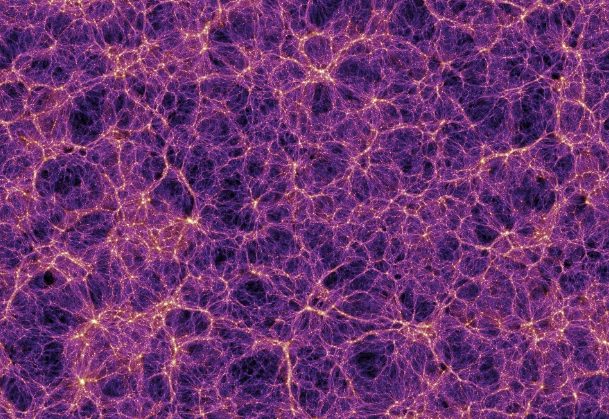
A distance of one million parsecs (approximately 3,260,000 light-years) is one Megaparsec (Mpc)


")