Waluigilicious
Member
https://www.reddit.com/r/NintendoSw...ndo_has_guidelines_on_switch_app_icon_design/
Reddit thread using images from here
I'm fine with it, seems like the word is spreading and someone said they will be contacting sega.
https://www.reddit.com/r/NintendoSw...ndo_has_guidelines_on_switch_app_icon_design/
Reddit thread using images from here
The few that haven't done this look tacky and cheap, like smartphone apps, which is probably what Nintendo was trying to avoid when making that advice.
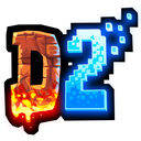
If you check the OP of this thread, Snake Pass had it right originally, but then they changed the icon in a patch.
That said, a bad icon will never bother me that much for a game. Sure, it's no eye candy, but if it can still launch the game, I don't really care unless it's like, grotesque.

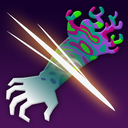
The Sonic Mania icon is similar
It's not that bad.
It's not that bad.
New name of the thread should be 'What Sonic Mania can learn from Mario Kart 8 Deluxe'.
sanfcv ovsimpzb,
agreed. Also I don't love the Splatoon 2 icon?
I like the way you meta.New name of the thread should be 'What Sonic Mania can learn from Mario Kart 8 Deluxe'.
It's not inkredible no.agreed. Also I don't love the Splatoon 2 icon?
The ๖ۜBronx;246531296 said:Not as a picture on its own, but as a library icon it's no better than any of the others shown here. This has been discussed quite a bit on the other pages if you wanted to contribute or see the other side of it all.
I have to admit I noticed the changed and I didnt appreciate how they changed it to look like some homebrew shit in the system launcher.

It's a nice piece of artwork, don't get me wrong, it's just poor as a library icon in the context of the Switch library. I'm not talking about whether it's pretty I'm talking about it's lack of consistency and disregard of accessibility standards. Not that I've focused on Sonic Mania, most of the examples in the thread are as bad as each other because they fail that very basic litmus test.I still don't think the Sonic one is that bad tho, I kinda like it.
I don't understand how someone can like Sonic Mania icon and not Snake Pass one.
I don't understand how someone can like Sonic Mania icon and not Snake Pass one


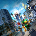


The ๖ۜBronx;247764818 said:Why couldn't that Lego Worlds one just be posted here where at least all of the baseline responses have already been addressed. That thread is just a sea of ignorance to endure.
The LEGO one might be the worst of them all.
Guys, proof that this sort of thing works, the LEGO Worlds icon is being updated!
Where'd you get this info from?!
To something much worse...Guys, proof that this sort of thing works, the LEGO Worlds icon is being updated!
To something much worse...
If you took a poll here, you'd see.
If you took a poll here, you'd see.
This is not an upgrade just because it's official box art with a name.
It's ugly.
NoTo something much worse...
I don't understand how someone can like Sonic Mania icon and not Snake Pass one.
Same expression, same posture, same angle. Both are minimalist that it could work as little icons on smartphones o bubbles on Vita, but they are terrible when icons occupy 25% of the screen. If, besides, they break the pattern, look even worse.
This is a MASSIVE improvement. I wish Sumo Digital would treat their own game with similar love.Guys, proof that this sort of thing works, the LEGO Worlds icon is being updated!
Guys, proof that this sort of thing works, the LEGO Worlds icon is being updated!
If you took a poll here, you'd see.
This is not an upgrade just because it's official box art with a name.
It's ugly.
That's awesome to see, great news.Guys, proof that this sort of thing works, the LEGO Worlds icon is being updated!
Except the popularity of an icon has no bearing on its function or purpose in the context it's being displayed. We're not discussing whether the icon is 'pretty' because that's not the primary purpose of a library icon or tile.If you took a poll here, you'd see.
This is not an upgrade just because it's official box art with a name.
It's ugly.
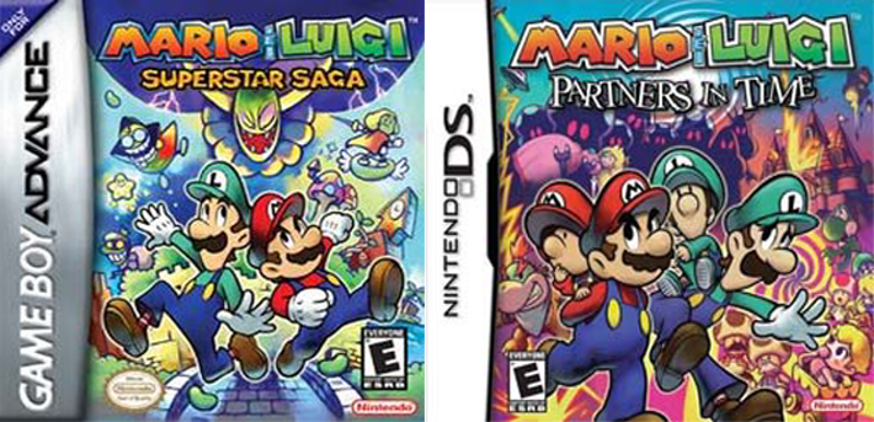
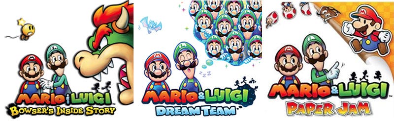
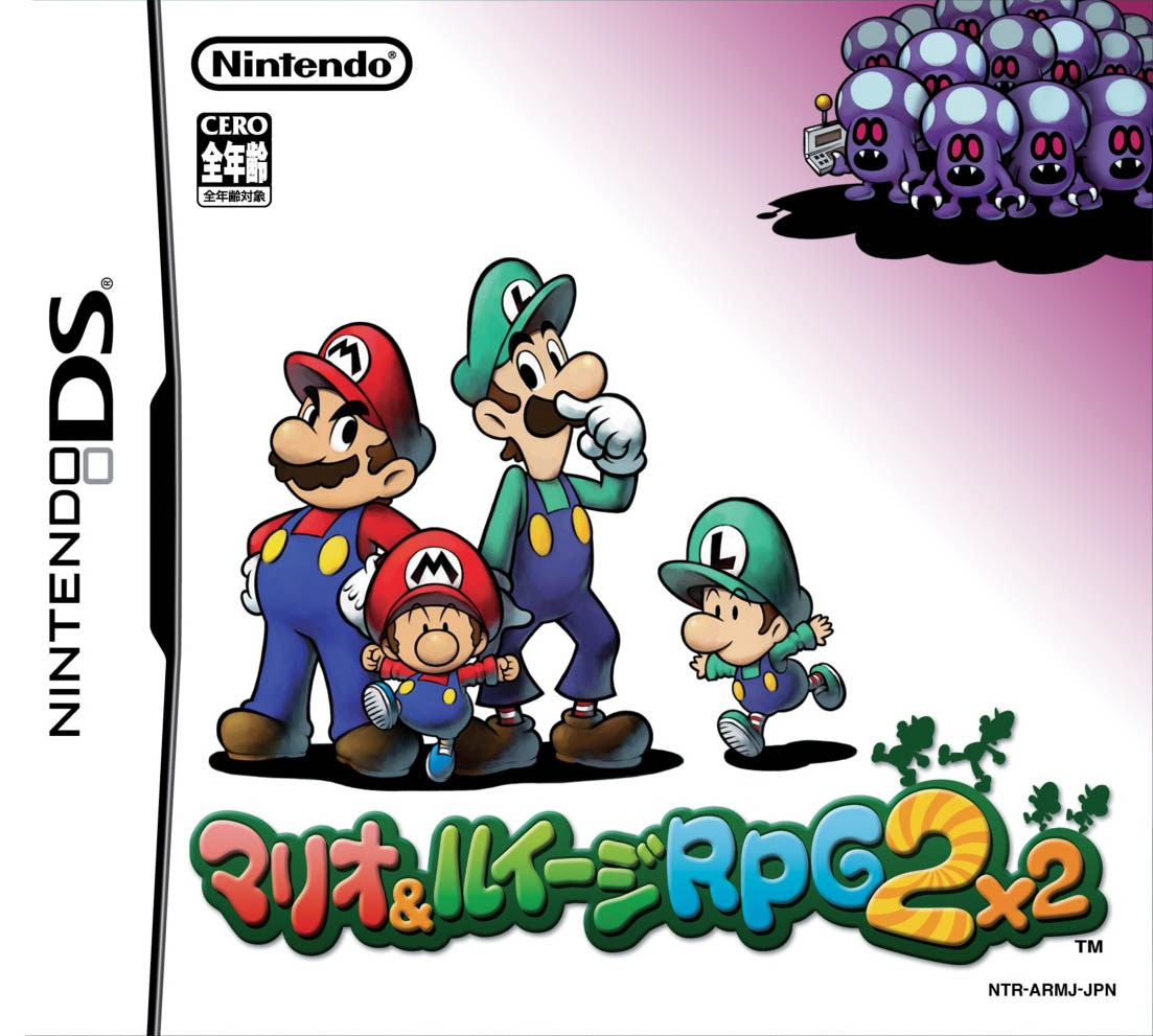
While we're at it, can we also talk about the huge dropoff in quality off the boxart in mario and luigi?
Yeah, it's a bummer that Sumo Digital hasn't fixed the Snake Pass icon. I have to wonder if they're doubling down because they find constructive criticism to be obnoxious, even when it's made in good faith by people who love their game. Ah well.Every time I see this thread pop up I'm like yiss finally...?
but then heartbreak
'least Lego one is being fixed. Looking good!
I know I struggle mightily to load Sonic because I get confused to where it is on the UI.The ๖ۜBronx;247998485 said:Except the popularity of an icon has no bearing on its function or purpose in the context it's being displayed. We're not discussing whether the icon is 'pretty' because that's not the primary purpose of a library icon or tile.
We may very well have multiple Sonic titles on the Switch within a year of Mania's release. In fact, Sonic Forces is also out this year. It's going to look pretty messy if you have multiple Sonic heads floating around your Switch home menu with no name to distinguish them.I know I struggle mightily to load Sonic because I get confused to where it is on the UI.
While we're at it, can we also talk about the huge dropoff in quality off the boxart in mario and luigi?
In the US for the first two games, they had great boxart that made the games look like epic adventures.
Then starting with Bowser's inside story, they started using the boring, lame japanese boxart that makes the games look generic.