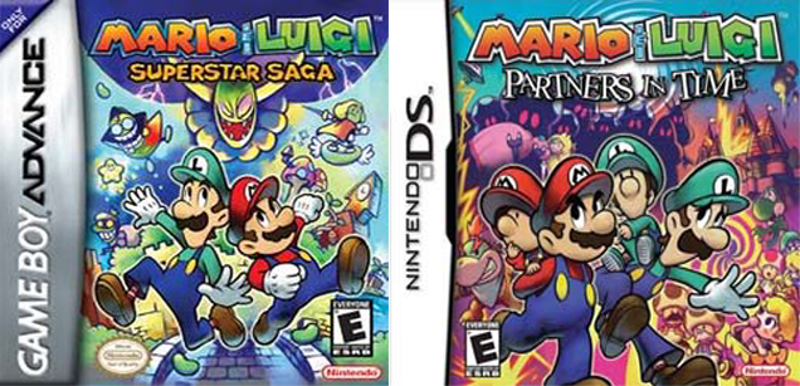
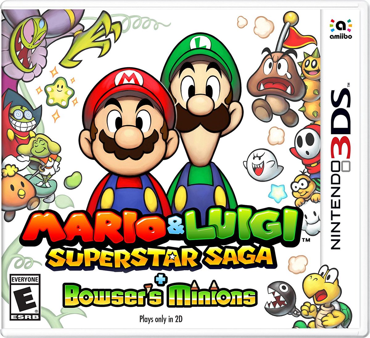
As you're asking in earnest and not belittling people here, I'll take the time to try and break it down a little. Remember we are discussing an element of design, not a piece of art or illustration. It has a purpose, and should be evaluated against that.
The Library on the Switch is a place that is designed to house all of your games in a single space, as well as populating a 'most recent' list of titles that have been launched. It is meant to be scalable, so that it caters for anyone from a person that only has two games, to someone that has two-hundred. It is designed to account for a lifetime's use of the system, and the growing library of games most users will have over the course of that time.
So, in order to achieve the above we ideally want to aim toward the following:
- Accessibility - Users of any age or ability should be able to navigate through the list of all of their games, regardless of the amount held.
- Ease of use - As this is the primary location to find a game you wish to play, this system must be easy to use and allow for the user to find the game they're looking for with as little difficulty or frustration as possible.
- Elegance - The design should maintain and support the standard of design kept elsewhere in the System UI. It should be clear, uncluttered and simple to navigate.
So, when it comes to the icon tiles, what are their main purpose? They sit within the library and aim to offer a visual representation of the game they're from, allowing the user to easily find and select said game among potentially hundreds of others without issue.
As above, this boils down to:
- Accessibility - Ensuring that it is clear at a glance, by users of any age or ability, what the game the tile related to, so that it can be identified when sat among numerous others.
- Ease of use - It should be obvious while skimming (which is how people digest information in digital spaces) what the game is, so that the user doesn't have to spend more time than necessary finding what they're looking for.
- Consistency - To bolster the above, and also present a tidy screen to the user that's easy to navigate through and upholds the strong design sensibility of the Switch. The game has been sold, standing out at this stage is about arrogance and ego at the expense of consistency.
So, for the above to be true we can imagine the minimum an icon should require is:
- The title of the game
- Recognisable artwork that is specific to the game, and distinct from others
So when people fail to meet that bare minimum it's frustrating as they're compromising the function of the tile for the sake of 'looking pretty', when it's entirely possible for both to be achieved. It's akin to having a bookcase of books, but there's only icons on the spine. It's fine if you have four books but once you start to have many it becomes harder to find the one you're looking for.
Design is about fulfilling a purpose, and looking for improvement toward that purpose, not simply looking nice. It's objective and has a purpose, which is what sets it aside from standard art and illustration.


