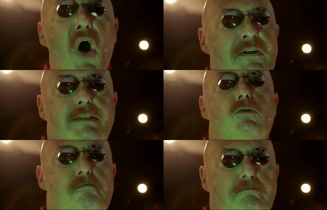
I think the filters and shading are
all wrong. Everything looks as though it takes place during the day when the original scene was at night. They lost everything and anything that added to the mood and atmosphere in that game simply by skimping and changing the visuals. It wasn't perfect back then because there were tiling issues, but those were certainly relatively minor in respect to what the intro
accomplished in terms of its mood.
It isn't just the music and dialogue that make the atmosphere, or even a game for that matter. A lot of it had to do with the colours used, the shades used, and the quality of the backgrounds and foregrounds in relation to telling the story. Again, it goes with the "show me, don't tell me" sort of philosophy I was talking about when I referred back to Generations there. I know that's something SE's been focusing on for a while now, but seeing this "Tell me, don't show me" stance retroactively (but very likely unknowingly) added to their older games is disheartening.
"One chili dog feast a day!"
...bleh! (not to the chili dog feast, I mean; that sounds fucking amazing)
Oh wow, now I'm wondering how they'd actually
write Classic Sonic if he were voiced.

