AnathemicOne
Banned
Kurisu losing to anyone, let alone Yozora is awful.
Worst saimoe contest ever, why do I even bother...
Kurisu losing to anyone, let alone Yozora is awful.
...well, it feels awfully awkward to post this in the middle of this discussion, but here's the day 4 results for ISML. No real matches of interest IMO.
http://i.imgur.com/2oZRQ7l.png
Wow Nyarlko W- 3 had some scenes worthy of Magi.
Was it unnameable?
Kurisu isn't even the best girl in her show. #TeamRukaKurisu losing to anyone, let alone Yozora is awful.
Kurisu isn't even the best girl in her show. #TeamRuka
Kurisu isn't even the best girl in her show. #TeamRuka


PTSD, but even then I would hug the fuck out of Noel.
I'm gonna have to plead a kayo~s on this.
Wow Nyarlko W- 3 had some scenes worthy of Magi.
Rukaisn't even a girl for half the show!
She's a girl at heart.#TeamKurisu
:lovecraft
She's a girl at heart.
really? because I saw this and now I have the urge to watch it.
Are her legs CGI?
Are her legs CGI?
When wideface goes wrong.

Poor Artemis-kun, always getting bossed around by Luna.
Are her legs CGI?
It's a shame Ruka didn't get more air time. She was just kind of "there" apart from 2 episodes.
It kind of looks like a flash animation where a still image is warped to create the illusion of motion. My baseless guess is that everything from the torso up might be rotoscoped. It's just too fluid and lifelike for a low-budget show.
Well there's credits so I assume it's from the OP or the ED. But the legs look like either Flash or CGI motion tweening.
Well there's credits so I assume it's from the OP or the ED.
Worst contest ever.

Sdburton is now in the best part of k-on!!

Hope you'll enjoy it !
So much wrong in this poll
-5000+ people who don't know the glory of sky raker yet.
-Makise kurisu losing
-Hinagiku losing
-Oshino shinobu losing
-Ririchiyo lost too
-Holo lost
This is so wrong ...
It's from the ED. The person who directed it, Hiroyuki Kitakubo, said that no CG was used.
(And yes, this is the Kitakubo who directed Golden Boy, Roujin Z, the 1990s Jojo OVAs, etc.)
Does it count as CG if it's just shitty use of a warp/tween tool?Are her legs CGI?
AnimeGAF confirmed for babies; you guys wouldn't have survived the glorious late 80's/early 90's and their gratutious gore.
Great to know KYH is doing well. It's all I care about.
#TeamKurisu
really? because I saw this and now I have the urge to watch it.


No clue why I'm bothering to write this post but whatevs. So since we were talking earlier about character designers, I feel I should state that I don't think Takashi Takeuchi is a bad character designer or illustrator now. I put an amazingly large emphasis on the now part as his stuff in Tsukihime makes my goddamn eyes bleed. That said, I think he has drastically improved over the past decade and while I wouldn't say he's great by any stretch of the imagination, I think he's fine. I also would like to make the distinction between character design and illustrator as they can easily overlap in that a great illustrator can make boring and generic character designs look fantastic through raw skill. Also viceverse in that a bad illustrator can make solid character designs look awful. I would say that Takeuchi has been always been a fine character designer and in the past was a horrid illustrator.

Shit like this is just flat out bad illustration work but I think the actual designs are solid if a bit on the simplistic side. It's certainly not busy but the characters are all somewhat distinctive. I would state that bad character design is that something about the design draws your attention in a negative manner that was unintentional on the part of the artist. A perfect example is the teeth in Ohtaka's works. Case in point would be Night 75 in the manga on page 11. I couldn't take the scene seriously because of the fucking teeth.
While part of it is bad illustration on the part of Ohtaka, the actual design in general is very distracting even without atrocious moments like that. I do think Ohtaka is very skilled with the design of the clothing though.
Can you see the blood over my keyboard? Takeuchi in his Tsukihime days was a horrible(and I can't emphasize that enough) illustrator. I'm not disputing that at all. I do think he's made a pointed effort of actually trying to improve, and has succeeded, both in his designs and illustrations compared to someone like Hirai. Hirai is another one I would without a doubt designate as a bad character designer. I mean look at this,
The same garbage in Gundam Seed and Heroic Age(I would actually argue the designs in both of the shows are slightly better actually although still garbage), which either demonstrates three things; that he thinks the designs look fine, is incapable of improving, or doesn't give a shit.
I think Takeuchi's made a pointed effort in progressing his skills, mainly as an illustrator. He's becoming noticeable better with shadows and backgrounds in particular. Also the way the humans look are much better in general. Look at his Witch on the Holy Night work in comparison to the stuff above:
The whole thing is obviously subjective but I certainly wouldn't put Takeuchi on the low end now. He's also pretty much acknowledged that his work in Tsukihime is literally eye-blinding as he's redoing the art. I didn't discuss much about the actual character designs in his works but I think he fulfills the basic goals of a character designer which are to reflect the personality of the character through their design and make the design be somewhat distinctive in a positive manner. Saber's personality comes through clearly in her design, in that she's stern and rigid.
Oh and there's also the Fate/Extra garbage too. I mean looking at Arco Wada's stuff, I really can't complain too much about Takeuchi.
Witch on the Holy Night is drawn by Hirokazu Koyama, not Takashi Takeuchi.
The winning team. The greatest team.
and i wasn't even thinking of posting that in the fear of it being too lewd :3
Witch on the Holy Night is drawn by Hirokazu Koyama, not Takashi Takeuchi.
Yea I just checked this as well. You're correct. Koyama was the lead.
time to drop Takeuchi! lol. Did Koyama do the artwork for the FES 2012 as well?
lol dat spelling.
Yea I just checked this as well. You're correct. Koyama was the lead. Well here is a more recent work then:
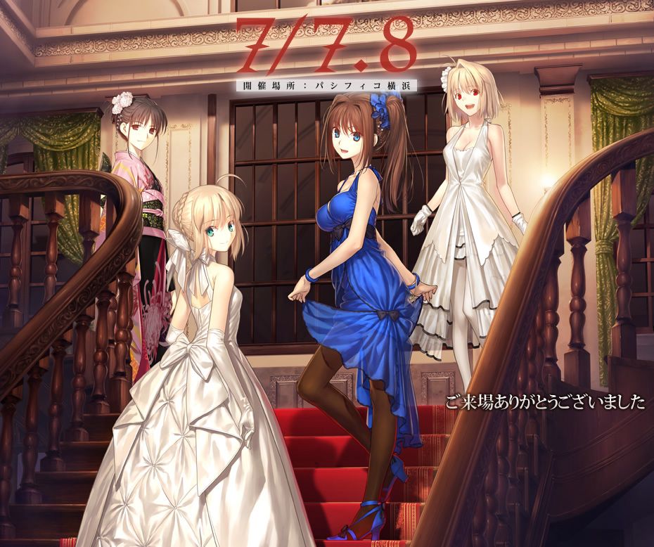
If you're referring to the promotional art for the Type-Moon FES event, Saber and Arcueid were drawn by Takeuchi while Aoko and Shiki were drawn by Koyama.
If you're referring to the promotional art for the Type-Moon FES event, Saber and Arcueid were drawn by Takeuchi while Aoko and Shiki were drawn by Koyama.
Oh, I just remembered: I actually got that poster as part of a swap meet back in December, the same place I got a bunch of K-On stuff that I posted in their thread. (The reverse side of the Saber poster is fanservice stuff from KoreZom, btw)Yea I just checked this as well. You're correct. Koyama was the lead. Well here is a more recent work then:
His coloring has gotten much better, but it's still lipstick on a pig.
Oh, I just remembered: I actually got that poster as part of a swap meet back in December, the same place I got a bunch of K-On stuff that I posted in their thread. (The reverse side of the Saber poster is fanservice stuff from KoreZom, btw)
I also got a two-side Magi pencilboard, and clear files for Fate/Zero, Madoka, and E7AO. I can take pictures/find them online if anyone wants to see them.