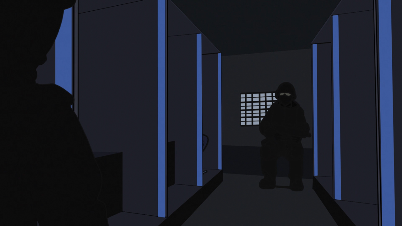
Sorry about the delay in responding to this post. I'm not going to through everything blow-for-blow as it's pretty clear there are somethings we just have a fundamental disagreement over (such as the colour design in certain scenes, the lighting in the park, etc etc).
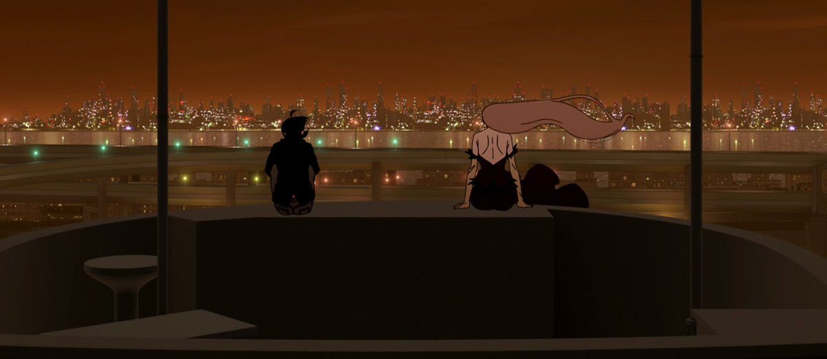
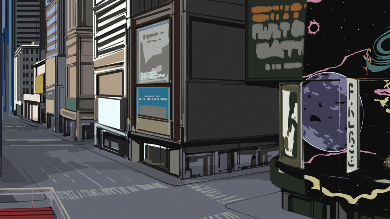
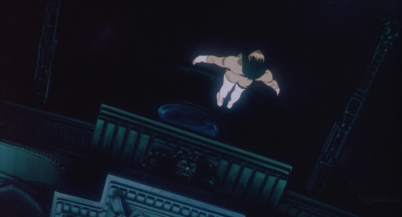
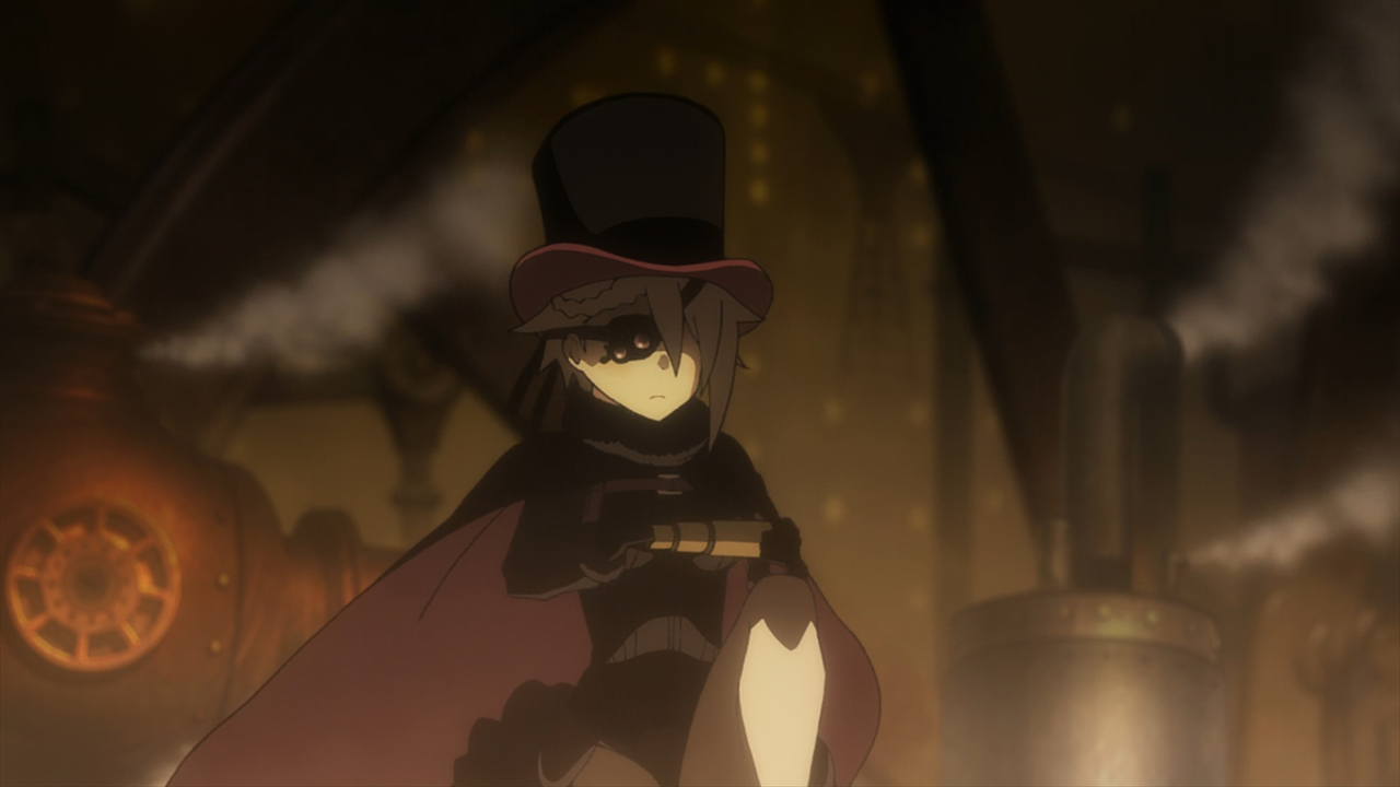
Did Oshii take out a patent on women falling from a building? If anything, this sequence riffs more on Gravity Rush, the video game, than Oshii's Ghost in the Shell movie. The character isn't supposed to feel threatened by gravity - she's in control of it due to the Cavorite orb she's using. This is establishing Ange as a self-confident character who can freely move through the insubstantial city.
I don't really agree with you here. The sequence may be in part inspired by
Gravity Rush (I am not familiar with the game) but the visual callback to
Ghost in the Shell is incredibly overt, to the point where I feel it is deliberately winking at the audience. Not only does this sequence borrow the visuals from
Ghost in the Shell, but there's certain plot and thematic elements present in this episode that feel like similar to
Ghost in the Shell (the TV series more so than the movie). Finally, I don't think the sequence in
Princess Principal cleanly conveys the message that you ascribe to it.
Starting with the
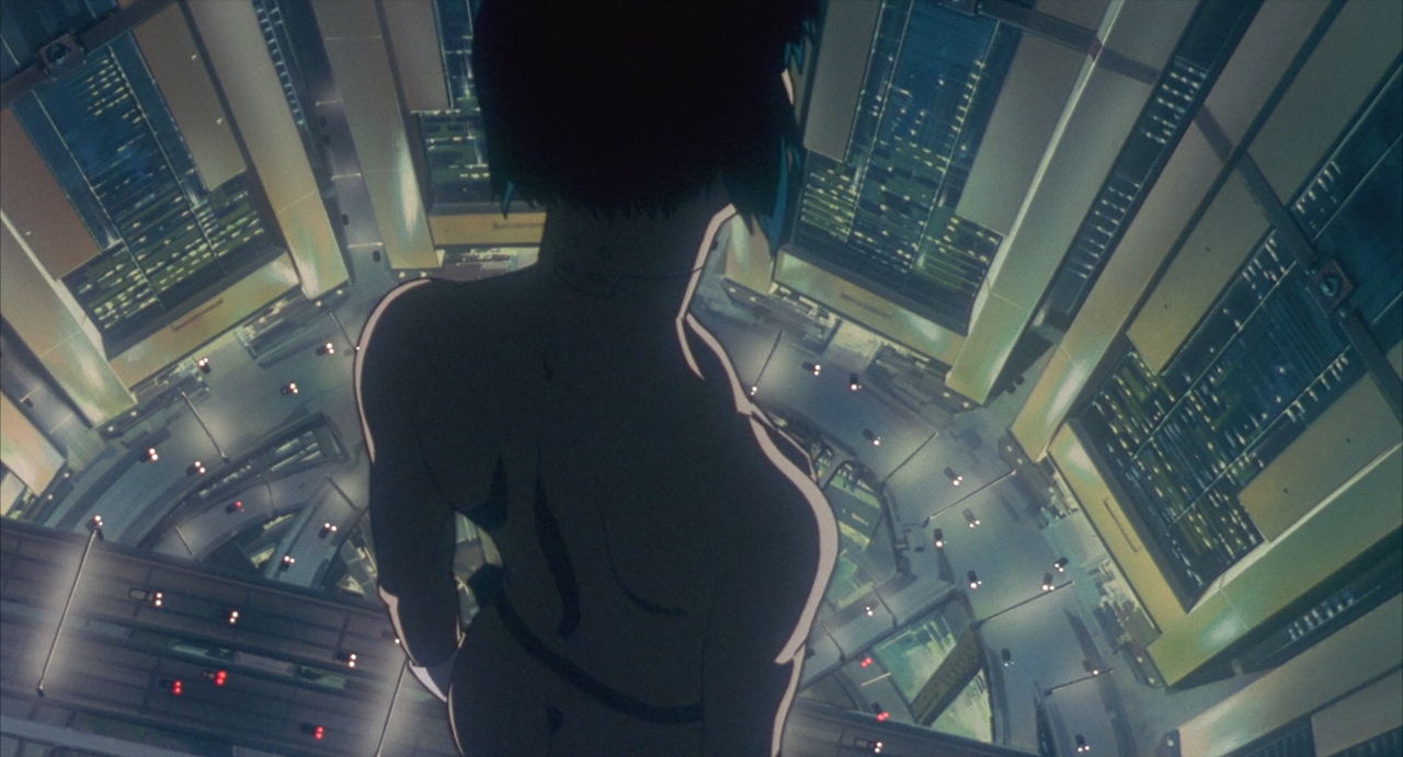
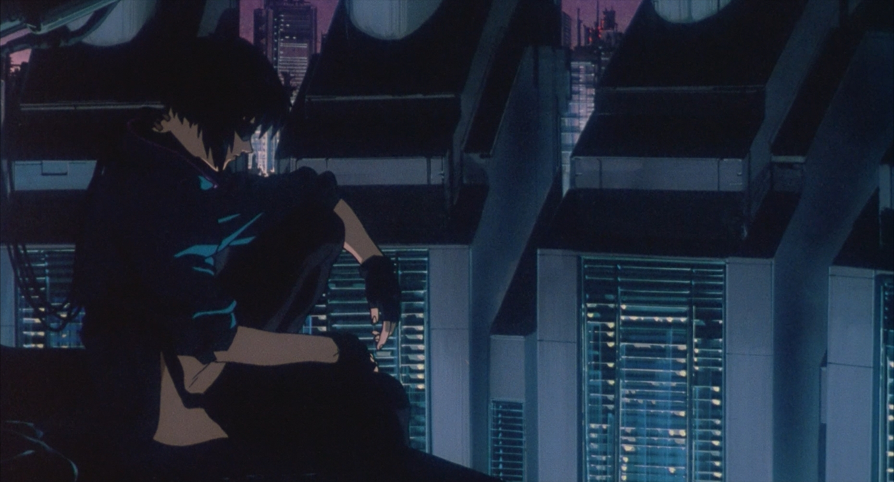
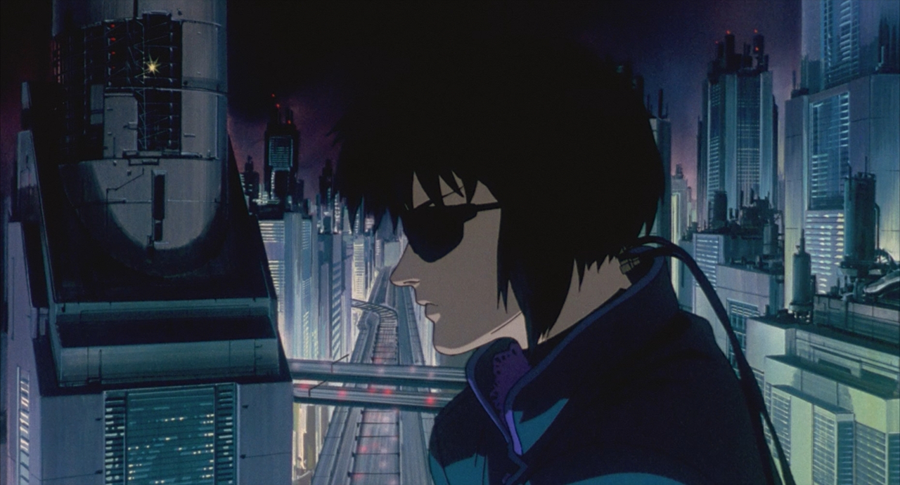
Ghost in the Shell comparison, I feel like all I need to do is present these two images next to each other for the visual mirroring to be obvious:
Here are the things which stand out to me as similar, just in these images
- Woman standing on ledge
- A cityscape at night
- The camera is positioned behind and above the woman, with the angle titled down
- This ledge overlooks a ring of four large buildings arranged in a circle
- This ledge also overlooks a ring of roads that are being driven on by cars
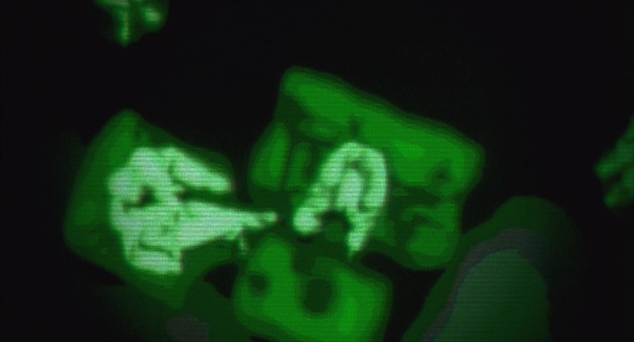
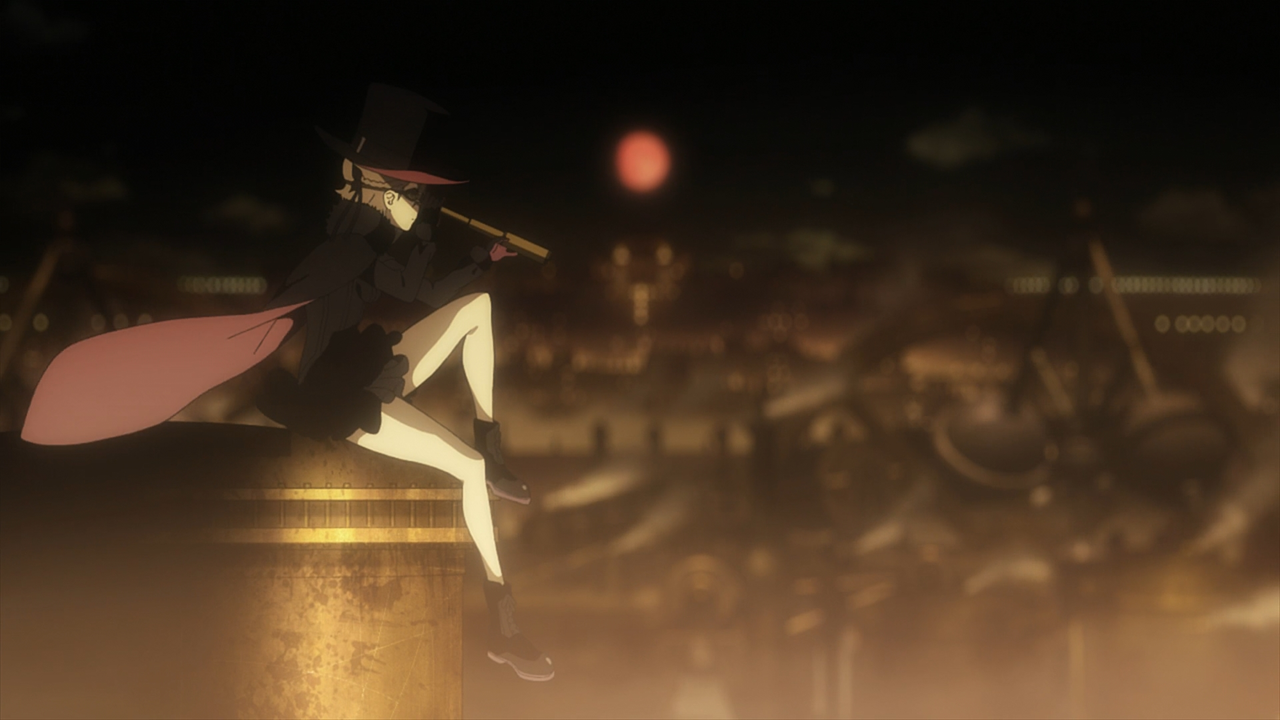
Once we take in the other images in this sequence, the visual comparison is even clearer:
- Woman overlooking the city with a technological device, shot from the side.
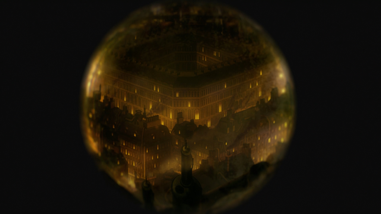
- Cut to a closeup of what she's observing with her technological device.
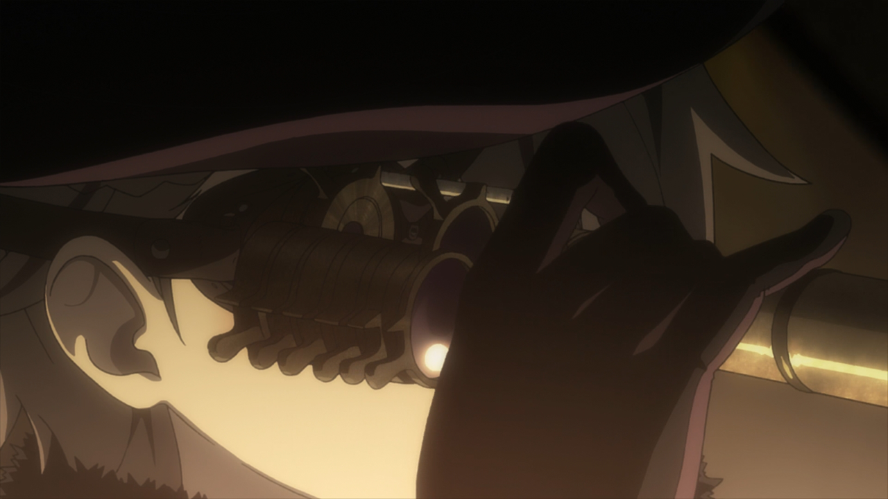
- We see her remove the device from her face.
- She takes a moment to observe the city.
- Then she jumps off the edge of the ledge.
It's just steampunk version of the
Ghost in the Shell scene, and I think the reason the show draws the comparison is because of the kind of story they're looking to tell. Both
Princess Principal and
Ghost in the Shell (especially the TV series
SAC) tell the story of clandestine government agency, formed from a small team of specialists, which engages in espionage, kidnapping, assassination, and other ‘dirty' spy activities. Both works takes place in morally grey worlds, with morally grey characters. There's also cool action sequences with people flipping around doing ninja shit and inappropriately dressed women.
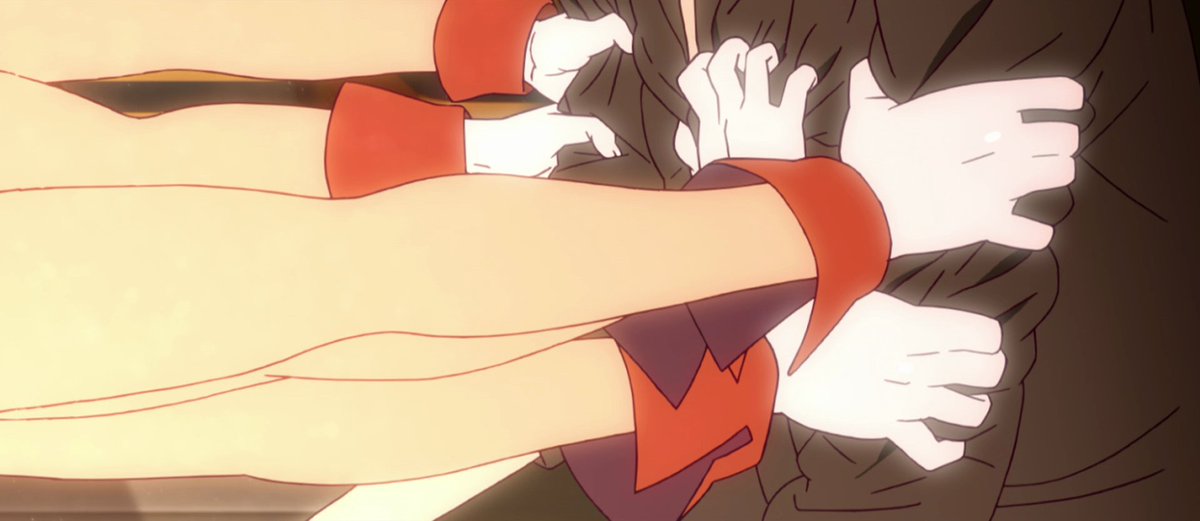
The problem is that I don't feel that visually borrowing from
Ghost in the Shell is good idea if the scene you create ultimately feels like a pale imitation. Hosannainexcelsis, you are right to point out that the visuals in
Ghost in the Shell and the visuals in
Princess Principal are trying to convey very different ideas. But my problem is that the visuals in the
Ghost in the Shell scene exist for a very clear reason that has a very clear payoff within the scene. The same cannot be said for
Princess Principal.
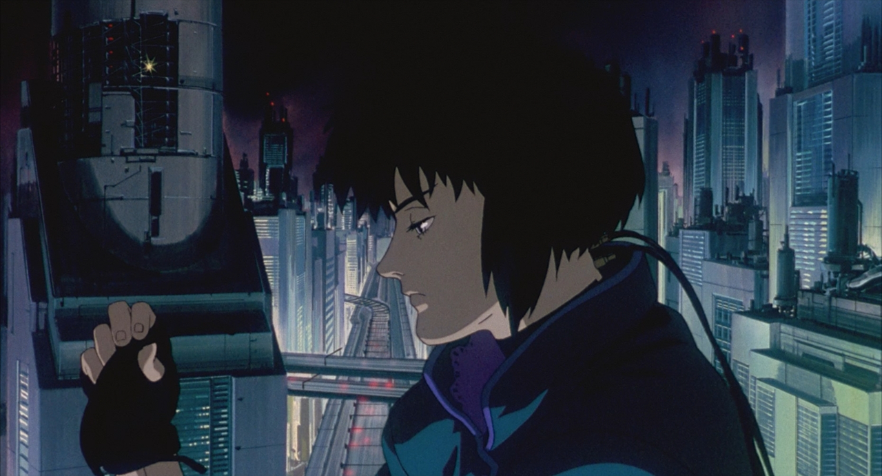
In both sequences, we're being introduced to a character who we know nothing about. In
Ghost in the Shell, there's a lot of build-up to the Major jumping from the building. We see her disrobe, something which should traditionally make you feel that a character is vulnerable. We see and hear the wind blowing in her hair, which combined with the camera demonstrating how far she has to fall and how solid the concrete below her is, induces a sense of vertigo. As the audience, we can't make sense of what's going on, even as the major dives of the building with a smile in her face, we can't fathom her plans until the very last moment when the camera cuts to a previously invisible thread that's attaching her to the building. Oshii builds up an expectation visually which he then pays off visually. The crucial piece of information concerning the thread is withheld from the audience until the very last moment of the scene. What does this tell the audience? We know that the Major is a character who is control, who is fearless, who is potentially a thrill-seeker and that even if we (in the audience) don't realise it, she is always acting on a plan of her own devising.
The sequence in
Princess Principal, by contrast, tells you very little. We observe Ange observing other people, and then she jumps off a building. There isn't build up or payoff within the scene to, because at the end of the scene we don't suddenly see Ange flying around with the orb. This reveal doesn't occur until a few minutes later. All we get instead is a tiny blink-and-you'll-miss-it flash of green at the nadir of her fall. Therefore I can't agree that this scene tells us that Ange is a character who can control gravity because we don't get that as part of the scene itself.
There's nothing necessarily wrong with that – as it leaves the exact nature of Ange's powers as a mystery, and it also serves to tell the audience that Ange is a character who is fearless. But by visually calling back so strongly to
Ghost in Shell I can't help but think about all the more interesting elements present in the original sequence.
I don't think this is an issue in the image you highlight, but as I alluded to earlier I do think the composite is lacking polish in integrating different elements.
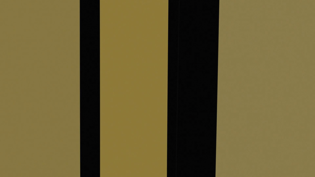
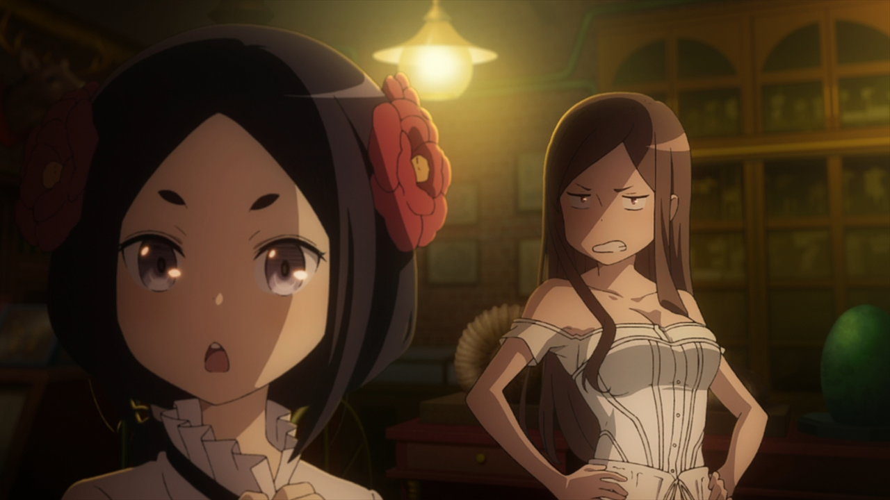
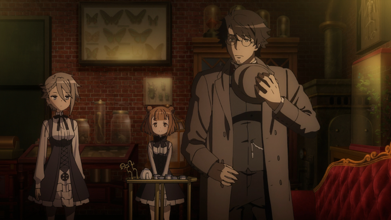
Right, I actually think the composition is very uneven. In some scenes the characters and world look completely interwoven, in others the characters feel like they're standing on backgrounds that they don't blend in with. I personally felt that this immersion-breaking visual problem occurred in too many scenes.
For example, I feel like characters don't really blend with the background here, and contrast in focus between the foreground and background is a little extreme:
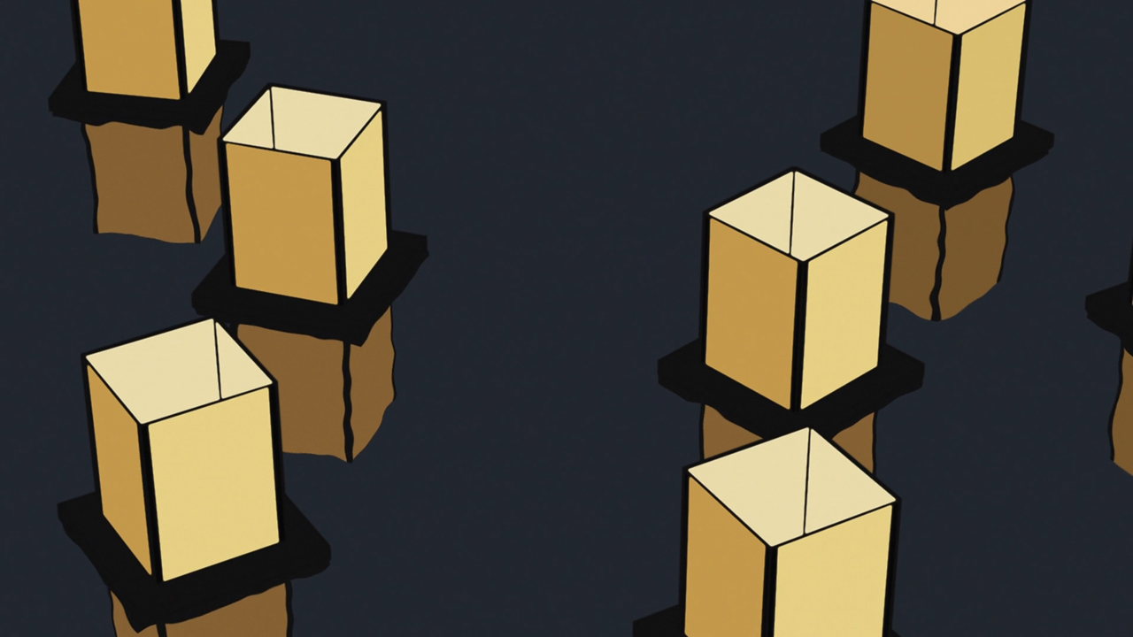
While in other shots, it feels like the focus naturally gets blurrier the further objects are from the camera:
But, even within this very scene, consistency is a huge problem. Look at this next shot:
Rather than taking place in an organic world, where there's actual depth to the image, this feels very "2D" with the characters placed in front of a flat background, rather than a room with real depth. Notice as well how the girl with her hair in buns has teleported from being in front of the large dresser to being in front of some kind of cage.
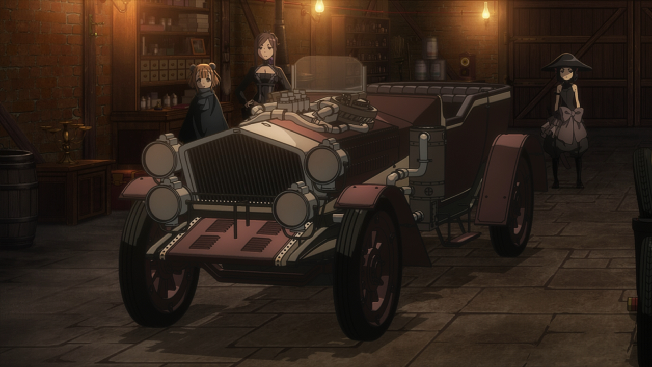
Hang on a second, we
clearly saw earlier that this sofa was against the wall, underneath the tusk. Who moved it to a different side of the room?
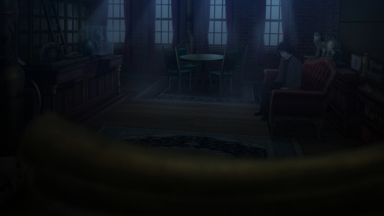
Other shots have a great sense of depth to them:
It's just very uneven.
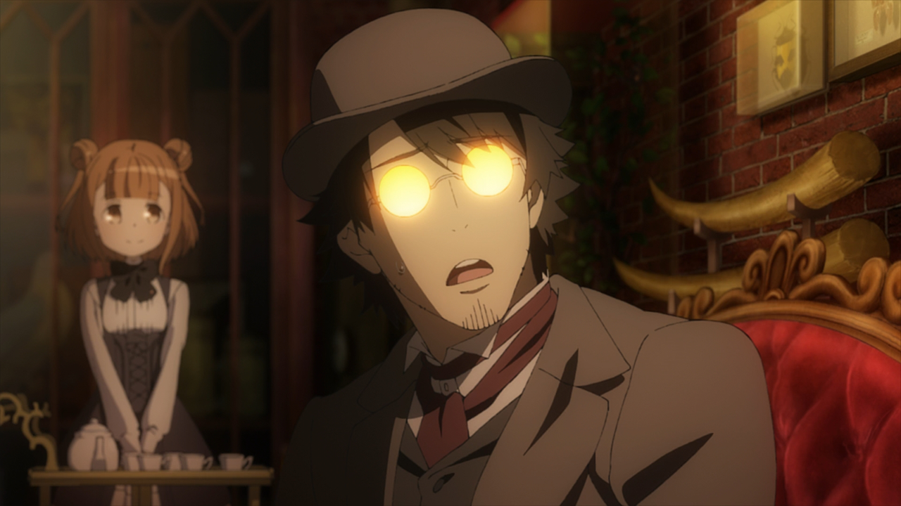
You might not have noticed this, but applying this kind of depth-of-field effect on facial closeups has actually become a common photography technique in current anime productions with some photographic ambition, such as Showa Genroku Rakugo Shinjuu S2 and Konosuba S2 at Deen or Sound Euphonium S2 and A Silent Voice at KyoAni. While I don't know the specific reason for using it in all circumstances, the interviews with KyoAni staff I've read say that they often use depth-of-field to create a hazy atmosphere, to make an image feel less solid and more touched with nostalgia or a heightened emotional state. That would fit with this image, in which Eric is getting emotional upon hearing Ange narrate her past tragedy.
I am aware of the growing rise of digital photography in anime and in many cases I think it works really well. I certainly understand that they're attempting to emulate the ‘blurry' camera look that signifies a character has been emotionally moved. I've trying to work out what bothered me about the use of the effect in this one scene and I believe it largely come down to a question of consistency, as it felt like that was the only shot in the scene that was shot with a blur filter. However, it makes sense as that's clearly a POV shot from Eric's perspective. So I don't really know why I dislike it.