You are using an out of date browser. It may not display this or other websites correctly.
You should upgrade or use an alternative browser.
You should upgrade or use an alternative browser.
This movie poster has the worst font I have ever seen
- Thread starter SJRB
- Start date
Reality Czar
Banned
Why is she wearing a telephone receiver as an eye patch?
The Cockatrice
I'm retarded?
Stop watching obscure shit.
Dr.Morris79
Gold Member
...Iphone?Why is she wearing a telephone receiver as an eye patch?
I'll get me coat.
J-Roderton
Member
rome irue
NeoIkaruGAF
Gold Member
Trump.
showernota
Member
GRUMEE
Julius Ibidus
Member
wow what a piece of crap! bizarre eye patch, way-too-small mouth, illegible title font, it has it all! and if you're going to do the whole 'eye of horus' thing, at least put a little effort into the visible eye. blech. still not as bad as turkish star wars posters.
Reality Czar
Banned
Don't forget the most successful movie of all time uses the papyrus font.

a multicultural team of v
Member
And a video game franchise in the running for most popular of all time (Grand Theft Auto) uses the Price is Right font.Don't forget the most successful movie of all time uses the papyrus font.

Last edited:
EverydayBeast
ChatGPT 0.001
Jo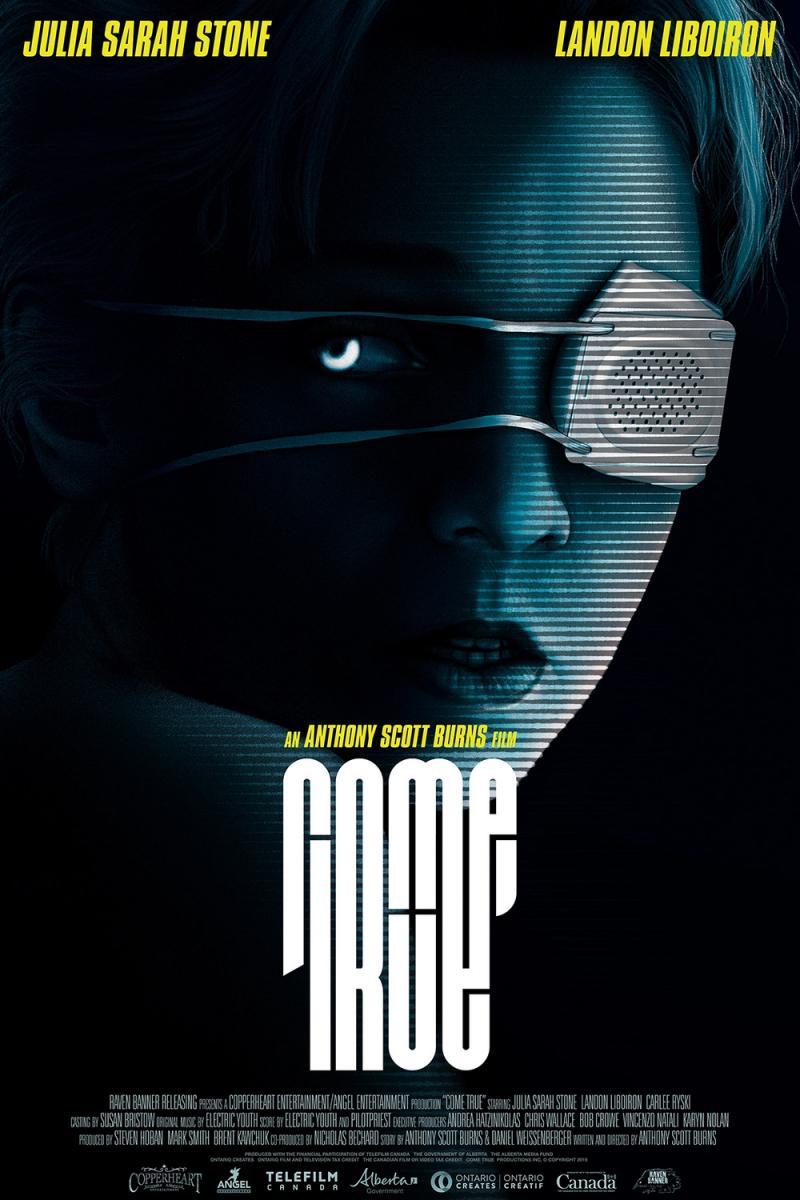
What's the title of this movie?

mango drank
Member
firmuee
rirmuee
rirmuee
Last edited:
hullostranger
Member
Wow. You weren't kidding OP. This is absolute garbage lol
pame gru?
pame gru?

BigBooper
Member
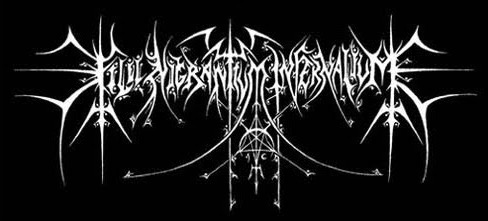
Kill gran um ver value?Almost as bad as a death/black metal band name logo
Corpsepyre
Banned
The film's pretty decent though, with a solid synth score by Electric Youth.
Derekloffin
Member
Well, it is "Come true" but I only know that by looking it up. That is next level bad.
What's the title of this movie?
01011001
Banned
Rome Irue is my guess
edit: wtf? it's Come True??? where the fuck is the C or the T???
the letter on the top left is a lowercase R and nothing else... wtf? and how is that straight line next to it supposed to be a T? a straight line is either a lowercase L or uppercase I
edit: wtf? it's Come True??? where the fuck is the C or the T???
the letter on the top left is a lowercase R and nothing else... wtf? and how is that straight line next to it supposed to be a T? a straight line is either a lowercase L or uppercase I
Last edited:
Ozzy Onya A2Z
Member
This is why I prefer designers who embrace the simplistic. Perfect example of when to adhere to form follows function.
DeepEnigma
Gold Member
It's no comic sans.
mango drank
Member
Kill Migrantum Internatium?Almost as bad as a death/black metal band name logo
That's Algonquin for, "The Good Land."
Cleared_Hot
Member
that's totally deliberate, but Avatar just got lucky. I honestly think they ran out of money for marketing and were like fuck it just let the visuals speak for itself, plus word of mouth, and that worked.And a video game franchise in the running for most popular of all time (Grand Theft Auto) uses the Price is Right font.
Dude I really hope the sequels are good. Wether you wanted them or not, they have crazy potential.
Hawking Radiation
Member
True Crime you numpties
Hawking Radiation
Member
True Come.... Hehe
BigBooper
Member
I rate that joke 69/100True Come.... Hehe
Reality Czar
Banned
Price is Right theme being used for GTA makes so much sense.
By the way, Price is Right is still on TV and it still rules.
By the way, Price is Right is still on TV and it still rules.
Mistershine.
Banned
It has the movie name in the text at bottom of the picture.
Master Of Illusion
Member
Heard this movie legit slaps. Gonna see it in the city later.
HoodWinked
Member
hard to make a T without altering the kerning, Come 7rue


triplestation
Member
grooee
Robot Carnival
Member
dorkimoe
Member
Don't forget the most successful movie of all time uses the papyrus font.
levyjl1988
Banned

