-
Hey Guest. Check out your NeoGAF Wrapped 2025 results here!
You are using an out of date browser. It may not display this or other websites correctly.
You should upgrade or use an alternative browser.
You should upgrade or use an alternative browser.
Windows Phone 7 |OT|
- Thread starter brotkasten
- Start date
- Status
- Not open for further replies.
Robobandit
Member
Lanbeast said:Finally a release date for the Titan. But it seems so far away :[
A week from sunday? Doesn't seem that bad to me..
Joel Was Right
If you smell burning, it's probably the generators acting up. Report it anyway.
The OS is dead in the market.
Just spent some time talking to a couple of phone store sales people and they barely know anything about WP7 and have no interest in it, and this openly admit that they do not pitch it to consumers - mainly because of their own lack of interest in it. One of them is getting the new Nokia for free and plans to sell it. He looked at my Omnia, was asking about it "does it have the same apps on the iPhone? Oh wow, it has Facebook built in?".
Windows Phone 7, we barely knew thee
Jason Raize '75 - '04 said:The OS is dead in the market.
Just spent some time talking to a couple of phone store sales people and they barely know anything about WP7 and have no interest in it, and this openly admit that they do not pitch it to consumers - mainly because of their own lack of interest in it. One of them is getting the new Nokia for free and plans to sell it. He looked at my Omnia, was asking about it "does it have the same apps on the iPhone? Oh wow, it has Facebook built in?".
Windows Phone 7, we barely knew thee
It's the same bias that goes on with reviewers writing articles on iOS. My friend works for AT&T and there was no phone in the world better than his Blackberry, until he got an Android. Now there is no phone better in the world than his Android.
Robobandit said:A week from sunday? Doesn't seem that bad to me..
It's not. I've just been really eager to get rid of my 3GS ever since iOS5 was released.
Where are you located? We might need to get that website, the one naming all those ignorant carrier stores, back up again.Jason Raize '75 - '04 said:The OS is dead in the market.
Just spent some time talking to a couple of phone store sales people and they barely know anything about WP7 and have no interest in it, and this openly admit that they do not pitch it to consumers - mainly because of their own lack of interest in it. One of them is getting the new Nokia for free and plans to sell it. He looked at my Omnia, was asking about it "does it have the same apps on the iPhone? Oh wow, it has Facebook built in?".
Windows Phone 7, we barely knew thee

Side note: This generation of phones has been disappointing. For all the criticisms of last year's models, we at least got sliders in both orientations, big speakers and a phone with a stand. This year the manufacturers aren't even trying to differentiate their phones from every other candybar device out there except by size. I'm
brotkasten
Member
Well, time to close this thread then.Jason Raize '75 - '04 said:The OS is dead in the market.
Just spent some time talking to a couple of phone store sales people and they barely know anything about WP7 and have no interest in it, and this openly admit that they do not pitch it to consumers - mainly because of their own lack of interest in it. One of them is getting the new Nokia for free and plans to sell it. He looked at my Omnia, was asking about it "does it have the same apps on the iPhone? Oh wow, it has Facebook built in?".
Windows Phone 7, we barely knew thee
frontieruk
Member
so been playing with Tango video calling with my mate on his iphone today, i have to say quite impressed. bring on Skype and shit might just get real
non stealth edit to save double posting
Not seen a titan advert, the Radar one is kinda cool in an artsy way but it doesn't catch the imagination or show what WP7 is about bar it's a social media hub, but everyone has their facebook and twitter apps anyway.
At least the Nokia adverts catch your eye and the music, i had to set it as my ringtone lol
non stealth edit to save double posting
kharma45 said:If anything in the UK it's starting to a bit of a revival, HTC have WP7 ads everywhere for the Titan and Radar and Phones4U are pushing the Lumia 800 and HTC phones hard.
Not seen a titan advert, the Radar one is kinda cool in an artsy way but it doesn't catch the imagination or show what WP7 is about bar it's a social media hub, but everyone has their facebook and twitter apps anyway.
At least the Nokia adverts catch your eye and the music, i had to set it as my ringtone lol
AT&T is supposedly going to have a two-for-one deal on their WP7 phones so that might precipitate some action in the USA. The last time they did that for Blackberries, I believe they were the best selling brand that quarter.kharma45 said:If anything in the UK it's starting to a bit of a revival, HTC have WP7 ads everywhere for the Titan and Radar and Phones4U are pushing the Lumia 800 and HTC phones hard.
Complex Shadow said:There is no chance. Forget little.
What happened to make you so bitter? You don't seem to think any good ideas are going to happen, or that there's even a chance (unless you have some inside knowledge).
Complex Shadow
Cudi Lame
blame brotkasten,VanWinkle said:What happened to make you so bitter? You don't seem to think any good ideas are going to happen, or that there's even a chance (unless you have some inside knowledge).
j/k
but seriously. MS can't even seem to unify ms points with the market place.
http://www.guardian.co.uk/technology/2011/nov/09/htc-titan-mango-windows-phone-review
I never realized how much Mango sucked until I read this review.
I never realized how much Mango sucked until I read this review.
Robobandit
Member
I'm seriously contemplating the import of a lumia 800..
I've never had a Nokia phone before.. and I'm a sucker for build quality..
I've never had a Nokia phone before.. and I'm a sucker for build quality..
Totakeke said:http://www.guardian.co.uk/technology/2011/nov/09/htc-titan-mango-windows-phone-review
I never realized how much Mango sucked until I read this review.
He's so wrong (or lacks the knowledge) about many things it ain't even funny.
derFeef said:He's so wrong (or lacks the knowledge) about many things it ain't even funny.

He does have a valid point...
Twitter integration is not good on WP7, I agree. But for example, he should try to tap the top of the screen to get the connection and battery status, instead of writing 3 paragraphs about it.
Plus he complains about swiping to get to new options in the people hub. "Really, Charles Arthur?" - to use his writing style here, which is a little bit pompous.
Plus he complains about swiping to get to new options in the people hub. "Really, Charles Arthur?" - to use his writing style here, which is a little bit pompous.
This points out a gripe I've had with WP since it's unveiling. While I can appreciate the styling of metro typography, I think the headers are a HUGE waste of space. I think Metro is amazing, and it will do wonders on tablets/laptops/bigger screens, but on a device with limited space, the form is stepping on too many of function's toes.
Metro is going to use up more space compared to a traditional UI regardless of where you use it. Since it's essential to the core design (since there are no graphics to guide to eye, so to speak), it's arguable whether it's actually a waste of space, though. Using smaller titles in Metro tend to make it look cluttered, which can be seen in a few apps (SuperTube, etc).Copernicus said:
This points out a gripe I've had with WP since it's unveiling. While I can appreciate the styling of metro typography, I think the headers are a HUGE waste of space. I think Metro is amazing, and it will do wonders on tablets/laptops/bigger screens, but on a device with limited space, the form is stepping on too many of function's toes.
Correct.NotTarts said:Metro is going to use up more space compared to a traditional UI regardless of where you use it. Since it's essential to the core design (since there are no graphics to guide to eye, so to speak), it's arguable whether it's actually a waste of space, though. Using smaller titles in Metro tend to make it look cluttered, which can be seen in a few apps (SuperTube, etc).
Brettison said:Does nothing when I click.
Wierd that people think the app is barebones. I actually thought it's solid. It's a mango app, plays under the lock screen, has a solid metro look, and all the settings I'd want like toggling HQ streams on and off or only play on WiFi.
Smart DJ on Zune seems better as I couldn't really find a way to do that in Spotify without just manually making my own. I thought the related artists was fine though. I like how Zune throws up a background if it can though and even has a bio of the artist when browsing.
PS: I love the artist background thing on both the phone and PC, but gosh damn do id tags funk me on getting this 90% of the time even with the Zune social tagger. Without the tagger it would be like 95%.
Damn, does windows phone support custom URLs (basically URLs that launch apps when clicked in IE)?
brotkasten
Member
Works great with zune:// marketplace links.Ghost said:Damn, does windows phone support custom URLs (basically URLs that launch apps when clicked in IE)?
antiquegamer
Member
Totakeke said:He does have a valid point...
Only point I got from him is that he is another Apple fanboy reviewing Microsoft product and giving low mark because it doesn't function like iOs.
To me Metro is more intuitive than iOS ever was, I hate all the graphic box that iOS is using. To me it's clutter and messy, I prefer the free flowing style of Metro. That doesn't mean I think iOS UI is crap because it's not.
Not sure why we even care anymore when we get review from someone like him. There's nothing on iPhone that miss having beside Facetime (and this is only because all my family are Apple fans).
frontieruk
Member
Sheesh the only thing i agree with from that review was the data connection, which i ended up setting manually... (oddly only for my o2 sim)
the rest is pure 'but it's not an iphone' rhetoric

the rest is pure 'but it's not an iphone' rhetoric
That's such a ridiculous comparison. That iPhone has a higher resolution (twice the number of pixels!) and ppi than all the Windows phones. Anyone expecting it to display the same amount of information is having a laugh. Here's the Galaxy Nexus thenCopernicus said:
This points out a gripe I've had with WP since it's unveiling. While I can appreciate the styling of metro typography, I think the headers are a HUGE waste of space. I think Metro is amazing, and it will do wonders on tablets/laptops/bigger screens, but on a device with limited space, the form is stepping on too many of function's toes.

Would that reviewer in turn compare the iPhone 4/S to that and find it wanting?
Actually I think the Headers are even more brilliant given the limited space. It's so hard to provide whitespace and let the content feel free without being cramped. iOS looks cluttered in comparison to Mango which is amazing given how many fewer pixels the WP has to work with
brotkasten
Member
I love how he complains about the task viewer. Holding the back button isn't intuitive, I agree, but double pressing the home button is the most natural thing you do, when you want to switch between apps? For an iOS user maybe.antiquegamer said:Only point I got from him is that he is another Apple fanboy reviewing Microsoft product and giving low mark because it doesn't function like iOs.
To me Metro is more intuitive than iOS ever was, I hate all the graphic box that iOS is using. To me it's clutter and messy, I prefer the free flowing style of Metro. That doesn't mean I think iOS UI is crap because it's not.
Not sure why we even care anymore when we get review from someone like him. There's nothing on iPhone that miss having beside Facetime (and this is only because all my family are Apple fans).
GuardianReview said:(A side note: Windows Phone orients its tiles vertically; Metro, horizontally. Metro has continual sets of tiled screens; Windows Phone has one tiled screen, and then a giant single-width list of icons. I wonder how easily people used to one interface will adapt to the other.)
For an idiot such as yourself, probably not very easily, for the rest of the world, probably pretty damn easy.
That's not to say that Windows Phone fails in its desire to be a "glance-and-go" interface.
This line doesn't even make sense because he has said nothing about the OS besides describing what the home screen looks like by this point.
With iOS and Android, if you choose one of those icons, you'll be taken straight into the app, which will come straight back into action. On Mango, I would get a blank screen for a moment, and sometimes the message "Resuming ", which while faster than startup, still felt like a swizz compared to rivals. Just as with the wireless connections, suspend-and-reanimate may be good for battery life, but it makes for a bad user experience.
Do "mangofied" apps experience this or was he resuming a non "mangofied" app?
I criticised the lack of this information (which does exist, and can usually be coerced into appearing by prodding the top of the screen) with WP7. On a phone, information about your connection quality is not spurious or inessential data; it's part of the connectivity picture.
It either is working or it isn't, how good a connection is doesn't seem to be information that should constantly be taking up screen space. Especially on devices with limited real estate.
Secondly, the implementation of Twitter interactivity in the People hub is woeful. You can't "favourite" tweets to savour later or use for other purposes (personally, I do this for plenty of Boot Up fodder). You can't use Lists. You can't add someone to a List (though you can view their profile details, connected to any other details you have about them). You can't reply-all to a tweet. (You can retweet a tweet small mercies.) You can't retweet a tweet while adding a comment. You can't see the conversation (the back-and-forth of tweets). Ditto for LinkedIn. All you can do is post or reply, where on the iOS app (for example) you can share, message privately, see who's gotten connected it's a whole universe.
Is there not a Twitter app for WP? He is comparing a general social network OS integration with an application's functionality.
Sure, on iOS or Android it's a separate app. But remember multitasking? On iOS that separate app with all that functionality is just a double-tap and a couple of tray swipes away; on Android, a long-press (or possibly a launch) away. And you'll be amid the rich potential of those platforms, nor in a poor version of it. For Facebook posts, you can't see what other people have written on someone's wall. It's the least common denominator of each network thoughts pitched into the semi-void.
I guess the holding of the back button negates the multitasking functionality? Then goes on to bitch about the integration some more. But it is completely added functionality. Nothing is lost. If you don't want to use the hub, don't. Go back to separate apps.
Is the connectivity to WiFi and mobile data as bad as he is making it out to be?
Dude talks about copy/paste like it is new in Mango.
Tough luck if you're starting at Woodside Park. OK, now your departure? Same thing again. Not recommended if you want to go to Woodford. That's just one app, but clearly developers aren't using, or aren't able to use, inbuilt searching or type-ahead. Again, a bad experience.
Is this true? Can developers not access this kind of stuff?
Mostly the review was bitching about the People Hub.
Greyface said:That's such a ridiculous comparison. That iPhone has a higher resolution (twice the number of pixels!) and ppi than all the Windows phones. Anyone expecting it to display the same amount of information is having a laugh. Here's the Galaxy Nexus then
Would that reviewer in turn compare the iPhone 4/S to that and find it wanting?
Actually I think the Headers are even more brilliant given the limited space. It's so hard to provide whitespace and let the content feel free without being cramped. iOS looks cluttered in comparison to Mango which is amazing given how many fewer pixels the WP has to work with
It's not a ridiculous comparison at all. As typography nut, I love the WP7 look, but the rigid heading format they've chosen is a waste of space, nearly a third of the screen is wasted space for every app. When I look though my emails, I want to see my emails not see "Inbox" the entire time. If that headers had snapping functionality and would scroll out of the way when you want to peruse your content, it'd be awesome.
brotkasten said:Works great with zune:// marketplace links.
Looked it up on the dev forums, there's no API for it at the moment
shame, it's a great tool in iOS for moving data from one app to another.It's not a third, more like a fourth or a fifth of the screen.Copernicus said:It's not a ridiculous comparison at all. As typography nut, I love the WP7 look, but the rigid heading format they've chosen is a waste of space, nearly a third of the screen is wasted space for every app. When I look though my emails, I want to see my emails not see "Inbox" the entire time. If that headers had snapping functionality and would scroll out of the way when you want to peruse your content, it'd be awesome.
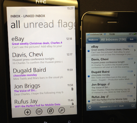
And lets be clear, you complaining about this

compare to


The Metro UI provides for better navigation (you can jump to either unread or flagged ,for example). And yes, the headers scroll away when you're open up the email messages i.e. when you're perusing the actual content. And I'm sorry but whitespace is not a waste of space. I don't want every inch of the interface covered with information.
Greyface said:It's not a third, more like a fourth or a fifth of the screen.
And lets be clear, you complaining about this
http://i.imgur.com/OSsft.png[IMG]
compare to
[IMG]http://i.imgur.com/OpyeV.png[IMG]
[IMG]http://i.imgur.com/5YxSv.png[IMG]
The Metro UI provides for better navigation (you can jump to either unread or flagged ,for example). And yes, the headers scroll away when you're open up the email messages i.e. when you're perusing the actual content. And I'm sorry but whitespace is not a waste of space. I don't want every inch of the interface covered with information.[/QUOTE]
I'm all for proper use of negative space, but when you combine the header from the wp7 app, with the dead space for the status bar, alot of the real estate is lost. I don't hate the headers on WP7, but I think they're not meant for small screens.
I'm not too big of a fan of the new action bar on ics, but it provides alot more functionality within less space compared to the WP7 setup.
The twitter thing seems like constructive criticism Microsoft could look at and maybe changeTotakeke said:
He does have a valid point...
We looking at this differently then. I don't see this as losing space at all but instead as utilizing space to make the information and navigation stand out more.Copernicus said:I'm all for proper use of negative space, but when you combine the header from the wp7 app, with the dead space for the status bar, alot of the real estate is lost. I don't hate the headers on WP7, but I think they're not meant for small screens.
... the ICS action bar is at the bottom and almost a carbon copy of the WP7 bar at the bottom (both of which are better than iOS's scattered buttons imo). Are we talking about different things? I intentionally cropped the screenshots so this wouldn't happen. *shrug* oh well. agree to disagreeCopernicus said:I'm not too big of a fan of the new action bar on ics, but it provides alot more functionality within less space compared to the WP7 setup.
Totakeke said:
He does have a valid point...
What's the valid point? It's not supposed to completely replicate the dedicated twitter and facebook apps.Korey said:The twitter thing seems like constructive criticism Microsoft could look at and maybe change
Greyface said:We looking at this differently then. I don't see this as losing space at all but instead as utilizing space to make the information and navigation stand out more.
... the ICS action bar is at the bottom and almost a carbon copy of the WP7 bar at the bottom (both of which are better than iOS's scattered buttons imo). Are we talking about different things? I intentionally cropped the screenshots so this wouldn't happen. *shrug* oh well. agree to disagree
.
Preference I guess, I mean it definitely looks better on the titan, due to the larger screen, but when I look at screens for normal sized phones it just doesn't look right.
The action bar isn't always split up like Gmail though. It can be split and overflowed to the bottom if needed, most apps won't need to overflow to the bottom.
again we disagree. I think it looks comical on the Titan, the screen is just too big with that low pixel density. I think Metro UI looks better on the smaller screens.Copernicus said:Preference I guess, I mean it definitely looks better on the titan, due to the larger screen, but when I look at screens for normal sized phones it just doesn't look right.
The action bar isn't always split up like Gmail though. It can be split and overflowed to the bottom if needed, most apps won't need to overflow to the bottom.
I don't think the shifting action bar on ICS is that good. I prefer WP7: navigation on top, content in middle, action bar at the bottom. iOS is just scattered. You may have the navigation guide at the top and then have a tab bar at the bottom. (NB: I'm exaggerating a little for effect here)
http://windowsphone.uservoice.com/f...-microsoft-points-for-app-purchases?ref=titleDocStar said:Yeah, I simply don't understand that decision.
I bet this takes until Windows Phone 8.5 until it has been integrated.
WTF Microsoft!
Make your voice be heard.
http://www.theverge.com/2011/11/10/2551810/nokia-lumia-800-att-lte
Exclusive: Nokia, AT&T collaborating on Lumia 800 with LTE
As someone who has been using iOS for 3 years or so now, I feel dumber after reading that Guardian review.
edit: I'm heading to the Windows Phone event in Baltimore tonight. They said they'll have free cocktails and appetizers. Anyone have an idea as to what exactly they'll have? Trying to figure out if I should eat beforehand, etc.
edit: I'm heading to the Windows Phone event in Baltimore tonight. They said they'll have free cocktails and appetizers. Anyone have an idea as to what exactly they'll have? Trying to figure out if I should eat beforehand, etc.
i was hoping that verizon would get the nokia 800 first.PG2G said:
Copernicus said:
I find this comparison screen kind of silly since is shows the same number of emails but the iOS has an extra line of the text from the email, wow
 Your still going to need to open the email anyways.
frontieruk
Member
Not seen posted yet
http://www.reghardware.com/2011/11/10/review_nokia_lumia_800_windows_phone_7_mango_smartphone/
Seems positive overall
http://www.reghardware.com/2011/11/10/review_nokia_lumia_800_windows_phone_7_mango_smartphone/
Seems positive overall

antiquegamer
Member
brotkasten said:I love how he complains about the task viewer. Holding the back button isn't intuitive, I agree, but double pressing the home button is the most natural thing you do, when you want to switch between apps? For an iOS user maybe.
I used iPad all the times, and I hate the double clicking to get to row of icons button interface to switch my task. Oh and I am still piss that I have to do that now every time because Apple decided to move my rotate lock button ...
Complex Shadow
Cudi Lame
Double clicking on my iPhone feels akward. Esp. one handed my thumb wasn't made to bend like that.antiquegamer said:I used iPad all the times, and I hate the double clicking to get to row of icons button interface to switch my task. Oh and I am still piss that I have to do that now every time because Apple decided to move my rotate lock button ...
Higher resolution means nothing since the UI is being scaled to the higher DPI. The UI doesn't change from the 3GS to the 4. Think in points instead of pixels.Greyface said:That's such a ridiculous comparison. That iPhone has a higher resolution (twice the number of pixels!) and ppi than all the Windows phones. Anyone expecting it to display the same amount of information is having a laugh. Here's the Galaxy Nexus then
[IG]http://i.imgur.com/5tx7l.jpg[/IMG]
Would that reviewer in turn compare the iPhone 4/S to that and find it wanting?
Actually I think the Headers are even more brilliant given the limited space. It's so hard to provide whitespace and let the content feel free without being cramped. iOS looks cluttered in comparison to Mango which is amazing given how many fewer pixels the WP has to work with

Xbox.com got updated.... not much new for us but something I didn't know about before is beacons will show on the phone in the requests section of xbox live.
http://forums.xbox.com/xbox_forums/...m-enhanced-new-social-amp-video-sections.aspxClick a title and youll be taken to a page that not only shows your achievements, but also which of your friends have also set Beacons for that game. Below the Beacons you can see anyone whos online playing right now, and others whove recently played it. Youll also be alerted to friends playing titles that youve set a Beacon for on your Xbox 360, but that wont happen until after the next System Update goes live. However, Windows Phone users can see Beacons under the Xbox LIVE Requests section right now!
- Status
- Not open for further replies.