PotionBleue
Member
This game is a bastardization of what I consider the greatest Zelda game.
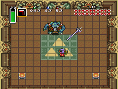
Graphically:
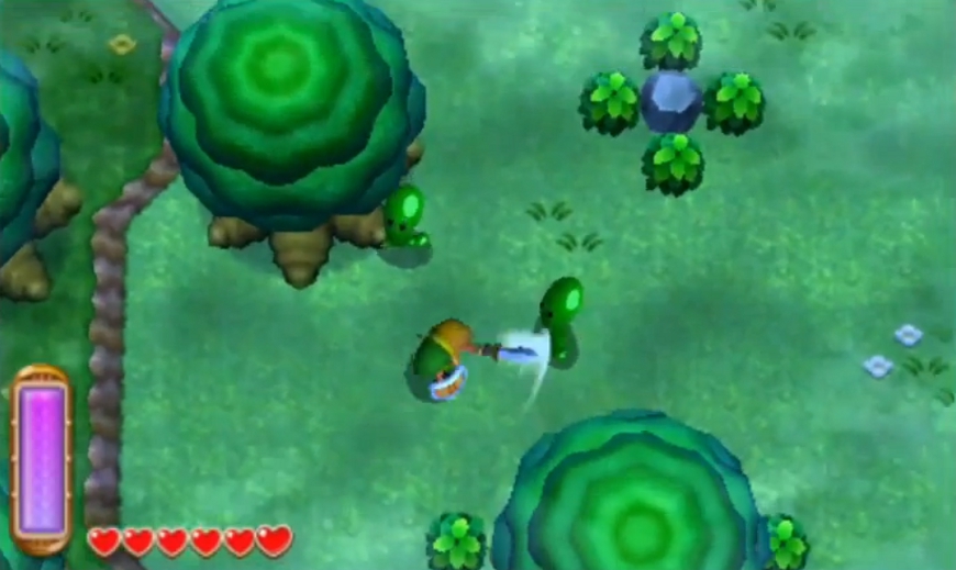
Now look at this ALBW screen:
Please. That is a ridiculously unfair comparison. Let me show you what you've basically done, the opposite way:


This game is a bastardization of what I consider the greatest Zelda game.
Graphically:
Now look at this ALBW screen:


To everyone who's completed their first play-through, how long did it take to finish the story?
Please. That is a ridiculously unfair comparison. Let me show you what you've basically done, the opposite way:


It's a huge step down, agreed. The stereoscopic 3D is pretty solid though, for what it's worth. The art style looks like it has some good intentions, but the models just weren't finished. Reminds me a lot of the early shots of OoT. I really enjoyed seeing some of the old enemies and bits of the environment in 3D though, like 'oh, that's what the sprite was going for." Still doesn't look half as good, but interesting.
NPC part is a good point. There's no good reason for half of it that gets thrown in there.
I found the 3D aspects to be very natural, easy to see, and pretty interesting. Sometimes even nice little 'aha' moments. And the same is true of the wall merge. It's pretty different from anything I've come across in (especially 2D) Zelda before. Imo it's a really fun mechanic, though probably a bit overdone here (since it's the only ability that pretty much the whole game knows you'll have.)
Dungeons being fast is one of the best parts of this game. Just like in LttP, the dungeons are quick and fun all the way through, instead of overstaying their welcome. The dungeons and puzzles in LttP were easy as well, for better or worse.
Where you see a mutant, I see a well done sequel. Yes, it reuses aspects of LttP, but that's ok with me. I love that world, and a chance to explore it again and find new things is much appreciated. Maybe it sullies your nostalgia, but it's hitting mine in all the right spots.
I don't think that's true at all. It's not like 3D adds any visual fidelity.I've been playing this game for a few hours and it's far from ugly. It looks great with the 3D slider all the way up. It doesn't look as good in 2D mode, so I would really recommend playing it in 3D, the 3D adds a lot to the visuals.
I don't think that's true at all. It's not like 3D adds any visual fidelity.
I just dont agree man, I think the bottom picture, even blown up, is leaps and bounds superior in terms of design and art. It is actually pretty to look at! It has color, depth, intensity. The 3D design just does not have the same feeling, it's just, flat.
ALBW has brighter graphics compared to LTTP, probably because of the 3D (with darker graphics ghosting are more frequent...).I just dont agree man, I think the bottom picture, even blown up, is leaps and bounds superior in terms of design and art. It is actually pretty to look at! It has color, depth, intensity. The 3D design just does not have the same feeling, it's just, flat.
I don't think that's true at all. It's not like 3D adds any visual fidelity.
I personally can't understand the point of boring NPC, but I thought the characters were pretty charming and interesting. Biggest shame is, though, that the characters aren't fleshed out. That's something which has been missed in any Zelda game. (Except Majora's Mask).This game is a bastardization of what I consider the greatest Zelda game.
Graphically:
A link between worlds looks like animal crossing. I can't impress just how ugly the art style is. The pixelated, bright, blocky, overhead view pales in comparison to the initial 2D design. The push on the 3DS to create a 3D experience results in a less artistic, less immersing style. Maybe I just don't have an eye for newer generation art, but the Nintendo 64 style graphics look terrible and age even worse. LTTP is still a pleasure to look at after all these years, I sure we won't be saying the same for ALBW.
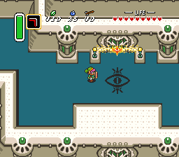
Look at these LTTP screens:


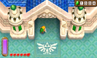
Now look at this ALBW screen:

Gameplay:
NPCs in this game are incredibly annoying. Starting in Ocarina of time, and progressively getting more controlling and overbearing, this game follows the path of WW or Skyward sword with long, annoying, pointless NPC interactions. For the love of god Nintendo, please stop wasting my time with all this worthless dialogue.
3D aspects of play are gimmicky, often difficult to physically see. New item system is cumbersome, switching items is difficult. Dungeons and puzzles are incredibly fast and easy. Without getting items from a dungeon, instead just "renting" them, makes dungeons seem more like a chore and less like a chance to upgrade your character. Overworld is exactly the same structure of aLTTP. 2D "painting on wall" mechanic is not enjoyable.
Impression:
If Nintendo wanted to make a port of LTTP, they could have kept the art style and 2D aspect, resulting in a rehash of an excellent game. If they wanted to make a new 3DS game, they should have made a new game. Instead, they formed some mutant bastard child of aLTTP and the newer, shitty zeldas. This mutant excels in no areas. It looks like garbage, has mediocre gameplay, repetitive mechanics, and sullies my LTTP nostalgia. I honestly enjoyed my LTTP re-playthrough a year back significantly more than aLBW.
If you enjoy the newer Zeldas, this game may appeal to you. But as an advocate for the original game, the resulting aLBW is a cluttered yet gameplay simplified, overbearing, ugly semi-remake of a once excellent game.
ALBW has brighter graphics compared to LTTP, probably because of the 3D (with darker graphics ghosting are more frequent...).
Speaking of 3D, it's really well done.
One of the better example on 3DS IMO.
Yeah. It's funny, even trying to prove a point by showing the original in a lower pixel density, it still looks miles better.I just dont agree man, I think the bottom picture, even blown up, is leaps and bounds superior in terms of design and art. It is actually pretty to look at! It has color, depth, intensity. That giant skull entrance looks scary as shit! The 3D design just does not have the same feeling, it's just, flat.
I'm really nostalgic too. I can understand some of the disappointment, but I'm just happy to get something similar to LttP at all. Maybe it's just that I've been so starved for classic-style Zelda since like... Oracles or Minish Cap.Strong reply, I appreciate your insight. I would agree that perhaps I'm too nostalgic with aLTTP, which may alter my experience.
Wow. GAME was giving us a bargain(!)The treasure chest I got with my preorder goes for £50+ solo on eBay 0_o
Another awesome example:

Such graphics.
wow, I just found there is an actual intro sequence if you leave the slot selection screen idle for a minute
I wish this would come back. I think they did that as a throwback to SNES times.
wow, I just found there is an actual intro sequence if you leave the slot selection screen idle for a minute
Gorgeous? Not at all. Adequate is the word I'd use. It gets the job done, but it's hardly eye candy.And anyone who's played this game knows that it looks gorgeous in person.
So did Wind Waker.Skyward Sword has an intro sequence like that as well if you leave it on the title screen for a minute or so.
That's the first intro, he is speaking about the second one.I think it changes depending on where you last saved at.


So hideous. I mean, A Link to the Past looks so much better!
Gorgeous? Not at all. Adequate is the word I'd use. It gets the job done, but it's hardly eye candy.
I stopped taking you seriously after this line right here, because that seems unnecessarily harsh. Perhaps you have the nostalgia goggles on too tight, because I played LttP, I loved it, and I adore this game. It's like returning home after 20 years, and the game looks amazing. Lorule is eerily creepy throughout, and is a great successor to the Dark World from LttP. The flow of the game is tight, the music is incredible, and It's just a lot of fun to play. I'm just sorry you didn't get the same experience.This game is a bastardization of what I consider the greatest Zelda game.
So where's...? I've already beat like 2 dungeons in theMaimaiand have yet to find her.Dark World
Currently I still have 3 Sages to go and I'm enjoying the hell out of this game!
I really enjoy the more open structure of the game. The renting/buying mechanic seems like such a small addition on paper, but man does it change the game! If the team transfers that to the next 3D Zelda, it will be awesome! Also it feels like it has the perfect amount of Sidequests which also feel interesting so far - I haven't done all of them, but it's nice that you can differ from the main path and do other things for hours if you wanted to.
The visuals are fine - could have been better, but they sure accomplish their goal. I am in the fire dungeon right now and it's the first time that I'm having frame drops.
The most awesome thing I never expected in this game is throwbacks to SM64 of all games in the fire dungeon. The music and the design manages to throw loads of nostalgia my way.
Below the bridge to the west of Links house in a cave.
Is it still 60 fps with 3d enabled? Is that a first?
Is it still 60 fps with 3d enabled? Is that a first?
Tekken 3D and I believe Jett Rocket 2 too.Mario Kart 7 is 60fps locked in 3D and 2D.
The treasure chest I got with my preorder goes for £50+ solo on eBay 0_o
Below the bridge to the east of Links house in a cave.
Below the bridge to the east of Links house in a cave.
What SM64 reference? I never caught that.
Tekken 3D and I believe Jett Rocket 2 too.
All this graphic discussion is silly. I've got a definite bias/warm place in my heart for LttP's visual style, and sure, maybe I prefer it to this game's visuals, but there's nothing wrong with the new style. It looks great in motion and it doesn't feel un-Zeldalike or anything.
Anyway, finally made it to Lorule this morning. Had enough money saved during the first 3 dungeon runs that I was able to buy 5 of my rented items outright.
Having reached this point in the game, I feel pretty confident in saying that this game is all but parallel with LttP in most ways. Challenge level is about the same, soundtrack (for its time) is amazing, and gameplay is smooth and satisfying.
I know it's a kinda-sorta "sequel" to Link to the Past, but in a lot of ways it just feels like a remake. Sure, the story elements vary a little bit and the world is slightly different, but it's all structured the same. I'm not really complaining. After 20 years of waiting for this game, I won't demand anything great and new until the next installment.
Very enjoyable game, I can't wait to play it more tonight.
And Gunman Clive
Its still very early in development and a lot of the design isnt finalized, but its very heavily inspired by the early Zelda games; it uses a topdown perspective with 3D graphics and its for the 3DS. The artstyle is fairly different from the new Zelda but has some influences from [A Link to the Past] as well, so yes I think comparisons will certainly be made [to A Link to the Past 2].
