-
Hey Guest. Check out your NeoGAF Wrapped 2025 results here!
You are using an out of date browser. It may not display this or other websites correctly.
You should upgrade or use an alternative browser.
You should upgrade or use an alternative browser.
Apple announces Apple Watch
- Thread starter Volotaire
- Start date
- Status
- Not open for further replies.
soundahfekz
Member
"Basically, Google has built a voice command and notification platform, while Apple is building a mini smartphone."
- Ron Amadeo, ArsTechnica
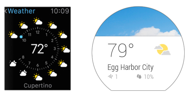
Weather:
Some one PLEASE shop Kornheiser's WHY on each hour of this image
Why is it that Apple haven't moved to OLED for their other product lines yet? They're thinner, give off less heat and actually use less power, right?
Because Apple is all about that bright OS with lots of light colors so an OLED would suck more battery.
Jill Sandwich
the turds of Optimus Prime
Why is it that Apple haven't moved to OLED for their other product lines yet? They're thinner, give off less heat and actually use less power, right?
I think they're waiting on IGZO tech.
Why is it that Apple haven't moved to OLED for their other product lines yet? They're thinner, give off less heat and actually use less power, right?
My best guess is that yields aren't high enough to meet the massive production capacity required by Apple, or they just can't secure that capacity at a price they like. That's fairly uninformed speculation on my part, though. There could be a more technical reason.
First, we don't know what sort of voice activation there will be. It uses Siri, so it's hard to imagine they'll omit at least simple things like 'Siri what's the weather' launching said app.Just think about the situations where you can't use your phone or an access to your watch is just easier and quicker.
You're in the subway or in a bus full of people, you're driving, you have one hand that is occupied with a bag, or you just really need to know what time it is... which one comes in handier?
The one you can summon with your voice and that shows a bold and front-and-center picture of the core information... or the one you will have to manually activate in order to get a smartphone-sized information package shrunk into a 1.5" display?
What's quick and at a glance in that? If for whatever reason you need a specific forecast for a specific period of time, all you have to do is ask (what will the weather be tonight/tomorrow morning/this afternoon/etc.).
And as far as interface beauty goes, well...
Second, as long as the main screen for an app/function at least has the same information (cluttered or not) as the Google equivalent, it really isn't any less glanceable if the main info is highlighted. And that seems to be the case. And if you do in fact need a bit more info, it's quite possible it is actually more glanceable and functional in Apple's case. For example, the media player is terrible in Google's implementation.
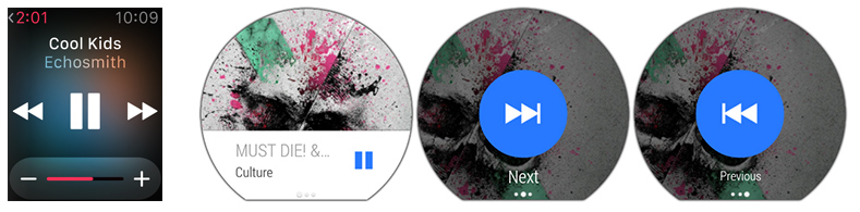
While I won't argue that I prefer what Google is doing aesthetically, the functionality is questionable. Swiping between 3 screens for media playback is hardly user friendly ... and that includes when considering the very use-cases you cite such as sitting in a subway, driving, etc.
victreeb3l
Member
lol They seriously thought the cover art had a higher priority than back/forward?
For one, costs. While the long-term expectation is OLED will end up costing less than LCD, it is certainly not there.Why is it that Apple haven't moved to OLED for their other product lines yet? They're thinner, give off less heat and actually use less power, right?
As for battery life, it matters what type of LCD you are comparing to. iOS is traditionally a white interface. Emissive displays do not have constant power usage, it fluctuates based on what is being displayed. The more light colors, the more power. OLED will still be better than some LCD's on average, even with iOS's UI, but there are alternatives that are as good or better with power usage. IGZO especially.
The watch is a different beast. It has a black UI, so OLED gets some real power savings. Plus then need true blacks in order to blend the UI/background into the interior bezel. An LCD would look especially terrible at night.
Marty Chinn
Member
While I won't argue that I prefer what Google is doing aesthetically, the functionality is questionable. Swiping between 3 screens for media playback is hardly user friendly ... and that includes when considering the very use-cases you cite such as sitting in a subway, driving, etc.
Not having used it, my only guess would be is they did it this way so you could use it without looking at the screen since there's no tactile feedback.
lol They seriously thought the cover art had a higher priority than back/forward?
One company went for function over form ... the other went for form over function.
Historically that's what you'd expect from Apple and Google. Who chose what though is the crazy part. Complete role reversal.
Not having used it, my only guess would be is they did it this way so you could use it without looking at the screen since there's no tactile feedback.
Possible, though that's dependent on whether the watch keeps auto-switching back to the main screen so you can easily swipe-tap. Otherwise you have to remember where you are or look down.
Can any 360 owners chime in?
D
Deleted member 22576
Unconfirmed Member
Looking at that 360 interface its clear that you have to swipe left or right to reveal the seek buttons.. why wouldn't they just have that swipe gesture be the seek command?
One company went for function over form ... the other went for form over function.
Historically that's what you'd expect from Apple and Google. Who chose what though is the crazy part. Complete role reversal.
I honestly find that that the Apple watch is reminiscent of Android 2.x and Wear has hints of iOS7. Crazy.
Possible, though that's dependent on whether the watch keeps auto-switching back to the main screen so you can easily swipe-tap. Otherwise you have to remember where you are or look down.
Can any 360 owners chime in?
Well it seems to me that, for example skipping to the next track would be swipe left then tap, which could be done without looking very easily. This however depends on that being the default app on screen when music is playing, in which case it's moronic that the time isn't displayed somewhere on screen. I don't think it is on by default so I think it's swipe up, swipe left, tap, which is still convoluted but I guess could be done without looking.
sometimes i game
Member
lol They seriously thought the cover art had a higher priority than back/forward?
Seems like it's better to swipe left or right vs hunting for the tiny icon. Keep things simple on the watch, it's not a phone. Apple got this one wrong, Google got it right.
Kevin Lynch, the guy who demoed the watch, was great to listen to. Hope we see more of him in the coming keynotes.
Yep, I enjoyed it as well. I missed Craig, though. They should have had him on stage a few minutes to talk about iOS 8 or something.
Extra gestures for an incredibly basic and simple function is better UI design now? That's a new one on me.Seems like it's better to swipe left or right vs hunting for the tiny icon. Keep things simple on the watch, it's not a phone. Apple got this one wrong, Google got it right.
northead
Member
First, we don't know what sort of voice activation there will be. It uses Siri, so it's hard to imagine they'll omit at least simple things like 'Siri what's the weather' launching said app.
Second, as long as the main screen for an app/function at least has the same information (cluttered or not) as the Google equivalent, it really isn't any less glanceable if the main info is highlighted. And that seems to be the case. And if you do in fact need a bit more info, it's quite possible it is actually more glanceable and functional in Apple's case. For example, the media player is terrible in Google's implementation.
While I won't argue that I prefer what Google is doing aesthetically, the functionality is questionable. Swiping between 3 screens for media playback is hardly user friendly ... and that includes when considering the very use-cases you cite such as sitting in a subway, driving, etc.
Of course not, launching the Weather app, but hands-free voice activation from anywhere in the system looks much better to me, and is one of the key element of Wear, nowhere to be found on the Apple Watch, at the moment.
Siri is there, but it's not integrated as Google now is.
It's not just the weather. I don't want to zoom out with the wheel, lose my head to find the timer app and then tap to let it start. Something like "Ok Google, set a 10 minutes countdown" sounds definitely more clever to me - again, regardless of where you are in the system.
That's why I disagree with the second point, for all the examples we have seen, albeit the music one certainly finds its upper hand on the Apple side.
But that's just one example.
All of the others show the Apple watch trying to squeeze as much information as possible into something that ultimately looks cluttered and confusing to my eyes, not to mention that tapping on those small areas could be extremely painful.
Hopefully Apple will manage to work around it.
Seems like it's better to swipe left or right vs hunting for the tiny icon. Keep things simple on the watch, it's not a phone. Apple got this one wrong, Google got it right.
This cannot be serious...
Of course not, launching the Weather app, but hands-free voice activation from anywhere in the system looks much better to me, and is one of the key element of Wear, nowhere to be found on the Apple Watch, at the moment.
Siri is there, but it's not integrated as Google now is.
It's not just the weather. I don't want to zoom out with the wheel, lose my head to find the timer app and then tap to let it start. Something like "Ok Google, set a 10 minutes countdown" sounds definitely more clever to me - again, regardless of where you are in the system.
That's why I disagree with the second point, for all the examples we have seen, albeit the music one certainly finds its upper hand on the Apple side.
But that's just one example.
All of the others show the Apple watch trying to squeeze as much information as possible into something that ultimately looks cluttered and confusing to my eyes, not to mention that tapping on those small areas could be extremely painful.
Hopefully Apple will manage to work around it.
If Siri is there then of course you can still do 'set a 10 minute timer'
northead
Member
If Siri is there then of course you can still do 'set a 10 minute timer'
Nothing I have seen lets me understand that you can summon it hands free from anywhere in the system.
Or am I mistaken?
It's been part of Siri functionality since the beginning of Apple's Siri beta, dude.Nothing I have seen lets me understand that you can summon it hands free from anywhere in the system.
Or am I mistaken?
Having no dead space makes the screen look cluttered as fuck.
The use if a lot of black space is because of what Jony said - trying to blend the use of software and hardware together - basically it's so you don't easily recognise where the software screen begins and the hardware bezel begins. You just have a device and it has a face.
Personally, I'm not a fan of square watches much either, but since the straps come out of the watch as opposed to a watch that appears to sit on top of a loop help mitigates the edges.
I can't help but think that the digital crown, as cool and useful as it may be, is paying homage to the watch form factor ahead of it actually being the ideal input method for this kind of device. It's kind of like they decided they wanted to make a watch first and see what they could do with that form factor rather than decide there was a problem to solve and a watch would be the solution.
As opposed to what? Buttons? The rotary functionality allows it to determine a scrolling speed that a button can't provide and gives it some slight consistency with iOS that way.I can't help but think that the digital crown, as cool and useful as it may be, is paying homage to the watch form factor ahead of it actually being the ideal input method for this kind of device. It's kind of like they decided they wanted to make a watch first and see what they could do with that form factor rather than decide there was a problem to solve and a watch would be the solution.
Why is it that Apple haven't moved to OLED for their other product lines yet? They're thinner, give off less heat and actually use less power, right?
Not only that but OLEDs today are more expensive and way way way less reliable than LCDsBecause Apple is all about that bright OS with lots of light colors so an OLED would suck more battery.
I think they're waiting on IGZO tech.
IGZO has been in the products since iPhone 5.
It's not just the weather. I don't want to zoom out with the wheel, lose my head to find the timer app and then tap to let it start. Something like "Ok Google, set a 10 minutes countdown" sounds definitely more clever to me - again, regardless of where you are in the system.
Lol, someone has never used Siri.
HolyBaikal
Banned
I don't much care for Apple stuff. I guess partially because I'm not supposed to.
But I guess it does kind of make sense, I don't like the whole close platform that Apple has. I think that having options and being open is a good thing.
But I do like the fact it's easier to download things from Apple than Android. And I like a lot of the designs of a lot of Apple than a lot of PC stuff. Apple stuff has looked very cute a lot. While a lot of PC stuff is always black, and looks like it's trying to look very... masculine?
I always feel like I want to buy Apple products in a way. Because they're so pretty. I've always really liked Apple's aesthetics. But I don't because I feel like I shouldn't support their closed stuff.
Well, I hope at least that this helps make wearable technology more popular. Because I would like that.
Why is it that Apple haven't moved to OLED for their other product lines yet? They're thinner, give off less heat and actually use less power, right?
http://www.cnet.com/news/oled-displays-theyre-awful-says-apples-ceo/
efyu_lemonardo
May I have a cookie?
A round watch could have the rotary be a ring around the entire frame.As opposed to what? Buttons? The rotary functionality allows it to determine a scrolling speed that a button can't provide and gives it some slight consistency with iOS that way.
That sounds rather comfortable to use, and it could make a slight click every few degrees, further aiding in non visual input.
SuicideUZI
Member
Not only that but OLEDs today are more expensive and way way way less reliable than LCDs
IGZO has been in the products since iPhone 5.
To add to that, Apple has patents regarding OLED and Steve Jobs has mentioned OLED in one of the iphone press conferences before basically saying that OLED tech isn't ready yet, granted that was some years ago but I'd say the same is still true. I imagine OLED is a work in progress behind the scenes but isn't ready for prime time yet.
Given those apparently are the only screens in that app ... lol yeah. That's pretty damn dumb.Looking at that 360 interface its clear that you have to swipe left or right to reveal the seek buttons.. why wouldn't they just have that swipe gesture be the seek command?
If Siri is there then of course you can still do 'set a 10 minute timer'
yupIt's been part of Siri functionality since the beginning of Apple's Siri beta, dude.
Woof, that Android Wear media player is...something. I have no doubt stuff like that is going to be fixed quickly though. Google was smart to force hardware requirements and maintain update control.
Really, I'm just excited for smartwatches in general. We now have two strong, competing platforms that are going to do a lot to push each other forward, as we figure out where we go from here in the wearable space.
Really, I'm just excited for smartwatches in general. We now have two strong, competing platforms that are going to do a lot to push each other forward, as we figure out where we go from here in the wearable space.
Which would be a longer and wider movement that obscures the screen with 2 fingers, or is too loose and fragile if designed for single-finger operation.A round watch could have the rotary be a ring around the entire frame.
That sounds rather comfortable to use, and it could make a slight click every few degrees, further aiding in non visual input.
Watches are designed the way they are for very specific reasons. It's not just tradition, it's tried-and-true optimal usability.
I didn't say the digital crown wasn't the best solution - knowing apple, it might well be.As opposed to what? Buttons? The rotary functionality allows it to determine a scrolling speed that a button can't provide and gives it some slight consistency with iOS that way.
I was just saying the whole device FEELS like a solution looking for a problem rather than the other way around that is typical of apple products. Sometimes we don't even recognise that there is a problem at first though.
Maybe that's the case here.
I still think it's very cool, and budget allowing I really want one.
http://www.viper.com/SmartStart/i'd like to start my car from my watch
Similar functionality is integrated in at least some cars. In a few years I expect it to be more common.
efyu_lemonardo
May I have a cookie?
There are watches with the exact design I mentioned.Which would be a longer and wider movement that obscures the screen with 2 fingers, or is too loose and fragile if designed for single-finger operation.
Watches are designed the way they are for very specific reasons. It's not just tradition, it's tried-and-true optimal usability.
Lol, someone has never used Siri.
He's complaining about not being able to activate Siri to receive voice commands without pressing a button, which to my knowledge you still cannot do (ala "Ok Google"). He then likens pushing that button for a sec to trudging through a series of menus to navigate to a timer app, which is where I think he loses everyone.
Show me one, since I'm not familiar.There are watches with the exact design I mentioned.
I think Google's implementation for the back/skip tracks is far superior. I initially thought, "yeah, that does make sense to have all the controls laid out." But after thinking about how I use my Bluetooth headset when I'm at the gym, I never ever need to see my phone to skip tracks. It's an action that should produce an immediate result without requiring me to look at my screen. For example, if I'm running, a quick swipe and tap without having to worry about finger-to-screen accuracy is perfect. Whereas if I actually have to look at the screen, I have to coordinate both my hands to be steady while attempting to tap a specific section of a small screen without accidentally pressing something else.
I think they're waiting on IGZO tech.
Already in use in the iPad Air
I think Google's implementation for the back/skip tracks is far superior. I initially thought, "yeah, that does make sense to have all the controls laid out." But after thinking about how I use my Bluetooth headset when I'm at the gym, I never ever need to see my phone to skip tracks. It's an action that should produce an immediate result without requiring me to look at my screen. For example, if I'm running, a quick swipe type without having to worry about finger-to-screen accuracy is perfect. Whereas if I actually have to look at the screen, I have to coordinate both my hands to be steady while attempting to tap a specific section of a small screen without accidentally pressing something else.
You can use google's implementation without looking?
Got a video demonstrating that? I'm not familiar with it in actual use, and am not sure how that would work.
He's complaining about not being able to activate Siri to receive voice commands without pressing a button, which to my knowledge you still cannot do (ala "Ok Google"). He then likens pushing that button for a sec to trudging through a series of menus to navigate to a timer app, which is where I think he loses everyone.
I think by default Siri on the iPhones have raise to talk. If you follow a certain pattern of lifting the phone to your ear from inactivity, it activates Siri automatically. No reason why this wouldn't be an option for the watch.
That feature was added to Siri, you say the name and can activate it from idle. It's a setting you can turn on and off on iPhones.He's complaining about not being able to activate Siri to receive voice commands without pressing a button, which to my knowledge you still cannot do (ala "Ok Google"). He then likens pushing that button for a sec to trudging through a series of menus to navigate to a timer app, which is where I think he loses everyone.
efyu_lemonardo
May I have a cookie?
Show me one, since I'm not familiar.

A lot of watches designed for extreme sports such as diving or climbing have all kinds of additional buttons and input configurations.
The reason they're so great is because you can enter quite a lot of input without having to look at them.
And if you ask me, emphasizing tactile feedback while simplifying visual feedback should be the main differentiating factor between smart watches and smartphones.
You can use google's implementation without looking?
Got a video demonstrating that? I'm not familiar with it in actual use, and am not sure how that would work.
Here's a video of someone explaining the music-control usage. When you start music on your phone, the controls for the music remain on the top of the watch's screen. He shows that you can just swipe left or right to perform back/skip respectively, and then you just tap the screen. I wouldn't have to look at my screen for any of that.
I think by default Siri on the iPhones have raise to talk. If you follow a certain pattern of lifting the phone to your ear from inactivity, it activates Siri automatically. No reason why this wouldn't be an option for the watch.
That feature was added to Siri, you say the name and can activate it from idle. It's a setting you can turn on and off on iPhones.
Oh neat. I tried this on my phone before posting to make sure I was correct, I'll have to find the setting and enable it because obviously I haven't done so.
Edit: Yep, that is nice. I especially like that it reroutes Siri through the earpiece so everyone within 50 feet doesn't know you are having a convo with your phone.
- Status
- Not open for further replies.