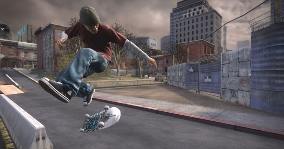
That is the worst cel-shading I've ever seen.
You must have missed the PS2 era....or default Unity shaders
That is the worst cel-shading I've ever seen.
Last gen launch at best.
No.You must have missed the PS2 era....
Can't be worse than this, tbh.or default Unity shaders
Man, they are having a really hard time nailing down the art style for this game. What studio and game engine is this game being made in? Everything about it screams last gen tech.
I think this is going to look better in motion.
Quick guys, its time to refill!!!

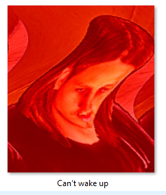
But what is going on with that woman's hair and fingers?
Them black outlines don't seem to scale well at a distance with thinner geometry.
I don't see why people think this looks that bad - jesus, PS2 game? Really? Character models are ugly "looking" but the for fucks sake look at the poly counts. I swear people hate this game just to hate it now. I don't have high expectations at all, but this is shit spewing.
Don't fret. I'm sure it'll play "as same" as Tony Hawk's Pro Skater HD did when it came out in 2012. Nothing to worry about.Looks fine to me. As long as the game plays the same it doesn't matter. What are you all wanting from this? Hyper realistic models?
What is Kyle Bosman doing in THPS5?

But what is going on with that woman's hair and fingers?
But what is going on with that woman's hair and fingers?

Crystal Meth Pro Skater 5
Crystal Meth Pro Skater 5
fuck lmaoDon't fret. I'm sure it'll play "as same" as Tony Hawk's Pro Skater HD did when it came out in 2012. Nothing to worry about.
You all asked for this. You have yourselves to blame.
Can't believe the PS2 is still getting support 15 years later, what a legacy.

/cdn0.vox-cdn.com/uploads/chorus_asset/file/3589608/tony_hawk_5_instagram.0.jpg)