PurePlatinum
Member
iPad continues to be sort of a confusing product. Who is plopping down the money for a new iPad + keyboard case and couldn't just afford a MacBook Air which is much more capable?
iPad continues to be sort of a confusing product. Who is plopping down the money for a new iPad + keyboard case and couldn't just afford a MacBook Air which is much more capable?
Apple made a bad version of Windows Vista
Nice try troll
No doubt Windows 12 will attempt to copy all of this while still having UI elements and icons that haven't changed since Windows 95 like Control Panel.
Nice try troll
No doubt Windows 12 will attempt to copy all of this while still having UI elements and icons that haven't changed since Windows 95 like Control Panel.
Ok.. windows 7 then. It's not a troll, it's just funny. I have an iPhone.
Don't use apple so I don't really have a stake in it but it's very aesthetic. The readability hysterics is engagement/rage bait, they'll tune it as they get more feedback.
Windows 7 only had transparency and blurring
It had none of the light refracting and splitting that Liquid Glass has.
This is some next level shit

Don't use apple so I don't really have a stake in it but it's very aesthetic. The readability hysterics is engagement/rage bait, they'll tune it as they get more feedback.
also that last part of that video reminds me of this. Give or take the live tiles which are now called widgets on iOS.
I agree with you. iOS26 is basically if Windows Vista / 7 came out today across multiple devices. Addint with it is a crap-ton of icons and a cluttered desktop that you can shove together in more icons called folders. They're doing nothing to innovate or simplify and are adding a ton of complexity by hiding features. Phone OS's in general need an overhaul.Worst OS I've ever used, the hybrid approach defied all logic, it's like they just spent an evening designing it while having a night out on the piss in a bar and just dumped it on the public.
Aesthetically it was awful too.
- Start menu had random blank spaces
- Tile colours were garrish
- Visually inconsistent with the desktop
- Win 95/XP/7 icons mixed with flat white 8 icons
- Buttons were flattened starting an awful trend, even MacOS 7 and Win95 designers realised buttons needed to appear raised.
Seriously, I can't believe we went from fruitier aero to THAT!
I remember downloading it on my last Windows PC and just having this sinking feeling while using it. I've never owned a Windows app since, though I do find Windows 11 aesthetically pleasing
Funnily enough both iPad and Android tablets are finally getting traditional desktop windowing this year, who thought multistasking design from the 80s with overlapping resizable windows was the answer all along.
I agree with you. iOS26 is basically if Windows Vista / 7 came out today across multiple devices. Addint with it is a crap-ton of icons and a cluttered desktop that you can shove together in more icons called folders. They're doing nothing to innovate or simplify and are adding a ton of complexity by hiding features. Phone OS's in general need an overhaul.

")
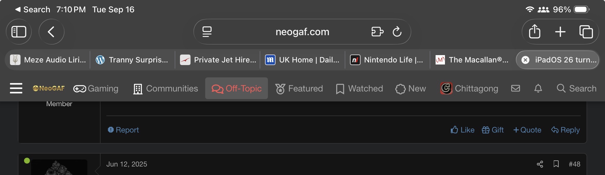
On iPhone I've changed the setting from compact to bottom, so I can easily access tabs, otherwise the new layout is good.Updated this morning. Took around 15 minutes.
Safari seem snappier
It is certainly niche. Best I can think about are some top execs that travel frequently, and do not need a keyboard all the time, but even then it's a stretch. It's not even about being more capable, for me typing on the Macbook is still infinitely better than on iPad with a keyboard attached.iPad continues to be sort of a confusing product. Who is plopping down the money for a new iPad + keyboard case and couldn't just afford a MacBook Air which is much more capable?
My iPad Pro is an excellent PDF and comics/magasines reader, but for anything requiring desktopish functions I use my laptop. Having a true desktop OS will always be more comfortable to me.It is certainly niche. Best I can think about are some top execs that travel frequently, and do not need a keyboard all the time, but even then it's a stretch. It's not even about being more capable, for me typing on the Macbook is still infinitely better than on iPad with a keyboard attached.
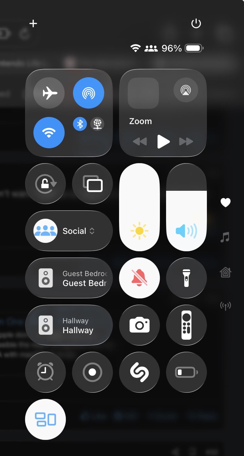
iOS 26 looks fucking terrible on my iPad. Everything being rounded makes for some really bad alignment. The shines also are really distracting, they look like scaling artifacts.
Unless you're being deliberately pedantic he clearly means iPadOS.How did you get iOS to run on an iPad?
it´s the whole package in one spaceIn for the OS, out for the Tranny Surprise.
It's not great on iPad. Waiting for when square icons are back in.
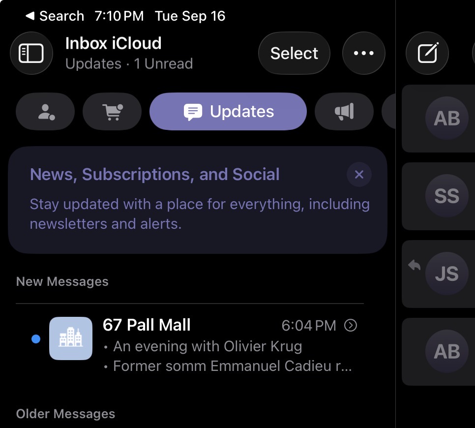
I updated my mac and effing hate it so much. Just in Music you have a hovering menu to hit the next song, ridiculous.Yeah, this is Apple's worst iOS update ever. Not just is everything visually bugged, unpolished and misaligned, but they changed something about the hit detection and cursor control, so that I hit wrong stuff constantly. I challenge anyone to try to download a bunch of episodes on the TV app, and not fire the episode up by accident. Which now highjacks audio from Spotify I am AirPlaying to my Sonos system.
Also, the transfer assistant from iPhone to a new iPhone is borderline broken. I have been battling for hours to get an iCloud backup or a device-to-device transfer happen.
Absolute shite.
Agreed i hate my iphone 15 pro max right now.Yeah, this is Apple's worst iOS update ever. Not just is everything visually bugged, unpolished and misaligned, but they changed something about the hit detection and cursor control, so that I hit wrong stuff constantly. I challenge anyone to try to download a bunch of episodes on the TV app, and not fire the episode up by accident. Which now highjacks audio from Spotify I am AirPlaying to my Sonos system.
Also, the transfer assistant from iPhone to a new iPhone is borderline broken. I have been battling for hours to get an iCloud backup or a device-to-device transfer happen.
Absolute shite.
I updated one of my Macs and I don't really see much of a difference so far. It doesn't feel all that drastic to me.I updated my mac and effing hate it so much. Just in Music you have a hovering menu to hit the next song, ridiculous.


