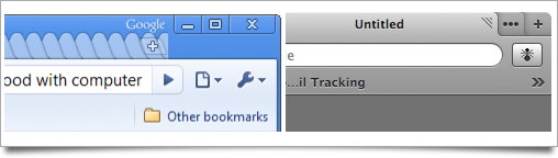
How to make stuff like Safari 3 again (copy and paste into Terminal):
Get the old tab bar back (Tabs under address bar)
Code:
defaults write com.apple.Safari DebugSafari4TabBarIsOnTop false
(change "false" to "true" to change it back to new way)
for the rest, 0 = Turn it Off / 1 = Turn it On
Get the old toolbar back (Separate Add Bookmarks icon, etc.)
Code:
defaults write com.apple.Safari DebugSafari4IncludeToolbarRedesign 0/1
CoverFlow View On/Off
Code:
defaults write com.apple.Safari DebugSafari4IncludeFlowViewInBookmarksView 0/1
New URL Completion Menu On/Off
Code:
defaults write com.apple.Safari DebugSafari4IncludeFancyURLCompletionList 0/1
Google Suggest On/Off
Code:
defaults write com.apple.Safari DebugSafari4IncludeGoogleSuggest 0/1