• Hey, guest user. Hope you're enjoying NeoGAF! Have you considered registering for an account? Come join us and add your take to the daily discourse.

Arts & Farts

daedalius

Member
Vespa, you're too good bro.

Was thinking about putting a 'UI' on my latest enviro, haven't decided if I actually will, but the snake picture made me think about it ;)

UI overlay maybe on this (yes its a very big image, might want to just open it in a new tab, heh)

If you guys see anything you think I should adjust in here, let me know.

purge-the-outsiders2_fin.jpg

http://galefire.com/2012/02/galefire-environment-purge-the-outsiders-cenrea/

Only like 4 more enviros to go till I can feel like my portfolio actually shows my current level of work well (and in enough quantity)!

Ugh dudes on polycount forum complaining about being old at 24. Just shoot me now.
 

Jhoan

Member
A couple of drawings I did recently for my Advanced Drawing class last week:
Charcoal and Eraser on sketch pad paper; still life:
QdF0hl.jpg

hIgl0l.jpg

And then there's a series of drawings that I'm doing for my 2D Studio Intensive class. I did these on Friday.
Oil Pastels on Bristol:
txEdcl.jpg

Qo7uDl.jpg

Pencil on Bristol Pad:
U9d6Wl.jpg


Lastly, here are two out of 11 paintings that I did for my painting class last semester. I did all of them with acrylic paints:
For this painting's color scheme, I was thinking of Power Rangers, so I decided to color code them appropriately. It's a pseudo-homage to Power Rangers yet social commentary on the big Big Six (Well Five in this painting) CEO's that control the media in the US:
SY2c5l.jpg

The professor's favorite painting. It's hanging in my bed room as a reminder that if I want to say something, I need to speak up. It's 18x24:
DTf50l.jpg

And here's the original drawing that it's based on. I had a reason for drawing it:
PMUBhl.jpg


Enjoy folks. I've been lurking in the thread a lot and I must say, you guys are amazingly talented. Keep up the good work. I did most of these drawings from my imagination save for the still life ones. Unfortunately, I've never done any digital drawings (no Wacom tablet).
 

daedalius

Member
Kinda slow in here over the weekend...

Oh well, working on a UI over that piece I just posted.


Suggestions on UI layout would be cool. Will be updating this link as I go.

Before you get to the UI (and I wouldnt, if you want to be a UI designer, be a UI designer) you reeeeally need to separate your foreground, middleground and background more. Right now everything has the same tone and value, its hard to tell whats what (your character needs to read a lot better, hes meshing with the background)

Lighting is also inconsistent, make that big pillar of light the main light, then have the torches as your secondary instead of that out of nowhere light source that's on the left of the screen. Youre so worried about the details that you're killing the mood.

This isnt a thread to critique art, so I'll leave it at that, Im just putting this out there because I know youre making portfolio pieces now.

I am just messing around with the UI stuff because I wanted to show something like that in this piece; I wouldn't say its gotten as much time as the piece as a whole, haha. Just doing it for some fun and something different. The UI picture won't be in the portfolio, just the regular piece will be.

What do you think would be the best approach to push the midground/background back and emphasize the character? fog and edge-lighting? Doing 2 light sources would probably be better overall, I think I'll try to stick to that in the future; hmmm how hard will it be to remove that left light. Might need to do a couple of adjustment layers. (the light on the left was left-over from my initial rough where I was going to make this piece during the day... probably should have changed that once I decided to go with the night piece)

Well anyone can feel free to critique my art, especially you, because you're right, I am making portfolio pieces. Too much close detail rendering, really need to stop doing that.

My art friend at Turbine said to push some more yellow-orange in the foreground, maybe that would pronounce it more-so to separate it from mid/back better.
 

Raging Spaniard

If they are Dutch, upright and breathing they are more racist than your favorite player
Before you get to the UI (and I wouldnt, if you want to be a UI designer, be a UI designer) you reeeeally need to separate your foreground, middleground and background more. Right now everything has the same tone and value, its hard to tell whats what (your character needs to read a lot better, hes meshing with the background)

Lighting is also inconsistent, make that big pillar of light the main light, then have the torches as your secondary instead of that out of nowhere light source that's on the left of the screen. Youre so worried about the details that you're killing the mood.

This isnt a thread to critique art, so I'll leave it at that, Im just putting this out there because I know youre making portfolio pieces now.
 

Raging Spaniard

If they are Dutch, upright and breathing they are more racist than your favorite player
Okay, since you insist, heres a quick PO

First I cropped the image, you as a concept artist need to find your focus and stick to it. If you want to add extra shits here and there to insinuate gameplay, do it without compromising the image. This also goes for the image layout, i took out the extra yellow lights at the right end because they lead the eye right out of the image, use your warm highlights to keep the audience looking TOWARDS THE FOCUS, which is the tower.

I also took out the glowing tower to the left, it brings nothing to the equation and harms your layout considerably.

I put the torches throughout the path, this is important. Why? because now yu have a clear sense of depth by seeing the same object get smaller along the path, that gives the viewer a clear example of distance and gives the image a lot more depth.

Made the background lighter for more environmental perspective goodness.

Gave it a gradient map to add some color, avoid pure white/pure black!

Redrew the character and put him in a more gameplay and layout friendly position. Darksiders is a Zelda'ish game, not Gears. Also, we get a clearer sense of his size against the environment.

Again, even if you're playing around, take the UI out, it does you more harm than good.

One last thing, dont make your images that big online, smaller is better! (800 to 1000 pixels max in any direction)

Anyways Original:

dalus.jpg


And my paintover:

dalus_po2.jpg
 

daedalius

Member
Thanks RS,
will take it back and do some revisions (and take out the UI, as fun as it is, haha)

Need to work this stuff out in the quick comps!
 

RyType

Member
I just got a commission to make some characters to appeal for children in a new Museum in the City of Southampton. Looks like my drawings are really popular with the kids- I'm excited! I thought I'd just share some more of my little drawings on here:

OwlTreeSmall.jpg

MrDinosaur.jpg

MrDeer.jpg

ICantSleep.jpg
 

Phandy

Member
Pretty much what RS said are my main concerns.
Other thoughts:
Your use of White and Black for tonal stuff just seems to make everything flat almost.
Contrast will be weaker generally in the background, and shadows are more likely to be coloured (same colour as your atmosphere). Use that to create depth. Also think about different light sources to seperate areas, sort of like how your using some yellow light sources in the middle but do it a bit more maybe. More variety in the colour of your lights too, everything its either white-lit or that yellow-lit. Nothing else.

Also compositionally, you have a lot of verticals in the front/mid/back ground. You could do with some more strong horizontals in the mid ground that really breaks stuff up. Also your going for a very flat perspective, because your using 1 point perspective. Think about including another point so you get a less 'tunnel' sort of perspective. Also since you are doing perspective, make sure that your horizontals do line up. I'm only eye balling this, but I'm pretty sure your edges on the buildings dont meet up at the same point on the horizon. Its always worth making perspective work for you, it adds a whole lot to an imagine if it looks accurate.

I might try a little paintover to show you what I think.
Hope this helps/isn't too blunt.
 

Phandy

Member
Hey Phandy, did you get my paintover from the last page?

Yes Yes, I did, sorry I thought I had made a reply.
Yeh when I get around to adjusting it, I want to do add a version that has more atmosphere and I'll add in some colour gradients. It definitely needs a bit more variation away from the blue everything. I might be able to add a better focus too if I use them right.

Also Daedalius,
You've got good ideas and your rendering is good but you gotta nail your fundamentals. Like your depth/perspective/light, and then it will really shine.
Heres some stuff I would be looking at. This is mostly looking at creating depth through perspective and composition.

Use textures and buildings to really put the perspective on show (as long as its correct). So something like tiled floors let you know whats going on.

The building at the front: Your inside a building, I'd use this to help push the depth. have more of it sort of 'cropping' around the image. Letting you know that your indoors, and everything else is outdoors. Again floor and ceiling make the perspective evident.

On the Left, get rid of some of the verticals so you have a nice big horizontal that cuts right across your main Vertical. The vertical is clearly connected to foreground via floor/ceiling; so its sits nicely back.

Also for depth, make the indoors really dark or something, or a dramatic change in lighting from outside.
Like RS said too. A character is really good for scale. You pretty much need them right in the picture, especially their feet since it lets you know where they standing.
Also not super important but I threw it in for funsies on the right side.. Repetition of elements and then obviously shrinking them for scale is good to show depth/perspective.

And the picture:
ibkWw9EQZ3GpDa.jpg
 
You make some good points, Phandy. Depth, light, perspective, texture, scale, saturation, composition... and let's not forget the biggest contrast difference or saturation boosts at the focal point of the image or balancing the comp with combinations of those... this fundamental stuff goes a long way in making images pop.
 

MrBig

Member
Eh I kind of like the idea of getting critique from other GAF artists, though. Like you said it's a small community with varying skill levels and styles and I think there's a lot we could teach each other, as demonstrated by Phandy and Raging on this page.

Yeah, that is great, and I would love to be a part of it. I just wouldn't support separating it off into another thread. It's not like there's a whole lot of traffic in here that critiques and discussion would block, it would only help the thread grow and become more interesting.
 

daedalius

Member
Pretty much what RS said are my main concerns.
Other thoughts:
Your use of White and Black for tonal stuff just seems to make everything flat almost.
Contrast will be weaker generally in the background, and shadows are more likely to be coloured (same colour as your atmosphere). Use that to create depth. Also think about different light sources to seperate areas, sort of like how your using some yellow light sources in the middle but do it a bit more maybe. More variety in the colour of your lights too, everything its either white-lit or that yellow-lit. Nothing else.

Also compositionally, you have a lot of verticals in the front/mid/back ground. You could do with some more strong horizontals in the mid ground that really breaks stuff up. Also your going for a very flat perspective, because your using 1 point perspective. Think about including another point so you get a less 'tunnel' sort of perspective. Also since you are doing perspective, make sure that your horizontals do line up. I'm only eye balling this, but I'm pretty sure your edges on the buildings dont meet up at the same point on the horizon. Its always worth making perspective work for you, it adds a whole lot to an imagine if it looks accurate.

I might try a little paintover to show you what I think.
Hope this helps/isn't too blunt.

I actually don't use that much white/black to do my initial tonals, I mostly just use it to figure out where I want my shadows to be; as seen here:


After that I do some color variations with multiply layers, I linked these a few pages back.

As for the perspective, it is 2 point, or is supposed to be. One is ahead underneath the citadel, the other is far off the page on the left side. I would link my perspective comp, but that is buried long ago in my PSD I think, I'll attempt to find it, it may be in a different document.

There were too many lights in this piece, I think mostly because I decided to turn a day piece into a night piece without updating that shadow map above. Will try and keep it to 2 in the future(not to mention updating the shadow map after I figure out a color scheme).

Putting in tiles now, also adopted most of what RS posted, will post an update soon (without UI).

Perspective lines
 

Ken

Member
I picked up those Loomis books you guys suggested awhile back but haven't had the time to get into them. Hope to do so in a few weeks though when I have some free time (currently busy with a research proposal u.u).

For now, all I have are these lame doodles I did a week or two ago. :(


MrBig

Member
I actually don't use that much white/black to do my initial tonals, I mostly just use it to figure out where I want my shadows to be; as seen here:

Pretty sure he was referring to your color values just going up and down in b/w tone, as opposed to having more or less saturation depending on the light.
http://itchstudios.com/psg/art_tut.htm

I agree that the composition is looking really flat. Needs some more atmospheric colors and less super sharp detail in the background.
 

Slair

Member
There is alot of fuck-awesome stuff in this thread. If i can find a scanner lying about my house, that isn't a piece of shit, i'll post up some stuff from my sketch book.

In all my years of drawing i've pretty much excusively drawn in black and white with pencil on paper (except for the ocassional pastel), but i desperately want to put this intuos3 (that i've criminally under used) to some hardcore work before I go back to university in september. Have you guys got any tips, help or ideas on getting started and progressing with colour?
 

daedalius

Member
No more UI
moar tiles
less annoying lights
moar color

As for my color depth. Well, I used to use overlays on color layers for quite some time... now I find I'd much rather just lay down colors, but I'd say I'm still getting used to this technique to some degree. Will try to keep in mind that saturation increases with light... but I thought I already did that most of the time. This picture is a strange beast, I don't do many night scenes with giant lightning towers in the distance. When I lay down color in my comps, I do so pretty quickly to try and find something I like. I'm sure there is something going on inside of my brain while I am doing it, I just don't know how to describe it. On this one in particular I screwed up way early because I didn't update my shadow map, like I said previously; obviously we saw all sorts of problems stem from there.

Oh yea, my repetition element was supposed to be that statue on the left side. Of course, I probably shouldn't have broken it so much as it gets further away, since the 3rd one in is like, cut in half; hah. Will make sure not to do that again; since for it to appear to repeat it can't look that much different.

Going to keep the gears pose this time, but I think I like him better within the environment ala Darksiders/Zelda. I don't really know what kind of 'game' this would be, haha.


May have to reload the page, as I simply replaced the old file.

We should have an art critique/advice topic, as I've found a lot of this stuff very interesting to read.

Just keep it in here, if you want crits just ask ;)
 

Phandy

Member
1 Tiny thing you should definitely change is the tangent down the front of his gun. It is lining up directly over the verticle of the pillar. Shift it forward. That kind of stuff hampers depth too, you need good overlaps between planes. Hence why I suggested too making a nice horizontal under those statues that crosses the vertical pillar.
 

Raging Spaniard

If they are Dutch, upright and breathing they are more racist than your favorite player
I redraw him completely, take the gun out entirely. Even without the huge tangent, theres absolutely no point in him having his gun out with no enemies in the area. Heck, even the environment doesnt look very menacing.

Concept pieces need to tell a story if you want them to be any good, if your character has a weapon drawn, there better be a good reason for him to do so.
 

daedalius

Member
Wow my wife just looked at it on her computer, ugh so bright. Why can't everyone's monitor be calibrated?! lol

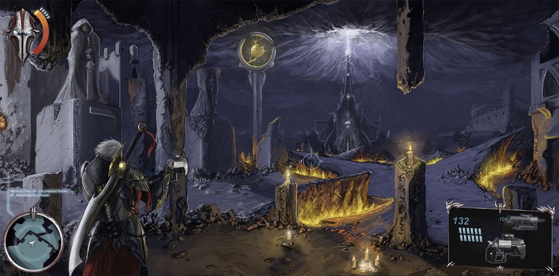
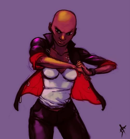
The gun lining up with the pillar is pretty bleh now that I actually see it. Will probably just move him up and draw the rest of him in (and have him put his gun away), might try putting the gun away first and see how it looks. I guess even the gears guys aren't 'aiming' all the time when they are walking around, since they only aim when you hit your trigger after all.

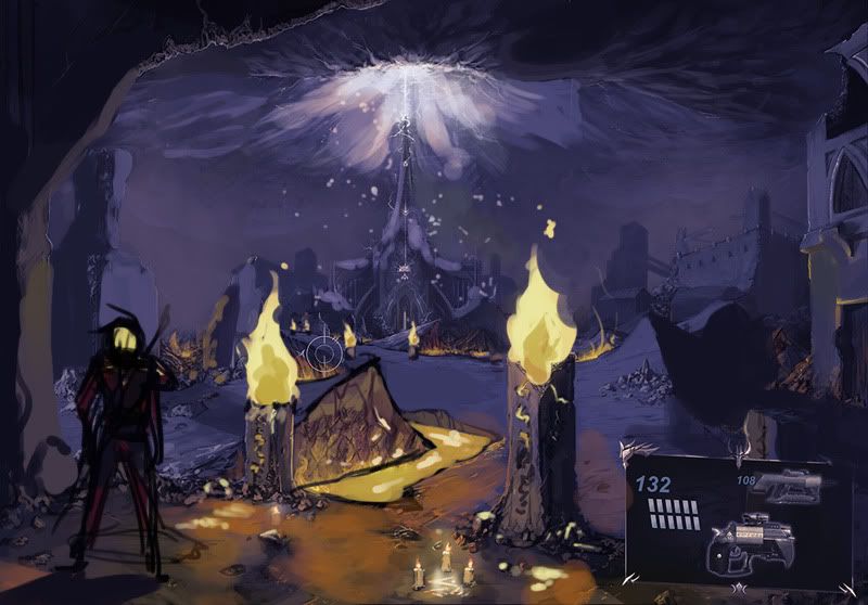
I could have sworn I wrote something here... well I said the piece looks a bit muddy with the left side all dark now and the foreground torches so light. I think I will crop it in a bit from the left and tone down the torches closest to the viewer, and also move the character into the frame more, since if he puts his gun away the pose will be different anyway. Maybe I'll try to clip him out currently so I can use that pose in another piece where he is actually shooting his gun ;)

Was just zoning out during the morning meeting trying to think of compositions, seems like it helps to not have a set frame in front of me, or a set frame at all, and just try to frame around the subjects in the piece, rather than having a set frame and putting the piece inside of it. Also, was thinking about pushing the story/fiction behind images a bit more before starting to comp them, to make sure the story and narrative is front and center, moreso than now.

Don't know why I've been set on keeping a rigid 16:9 frame all the time, definitely hampers creativity. Probably because I always do quick comps on wide sticky notes, lol.

Wow, breaking the 16:9 frame is great, I have so many good comps here (well maybe, framing around the focus makes it a lot easier). Been putting my ideas in the box of having the character in the foreground and not framing around the subject. So bad.

So taking stock of my environments and planned environments I have:
A corrupted city
A lava/hellscape cavern
A water overlook with a giant geometric colossus in the background
the interior of said geometric colossus

want to do another or a couple (would prefer if total portfolio was 15), was thinking of an arctic structure... I have something in mind, but I think that will contrast pretty well with the rest.
 

SovanJedi

provides useful feedback

I LOVE this chap! I think his name should be Enrico and he waxes his moustache every day. All the other drawings are simply wonderful too. Awesome style.

You mean Southampton in the UK, right? Where and when is the exhibition going up? I might have to toddle along to have a look when it does.
 

Vespa

Member
I love how you're taking feedback and improving your art, daedalius! And thanks to everyone posting crits, love to read how people tackle conventions.

More speedy junks-
537skyshipflat.jpg


536pipe_enviro.jpg


962topdown_small_flat.jpg
 

daedalius

Member
I love how you're taking feedback and improving your art, daedalius! And thanks to everyone posting crits, love to read how people tackle conventions.

I've noticed getting more people to look at and crit my stuff usually leads to better results ;)

Will post an update before I goto bed... been 'researching' painting car materials in Forza 3. Orrrr not, tablet appears to be angry and requiring hoops to be jump through.

Phandy, if you get a chance, will you let me know what kinds of materials and render settings you use for your rough 3d base? I am going to do something like that soon, and the way yours renders out is obviously perfect to lay linework over.
 

Phandy

Member
Phandy, if you get a chance, will you let me know what kinds of materials and render settings you use for your rough 3d base? I am going to do something like that soon, and the way yours renders out is obviously perfect to lay linework over.

Er, I'm using v-ray in 3ds max I think, for rendering. But honestly, it was a lot of experimenting with different settings and using online tutorials. I'd never done it before so I had to figure it out. I cant remember any of it and its just a saved profile for me now. Sorry :S.

Just set your render size to really small and experiment. Change some settings and lighting and just do quick renders over and over. :/
 

daedalius

Member
Create a weapon for Darksiders 2 contest

Too bad I can't sculpt for shit yet, lol.

Asked in the FAQ if collaboration is allowed... sigh, no. I don't think I can learn how to sculpt, texture, normal map, etc, well enough in a month to design a weapon. fml

So here are my initial designs for the weapons, moving onto color and paint next, then selecting one to model/texture. Any 3d advice would be great ;)
oh boy, a friend of mine certainly is helpful "the bird one and the ladyface one and the right angle one" /sheesh

ds-weaponcomps_michaelrookard.jpg


And Phandy, I will just mess around a bit like you say; see if I can get something to work well.

Should have an update on my other picture tonight, had to redraw arms and stuff on the character, etc. --

Here it is with... basically all of RS's changes, haha. I didn't crop it in quite as far though, I thought this framed the citadel in the distance slightly better.


Raging Spaniard

If they are Dutch, upright and breathing they are more racist than your favorite player
marco__color_01.jpg


Speedpaint over lunch, if you have the right brushes and add a Gradient map, you can make most quick sketches look kinda polished.

Not too sure I like his wet noodle arms, back in art college I would have to defend them in the "IT'S NOT WRONG IT'S JUST MY STYLE, GOSH" way, but lets be honest, if only one element of your drawing is super stylized, you're doing it wrong.

He's also looking a little Fei Fong Wong, but eh, I can't keep beating myself up!
 

daedalius

Member
Good shit eh?

You'll find that when you use both Maya and Mudbox together you'll have an unstoppable team.

Haha, uh, sure; as long as I can figure it all out!

A good sculpt seems to hinge on having a pretty damn good low poly model it seems, am I right?

There doesn't seem to be a whole lot of poly modeling options in Mudbox, although I wouldn't think there would be since its basically only for sculpting.

Wow painting directly on the model in mudbox... seems pretty cool. Definitely not something for real-time graphics though; this guy hasn't really gone over extracting UVs and hand painting them in photoshop. So I have basically no clue how to do that still.
 
I need some new PS brushes and I suck at making them (I haven't put too much effort into it).

Any advice on some good painterly/concept art brushes?
 

Sofo

Member
I feel a bit ashamed of myself and of my art, but here it goes!


It started as a doodle to hand out my friend code for the new 3DS I just got (too bad you can't even see it now!) and it developed into this taking too much time. Ugh, so many mistakes! But just got tired of reworking them >:
 

Dali

Member
Wow, rtype. I love how intricate your stuff is. Really digging your style.

Foxy Fox 39, I like your style too. I'm not sure if it was something you posted pages ago or not that I said reminded me of someone's style that I couldn't remember. If it was you, then I remember now; His name was Clemet Sauve, RIP.

http://clementsauve.deviantart.com/
 

Raging Spaniard

If they are Dutch, upright and breathing they are more racist than your favorite player
Clement :(

sigh

anyways, new blog post:

shaolin_07.jpg


All out digital sketching has never been my thing. My forte is drawing on paper, then coloring digitally. For a while I thought that it was just a talent thing. That was wrong.

Drawing digitally is like anything else, you suck at the beginning, get better with time. Over the years I've done enough digital correcting that I can draw pretty much whatever digitally, but as farm as building shapes and get proper anatomy down, its been a struggle, so I've been trying to put down the time to get better.

One particular difficulty is the drawing angle. Proper anatomy is perceived differently depending on what angle you're looking/drawing it from. When you learn how to draw traditionally you're looking down at the paper, usually in an angle, but when you draw digitally you're looking straight at a computer screen, meaning that the way you draw people changes slightly.

As far as the digital process itself, I've been holding out for a pencil-esque brush i actually liked ... but to this day it hasn't happened. that's when I started to understand that digital sketching has to be played by its own rules instead of trying to translate the analog process. Sometimes I'll play with a hard brush, sometimes with an opacity one, you can erase your lines when you don't want them, retrace them in a different layer, put the lineart on multiply and instead of erasing the line chisel it with a white brush, maybe paint out a black silhouette and then break down the shape with white later on to find something interesting underneath ...

Digital drawing is not a replacement, its just a different tool now when I don't feel like going analog and scanning ... just don't expect to be good at it right away just because you're a skilled analog artist, you start from zero.
 

Phandy

Member
Yeh digitals sketching is really tough for me. I just can't quite get used it, its leagues behind my pencil sketching. For me its the handling on pressure and especially the lean/different grips you can get with a real pencil/paper.
But like you said, I'm starting to not try and draw the same way, I feel like I approach it more like painting. I abuse the eraser and do a lot more 'negative shape' type work, where I work back against the lines to create the right shapes. Still not perfect though, always makes me mad trying to sketch in PS.

Also <3 Clement Suave so bad,
and Jaime Jones is the nicest guy I ever met, the whole time he was being modest about how he just rips off Craig Mullins, LOL. What a guy.
 

daedalius

Member
So guys, Maya sucks for modeling.

Silo is pretty sweet though.

I'm the opposite of you guys, I think my traditional sketching is actually behind what I can do digitally most of the time; however I do feel boxed in sometimes by the screen on my tablet. All of those weapons I did I sketched on sticky notes before i took them into PS and drew over them though.

Having some serious edges being left open in silo preventing me from bringing them into mudbox... WHY?!

AnCv9unCIAATDmc.jpg
 
Top Bottom