ganbareneopokekun
Member
olympia, your work is awesome! i love your style already
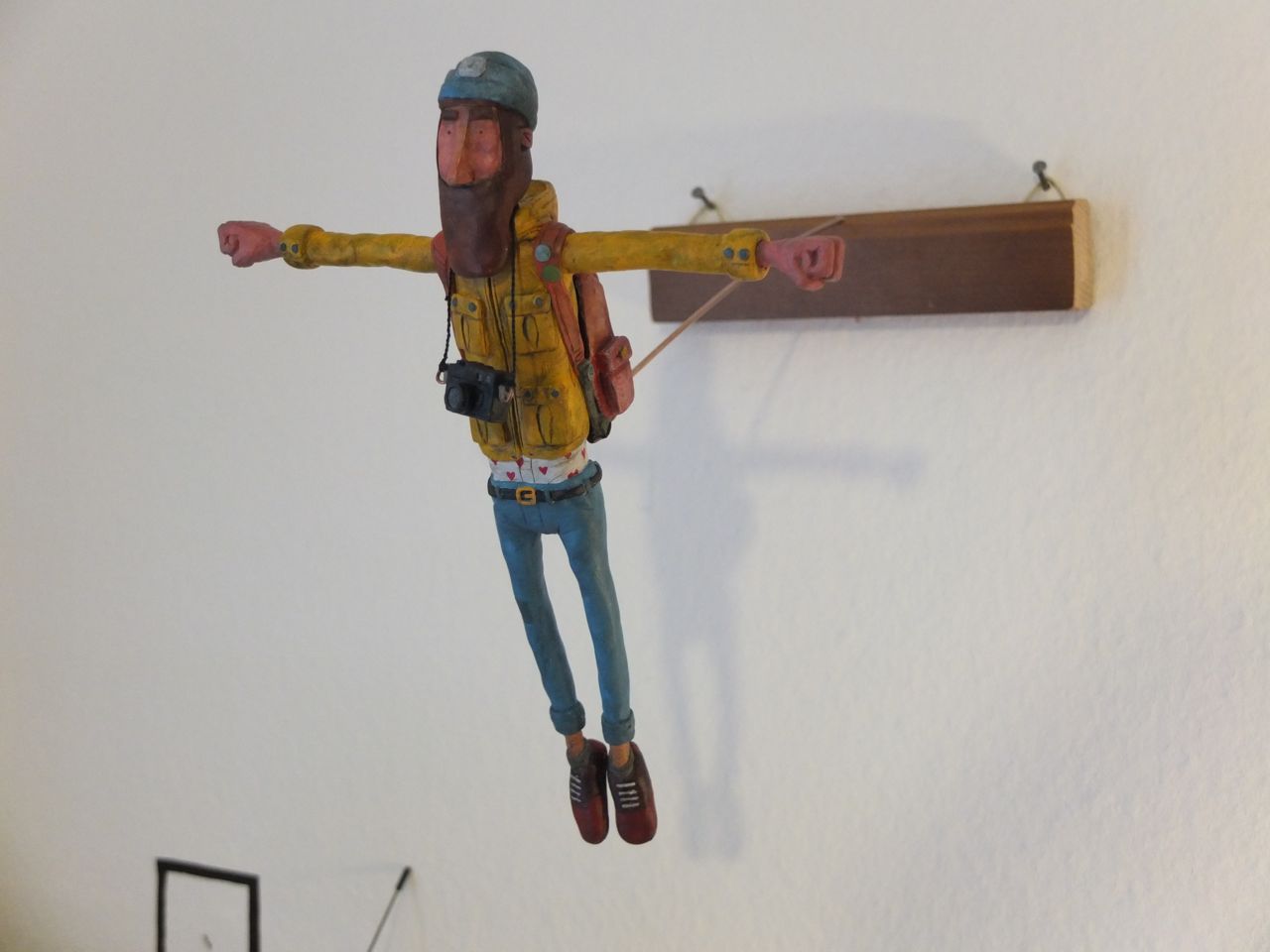
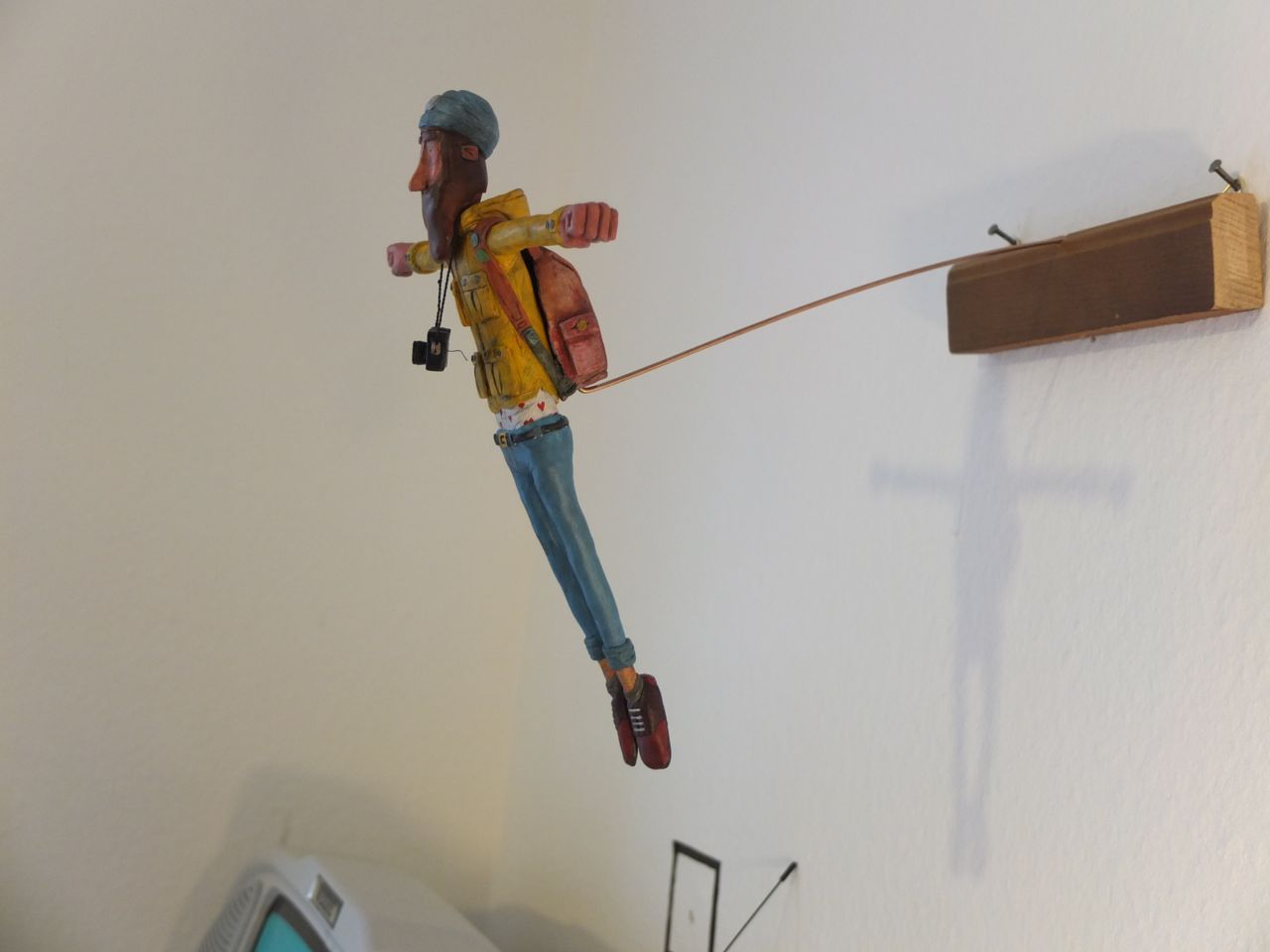

finished one sculpting project, feelsgoodman.jpg
Love it. What materials?

thanks ;D!
super sculpey (the grey one) and inside the figure is a skeleton made from steel wires
i switched to the skin colored one after this sculpt, kinda felt easier to work with
i also used warhammer paint for the coloring, i only have 4 colors, though.
Very nice. What is the rough size?
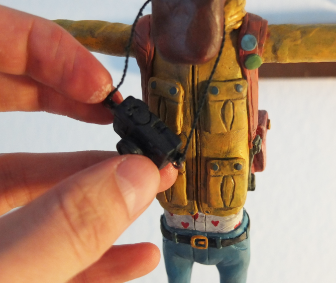
the figure is about 25cm (9.84 inch) tall,


1- I already started painting with pencil sadly, what can I do to give the drawing a more professional look?
2- What am I going to do for a background? I'm thinking of either give it a soft grey watercolor background, mainly to stop the imperfections and dirt of the Paper. Or using Oil Pastel (well Crayons...) on the background.

Love your stuff Daedalius. Please bless us with more high quality art anything you wish. Just magnificent.
(Crosspost from Mental Health thread)
I just started this last one, it's going to be a literal 'little black book', I'm trying to make everything black. Including the glue. It's not practical per se, but a fun project.


What do you guys think it's the fastest/most efficient way to build perspective lines in photoshop? For either 1 or more vanishing points structures.
The end result should had every part as dark and smooth as the King and his arm.
What do you guys think it's the fastest/most efficient way to build perspective lines in photoshop? For either 1 or more vanishing points structures.
Yup, this works flawlessly, thanks.Probably Snap to Grid > Pen Tool > Stroke Path. Just put all of the perspective lines on a separate layer with low opacity.
The shift+stroke is what i was using, though it's annoying, because sometimes you want to start from the vanishing point and actually see where the line goes, given a middle point.I usually just draw them. If you hold shift, you get straight lines. Draw a spot and then move the cursor where ever you need while holding shift and click again.
There's a fancier way too with the polygon tool. Change it from polygon to "star", put indent to 99% and add sides (something like 50-100). Then just make a few of these stars and you'll see that where they intersect they form a grid.

I usually just draw them. If you hold shift, you get straight lines. Draw a spot and then move the cursor where ever you need while holding shift and click again.
There's a fancier way too with the polygon tool. Change it from polygon to "star", put indent to 99% and add sides (something like 50-100). Then just make a few of these stars and you'll see that where they intersect they form a grid.
Nope
Make a new layer, go to filter > vanishing point
Youre welcome
Nope
Make a new layer, go to filter > vanishing point
Youre welcome
Here are my latest drawing dumps from last week. Most of them are subway drawings save for the bear and the last person. The bear is a statue that's on display at The Met (a popular museum in NYC for the uninitiated) which I should've drawn using a pencil and eraser to get all the values properly (the one drawback of drawing in pen); the last one is my oldest brother who I drew yesterday (he looks a bit like a cyclops I noticed). I had the most fun drawing the first dude with the guitar bag and the person with the jacket over his head:
I remember you posting some stuff from way back. I can see some improvement. Keep it up.


Those are some excellent studies my homie. How long did it take? I have to do some for my course, but I havent started yet.
Here's some of my stuff

I'll post some ballpoint sketches soon.
Haven't posted in a bit so somewhat of a dump:
Hey, wasn't this done for the Girl Fact+Fiction exhibition at Light Grey Art Lab? Your piece was one of my favorite. Really digging the style and colors.
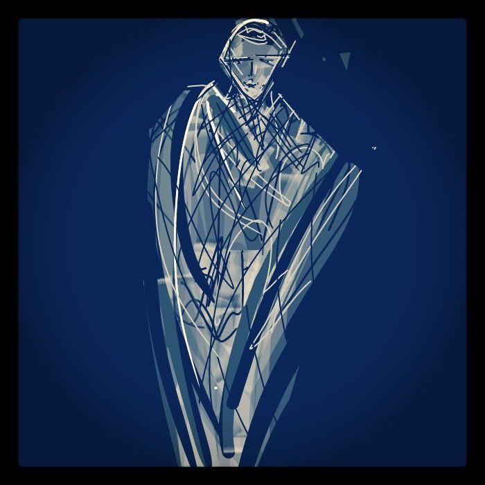
i know this makes little sense
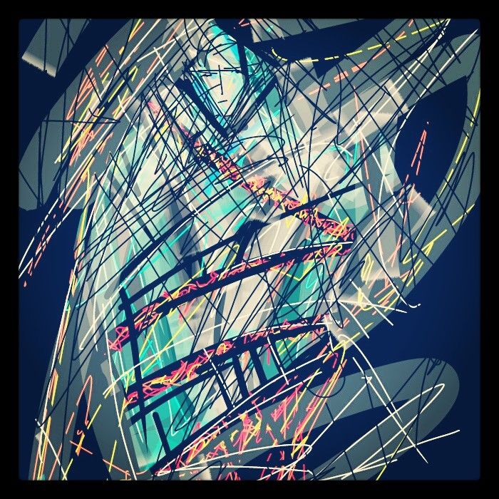
i know this makes little sense
Those are some excellent studies my homie. How long did it take? I have to do some for my course, but I havent started yet.
Relatedly, here's a WIP:
Here's a sketch I did of a minimart I did while my friends were buying drinks.
PS: Thanks for the love at my previous post. Ya'll are too nice.
Anyway, that's about it. I guess what I'm wondering is what does a fresh pair of eyes, especially an artist's eyes, see?
Feel free to be brutal. It needs it.