WadiumArcadium
Member
Next up is Black Widow.
Waid and Samnee? I'm loving it so far. I tried the first five issues or so of Edmonson and Noto's run on Marvel Unlimited but I couldn't get into it. This has been the opposite.
Next up is Black Widow.
Havin a Moonknight Netflix show could be done fucking amazing with a big CGI Budget.
Would be amazing if they could do one.
Edmonsons Run. Have that trade for months on my Backlog.Waid and Samnee? I'm loving it so far. I tried the first five issues or so of Edmonson and Noto's run on Marvel Unlimited but I couldn't get into it. This has been the opposite.
Sounds great, but you have to do these scenes where Khonsu pulls him to eagypt with CGI.Nah, brah. Get Guillermo Del Toro on that shit and go with puppetry. It would be amazing.
Batman's Marvel is no Marvel I want to be a part ofSounds great, but you have to do these scenes where Khonsu pulls him to eagypt with CGI.
Well done he could really become Batmans Marvel.
ah gotcha, I guess I was reading into your question wrong
Yeah definitely agree about Quitely. Even in his lesser work like New X-Men always contained some really interesting pages. One thing that I think is kind of rarely discussed about Quitely is that his work is actually really hard to draw. I mean taking away all his ingenuity and design that really pops in something like We3, his sense of space, in particular the way planes face and interact with each other, is remarkable.
There are very few artists that create consistently interesting relationships between their shapes and planes. Moebius and Darrow both have that quality; I can't really think of others.
Quitely also has amazing sense for eye direction. As an example, Ive added my notes on why this page works, its the opening page of his New X-Men run.

Think of what this page accomplishes.
Wolverine attacking sentinel in background. Cyke attacking the head of the severed head of the sentinel which is on the ground, the mutant they are saving is under the hand of the destroyed sentinel, and the location is easily set with an understated background. A clear sense of scale and position is established. All of that in a splash page that is super easily readable. Its fucking masterful. Most artists can't pack that much info into a 5 panel page without fucking it up.
But sure, people look at his faces and ask why his women aren't pretty. As if Quitely were interested in romanticizing human faces. To get back to Jupiters Legacy, yeah I agree that you don't really know where its going until the end. It left me hungry for the next installment but not unsatisfied. Tricky thing, that.

So good and nobody believes me
Absolutely not. I've said before that it's amazing.
I was probably talking about valiant and you got confused.
lol
Was not a fan. BKV never gave me a reason to care about any of those people.
Well done he could really become Batmans Marvel.
American Alien's last issue was kinda meh compared to the rest of the series, which also means the issue is still good. Not sure whywas in it though. Sometimes it seems like Landis just likes to throw random DC characters in the mix of his stories to show he "gets them" too. It worked with Dick and Oliver Queen in issue #4 I think but that time Deathstroke showed up, and nowLobo, I'm just like, huh?Lobo
"I don't hate Jupiters Circle
It's not good
But I don't hate it"
Help I was hacked
Figboy, congrats! I'll check it out.
I missed the Quitely lovefest, how sad.
You should do more of these annotated posts though ed, that was awesome. As a counterpoint you should pick a shitty artist like Brett Booth or Tony Daniel and pick it apart.
ah gotcha, I guess I was reading into your question wrong
Yeah definitely agree about Quitely. Even in his lesser work like New X-Men always contained some really interesting pages. One thing that I think is kind of rarely discussed about Quitely is that his work is actually really hard to draw. I mean taking away all his ingenuity and design that really pops in something like We3, his sense of space, in particular the way planes face and interact with each other, is remarkable.
There are very few artists that create consistently interesting relationships between their shapes and planes. Moebius and Darrow both have that quality; I can't really think of others.
Quitely also has amazing sense for eye direction. As an example, Ive added my notes on why this page works, its the opening page of his New X-Men run.
Think of what this page accomplishes.
Wolverine attacking sentinel in background. Cyke attacking the head of the severed head of the sentinel which is on the ground, the mutant they are saving is under the hand of the destroyed sentinel, and the location is easily set with an understated background. A clear sense of scale and position is established. All of that in a splash page that is super easily readable. Its fucking masterful. Most artists can't pack that much info into a 5 panel page without fucking it up.
But sure, people look at his faces and ask why his women aren't pretty. As if Quitely were interested in romanticizing human faces. To get back to Jupiters Legacy, yeah I agree that you don't really know where its going until the end. It left me hungry for the next installment but not unsatisfied. Tricky thing, that.
Help I was hacked
Figboy, congrats! I'll check it out.
I wanted to wait for the Deluxe... But at some point I will break and just buy it. Its such a wonderful book...Now that I'm home and have it handy, my favorite Quitely page. It's nothing flashy, just a boy and his dog.
Now that I'm home and have it handy, my favorite Quitely page. It's nothing flashy, just a boy and his dog.
Shhhhh. There is only Overwatch now.
Batman's Marvel is no Marvel I want to be a part of
Doom is filling in until Overwatch gets here. It's actually really good. It's stupid, but it's the best kind of stupid.
Between these two, 2016 is the year to Make FPS Great Again.
I'm going to start Doom tonight before the Raptors continue to pretend they are an nba team.
This is amazing. I did something like for a Sean Murphy Hellblazer page ages ago, lost to the wilds of time I suppose.
I missed the Quitely lovefest, how sad.
You should do more of these annotated posts though ed, that was awesome. As a counterpoint you should pick a shitty artist like Brett Booth or Tony Daniel and pick it apart.
I would argue that comics art is unlike any other type of art due to its innate functionality. Sure, one could argue all art tells a story, but comic art serves a story above all. Or rather, good comic art serves a story well. The technical rules to good art apply themselves in a warped fashion. Comics is like some punk bastard child with an abstract sense of what constitutes technically sound art. No image save maybe splash pages is meant to stand alone. All panels work within context.
One of the recent comics Ive had the pleasure of reading is Remenders Uncanny X-Force. Particularly, the first story arc, The Apocalypse Solution. For this article, Ill be looking analysing Openas pencilwork and Dean (da God) Whites amazing colors and how the art serves the direction of the story.
Page 1: Inversion
We dive into the story.
The page has two vertical panels.
The colors pull attention where the artists want it to. In the first panel, Deadpools cool white colors stand out lightly against the green while the reds in the eye and the Xs contrast heavily. Deadpool stands atop the panel, and thats where details are concentrated. The joke sets up.
The composition of the first panel is reversed and the joke is delivered. Deadpool has dived down and is in midair at the bottom of the panel. The green cascades down from the top now rather than falling down.
One strange detail I noticed is Deadpools odd perspective in relation to his jumping point. If you traced his trajectory to a jumping point, the point doesnt make sense for him to fall from in relation to the structure behind him. Just an odd thing for Opena to miss.
Page 2:
5 panel structure with of varying sizes. The biggest one is the second panel.
The first panel is a ho hum continuation of the first page action.
The second panel has great, great composition. It is a phenomenal panel. Deadpools pose is static after a state of dynamism. The whole focus of this structure is the small door at the bottom of the inverted pyramid. Its the next point in the story and this panel does a great job of subconsciously letting you know that.
Just look at how many things are pointing to that tiny little door or how things point to things that eventually point to the door. The vibrant cascade that falls from the statues mouth meets Deadpools body whose limbs extend out to the door. The swords he holds point to the door. The green lighting shines brightest at the door. The pyramid is upside down so the edges point toward the door. Everything points to the door because thats where the story is going. Good comic book art communicates where the story is directed.
The third, fourth and fifth panel are of the same size in a comic where panel sizes vary widely. When this happens, it is because the creators are establishing a pattern so there may be a twist. Panel 3. Deadpool skips towards the door. Panel 4. Deadpools enters through the door. A large statue is situated above the door. Since the statue is the dominant figure in the panel where lines do not converge to a point, we know that the statue is the focus of this panel. not Deadpool. Panel 5, focus is maintained on the door. the twist is the statue isnt a statue at all.
You can think of three panels at the end of a page like a joke. There is a build up of expectation and there is a twist. We could really begin at panel 2. Our destination is set past the door at the base of the inverted pyramid. Panels 3 and 4, we travel to our destination. Panel 5. There is a danger after passing the door that our protagonist knows nothing about. This creates dramatic irony and advances the story.
I'm going to start Doom tonight before the Raptors continue to pretend they are an nba team.
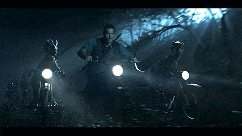
Raptors can't play basketball. They should stick to motorbikes.
ah gotcha, I guess I was reading into your question wrong
Yeah definitely agree about Quitely. Even in his lesser work like New X-Men always contained some really interesting pages. One thing that I think is kind of rarely discussed about Quitely is that his work is actually really hard to draw. I mean taking away all his ingenuity and design that really pops in something like We3, his sense of space, in particular the way planes face and interact with each other, is remarkable.
There are very few artists that create consistently interesting relationships between their shapes and planes. Moebius and Darrow both have that quality; I can't really think of others.
Quitely also has amazing sense for eye direction. As an example, Ive added my notes on why this page works, its the opening page of his New X-Men run.
Think of what this page accomplishes.
Wolverine attacking sentinel in background. Cyke attacking the head of the severed head of the sentinel which is on the ground, the mutant they are saving is under the hand of the destroyed sentinel, and the location is easily set with an understated background. A clear sense of scale and position is established. All of that in a splash page that is super easily readable. Its fucking masterful. Most artists can't pack that much info into a 5 panel page without fucking it up.
But sure, people look at his faces and ask why his women aren't pretty. As if Quitely were interested in romanticizing human faces. To get back to Jupiters Legacy, yeah I agree that you don't really know where its going until the end. It left me hungry for the next installment but not unsatisfied. Tricky thing, that.
I missed the Quitely lovefest, how sad.
You should do more of these annotated posts though ed, that was awesome. As a counterpoint you should pick a shitty artist like Brett Booth or Tony Daniel and pick it apart.
Jurassic World was so dumb that i forgot the raptors didn't have motorbikes when looking at that gif. "Yep, that's jurassic world."
. Going to start using the library while I have the chance this summer. Unfortunately their cape stuff is literally 90% X-Men or Spider-Man.They also have all the Absolute Sandman's, which I'm absolutely going to start reading.
BP 2 gets a 2nd printing with a Run the Jewels cover.

I'm still holding a grudge over the older brother character and The Raptor Squad, maybe the pro chopper pilot.I liked it. But it would have been even better with Raptors on motorcycles.
On a side note, I never read Rage of Ultron. Tbh I didnt know Remmender and Opena were on it and after the horrible Age of Ultron comic from Bendis I was not about to check RoU out. How was it received on here? About to order it on Amazon with the Uncanny Avengers omni.
Anyone read Uncanny Avengers #9? I dropped it after issue 3 because I wasnt a fan of the art at all or the first story arc but was very surprised with this new arc after hearing about on Kotaku of all places. The art is great and this new story line could be really good. Only issues I had with it were Rogue and Gambits designs. Wish Remmender was still on it though.
On a side note, I never read Rage of Ultron. Tbh I didnt know Remmender and Opena were on it and after the horrible Age of Ultron comic from Bendis I was not about to check RoU out. How was it received on here? About to order it on Amazon with the Uncanny Avengers omni.
On a side note, I never read Rage of Ultron. Tbh I didnt know Remmender and Opena were on it and after the horrible Age of Ultron comic from Bendis I was not about to check RoU out. How was it received on here? About to order it on Amazon with the Uncanny Avengers omni.
Anyone read Uncanny Avengers #9? I dropped it after issue 3 because I wasnt a fan of the art at all or the first story arc but was very surprised with this new arc after hearing about on Kotaku of all places. The art is great and this new story line could be really good. Only issues I had with it were Rogue and Gambits designs. Wish Remmender was still on it though.
On a side note, I never read Rage of Ultron. Tbh I didnt know Remmender and Opena were on it and after the horrible Age of Ultron comic from Bendis I was not about to check RoU out. How was it received on here? About to order it on Amazon with the Uncanny Avengers omni.
The best, and my favorite Quitely page. Simple, soulful, beautiful.
I quite liked Rage of Ultron but the way Remender wrote Hank really bugged me especially after reading Avengers A.I. The art is godlike.
Man, avengers ai was some flash in a pan stuff. Only really good thing that writer ever wrote, and he nailed it with almost the whole cast.