Definitely the ugliest PS4 retail game. I hope Sony didn't pay too much for this crap.
I'm sure the compression doesn't help
Definitely the ugliest PS4 retail game. I hope Sony didn't pay too much for this crap.
Definitely the ugliest PS4 retail game. I hope Sony didn't pay too much for this crap.


Pretty ridiculous.
Amazing AI.
This one came around the corner and walked directly into a crate rambling on about how much she'd love a cup of coffee.. I went off and picked a lock, looted a house, and on the way back she's still there walking into the crate going on about the miserable weather now.... if she's there next time i enter that area, she's getting an arrow directly into her eyeball.

It's not that bad. It looks pretty sharp and crisp on my TV. The issue I have is that sometimes during cutscenes, the framerate will dip, but during the actual fighting, the framerate seems rock solid. The fighters look pretty good, but the NPCs look like booty. It's certainly no Killzone or ACIV (and ACIV isn't really that amazing looking, but the environments are great)
Amazing AI.
This one came around the corner and walked directly into a crate rambling on about how much she'd love a cup of coffee.. I went off and picked a lock, looted a house, and on the way back she's still there walking into the crate going on about the miserable weather now.... if she's there next time i enter that area, she's getting an arrow directly into her eyeball.

not the best quality because i dont own any sort of capture device. frames taken from game DVR uploaded to onedrive.
microsoft really needs to get working on some sort of snapshot feature.
I've played it and could barely tell it was 1080p because of how damn ugly it looks. Being crisp just really shows how poor the art in that game really was. You could tell me these screens are from the PS3 or Wii U versions and I'd believe you.

*shrugs* To each his own. I've seen and played worse looking games on the PS4. As I said before, I think the character models look good, except for some of the women's faces (mainly Wonder Woman and Raven's), and the environments are really nice as well. The fighting is a lot of fun, better than I was expecting, honestly.
Harley victorious:

I was really impressed with this sequence.
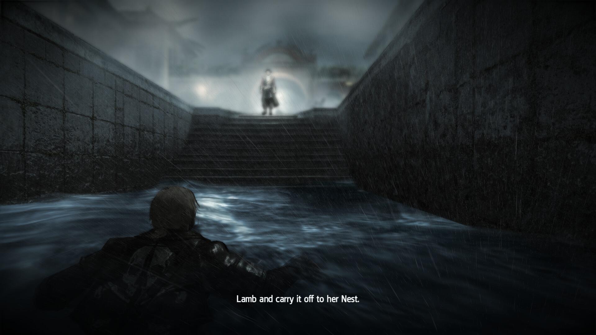

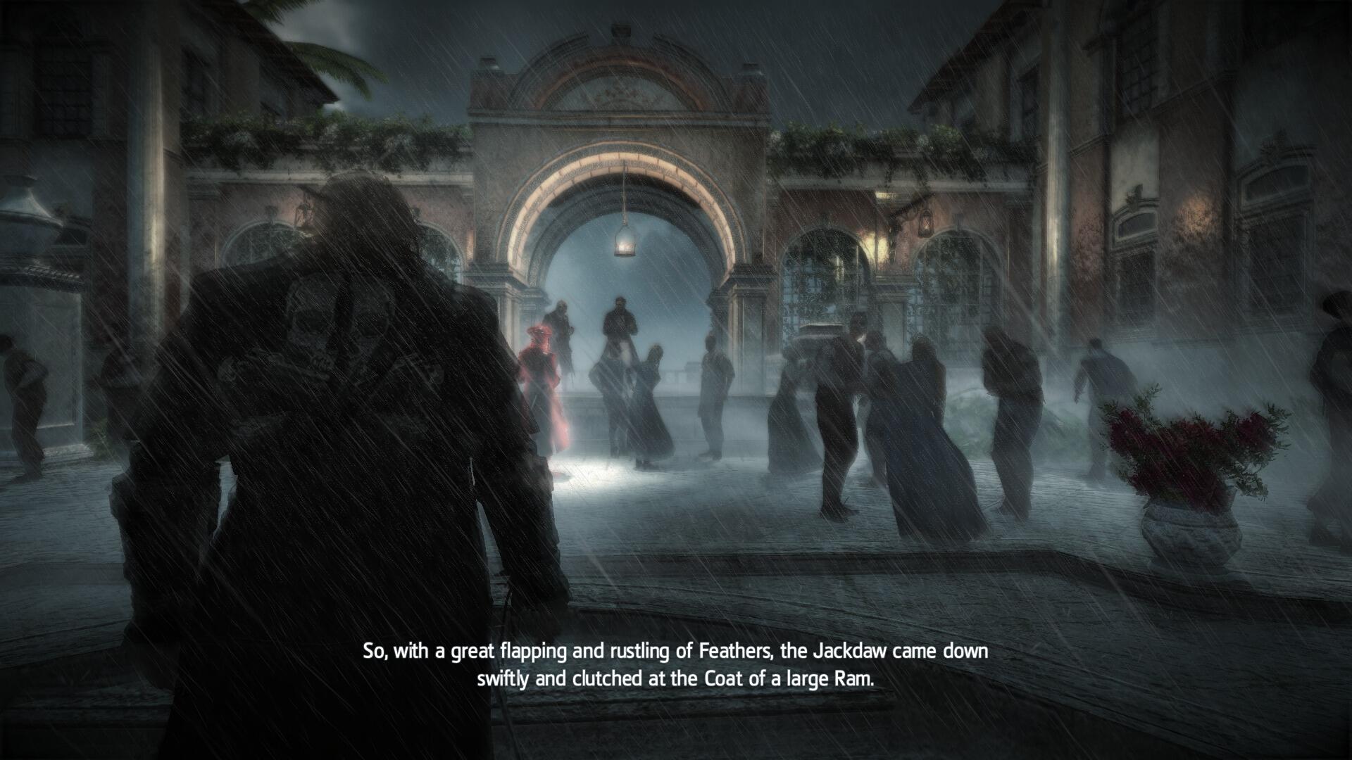
Your screenshots aren't exactly helping your argument. I dare say this is the worst looking game in the entire thread.


They do if you have a good capture card.=pand the games often don't look as great in screens as they do on a TV. Even the amazing Killzone screenshots from this thread look better on screen.
As was I. Loved it and moments like it, think we certainly need to see more moments like it. Going to do a retrospective thread about AC4 and am certainly going to talk about that sequence.I was really impressed with this sequence.


They do if you have a good capture card.=p


Unlike most people here, I quite love this game. It's easily one of the best (and best looking) Wii U games. I'm also not really into Sonic games, always been a Mario guy, but I personally find this one way better than the abomination that was Unleashed, and even Generations. It's a much slower paced and platform-y game than the other recent Sonic games and that's what I like about it. Plus Sonic gets all of his moves right from the start, no need to buy/unlock them or any of that leveling BS.Do you like this game? I just bought it on Amazon because it was only $29.99, but I still have time to cancel it if it's not good. I love 3D platformers, but haven't been very into most Sonic games, if that gives you some perspective.


Unlike most people here, I quite love this game. It's easily one of the best (and best looking) Wii U games. I'm also not really into Sonic games, always been a Mario guy, but I personally find this one way better than the abomination that was Unleashed, and even Generations. It's a much slower paced and platform-y game than the other recent Sonic games and that's what I like about it. Plus Sonic gets all of his moves right from the start, no need to buy/unlock them or any of that leveling BS.
So yeah, I'd say go for it.

Played some Ryse MP for the first time in awhile today

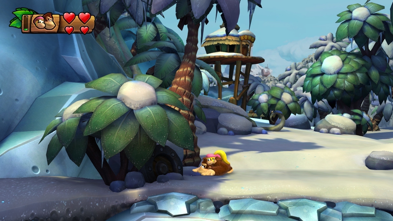
Whatever art designer decided to make that dual mace out of two pufferfish jammed on a stick, he deserves a damn raise. It's clever, it's funny, and it ties in with the pufferfish from the underwater level. Top notch creative work.
Even the amazing Killzone screenshots from this thread look better on screen.
They do if you have a good capture card.=p
Do you have 120 bucks to spend?=Ono Powerstar Golf in this thread? i have literally the worst shots to show it off, but something is better than nothing.
who wants to buy me a capture card. i'll quit shitting up your thread not the nicest looking game to begin with i guess. it gets the job done.
Ha! There's also an enemy named "Chum Chucker Charlier," who, well, chucks chum.Liabe Brave said:Whatever art designer decided to make that dual mace out of two pufferfish jammed on a stick, he deserves a damn raise. It's clever, it's funny, and it ties in with the pufferfish from the underwater level. Top notch creative work.
Your screenshots aren't exactly helping your argument. I dare say this is the worst looking game in the entire thread.
An uncompressed screen will always look the same as it does on your display since you are capturing it directly. Everything you see on screen can be captured and replicate what you're seeing. From motion blur to particle effects and such screenshots still capture everything perfectly, using a great capture card makes it more simple as well. My Ryse screens are proof of this.a screenshot is hardly a valid way to judge or compare graphics nowadays. you can point out certain aspects of a games graphics, but while doing that you will always hide others. we have come to a point where per pixel information density is so high, that stills simply aren't a good representation of whats really going on on screen.
ac4 maybe is a good example for that. all the screens of it in this topic look absolutely horrid, yet people seem to be impressed with its graphics.


Seems like when it comes to consoles, a majority of users in this thread post PS4 snaps.
LolOh by the way Frank, I took your advice and saved a ton on my car insurance!
Amazing AI.
This one came around the corner and walked directly into a crate rambling on about how much she'd love a cup of coffee.. I went off and picked a lock, looted a house, and on the way back she's still there walking into the crate going on about the miserable weather now.... if she's there next time i enter that area, she's getting an arrow directly into her eyeball.


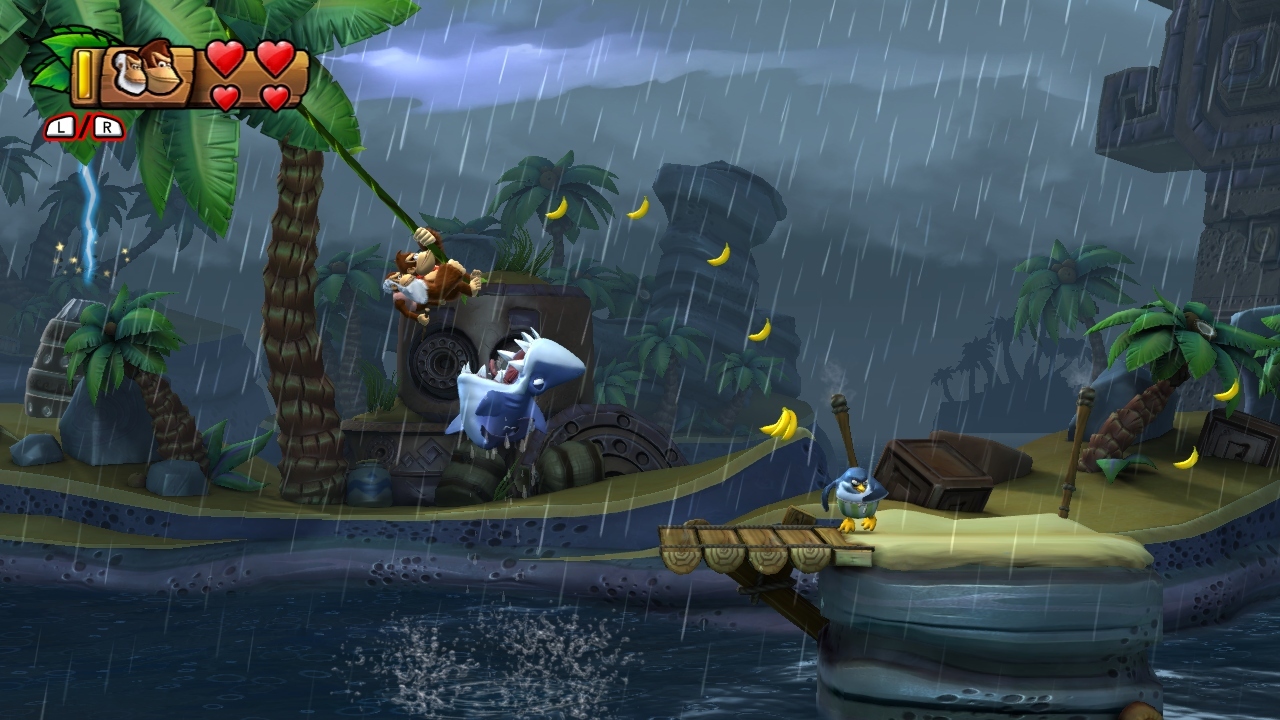
Donkey Kong looks very nice, but I do wish it had some AA. Then it would feel even more solid and real.
I'm not making an argument in the first place. I'm not trying to prove some kind of point about Injustice, I'm just sharing screenshots. PS4 screens are pretty compressed on Facebook and Twitter, and the games often don't look as great in screens as they do on a TV. Even the amazing Killzone screenshots from this thread look better on screen.
I feel your problem is the general art direction of Injustice. That, or you're purposely looking over some of these Thief screen shots.
That golf game looks nice. What system is it for? I like the character designs -- reminds me of Pixar's The Incredibles.
If only Powerstar Golf had a demo.
