You are using an out of date browser. It may not display this or other websites correctly.
You should upgrade or use an alternative browser.
You should upgrade or use an alternative browser.
Consoles screenshots thread (PS4/Xbone/WiiU) [Up: Thread rules in OP]
- Thread starter Peterthumpa
- Start date
thedarknight87
Banned
when a game sacrifices framerate/pop-in/etc to the IQ gods.
Infamous:SS looks better in screenshots than in motion, IMO. Killzone:SF, too, less severely.
Both KZ:SF and I:SS deliver a consistent 30fps with no tearing. For an open world game, it is staggering how little pop-in occurs in I:SS. Did you even play these games or is this another edition of Tales from my Ass?
xenogenesis
Member
Phreakuency
Banned
For an open world game, it is staggering how little pop-in occurs in I:SS. Did you even play these games or is this another edition of Tales from my Ass?
I've been saying the same thing.
For the amazing level of quality they've produced visually, to be able to zoom around the city at a million miles an hour and see almost no pop up/draw in is yet another amazing achievement of the ISS engine.
Excellent in action screenies!
The moment right before you take your phone out, DoF gets activated, you only have a split second opportunity to capture it though.
thx
I've been saying the same thing.
For the amazing level of quality they've produced visually, to be able to zoom around the city at a million miles an hour and see almost no pop up/draw in is yet another amazing achievement of the ISS engine.
Infamous SS is by far the best looking open world game at the moment, but I have to disagree on the pop up part. The game does have a nasty pop up issue where in fact entire buildings LOD pop up in the not so far distance:
http://www.youtube.com/watch?v=6um3XJZE120
TAJ
Darkness cannot drive out darkness; only light can do that. Hate cannot drive out hate; only love can do that.
Infamous SS is by far the best looking open world game at the moment, but I have to disagree on the pop up part. The game does have a nasty pop up issue where in fact entire buildings LOD pop up in the not so far distance:
http://www.youtube.com/watch?v=6um3XJZE120
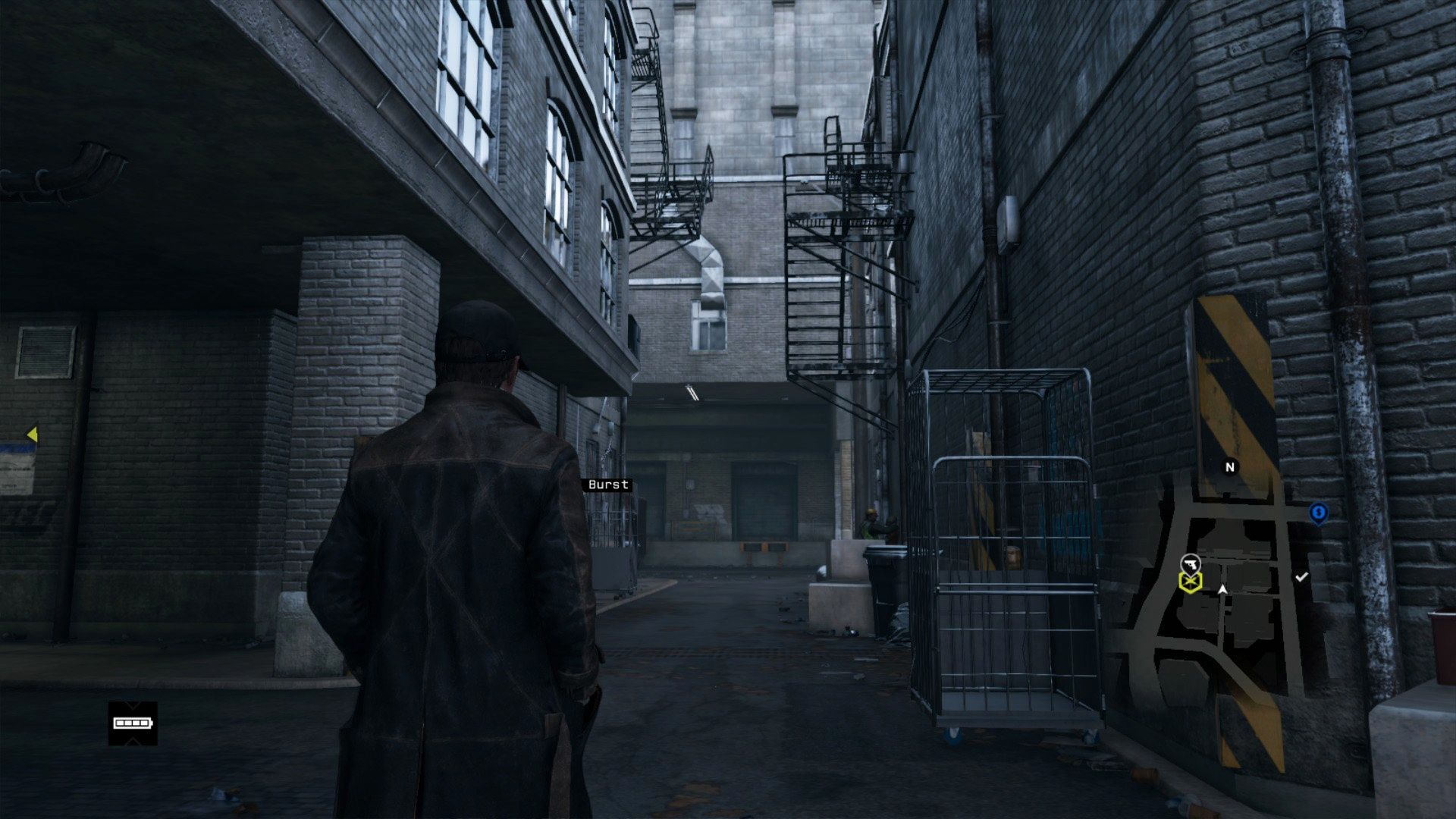
Not nearly as bad as how Watch_Dogs starts looking like Superman 64 when you climb a building.
Not nearly as bad as how Watch_Dogs starts looking like Superman 64 when you climb a building.
Fair enough, wont argue with you there. Watchdogs cannot even be mentioned in the same sentence as infamous when it comes to graphics.
But still infamous had this pop up and LOD thing that could have been better.
liquidspeed
Member
Fair enough, wont argue with you there. Watchdogs cannot even be mentioned in the same sentence as infamous when it comes to graphics.
But still infamous had this pop up and LOD thing that could have been better.
I've only noticed shadows pop in + 1 part of a building in the entire time I've played the game. I've never even seen a car or human pop in. I have lik 700+ screen shots of this game so I've spent tons of time scrutinizing it.
Daffy Duck
Member
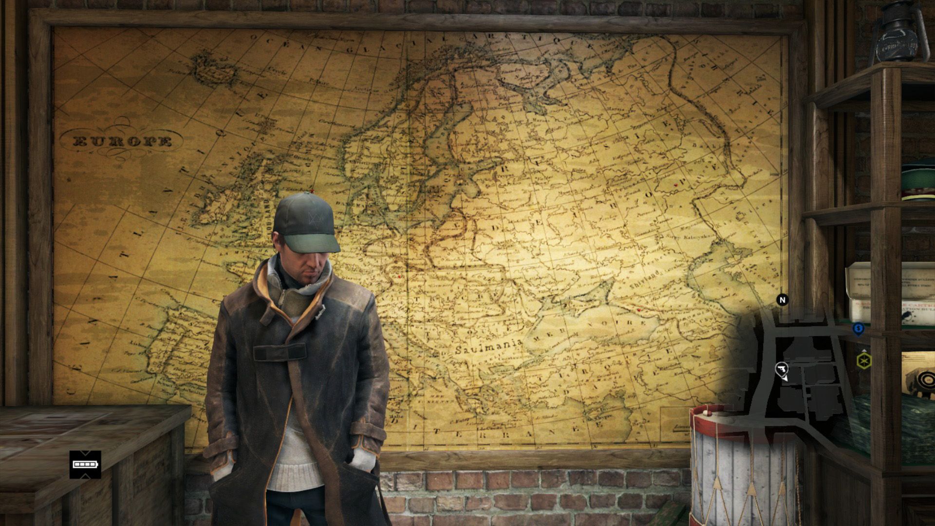
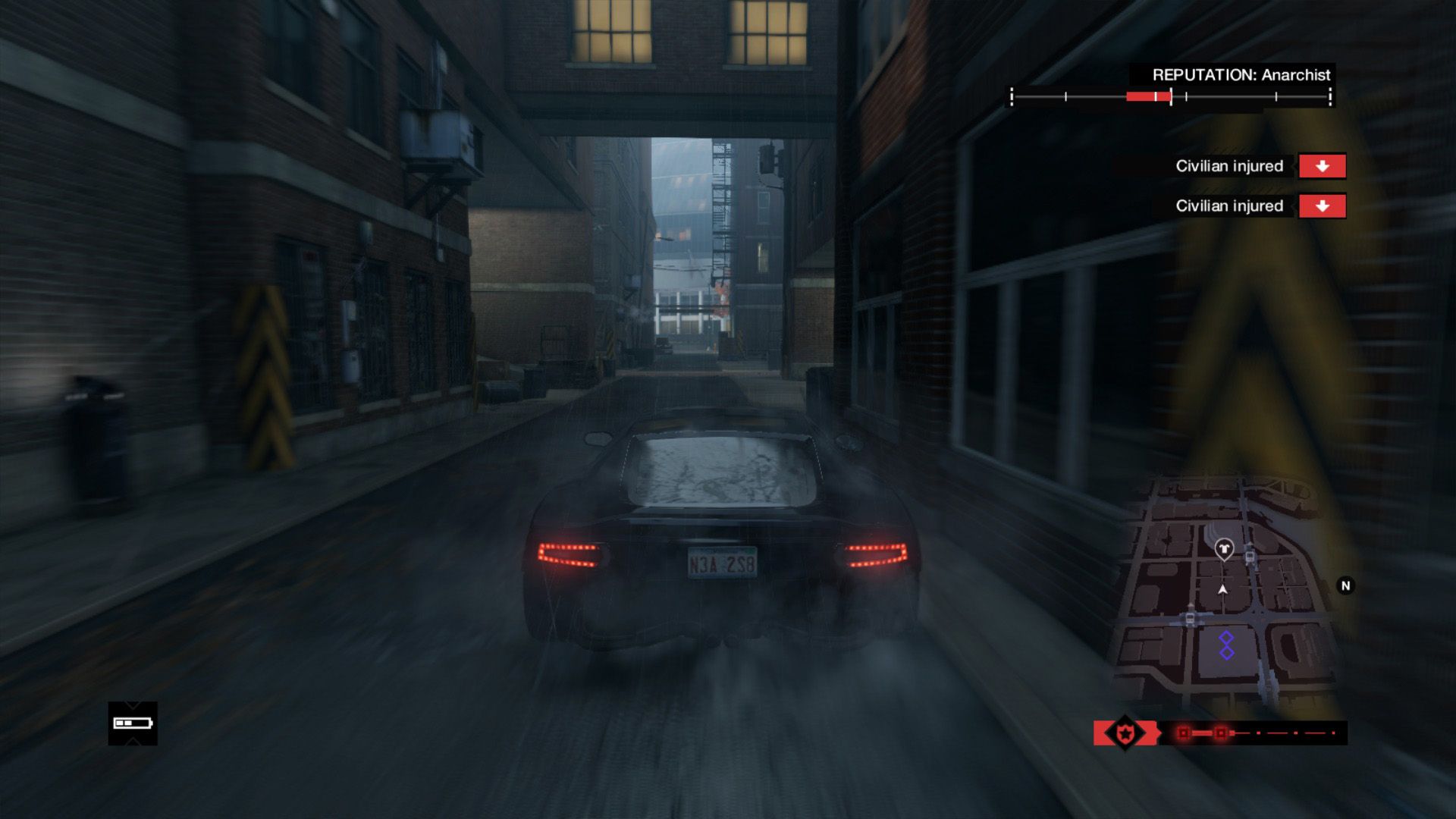
What outfit is that? I want it.
I can't stop looking at his right hand. Is he trying to pull something? I would like to know if this character is a taxi/bus/car driver, but I haven't got the game.A thousand developers and no art director.
That looks like assets cobbled together from three or four different games.
I've only noticed shadows pop in + 1 part of a building in the entire time I've played the game. I've never even seen a car or human pop in. I have lik 700+ screen shots of this game so I've spent tons of time scrutinizing it.
Its there man, the fact that you simply did not notice it doesnt mean its not there.
Play the game again and pay attention to something in the distance, walk towards it. You'll see that LOD pop up textures is quite noticeable.
But I stress it again, this is kind of nitpicking considering infamous SS is a launch window title... the gfx are out of this world and yes this minor hiccup doesnt take away anything from this game.
SmokedMeat
Gamer™
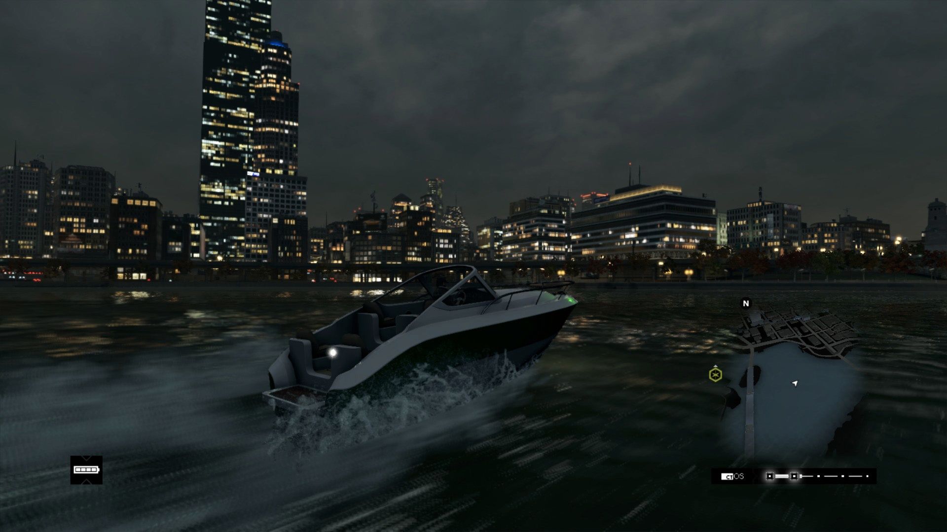
Watchdogs looks pretty good. I might have to grab Wolfenstein tonight, I'm itching for a new shooter.
Soren01
Member
What outfit is that? I want it.
Anarchist outfit.
thebesttheworst
Member
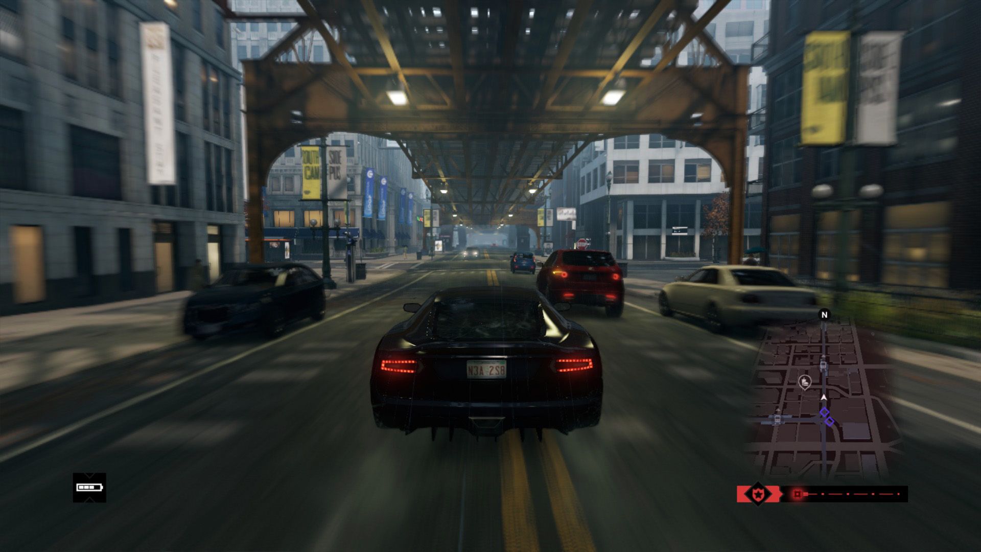
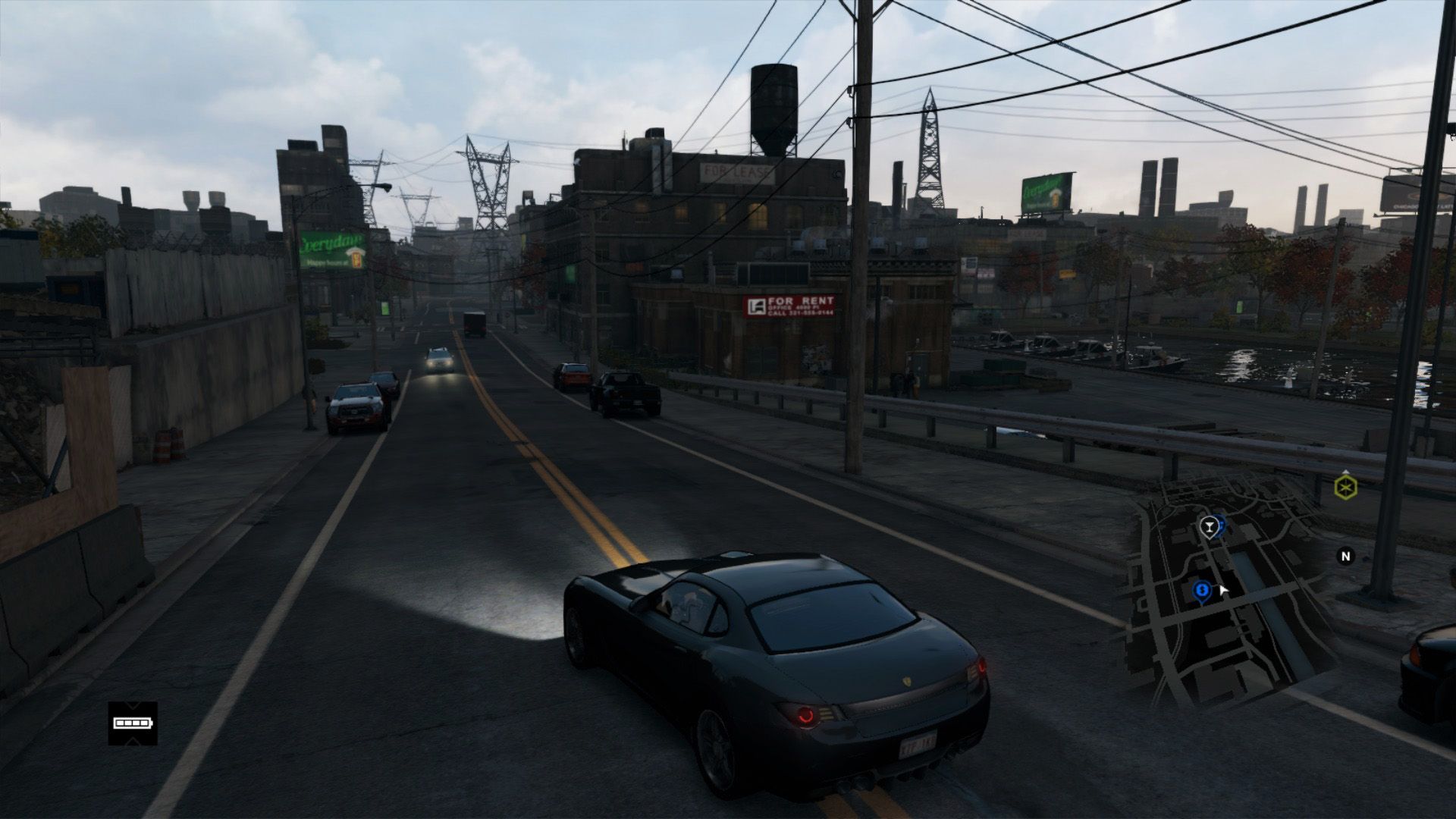
Watch Dogs PS4

Haha this is the opposite end of the scale then.
MaximusPayne
Member
So how are Watch Dog graphics compared to Black Flag on consoles?
StreetsAhead
Member
WeAreStarStuff
Member
Some of these WD pics are making me want to break my 'not buying a sub native res' game on PS4 stance.
FFXIV PS4:


The problem with this game is that it leaves me no time to play anything else.
FFXIV PS4:


The problem with this game is that it leaves me no time to play anything else.
Morrigan Stark
Arrogant Smirk
Sorry if I sound ignorant, but can anyone explain to me why DoF(or, rather, blurry backgrounds) is a desirable thing? Is it just to make it more "film" like?
StreetsAhead
Member
Jimmyfenix
Member
A wild Mario Kart appears!
megabytecr
Member
Can´t wait for MK8 late tonight! Great Pics!!
Some fantastic shots from the last page guys!
-
It looks like a lack of *anti-aliasing in MK8 really doesn't translate well into screenshots :/
*oops
Out of Working Order
Member
royox
Member
Shame about the jaggies in MK8, though the game is still great for screenshots. I may not even get my copy tomorrow and maybe next week so my uncompressed screens will have to wait until then.
Yep.all these screens are really making me want to get an Elgato. does it work on PC too?
Some fantastic shots from the last page guys!
-
It looks like a lack of aliasing in MK8 really doesn't translate well into screenshots :/
I think you meant lack of anti aliasing lol.
But yeah it definitely doesn't reflect well into screenshots. But hey 60
/59
Morrigan Stark
Arrogant Smirk
I never thought I'd be the one to make a comment like this but.... this screenshot looks two or three gens older than it is. Yikes.
Out of Working Order
Member
I never thought I'd be the one to make a comment like this but.... this screenshot looks two or three gens older than it is. Yikes.
I honestly think this track is really quite poor compared to others though. It doesn't look like a whole lot of effort went into it visually, or design-wise.
Yeah, haha!I think you meant lack of anti aliasing lol.
But yeah it definitely doesn't reflect well into screenshots. But hey 60fps makes it worth it plus it really looks great in motion to me./59
Clearly I know what I'm talking about 
It does look pretty good in some videos I've seen though!
megabytecr
Member
I love the art in MK8, no contest there. The aliasing is hurting the screenshots a lot, but comments on geometry from some fucking picks, give me a break, I don´t buy that.
WatchDogs does not look too hot, it has a strange mix where some things look amazing while others look like PS2 era.
WatchDogs does not look too hot, it has a strange mix where some things look amazing while others look like PS2 era.
StreetsAhead
Member
I honestly think this track is really quite poor compared to others though. It doesn't look like a whole lot of effort went into it visually, or design-wise.
Of the 3 3DS tracks, it certainly feels the least well done visually. As for the aliasing, I don't notice it while I'm racing, but while watching MKTV it is noticeable. Probably my focus is elsewhere during the race, haha.
Last batch of MK pics for the night, Streets gotta sleep.
I've been playing a lot of Final Fantasy XIV: A Realm Reborn, so here's three screenshots I took of it:

My alt on Mateus.

My friend (left) and I (right). Our first MMO together was Final Fantasy XI way back in 2003. This is our first MMO back together since.

My main on Mateus, during a cutscene.

My alt on Mateus.

My friend (left) and I (right). Our first MMO together was Final Fantasy XI way back in 2003. This is our first MMO back together since.

My main on Mateus, during a cutscene.
Mr. PlayStation
Member
Last few pages including this one, has some amazing Watch Dogs_PS4 shots. Great work GAF. Can't wait to get my hands on the game.
what benefit would i derive from making comments like that about games i've never played? I've nearly 100%'d I:SS and I noticed pop-in literally every 10 seconds or so in the game. It also dips below 30fps with frequency.Both KZ:SF and I:SS deliver a consistent 30fps with no tearing. For an open world game, it is staggering how little pop-in occurs in I:SS. Did you even play these games or is this another edition of Tales from my Ass?
in many ways KZ:SF and I:SS are visually amazing. I'm just saying they look better in screenshots than in motion (barely so, in the former case), whereas something like mario kart looks significantly better in motion than in screenshots. i was responding to a comment that basically challenged us to cite games that look better in screenshots than in motion, and i gave two examples.
Culebra 64
Member
I've been saying the same thing.
For the amazing level of quality they've produced visually, to be able to zoom around the city at a million miles an hour and see almost no pop up/draw in is yet another amazing achievement of the ISS engine.
I say this as someone who's only watched other people play it: Have you been in the room with that game and watched more than ten minutes of gameplay? It's still basically the best-looking open world game, but pop-in and LoD shifts in the architecture are pretty commonplace.
The MK8 screens look good aliasing be dammed.
Definitely agreed.
Ragnarok
Member
I love the art in MK8, no contest there. The aliasing is hurting the screenshots a lot, but comments on geometry from some fucking picks, give me a break, I don´t buy that.
WatchDogs does not look too hot, it has a strange mix where some things look amazing while others look like PS2 era.
Are you trying to tell me that you can't comment on geometry based on screens? What kind of sense does that make?


