• Hey, guest user. Hope you're enjoying NeoGAF! Have you considered registering for an account? Come join us and add your take to the daily discourse.

Consoles screenshots thread (PS4/Xbone/WiiU) [Up: Thread rules in OP]

Question for those with a PS4, could you tell me if you get more clarity with a high contrast setting (eg. 95) and a mid backlight 50 or what your mid range represents?

Note, I ask because you primarily game in 1080p.
 

Ishida

Banned
Holy shit, the Killzone screenshots are king on this thread. I can't believe that's a launch game! We are in for an amazing gen.
 

Ricky_R

Member
i934F3m1VYcdA.jpg
 

Timu

Member
Oh, you mean those elgato things? That !means I would need to have my PC next to the TV, and the wife would give me stink eye for days...

Do you need a really powerful PC for that?
Only for recording, for taking screenshots, nope.
 
In response to your statement about Mario and Zelda, that is simply not true. Upscaled to 1920x1080, both games have pretty bad aliasing. Shrunk down to their 1:1 pixel scale on a monitor does them a favor.

In response to your statement about compression, it still looks miles better than anything on Wii U. Still visible are the huge improvements in geometry, lighting, textures, resolution etc.

I am playing SM3DW on an 1080p LED TV and I even had to get up close to find jaggies, I was pleasantly surprised to find none.

Also for PS4 in the graphics department Killzone steals the show. AC 4 on PS4 obviously looks better but I will get the Wii U version, pretty satisfied on how that version turned out plus you get the map on the gamepad, I found that very useful on AC 3 Wii U.


One of my favs.
 

Bergsy

Member
Ive always said this about Forza, Sometimes the cars look to me a mixture of cell shading and realistic graphics. I cant quite put my finger on it and it annoys me. Lighting maybe?

Some shots look great but others look cartoon like.
 
I am playing SM3DW on an 1080p LED TV and I even had to get up close to find jaggies, I was pleasantly surprised to find none.

Also for PS4 in the graphics department Killzone steals the show. AC 4 on PS4 obviously looks better but I will get the Wii U version, pretty satisfied on how that version turned out plus you get the map on the gamepad, I found that very useful on AC 3 Wii U.

I see plenty of jaggies in the Mario screenshots in this thread and that's even before upscaling.
 

D-e-f-

Banned
Also for PS4 in the graphics department Killzone steals the show. AC 4 on PS4 obviously looks better but I will get the Wii U version, pretty satisfied on how that version turned out plus you get the map on the gamepad, I found that very useful on AC 3 Wii U.

And can make it HUD free without losing information! :D

That's my favorite part about it. Turning off the HUD would just make it annoying otherwise. And lord knows, this series really wants you to turn off its HUD.
 
And can make it HUD free without losing information! :D

That's my favorite part about it. Turning off the HUD would just make it annoying otherwise. And lord knows, this series really wants you to turn off its HUD.

Yeah, forgot about that feature. That completely sold me on AC3, you only know how great that is until you experience it, complete immersion.
 

nib95

Banned
Man, lack of AF really hurts in Forza sometimes.

AO0.png

This shot is unflattering. Forza still hasn't got the lighting and shaders right imo. It just looks too cartoon like and un-life like. The over cast lighting conditions do look far more realistic and better realised though.
 

RoboPlato

I'd be in the dick
these two shots from Shadowfall and BF4 real-time? gameplay? no way...? if yes way, i'm definitely happy with next-gen launch visuals. the next years are going to be effing crazy. Rockstar, Naughty Dog etc are going to blow my mind right out of my skull and i'm gonna love it.

Yeah, both are real time. BF4 is 60fps too.
 

dark10x

Digital Foundry pixel pusher
Second pic is kinda strange, DoF on the crowd in the back but the crowd which you can see through the windows of the car don't have DoF applied?
Yeah, this issue is present throughout. You can see it during Autovista mode when the camera moves under the stairs as well.

This shot is unflattering. Forza still hasn't got the lighting and shaders right imo. It just looks too cartoon like and un-life like. The over cast lighting conditions do look far more realistic and better realised though.
Agreed. The game can look nice at times, but the image quality is poor and their lighting just isn't quite right in many tracks. The use of AF wouldn't have solved those issues, of course, but it would definitely have improved the visuals a LOT.
 

Ricky_R

Member
these two shots from Shadowfall and BF4 real-time? gameplay? no way...? if yes way, i'm definitely happy with next-gen launch visuals. the next years are going to be effing crazy. Rockstar, Naughty Dog etc are going to blow my mind right out of my skull and i'm gonna love it.

Thing is that Killzone looks so much better when you're actually playing it. These shots are a bit compressed/low quality (even the 1080p ones) compared to the real thing.
I can say with certainty that you will be very happy with how these games look.

I game on a 55 inch LCD from 6-8 feet away and KZ (for example) looks jaw-droppingly good. No hyperbole whatsoever.
 

Aostia

El Capitan Todd
So, is Ryse the best looking game on the Xbone? Or Forza?
I think that for PS4 Killzone is the winner, right?
What about Wii U? the variety of genres and styles make the choice more complicated...
 
Thing is that Killzone looks so much better when you're actually playing it. These shots are a bit compressed/low quality (even the 1080p ones) compared to the real thing.
I can say with certainty that you will be very happy with how these games look.

I game on a 55 inch LCD from 6-8 feet away and KZ (for example) looks jaw-droppingly good. No hyperbole whatsoever.

I can back up this statement :)
 

TheZjman

Banned
that looks mighty impressive
how does it run? I'm considering the WiiU version


I don't know if it's because i'm playing co-op or what, but it runs pretty freaking bad, especially in the city.

There is pop-ins, horrible frame drops and everything but i am yet to test single player.

Generally i'm amazed how technically backwards a game can go from the previous title. LCU had long loading times but none of these problems.
 
Question for those with a PS4, could you tell me if you get more clarity with a high contrast setting (eg. 95) and a mid backlight 50 or what your mid range represents? Note, I ask because you primarily game in 1080p

I'll check my settings when I'm back at home; but remember these compressed FB uploads are only hints at how spectacular this game looks on TV.

I can back up this statement :)

Same; I hope most people realize this.
 

Figboy79

Aftershock LA
The crazy thing about all those Shadow Fall images is how it enforces my suspicion that Killzone: Mercenary reused a lot of assets from other Killzone games, tweaked and downsized for the portable, to economise development (makes sense, too). There's a few things in Shadow Fall that look crazy similar to stuff from Mercenary. Significantly improved obviously, but yeah, Guerrilla Cambridge probably had an archive of Killzone 2, Killzone 3, and Shadow Fall assets to put towards Mercenary and keep the level selection diverse.

Indeed.

To be honest, I enjoyed Mercenaries more than Shadowfall, but I'm really digging Shadowfall, and how very, very different it is from previous Killzone games. I think Mercenary is the last "traditional" Killzone game, while Shadowfall is the start of something new. I can see why it's not called "Killzone 4." I don't think it should be. I'm eager to see if Guerrilla will build on what they've set up here in Shadowfall. I want a more open, in depth look at the conflict between the ISA and Helghan, preferably through the filter of an RPG like setup, with skirmishes reduced, but tighter designed. In either case, Shadowfall looks amazing, and I can appreciate the narrative they are trying to paint. It's great to experience the Killzone world through the eyes of someone other than a meathead with a gun. And no Rico!
 

KHlover

Banned
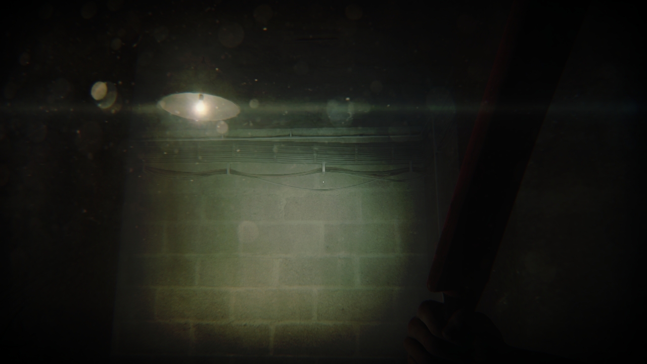
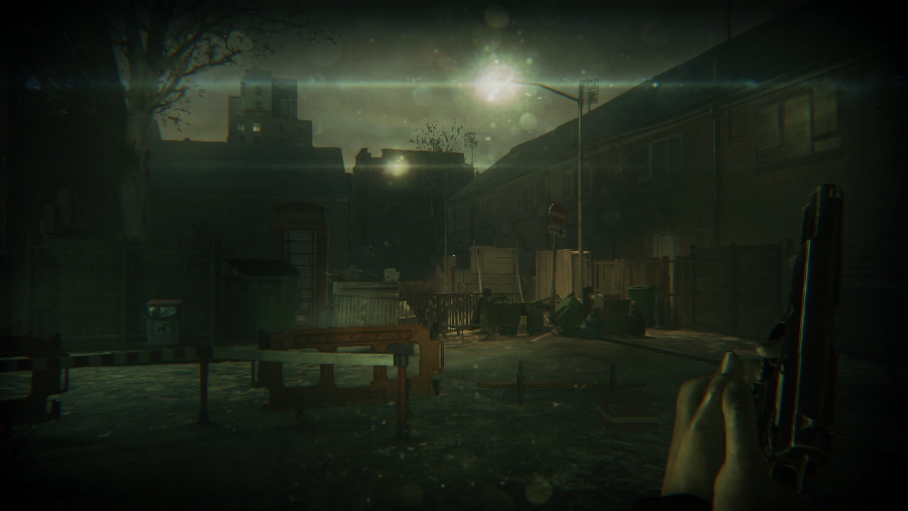
Please post more ZombiU, those shots really capture the great atmosphere this game gives you. You have to play it yourself to be truly terrorised though.

wiiu_screenshot_tv_01qppfg.jpg


wiiu_screenshot_tv_013ekg7.jpg


wiiu_screenshot_tv_0161jmv.jpg


Somehow...this game looks MUCH better in screenshots than in motion. One of the first games I'm experiencing this. Really strange :/
 
Man, lack of AF really hurts in Forza sometimes.

AO0.png


This looks nice though.

BO0.png

Top one is REALLY BAD. I thought second looked much better until you full screen it and notice the depth of field effect not being seen through the car's window, then it just looks like a bad photoshop mistake.
 

Timu

Member
I think my capture card is giving me random results, I mean it can be as clear as these shots:

iDQvb3mkBj8An.png

ibt6V1j2AO7jT1.png


But then as fuzzy as this one, because I know it looked better on my screen, it's not even as clear as it should be, I think because certain things are in motion:
ibapkLR5EZyXSW.png


Can' wait until Saturday!!!
 
wiiu_screenshot_tv_01qppfg.jpg


wiiu_screenshot_tv_013ekg7.jpg


wiiu_screenshot_tv_0161jmv.jpg


Somehow...this game looks MUCH better in screenshots than in motion. One of the first games I'm experiencing this. Really strange :/

Something about those screens makes this game look terrific. I bought this game a launch but haven't played it yet. I'm having a hard time re-adapting to dual analog after playing FPS with a Wiimote and nunchuk for so long.
 

Ricky_R

Member
I think my capture card is giving me random results, I mean it can be as clear as these shots:

iDQvb3mkBj8An.png

ibt6V1j2AO7jT1.png


But then as fuzzy as this one, because I know it looked better on my screen, it's not even as clear as it should be, I think because certain things are in motion:
ibapkLR5EZyXSW.png


Can' wait until Saturday!!!

Yeah, the the last shot looks a bit blurry, but the first two are marvelous and they look quite clear.
 

eso76

Member
This shot is unflattering. Forza still hasn't got the lighting and shaders right imo. It just looks too cartoon like and un-life like.

It's not the shaders.

it's not bad, but yeah, cars in direct sunlight appear strange, while they look very good in the shadow or under particular lighting conditions (sebring).
The reason is, despite T10 aknowledging that the "sun is orders of magnitude brighter than 255 white color on a screen" the game still doesn't take that into account outside of autovista/homespace.
So, while IBL lighting does a *great* job when cars are in the shadow (or at dusk)


(now wooden shader is weird, but serves the purpose. The wooden beetle is lit in a perfectly natural way)

it doesn't simulate 'britghter than white' (HDR) image based lighting and reflections.
 

Timu

Member
Yeah, the the last shot isn't very representative, but the first two are marvelous and they look quite clear.
My freaking capture card can't handle things in motion, even slightly, it's also why I had to be in one spot for the best capture. In the last shot the trees look all fuzzy even though that's not suppose to happen.

It's also why it's difficult to even take screens of Crimson Dragon because I'm always moving, lol, and Killer Instinct shots require characters to stand still, or else:

Clear:
ibiskWiv6Ul82b.png


Fuzzy:
iTlxlNDrP5Pw5.png
 
I'll check my settings when I'm back at home; but remember these compressed FB uploads are only hints at how spectacular this game looks on TV.


Same; I hope most people realize this.

Understood, but my question is more about what you see while gaming with the settings I suggested. I use these settings for blu ray viewing.
 
Top Bottom