You are using an out of date browser. It may not display this or other websites correctly.
You should upgrade or use an alternative browser.
You should upgrade or use an alternative browser.
Consoles screenshots thread (PS4/Xbone/WiiU) [Up: Thread rules in OP]
- Thread starter Peterthumpa
- Start date
Yeah, that was pretty fucked. I hated being stuck with the same primary for most of the game.That hallway is so frustrating. So many guns, grenades, ammo, etc. and you can only take one weapon and one type of explosive. -.-
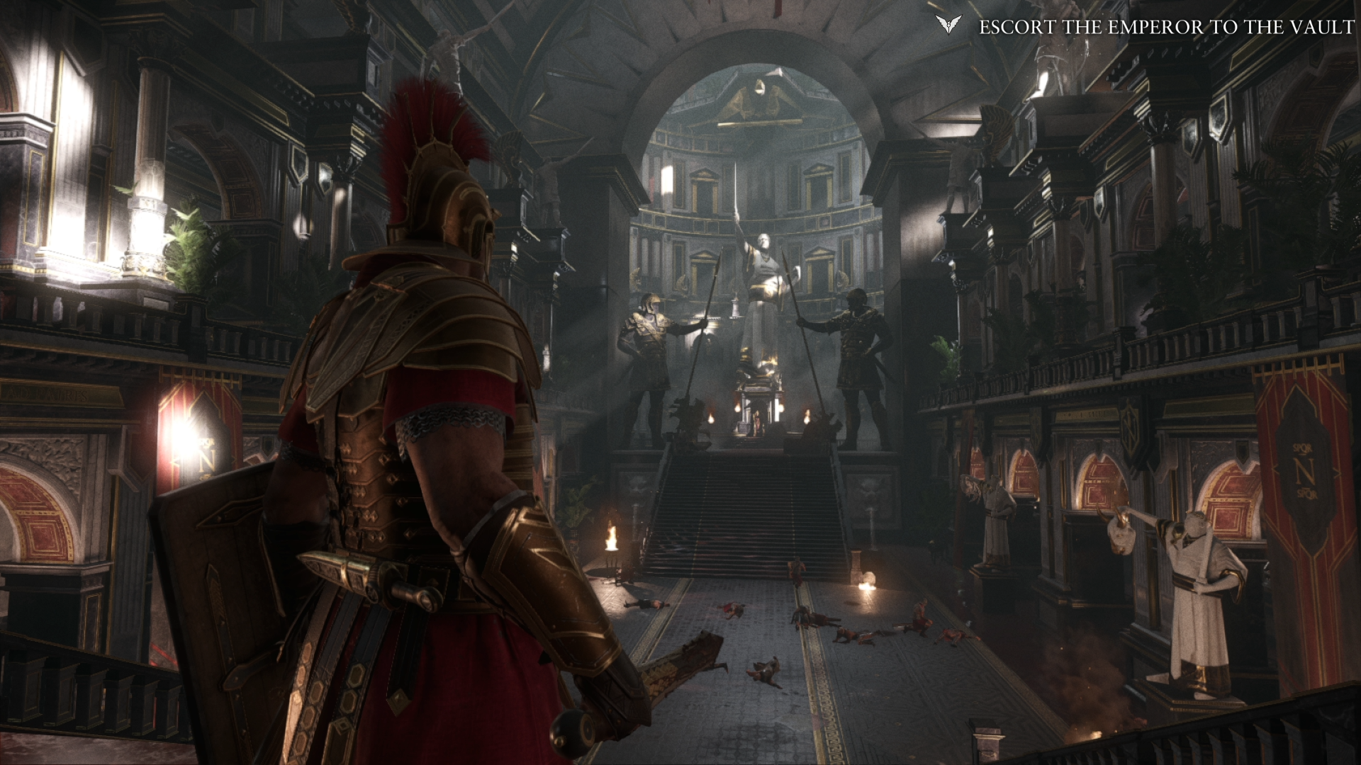
Just got my XB1.. And Ryse is just D:


Shame that most of the cutscenes are pre-rendered.
Looks amazing. There's definitely a loss of macro detail from the 900p though. It doesn't look tack sharp compared to some of the other screens you've posted. Lighting and overall cleanliness of the visuals are delicious though.
Ate the cutscenes prerendered?
This is a wonderful post
And Ryse having pre-rendered cutscenes is pretty disappointing :/
Holy crap this game is beautiful.=OJust got my XB1.. And Ryse is just D:

jim2point0
Banned
Tropical storms in AC4 are amazing:

I'd have to agree. One of my favorite aspects of some of the "next-gen" titles is the dynamic weather that kicks in and changes the atmosphere. Battlefield 4, NFS Rivals, and AC4 all have great weather systems.
Obviously someone cares if they keep quoting me.Let it go, bruh. Nobody cares.
Ate the cutscenes prerendered?
Why not? They're more tasty that way.
Honey Bunny
Member
Why on earth did they not implement it? I consider x16 standard for most games, but in a driving game where you spend most of your time focusing on the ground textures ahead of you a good amount of AF should really be considered a necessity.
tkscz
Member


Why not? They're most tasty that way.
Well that made me laugh uncontrollably.
nelsonroyale
Member
IQ in those Ryse shots is a bit strange. I think it looks clearer in motion than those indicate.
IQ in those Ryse shots is a bit strange. I think it looks clearer in motion than those indicate.
Grain filter is more visible on screenshots than in motion.
Thats why i disable grain filter and CA in most games for screenshots, because they mess up IQ.
zephervack
Member
More Mario World GIFs please, cant wait to get a Wii U
Goodacre0081
Member


Well that made me laugh uncontrollably.
Oh my!!! That first gif looks awesome. Looks like it must be a blast to play.
More Mario World GIFs please, cant wait to get a Wii U
Can we keep this thread for screenshots only? Too many GIF's just end up killing bandwidth and making threads un-browsable.
Interceptor
Banned
The one thing i hate about Nintendos approach to graphics is how they handle the altitude and shores of liquids. It just looks bad when the lava or water reaches somes walls. Their lighting is awesome but this part hasn´t changed since the days of the N64.
The one thing i hate about Nintendos approach to graphics is how they handle the altitude and shores of liquids. It just looks bad when the lava or water reaches somes walls. Their lighting is awesome but this part hasn´t changed since the days of the N64.
I was thinking the same thing when I saw that first gif where the lava rises. Surely they can make the lava behave more real and fluid when covering those steel boxes in that gif.
Not sure why they leave it like that though. Looks like a pop-in.
tkscz
Member
Can we keep this thread for screenshots only? Too many GIF's just end up killing bandwidth and making threads un-browsable.
Reason I normally don't post more than 2 per page. But if it is getting too much, I'll stop.
The one thing i hate about Nintendos approach to graphics is how they handle the altitude and shores of liquids. It just looks bad when the lava or water reaches somes walls. Their lighting is awesome but this part hasn´t changed since the days of the N64.
But you got to give them the lava detail. But yeah, you can see it cover the blocks a polygon at a time. Weird looking.
nelsonroyale
Member
We should have a thread for next gen gifs as well...
Interceptor
Banned
I was thinking the same thing when I saw that first gif where the lava rises. Surely they can make the lava behave more real and fluid when covering those steel boxes in that gif.
Not sure why they leave it like that though. Looks like a pop-in.
I just don´t get it. They put so much effort in everything but when it comes to this they are lazy as fuck. Rising lava? "Just modify the heightvalue in the engine - lol." Water next to a bulding? "Just put the buiding in the middle of a plain water texture -lol"
Why?
Omegabalmung9
Member
Wishmaster92
Member
Just got my XB1.. And Ryse is just D:


Shame that most of the cutscenes are pre-rendered.
Wait until you get to the second to last level.
Wishmaster92
Member
This is a wonderful post
And Ryse having pre-rendered cutscenes is pretty disappointing :/
They have the same detail as in realtime, i think a dev over at b3d said that most of them are pre-rendered because of making it a launch title and not having enough time.
Omegabalmung9
Member
Yup, me too. I've always liked the 'dirty camera lens' thing going on, a nice design decision imo. I'm pretty sure Ubisoft will continue their work on the sequel sometime next year once the likes of Super Mario 3D World and Mario Kart 8 have boosted the Wii U's installed userbase enough to make it viable. ZombiU should do over 1m sales during its lifetime I reckon.
I wouldn't count on that. That team has more than likely moved onto other projects. They're not going to just drop everything and make Zombi2, especially when the first one flat-out bombed.
They have the same detail as in realtime, i think a dev over at b3d said that most of them are pre-rendered because of making it a launch title and not having enough time.
That's not necessarily true. He didn't say they didn't add anything in post with the pre-recorded cut-scenes, just that they added very little. So it's not going to be exactly like real-time, though probably close enough.
Omegabalmung9
Member
turnbuckle
Member
This game looks absolutely incredible.
Wishmaster92
Member
That's not necessarily true. He didn't say they didn't add anything in post with the pre-recorded cut-scenes, just that they added very little. So it's not going to be exactly like real-time, though probably close enough.
My bad, yes i compared them and i guess they almost looked the same minus the horrible fmv compression so yeah, close enough.
The one thing i hate about Nintendos approach to graphics is how they handle the altitude and shores of liquids. It just looks bad when the lava or water reaches somes walls. Their lighting is awesome but this part hasn´t changed since the days of the N64.
in their defense, this is their first system with enough horsepower to make more advanced liquid effects without taking a big toll on everything else. they are lacking practice in that area so hopefully they put that in later games. this game also looked like it had to be released on time so they probably didn't have time for that.
xenogenesis
Member
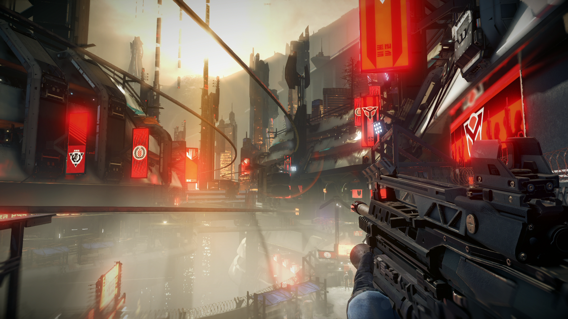
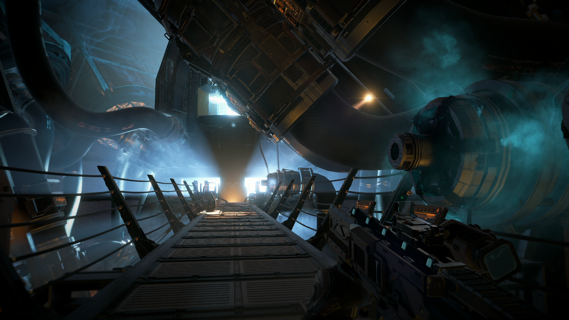
Killzone: Shadow Fall
Great screens Omega!
Omegabalmung9
Member
omg. It's Cruis'n USA all over again

I can't believe they didn't make a polygon crowd. smh
Honestly the crowd looks terrible but they could have had fun with it and used Kinect to like put your face or something in there that would have been pretty funny.
Something about those screens makes this game look terrific. I bought this game a launch but haven't played it yet. I'm having a hard time re-adapting to dual analog after playing FPS with a Wiimote and nunchuk for so long.
same, I've been trying to play that game but damn I suck at dual analog aiming, I am to spoiled by the wiimote or the superior kb + mouse combo that using an analog fells really archaic
tkscz
Member
Hmm can't say I'm that impressed with the Mario shots. Doesn't look that much better than the SMG games actually. I'm sure it's an amazing game to play but I guess I don't see what everyone is so agog over.
I see a big difference between the two. The art style is the same, but it's been the same since Sunshine. 3D world has much better detail than SMG.
Hmm can't say I'm that impressed with the Mario shots. Doesn't look that much better than the SMG games actually. I'm sure it's an amazing game to play but I guess I don't see what everyone is so agog over.
You should look at the Galaxy games again then.
You should look at the Galaxy games again then.
Maybe I should. Anyway, Rayman Legends' visuals impress me much more if we're going for something more even.
Looking at cross-platform games like AC4 and then looking at platform specific games like Killzone and Ryse is a world of difference.
Developing for a single platform can really deliver an incredible looking game if done right.
Whilst obviously true, it's not a completely fair comparison, as fans of DR3 will tell you.
AC IV (fully open world) vs KZ SF (semi open) vs Ryse (strictly linear).
FlashbladeGAF
Member
I just don´t get it. They put so much effort in everything but when it comes to this they are lazy as fuck. Rising lava? "Just modify the heightvalue in the engine - lol." Water next to a bulding? "Just put the buiding in the middle of a plain water texture -lol"
Why?
In Zelda, I could see why you may want those added details, but in a game like Mario, as cool as it would be to have, it's definitely not something you notice while your running and jumping to avoid instant death.
Hmm can't say I'm that impressed with the Mario shots. Doesn't look that much better than the SMG games actually. I'm sure it's an amazing game to play but I guess I don't see what everyone is so agog over.
the latest trailers look fun and the people actually playing it on their screens are loving the art style, hence why they are agog over it
Napoleonthechimp
Member
AC4 looks far too... "clean" for my liking. The exteriors look like everything is smooth and neatly placed.
McHuj
Member
Hmm can't say I'm that impressed with the Mario shots. Doesn't look that much better than the SMG games actually. I'm sure it's an amazing game to play but I guess I don't see what everyone is so agog over.
Even the dolphin shots of SMG can't compare with 3DW. The lighting, particle effects, and textures are on a whole different level.
So Vita screenshots are fine according to the thread rules?
Really love the looks of Uncharted (great game aswell). They should release a new part for the Vita
I have some Wii U pictures too, but they were old Miiverse posts (bad quality). Will post some good snaps here whenever they will happen on Wii U, PS 4 or Vita. ;D


KZ Beta

Really love the looks of Uncharted (great game aswell). They should release a new part for the Vita
I have some Wii U pictures too, but they were old Miiverse posts (bad quality). Will post some good snaps here whenever they will happen on Wii U, PS 4 or Vita. ;D
Doesn't look that much better than the SMG games actually. .
Lets just end this assumption now.


TrojanBlade
Member
How about some genuine Forza 5 shots captured from gameplay?


Just for fun

This is what it looks like in game while racing? OK not impressed at all. Yes of course when you see this in motion you don't see how bad it looks but the image quality is really bad. The lighting is nothing special, the environments look bad, the cars look ok but nothing like a big leap (GT6 cars look on par). This was supposed to be a showcase for XB1.They showed trailers with perfect IQ and but seeing the in-game shots it looks nowhere close. Of course if you sit far away F5 will look good in motion. Techwise its pretty poor.
On side note, KZSF is truly a beast. Amazed at all the screens in this thread.


