Cracker Barrel is going through fundamental changes.

It is here too, but Cracker Barrel Cheese is a completely different (and much older) company than Cracker Barrel Old Country Store. I'm surmising that up there in Canada only the cheese company exists.


I'm with @diffusionx - you're way overdue for your meds. "Mecha-Hitler", "Dogwhistle", "Coded language"… You sound like a sad and politically warped conspiracy theorist.
Yeah, only the cheese company.
 
This was exactly what I was talking about!

You claimed nothing bad happened when you visited but you "know" people who who had a bad experience. When asked what those experiences were? Total silence. Multiple other posts in this topic not addressing the question. Then someone else posts about an issue from over 20 years ago that was immediately addressed and now you finally reply. Hmmm.

J52YY3Bxrp6a4zt3.gif
 
Goddamn right they are! Just don't get the healthy harvest combo in an attempt to lose weight.....take it from someone who did that right before shipping off to basic training and just barely passing the weight to get in. It might be healthy, but it's not low cal, lesson learned. Got me all bloated, I literally had a drill sergeant walk by and see me in line, he says "you're gonna have a hard time here man". I was so embarrassed lol.

Worth it.

I need to confess something...

I've never been to an IHOP. And I literally have one right up the fucking street from me.
 
I need to confess something...

I've never been to an IHOP. And I literally have one right up the fucking street from me.
Its a pretty good eating experience, though there are plenty of better pancake choices in a decent city.

Waffle House, on the other hand, is peak diner dining regardless of fancier alternatives. Those griddles that see 24/7/365 use for DECADES.....wonder if I can buy one for my house just to get all that wok hei flavor. Same with a griddle used in a taco house that has chorizo spice embedded into it at a molecular level, just divine!
Tha fuck is a taco house? Is it like a crack house?
 
Tha fuck is a taco house? Is it like a crack house?
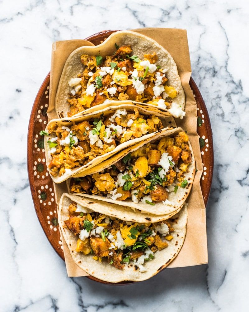
Sounds like you have the DISTINCT MISFORTUNE to live someplace where you can't get good tacos, especially breakfast tacos with chorizo, chilaquiles, chicharron, and nopalitos and all the other wonderful delights available to you served by a delicious latina but you should get to fixing that :P

yKUvzQ148cxXw8CY.jpg
Ok those look good but what the fuck is a taco house? What podunk ypipo town calls a taqueria a taco house? My city's taquerias are probably the best in the country outside of California
 
Last edited:
Ok those look good but what the fuck is a taco house? What podunk ypipo town calls a taqueria a taco house? My city's taquerias are probably the best in the country outside of California
Eh, we were discussing waffle house so I just said taco house to be clear. Taqueria may not be clear to folks cursed to live away from latinx people :P
 
I'm not going to bother with the underlying politics of this whole thing. What stands out to me is how completely inferior the new logo is from a graphic design standpoint. It feels almost engineered to be as bland and soulless as possible. There are a lot of stylistic touches that give the current logo its personality: the image of the old-timer leaning on the barrel, the shadow being cast on him, the K trailing off to become part of the logo's border, the border itself kind of bending around the words.....it evokes the image of an "old country store" in a way that the new logo simply doesn't. Unfortunately this is a trend I see a lot in modern businesses that change their iconography: they're going for a "clean and modern" look, but in practice it often ends up being more "plain and boring".
 
Top Bottom