MR BLACKMAGIK
Member
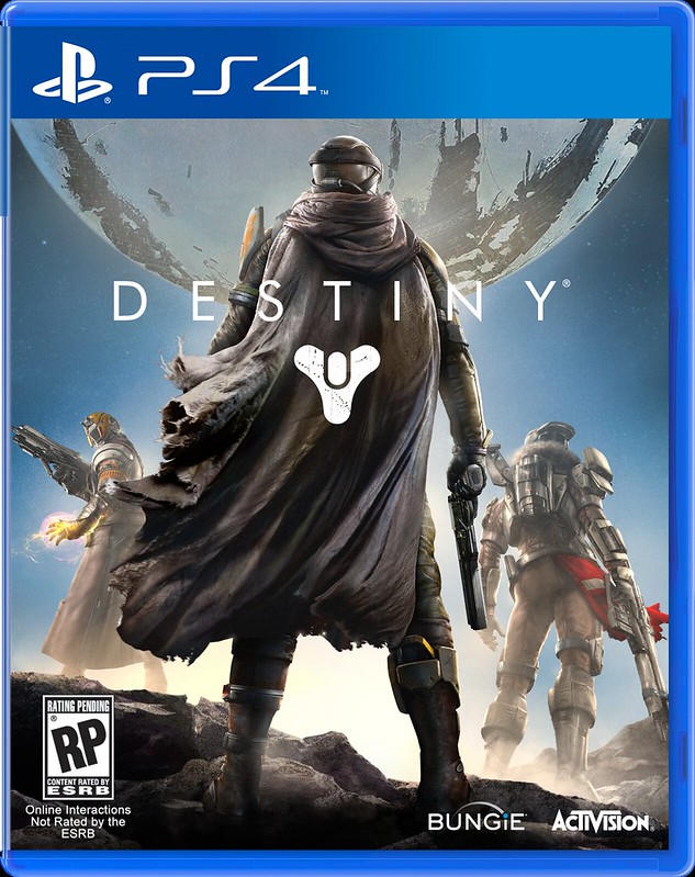
Looks like Chief in a poncho.
Why does the back of the helmet looks like a visor? :lol
My thoughts exact
Looks like Chief in a poncho.
Why does the back of the helmet looks like a visor? :lol
Yeah, this is much more distinctive and interesting. It also looks like one solid individual piece of artwork, while the new one looks like a bunch of different elements collaged together the more I look at it.Was hoping that this boxart would be chosen.

I totally agree.Yeah, this is much more distinctive and interesting. It also looks like one solid individual piece of artwork, while the new one looks like a bunch of different elements collaged together the more I look at it.
Hype.
Any PvP stuff in that clip?
avatar lacks ponchoI am leading the poncho revolution. Ya'll just mad, because I'm styling.
A vertical teaser? Fuck the universe.
Damn the music in that clip sounds astonishing
but it's SO SHORT
Was hoping that this boxart would be chosen.
Was hoping that this boxart would be chosen.
Whoa, that would have been awesome.Ah, the tease about a location fans were wanting to see makes sense now.
Back in the EGM reveal for Halo 2, for the version that was eventually scrapped, Bungie talked about low-gravity combat on the moon.
Was hoping that this boxart would be chosen.
!!!
It still kind of made it into the game on Cairo Station, but the time you spent with it was so short.Back in the EGM reveal for Halo 2, for the version that was eventually scrapped, Bungie talked about low-gravity combat on the moon.

Looks like Halo.
Also how is it possible to release a new trailer 10. January 2013 when we are in September?
I think some of us are just getting really, really sick of how formulaic these covers have gotten, so even a good one of this type ends up boring. I had a similar issue with Dawn of Mana's US cover contrasted with its Japan cover, but that was breaking from the continuity from Secret of Mana's own cover. And the game was widely regarded as shit so it's kind of a moot point anyway.Yeah. I mean, I can see why the marketing machine deemed it unfit, something to do with not communicating enough about the game, it's action, or it's characters. But then, the official box art doesn't do that either because they have their friggin' backs turned to you.
Should have been more like:

Still, it's just a box art. The world ain't gonna end.
Should have been more like:
Still, it's just a box art. The world ain't gonna end.
Should have been more like:
Still, it's just a box art. The world ain't gonna end.
Should have been more like:
Still, it's just a box art. The world ain't gonna end.

Was hoping that this boxart would be chosen.
Should have been more like:
Still, it's just a box art. The world ain't gonna end.
Should have been more like:
Still, it's just a box art. The world ain't gonna end.
This is what I think as well. The space shot is a little sparse for a boxart but the one they chose, while nice, doesn't quite fit. Something like this would be a perfect balance.
WHY DOES HELMET BACKWARDS???
Where is Ken when you need him.avatar lacks poncho
smh