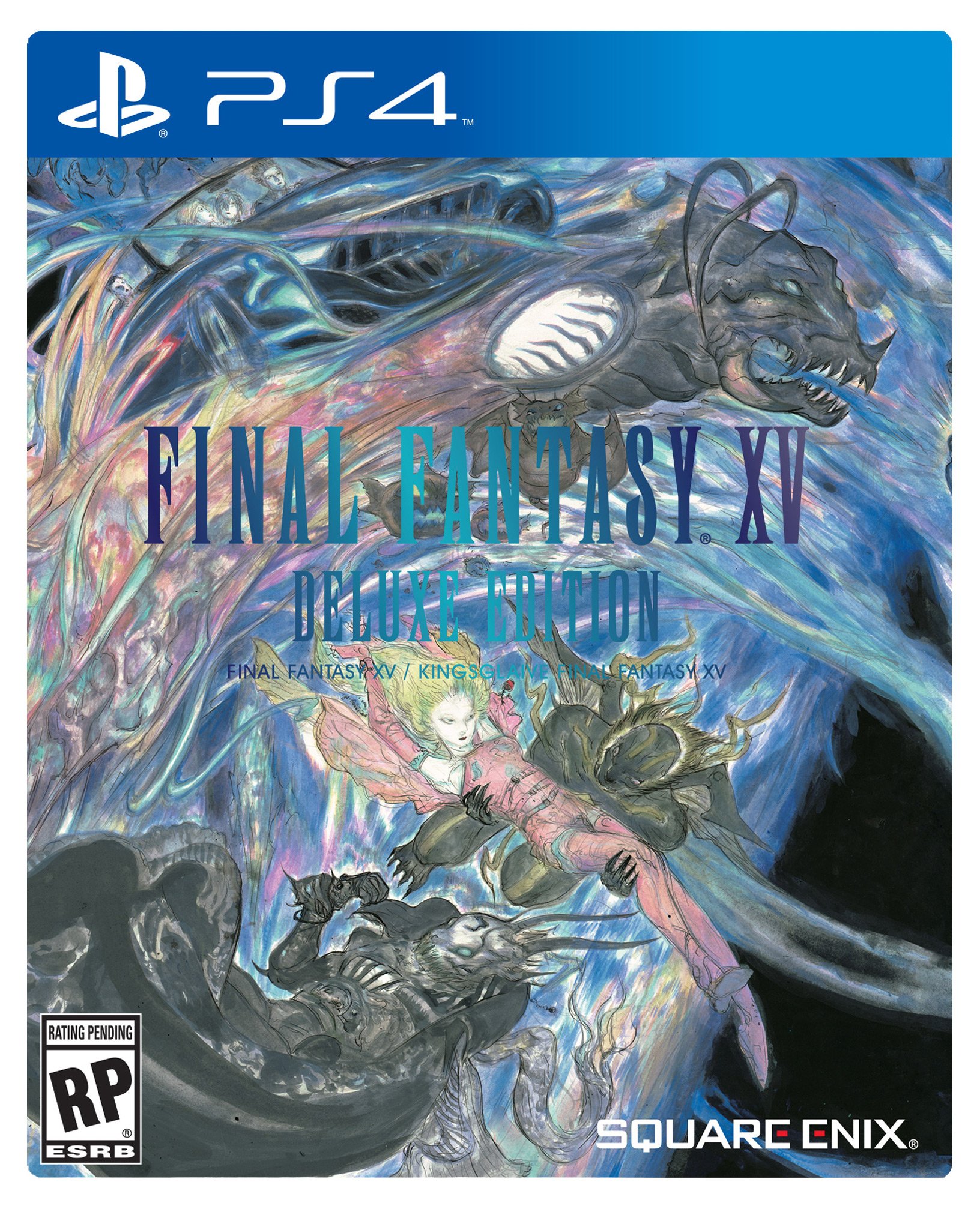
Final Fantasy XV Boxart

...well, I like it.

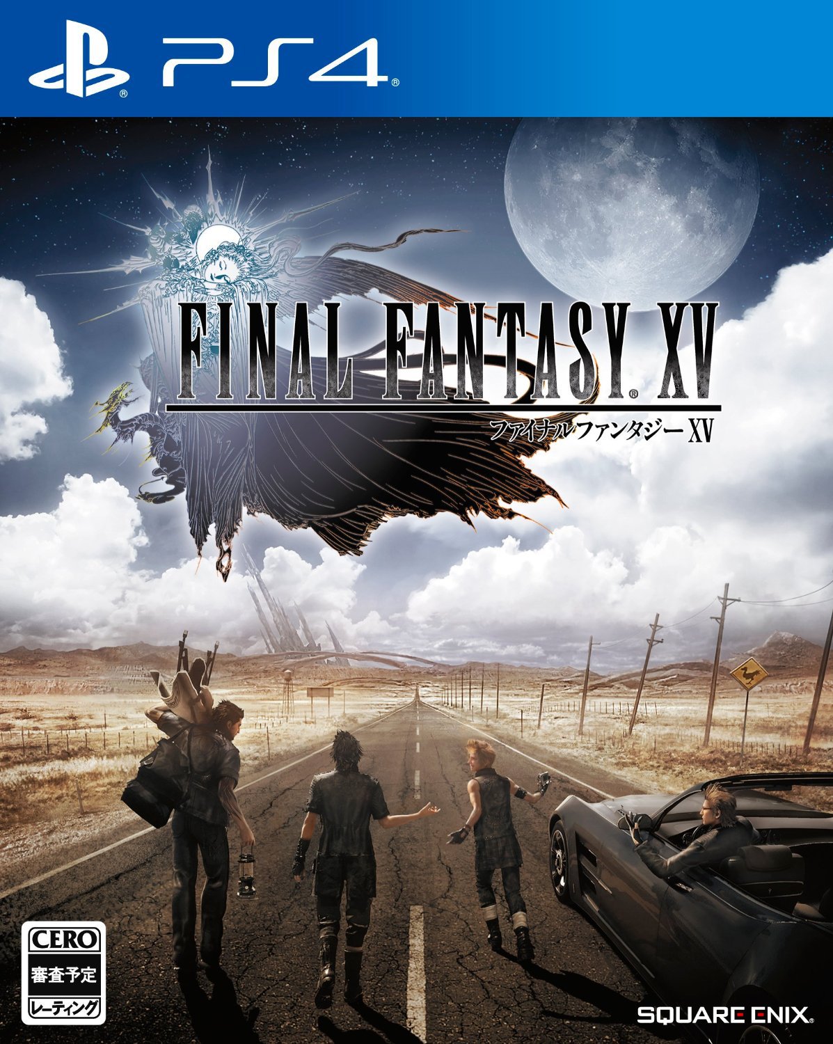
Meets their fantasy meets reality criteria. Everything below the horizon looks ordinary and earthly, then there's fantastical shit in the distance and sky

Alternatively, HD Remake of Dusty Dunes Desert from Earthbound

earthbound_00156.png


...now I'll be disappointed if there isn't a traffic jam that forces the crew to go off the beaten path
 
I'm 95% sure that this won't be the NA box art. Not enough explosions, guns, scrunchy faces or action poses.
 
The standard cover looks good, but the Deluxe cover looks great. Amano should be the default cover artwork for all FF related titles.
 
In the Final fantasy logo does anyone, instead of seeing the woman with her head down, see a head with something covering its eyes?
 
Amano's art is pretty hit and miss for me and I think the Deluxe cover is a miss, the car looks ridiculous and if I'm being really honest: just badly drawn. The standard cover is actually quite good, it's very atypical which I like and it really drives home (ahem) the road trip feel they're obviously going for.

I'm probably getting the Deluxe version, but I'd prefer the traditional cover (logo on white background).
 
I was about to throw all kinds of shade until I saw the posts saying there will be a reversible cover with the logo only on stark white. That shit has been an FF tradition since I first started importing them in 1997 and is non-negotiable!
 
Deluxe font is probably hard to read because the steelbook will have it in shiny metallic writing, the flat 2D image blends despite the gradient trying to show the shiny-ness
 
Standard looks great! That anyone could consider a cover like this "generic" is shocking. If anything, it's a surprisingly brave choice to have use such a serene and understated piece of artwork. (Also, I don't think it's CG? Looks more in the style of concept art we've seen.)

Deluxe will probably look better in person, but I'm a bit surprised by the fact that it doesn't do much for me.
 
I think its ok, goes with the theme of the game, emphasis on the logo, and not overshadowing with only the main character on front.

Its a good boxart.

Hell it looks better than the deluxe for once, that one is messy and the logo looks all wrong.
 
Standard japanese boxart that is way different from the traditional white background and logo seen on mainline Final Fantasy games? Interesting.
 
Pretty underwhelming, the deluxe one looks ok I guess if not for the utterly terrible colouring on the text, can barely see it.

Looks much better bigger but id prefer something like the kingsglaive thing
Ce2MctRUMAAyDzS.jpg:large

Agreed. More cool looking sword poses and less bros go on tour.
 
People like to give Nomura shit, but man. Most of the time, I really can't stand Amano's art.

The first time i saw it i didnt like it much either, but its really grown on me and i really appreciate the impact that his art has had on the series.

It's cool to see how developers translate his art into video games with the limitations they have.

Im pumped for the deluxe cover, it stands out, i dont have anything like that.
 
I think Amano's piece is so awesome because it didn't half-ass in being so chaotic. It's got a lot going on and I love it.

That being said, I think it would serve better as a poster instead of a cover.
 
I think Amano's piece is so awesome because it didn't half-ass in being so chaotic. It's got a lot going on and I love it.

That being said, I think it would serve better as a poster instead of a cover.

I agree it shouldnt be the main cover, but for a collectors edition i think its perfect.
 
The standard cover is great. Probably a little mundane for how they want this to sell in the west, in particular. Curious if they'll change it.
 
Top Bottom