• Hey, guest user. Hope you're enjoying NeoGAF! Have you considered registering for an account? Come join us and add your take to the daily discourse.

Forza 3 vs Gran Turismo 5 Comparison Thread of John, Chapter 11, Verse 35

Mobius 1

Member
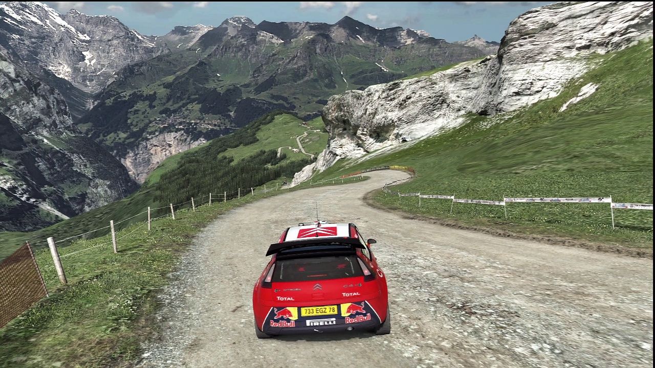
I think it's great to see good racing liveries, but they are the exception and not the rule.

All it takes to distract me, for example, is to see a poorly replicated Pirelli logo. I think because of this lack of control over the presentation of the game, Polyphony may have been hesitant to approach this.
 

Gestault

Member
Let's just say I question the motivation of someone who looks at photography like this and their first reaction is to say "[X] looks better." Not because something couldn't look better, but because the distinction at this point is so down to taste and composition that a black-and-white retort feels like the product of a simplistic assessment.

6692971967_84f064bfeb_z.jpg

6692972015_d48b51ef7e_z.jpg

8648392971_e7bd9a8844_z.jpg

8658854558_a82a2a1b1b_z.jpg

8505317952_8b07a52abd_z.jpg
 

nib95

Banned
I have no quarrel in this, just thought I'd post these nice GT5 captures. At it's best, this game is simply stunning.


Criio.jpg


JllGe.jpg


moMC0.jpg


oFKgX.jpg


S5wvA.jpg


vlcsnap-2011-10-22-09hwzr.jpg


vlcsnap-2011-10-25-17hdpoo.png


vlcsnap-2011-10-26-19hb7o6.png


CmaSE.jpg
 
the distinction at this point is so down to taste

I'm sorry, but the shaders and lighting used by PD is so technically superior, that I don't really see much competition.

I'd actually question anyone that doesn't see it :/

You can keep posting all those other people's FM4 pics. But to be honest, none of them look all that good. And are so heavily edited, there is no point.
 

Mascot

Member
Let's just say I question the motivation of someone who looks at photography like this and their first reaction is to say "[X] looks better." Not because something couldn't look better, but because the distinction at this point is so down to taste and composition that a black-and-white retort feels like the product of a simplistic assessment.

Don't look for logic in prejudice. None exists.

You can keep posting all those other people's FM4 pics. But to be honest, none of them look all that good. And are so heavily edited, there is no point.

Just how small are those eye holes in your fox suit?
 
It's called sunset. Go outside and you'll see it.

Gotta' love those midday sunsets ;)

Anyway, I've made a new one of these to spell it out again:

HnqjYUr.jpg


Horizon has an orange filter during all daylight times. it baffles me that I'm the only one here who can see it.
 

adelante

Member
Let's just say I question the motivation of someone who looks at photography like this and their first reaction is to say "[X] looks better." Not because something couldn't look better, but because the distinction at this point is so down to taste and composition that a black-and-white retort feels like the product of a simplistic assessment.

I do agree that Forza players generally would have to work a little harder to make their pics come close to looking photorealistic. More often than not that means having to avoid the game's glaring visual imperfections through clever composition, choice of location (in the shadows, away from the harsh in-game sun), right amount of motion/depth of field blur, etc. I'm partial to having metallic paint on my cars because they turn out a tad better in photos (taken by me):

6255073294_560180a59a_b.jpg
6255097076_8c610d3d13_b.jpg


Was just browsing through the Forza 4 Official Livery | Photos Thread, a few that I thought stood out:


bentleyvlen1.jpg
jaguar1ydsm.jpg
6230156170_30e8115a65_b.jpg
lambojvf48.jpg
6209335952_4579434b4c_b.jpg
 
Both FM4 and FH look really nice, but every picture I've seen looks fake compared to what you can get out of GT5 imo. I really don't know how to explain it. PD stuff looks much more realistic.
 

Gestault

Member
I do agree that Forza players generally would have to work a little harder to make their pics come close to looking photorealistic. More often than not that means having to avoid the game's glaring visual imperfections through clever composition, choice of location (in the shadows, away from the harsh in-game sun), right amount of motion/depth of field blur, etc. I'm partial to having metallic paint on my cars because they turn out a tad better in photos (taken by me):

[fantastic personal work and crazy-cool community work]

Dayum.
 

Ty4on

Member
Sun blobs exist in real life, too. My car on a sunny day:


The sun blobs on the Forza 4 photo look pretty realistic for a bright day.

I think I know what you're talking about, do you mean the blown-out lighting you sometimes see near the harsh edges on the outline of the car? If it's that, it's a specular highlight. In FM3 you could tell it was sort of a cheaper effect to help give high-contrast scenes some depth, but particularly in FM4, it's pretty darn close to the actual, real-world specular highlight you'll see when the sun is above ~30 degrees in the sky. So long as that "face" of the vehicle is pointed that direction in direct sunlight, you'll notice it in real photography too. Some guys love it and really try to highlight it, I tend to avoid it. For product shoots, they tend to avoid it because it blows out detail for that part of the car, and if it's at an angle, the symmetry can do strange stuff.

I just always found them very "plasticy" looking in Forza. Kinda like in TF2 just with reflections.

Ever since Forza 3 (or maybe even 2) I've found it hard to point the finger at what makes Forza just look off. There's just something plastic and perfect looking which makes them kinda dull computer cars. It also bothers me a lot when it seems like Forza 3 even could have looked awesome (dat geometry) and yet the polygon starved PGR3-4 and NFS HP3 look more realistic.

Here in the first pic the highlight is WAAAAAY overblown and is overly smooth and perfect. It looks like I made it myself in photoshop or something. In the second it looks good, but the general shading and reflections on the cars looks dull, sort of like plastic again.

I remember this one when FM4 was just out I think. Gotta be the best shot ever in a Forza game, those headlights look magical *-*
 

Gestault

Member
Great all conversation is pretty much gone and people are know just spamming pics from FM4 and FMH.

Considering I asked if a separate thread might be helpful, and I was basically told no, and considering you would assume that might be a prompt for GT5 pictures to be posted as a retort (I made a gallery for that myself because the GT5 people weren't), I'm not sure what you want.

I mostly see friendly banter.
 

Gestault

Member
I just always found them very "plasticy" looking in Forza. Kinda like in TF2 just with reflections.

Ever since Forza 3 (or maybe even 2) I've found it hard to point the finger at what makes Forza just look off. There's just something plastic and perfect looking which makes them kinda dull computer cars. It also bothers me a lot when it seems like Forza 3 even could have looked awesome (dat geometry) and yet the polygon starved PGR3-4 and NFS HP3 look more realistic.

Here in the first pic the highlight is WAAAAAY overblown and is overly smooth and perfect. It looks like I made it myself in photoshop or something. In the second it looks good, but the general shading and reflections on the cars looks dull, sort of like plastic again.


When you say "they look like plastic," I feel like I have to ask: You do realize most car bodies at this point are literally composed of plastic and carbon fiber, right? And you say it makes them look like "dull computer cars"; those words mean effectively the opposite of what you said a moment before. (I know precisely what you mean with regard to FM3 and Forza horizon though, you mean the sort of "flat" look to the overall appearance, right? I'm not as much of a fan of that.)
 

adelante

Member
Great all conversation is pretty much gone and people are know just spamming pics from FM4 and FMH.

Spamming? What's your problem? People are posting pics highlighting what they believe are strong points of their favourite game, just so happens that it's Forza players actively engaging in the conversation at the moment. If you wanna contribute, by all means do so.
 

eso76

Member
Say what you want but I really like this thread :)
It's car porn everywhere you look

And I like the constant
GT 5 pics: man, GT looks better than anything else
Fm4 pics: damn, but fm4 is no slouch either
GT 5 pics: yeah but GT 5 looks better
Fm4 pics : oh, but this is gorgeous too !

I took a lot of those pics BTW :p
Best photo mode trick in fm4: car has to be in the shadow - exposure up to 70 or more.
Makes reflections pop up and improves metallic look to near perfect results.
 
Spamming? What's your problem? People are posting pics highlighting what they believe are strong points of their favourite game, just so happens that it's Forza players actively engaging in the conversation at the moment. If you wanna contribute, by all means do so.

Yeah thats all cool but theres no need to keep posting them. I had to scroll through 42 images before getting here. We get it FM4, FH, GT5 look good but most of the photos aren't even comparisons but just hey this looks good. This isn't a photo sharing thread but if its how things go here then I will just deal with it.
 

eso76

Member
I had an idea for more photomode contests !
We could pick a real photograph of a car racing around a track and recreate it in GT and FM ! Yay !

An easy one

Ferrari-F458-Italia-04.jpg
 

Mascot

Member
Man, I wish Turn 10 and/or Polyphony would throw us a bone to gnaw on. Hell, even a sparrow's toe or a splinter. Something cryptic, some out-of-focus image or extreme close-up to dissect and analyse.

Che would have been all over this shit by now.
 

saladine1

Junior Member

Sunhi, have you got a replay gif of a car going through the tunnel at Eiger Nordwand?
(Where the camera pans across from outside)

I love watching that in replays especially in a red coloured car. Looks amazing.

Man, I wish Turn 10 and/or Polyphony would throw us a bone to gnaw on. Hell, even a sparrow's toe or a splinter. Something cryptic, some out-of-focus image or extreme close-up to dissect and analyse.

Che would have been all over this shit by now.
Yeah, c'mon Jube, Helios, B, come in and say hello!

I miss Che.
 

Ty4on

Member
From the GIF creation thread in OT

vZVlkso.gif

I posted that to show off how awful the 10fps restriction was :p
Not really. These file sizes are atrocious and tumblr only takes 1MB which is why the GIFs on it are so shitty.

Someone posted an 11MB GIF. Resize it so it looks 80% the as big but is 50% of the size for the love of progress. Don't get me started on how unsmooth so many of these are.
The 10 fps also make it shitty for so many things.
vZVlkso.gif

GT5 Spec 2.0 intro
JoEsm5P.gif

BMW Hydrogen 7
p0JKHbL.gif

Sonic Brother Trouble 1.5 (beta) song 98

The first two are YT vids, but you need to play the third one with Kega Fusion to see the original animation. Channel 2 (easier to see in chaotix mode which shows you what all the audio channels are doing) does something you can't see in that 10fps gif and at the bottom you can't see how the blue squares flash as the drum samples play. Not to mention how jeeeerky it is.
The first one is best at showing off the jerky motion and the links (except for the last one) are time stamped.

Edit: Horrible sentence in the original post, fixed that to make it somewhat readable. 2: Added Hazaro's quote.
 
Top Bottom