Graphical Fidelity I Expect This Gen

Insomniac finally returned to its roots, Suckerpunch slightly invested on tech hopefully they revamped their whole models and tech on their next game, sony santa monica I believe they will end up with best graphics Ps5 can do,
Finally ND I believe intergalactic will be good on it's next trailer.
I know we haven't seen much from Intergalactic, but my hunch is that it'll be a jaw-dropper, from the clips we've seen the lighting, the geometric density, the animations, the character and shading looks really superb. I can only imagine what it'll look like in a full open environment.
 
I know we haven't seen much from Intergalactic, but my hunch is that it'll be a jaw-dropper, from the clips we've seen the lighting, the geometric density, the animations, the character and shading looks really superb. I can only imagine what it'll look like in a full open environment.
I am with you on cutscenes part but that last seconds with gameplay part looks really underwhelming, hopefully this due to that scene overall conditions
 
The technology in the game is solid, from a next-gen perspective but I feel the art style of the game is the limiting factor here, it's as we've said "cartoony".

Now there may be some blame on my side, as I must state that for a game to be considered next-gen, it doesn't need to have a photo realistic art style, something which you see in games like TLOU and even Death Stranding. It makes sense why Insomniac went for that art style, it is a comic book character after all.
Not every game has to be photo realistic....

The enhanced PS4 games? Lol
Yes, they are very good looking games. I played them on an OLED with HDR and my jaw dropped at moments.
 
Last edited:
They could marketing this game in far better way than what they did
UYBg4fwhN5SGRFw8.jpg
UU8xuhd7vo1uqR8F.jpg
Zp2orFh66V8Oa5yC.jpg
CjrmWsb7OxvT3HWP.jpg
lsaxtcQrjxCxgs1A.jpg
DxlSICojXGuSW4f3.jpg
kvEB0WAoPUJggFxT.jpg
still looks pretty mid to me. Best one is the cave with a decent amount of volumetric smoke.

AC shadows looks a gen ahead.

0p3wpRr.jpeg


btACoG5.jpeg


1AJtHXY.jpeg

4wb0Fzk.jpeg


A0KdaDQ.jpeg
 
but the way they marketing yotei with regular ps5 60fps mode made it even worse
Lmao don't be like that! You see similar level hardwares barely surviving 1080p 60fps for max settings in first game's pc port, so this is actually a great move by sony team and we have to be impressed by their efforts like John Lameman as well /s
wanNP3UZGXGnGT96.png


FZGZfXCai0lg9JaQ.gif
 
Last edited:
Seeing both back to back, AC Shadows seems to be going for more realism with it's environments and Yotei seems to be going for a more CGI/Stylish look to it's environments, but Yotei seems to lack the lighting improvements to really push it forward. It appears really flat sometimes due to that. If it were cel-shaded or toon shaded it would work to this game's advantage.

I think a future PS6 edition of Yotei with lighting improvements will probably be the eventual better looking game, especially artistically. Screenshot 2 is a good example of this and the game oozes more style/atmosphere than I've ever seen from screenshots of Shadows, which is graphically great but on more of a technical level.
 
its the first game by a Taiwanese studio which was mostly doing support work before. Yes it has a b game feel to it but man your screenshots make it look like it's trading blows with the big boys.

They have the basics down. The next step is adding more life and detail to the scans and that should come with experience.
Yeah, I know and I get that, it's just weird, I said I like how clean it looks and I really do, but you know, sometimes it's just too clean, if that makes any sense.

But IMO it's still polished, like in this 1st screen, I like how the gutter fits perfectly into that hole, maybe I'm reading too much into it, but this caught my eye.


Seeing both back to back, AC Shadows seems to be going for more realism with it's environments and Yotei seems to be going for a more CGI/Stylish look to it's environments, but Yotei seems to lack the lighting improvements to really push it forward. It appears really flat sometimes due to that. If it were cel-shaded or toon shaded it would work to this game's advantage.

I think a future PS6 edition of Yotei with lighting improvements will probably be the eventual better looking game, especially artistically. Screenshot 2 is a good example of this and the game oozes more style/atmosphere than I've ever seen from screenshots of Shadows, which is graphically great but on more of a technical level.
Lol if tsushima/tlou2 glow up on ps5 is anything to go by, the special antifa edition of yotei on ps6 is gonna have a 120hz mode at best and a sword shaped dildo inside the box at worse.

Sony has been super lame with their remasters...
 
Last edited:
Lol if tsushima/tlou2 glow up on ps5 is anything to go by, the special antifa edition of yotei on ps6 is gonna have a 120hz mode at best and a sword shaped didlo inside the box at worse.

Sony has been super lame with their remasters...
Aside from the change of face models, the difference from Spiderman PS4 to Spiderman Remastered was pretty good in terms of lighting and reflections. Assuming PS6 comes with some sort of console standard RT solution, I'm expecting them to experiment and implement it in games from the second half of this gen, which could hopefully include Yotei and Wolverine.
 
Aside from the change of face models, the difference from Spiderman PS4 to Spiderman Remastered was pretty good in terms of lighting and reflections. Assuming PS6 comes with some sort of console standard RT solution, I'm expecting them to experiment and implement it in games from the second half of this gen, which could hopefully include Yotei and Wolverine.
Spiderman was decent, but lately they have been lazy as fuck, never expect the best from them until they prove us wrong.

They only gave sucker punch 60 mil for this game, i don't expect them to flush big money for a glow up on ps6.
 
Spiderman was decent, but lately they have been lazy as fuck, never expect the best from them until they prove us wrong.

They only gave sucker punch 60 mil for this game, i don't expect them to flush big money for a glow up on ps6.
Cerny is going to appear on a stage a few years from now and choose a few first party games to show off new tech. Most likely that tech is going to be RT-related. Choose which first party games you think will appear on stage.
 
I think you don't use HDR monitor to watch this video on HDR. This game is already flat looking but on your screenshot it is the Flat Looking King of all games :messenger_tears_of_joy:


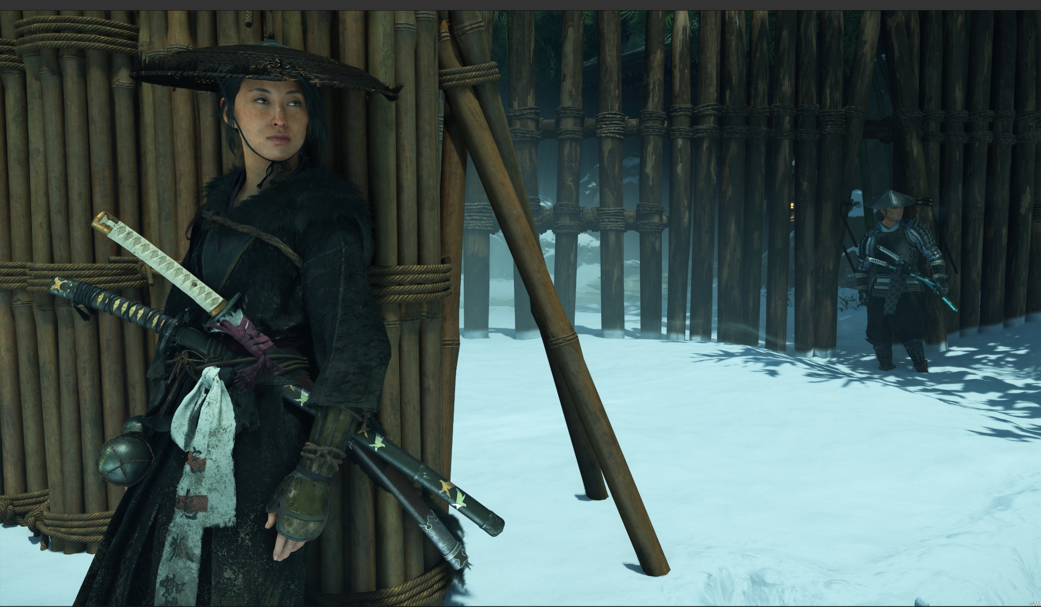
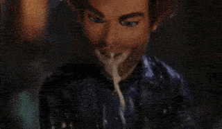
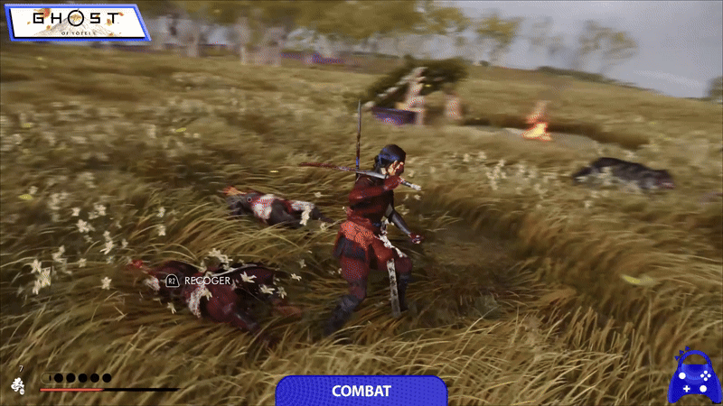
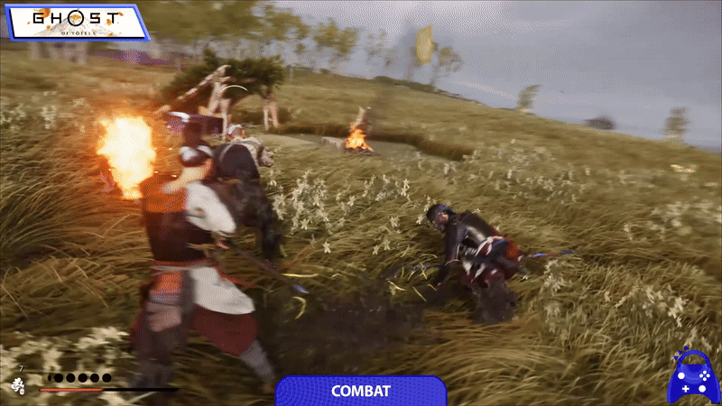
This aside, from Wolverine trailer my biggest take was the reaction of bodies to the action. When Logan pierce someone and then continues his motion, the dead body on his "fangs" moves according to the action. Or when he is sliding, or jumping his body moves according to terrain or action.

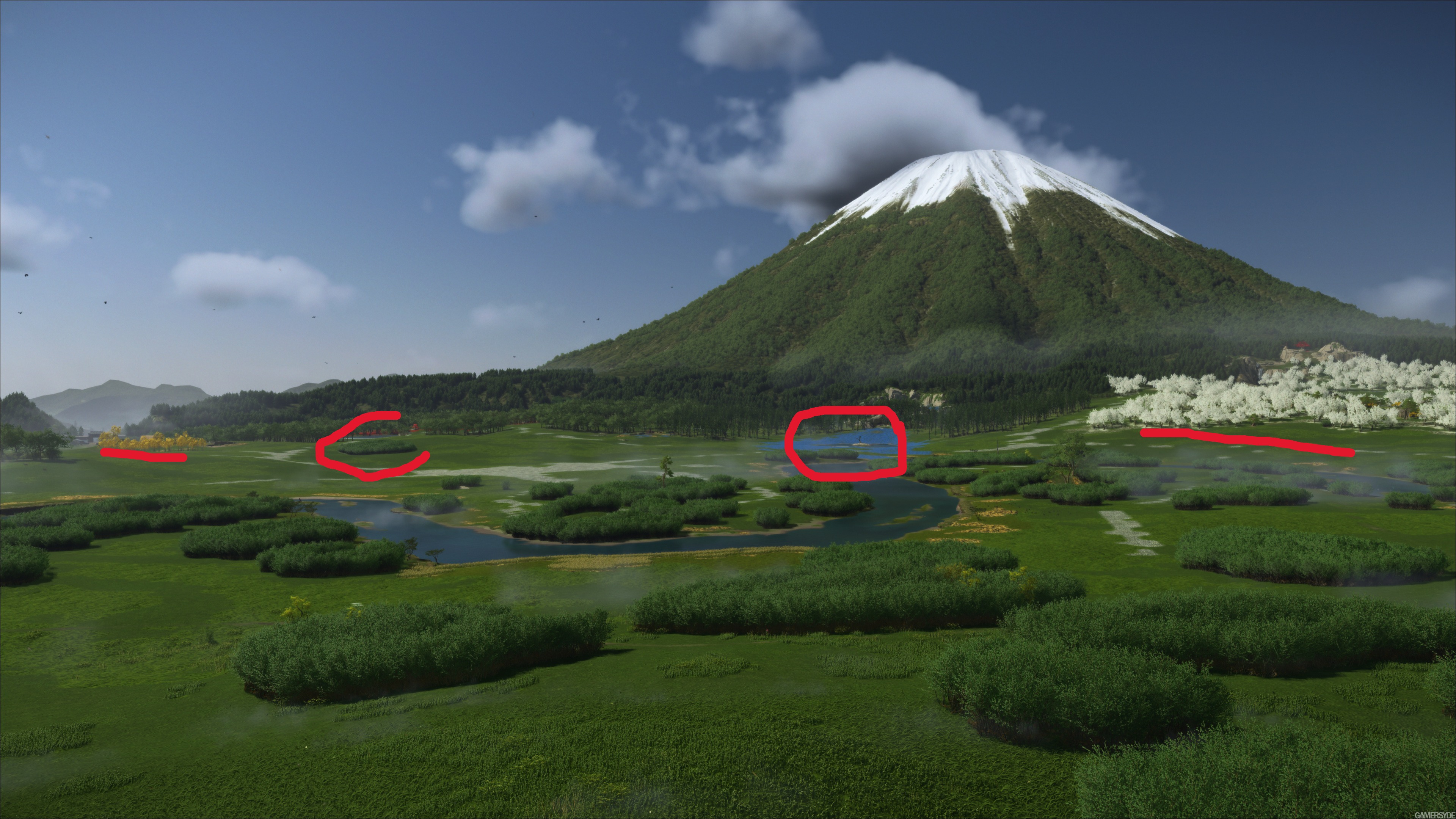
When you look to Yotei these, "body reactions" are so bad that you cannot believe they are both first party studios.
I don't think the print screen feature captures hdr. I'm using a LG C4 as monitor.

HDR alone can't improve models or SSAO or shadows, anyway. It looks flat because of their tech and art choices.

EDIT: those Msamy Msamy screens look nice. I'm kinda curious about the game. Never played the first one. Is it the classic ubi-like open world full of useless things? Can it be streamlined? I hated Horizon. xD
 
Last edited:
I think a future PS6 edition of Yotei with lighting improvements will probably be the eventual better looking game, especially artistically.
Damn, as a PS5 owner I waited 5 years for Sony to show up with the next gen goodies.

When I brought the PS5 pro, I remember thinking to myself, now surely they will blow us all away.

Turns out I was wrong again, just need to wait a few more years for the PS6 remasters for these games to really shine..

Lilo And Stitch GIF
 
still looks pretty mid to me. Best one is the cave with a decent amount of volumetric smoke.

AC shadows looks a gen ahead.

0p3wpRr.jpeg


btACoG5.jpeg


1AJtHXY.jpeg

4wb0Fzk.jpeg


A0KdaDQ.jpeg
Yup, Sucker Punch left tons of "next gen fidelity" on the table just by chosing game to run at such a high resolution, that alone forces the game to compromise hard on next gen look, ofc it can look great at times, hell lets give it 50% of time it looks current gen/proper, but for me personally, i want games to look great 90-95% of the time(current gen isnt strong enough for games to look outstanding all the time).
 
They only gave sucker punch 60 mil for this game, i don't expect them to flush big money for a glow up on ps6.
only 60 million? other developers have done much better with less money.

Sony gave them 5 years. Artists still get paid yearly. They just had to come to work and create new assets. If you cant afford to go to Japan, (highly doubtful since they went there last time), you can buy assets from the megascans library like Capcom does. Or just rescan the pictures you took last time, and just use higher quality models. this shouldnt be that hard.
 
Yes, there are improvements, but it still looks like a last gen game.
Well it looks far better than the last-gen Ghost of Tsushima, I would say Ghost of Yotei still looks way better than most last-gen games, yet it still feels more like an iterative upgrade rather than a generational one, that's for sure!
 
only 60 million? other developers have done much better with less money.

Sony gave them 5 years. Artists still get paid yearly. They just had to come to work and create new assets. If you cant afford to go to Japan, (highly doubtful since they went there last time), you can buy assets from the megascans library like Capcom does. Or just rescan the pictures you took last time, and just use higher quality models. this shouldnt be that hard.
Their hq is in midsize (150k) city in washington state, on top they have to pay top money for woke parasites in the studio, thats huge difference vs most eastern european or japanese/korean/chinese studio( just to give u example here in poland median salaries are 3-4x lower vs median US salaries, not to mention in expensive state like washington ;p).
However, the median salary in Poland is 6,540 PLN or 1,648 USD per month, which serves as a middle ground for the diverse range of salaries.
Thats under 20k usd yearly, for those that are matho-fobic :P
Quick comparision to washington state salaries:
The median salary in Washington state varies significantly by what it measures; the median household income was $94,605 in 2023, while the median individual full-time salary was $76,323 in 2024, according to Visual Capitalist and Wikipedia.
 
Yup, Sucker Punch left tons of "next gen fidelity" on the table just by chosing game to run at such a high resolution, that alone forces the game to compromise hard on next gen look, ofc it can look great at times, hell lets give it 50% of time it looks current gen/proper, but for me personally, i want games to look great 90-95% of the time(current gen isnt strong enough for games to look outstanding all the time).
whats funny is that just like spiderman 2, this performance mode still drops to 1080p during high stress areas. So you're targeting native 4k 30 fps just so you can hit 1440p 60 fps but you cant even do that consistently. But what you did do consistently is make your game look consistently mid.

Come to think of it, only Bluepoint's Demon Souls remake is a consistent 1440p 60 fps and looks clean on a 4k screen. Ratchet, Miles, Spiderman 2, DS2 and GOW Ragnorak do not look as clean despite supposedly targeting 1440p. Probably all dropping resolution. And HFW runs below 1440p though it does look cleaner than the rest thanks to their new reconstruction algorithm. Also, TLOU2 and TLOU1 remake look awful in their 1440p modes which were not using the highest quality textures. It wasnt until the native 4k and PSSR upgrades were launched where the game finally started to look truly fantastic on the PS5. before that, it was just a muddy looking game that was hiding all the detail. So its not like 1440p is some magic pill that makes everything look better.

That said, PSSR does work well on these first party games which is even more frustrating because people have to spend $750 just to get great IQ in their games that were held back because the devs prioritized great IQ.
 
still looks pretty mid to me. Best one is the cave with a decent amount of volumetric smoke.

AC shadows looks a gen ahead.

Assassin's Creed Shadows looks quite a bit better close up but I think Yotei destroys it in rendering of distant terrain.

image_ghost_of_y_tei-45613-5462_0075.jpg


The way the volumetric clouds cast shadows onto the landscapes looks really really good:

image_ghost_of_y_tei-45613-5462_0015.jpg


Assassins Creed Shadows has this problem where distant foliage gets next to no lighting applied to it and trees end up looking like billboard cut-outs rather than a 3D object that fits in the scene. It's the one weakness in its visuals (probably because their virtualized geometry didn't apply to foliage):

image_assassin_s_creed_shadows-45453-5060_0039.jpg
 
Last edited:
Their hq is in midsize (150k) city in washington state, on top they have to pay top money for woke parasites in the studio, thats huge difference vs most eastern european or japanese/korean/chinese studio( just to give u example here in poland median salaries are 3-4x lower vs median US salaries, not to mention in expensive state like washington ;p).

Thats under 20k usd yearly, for those that are matho-fobic :P
Quick comparision to washington state salaries:
but this was also true when they made Infamous 1-3 and Ghosts. They still got paid more. they still had wokesters. and they were still able to make some stunning look games. Well, maybe not infamous 1 which looked like garbage, but the glow up for the second game was incredible and infamous Second Son was one of the best looking games of the launch window.

you give a blind guy 5 years to draw something and he will draw something new. unless they laid off all their artists, i dont know what happened here.
 
Assassin's Creed Shadows looks quite a bit better close up but I think Yotei destroys it in rendering of distant terrain.

image_ghost_of_y_tei-45613-5462_0075.jpg


The way the volumetric clouds cast shadows onto the landscapes looks really really good:

image_ghost_of_y_tei-45613-5462_0015.jpg


Assassins Creed Shadows has this problem where distant foliage gets next to no lighting applied to it and trees end up looking like billboard cut-outs rather than a 3D object that fits in the scene. It's the one weakness in its visuals (probably because their virtualized geometry didn't apply to foliage):

image_assassin_s_creed_shadows-45453-5060_0039.jpg
Hmmm, the draw distance on foliage isnt even that great in yotei. you can see its just a flat texture on the ground. the only thing that doesnt is the mountain which does look great.

As for shadows, aside from autumm which looks like shit because of those awful looking red and yellow trees, i didnt have a problem with draw distance in AC Shadows. Very little pop-in and it was always fill to the brim with trees.

BA0gojq.gif


that said, this is the only gif i could find of the draw distance so the vistas probably didnt impress me enough. maybe you are right.
 
Finally found this pic after looking for it for the last few days. I wanted to see just how much of it they would be able to include after outlining it as dev items:

omhl7omm9y9c1.png


Looks like Film quality facial animation is in. Cloth and muscle sim, not so much. Though muscle sim was in spiderman 2.
Destruction is in.
Realtime GI - That seems to be in given the big leap in lighting.
Dynamic Weather and Foliage - not shown in the trailer
60 FPS with RT - shouldnt be too hard but i expect it drop well below 1080p with these visuals just like Lumen games and Avatar.
AI upscaling - this is PSSR i guess. Already in spiderman2 .
Fluid Dynamics - Blood sim does look pretty good, but not much else shown.
Deformable surface - this seems to be in
Motion matching - Animations do look to be improved but still not up there with TLOU2 standards.

I will slow down some footage and see if i can find evidence of muscle, cloth, fluid simulations. as well as motion matching.

Very interesting to see them outline things at the start of development, and get almost all of them done. Insomniac, i was too harsh on you.
 
Last edited:
but this was also true when they made Infamous 1-3 and Ghosts. They still got paid more. they still had wokesters. and they were still able to make some stunning look games. Well, maybe not infamous 1 which looked like garbage, but the glow up for the second game was incredible and infamous Second Son was one of the best looking games of the launch window.

you give a blind guy 5 years to draw something and he will draw something new. unless they laid off all their artists, i dont know what happened here.
Played ISS at launch, and u know me well- im as antiwoke/antifeminist as they go and if game actually was woke i wouldnt be able to enjoy it/finish it 3 times like i did.
And i agree- playing infamous on ps4 was that feeling of- hells yeh, thats a next gen, loved it.
I can even pinpoint it to very specific first moment in the game:
 
Hmmm, the draw distance on foliage isnt even that great in yotei. you can see its just a flat texture on the ground. the only thing that doesnt is the mountain which does look great.

As for shadows, aside from autumm which looks like shit because of those awful looking red and yellow trees, i didnt have a problem with draw distance in AC Shadows. Very little pop-in and it was always fill to the brim with trees.

BA0gojq.gif


that said, this is the only gif i could find of the draw distance so the vistas probably didnt impress me enough. maybe you are right.

Assassins Creed Shadows uses that volumetric haze effect a lot of the time which I think obscures how poor they can look in the distance at times.

The screenshot I posted is probably a worst case scenario. Below you can see how the trees on the left hand side, which are further in the distance, have a big drop-off in level of detail and the application of the lighting compared to the trees on the right, which are closer to the player:

sFvr192H0zthwDmm.jpg


While in Yotei, even trees which are dramatically further away than the trees in the above screenshot still retain their 3D structure and the shadowing better:

y6uIr0zmrkU6Mlpo.jpg


I don't think the issue is pop-in, I didn't notice much either in Assassins Creed Shadows. It's more that the lowest LOD they use for foliage is just too low and the lighting fall-off is closer to the player than Yotei.
 
Top Bottom