Gabotron ES
Member
Guys, guyz... TWO days till the FIRE RISES.
I know I'm in the minority here and this argument usually applies to gameplay rather than UI, but as long as everything's functional and streamlined (especially if it turns out 343 figures out a few new UI tricks for additional optimizing that Bungie didn't) the new UI can look like it's being run by a potato for all I care.
LEAVE THQ ALONE.
Competitve or Spops, or both? I've never really seen you on reach for competitive.
Every beginning... has an end.Guys, guyz... TWO days till the FIRE RISES.
Sure. Darksiders 2 will be sitting on the store shelves alone this Christmas. Unloved.
Guys, guyz... TWO days till the FIRE RISES.
It's not an icon I'm familiar with, but Google's telling me it's a database icon. I'm not entirely sure how that correlates with a range of icons aimed at telegraphing armour abilities within a few seconds, though.
Here, this should hold you guys over until the Arbiter cutscene replaced with GAF stuff gets done.
Now in video form!
ugly pregame lobby UI
Every beginning... has an end.
Both. Figure I'll be playing spops in the early morning before work, like I did with Reach's co-op.
I really enjoy competitive play but am hamstrung by the fact that (1) I suck & hate being a liability for friends, and (2) I'm not online enough when everyone's in competitive. The most fun I had in Reach was in competitive customs.
Here, this should hold you guys over until the Arbiter cutscene replaced with GAF stuff gets done.
Now in video form!
i love you.
hahhaahaha no.
Never looked interesting. Someone on youtube said they actually regret wasting their time with that at E3 and wished they were playing something else. Enemies are supposed to be boring and repetitive.it was delayed cuz it sucks so bad

I almost puked. You are a bad man, a bad man.Every Generation Has A Legend. Every Journey Has A First Step. Every Saga Has A Beginning
Welcome to the...phantom menace!
In this case, I probably wouldn't even raise an issue since we are just talking about icons meant to relay information to the player; while they could be more like Reach icons, that isn't the design intent. They are quite abstract currently, although I think readable enough; especially after looking at them a few times.
In general, critiquing design is just like anything else, substantive is better. I don't particularly like 'ugh, this is bad' or 'oh they did it wrong'. Personally not liking something is fine, saying it is wrong or bad just because you don't agree with the design intent is something I would generally take issue with.
The discussion about the icons seems fine to be honest, as most people are bringing up salient points in terms of readability. Yesterday we had the gem 'wtf frank tell your design team to get their shit together ffs' and a few other amazing points of discussion that pushed me to flip keyboards.
Cool, hope to actually play more with you, in that case.
Just doing a community service.Holyshit how did I miss this? That's awesome.
And thank you for quoting that. I'd have totally missed it had you not.
I thought that was the 2009 Star Trek movie tagline. :/Every Generation Has A Legend. Every Journey Has A First Step. Every Saga Has A Beginning
Welcome to the...phantom menace!
Cool, hope to actually play more with you, in that case.

And why is that? I'm not saying you're wrong or anything, but I'm curious because I do want to give good feedback on anything I can. I can see what you're saying is bad in isolation, but if someone doesn't like a design because they think there is a better design intent than the one being used, why is that bad?In general, critiquing design is just like anything else, substantive is better. I don't particularly like 'ugh, this is bad' or 'oh they did it wrong'. Personally not liking something is fine, saying it is wrong or bad just because you don't agree with the design intent is something I would generally take issue with.
I really don't feel like getting into this – and I doubt people want to read a discussion about how to best convey functions through an icon – but I'm really taking issue with the way you're trying to prove your point. Context is everything.
Quick question; Can you tell me what this is? It is a very commonly used icon. What does it represent and what function is instantly being communicated?
Ask anyone who works with databases what that cylinder is and they'd say a database. There is no function being communicated at all. Databases are not round. Yet, it's an industry wide agreed-upon representation of a database.
I don't see how this is even related. The AA icons in Reach do a very effective job of letting a player know what they do:


It's a valid criticism that the H4 icons don't communicate that well what each ability does.
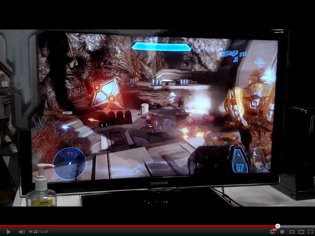
from r/halo (promethean grenade)
Hey now, easy, I have personal involvement with THQ.
RE: Icons
I don't think the AA icons are going to be as important in 4 as Reach. In 4 we set our own load-outs BEFORE the game starts, and go into the menu and see the AA with a description. In Reach you had to choose during your respawn, which was sometimes as short as 3 seconds. So the quicker you could identify the better. I think being able to set up our class while not in a game in 4, and even rename that class, will make having a very telling icon less necessary.
And why is that? I'm not saying you're wrong or anything, but I'm curious because I do want to give good feedback on anything I can. I can see what you're saying is bad in isolation, but if someone doesn't like a design because they think there is a better design intent than the one being used, why is that bad?
I really don't feel like getting into this and I doubt people want to read a discussion about how to best convey functions through an icon but I'm really taking issue with the way you're trying to prove your point. Context is everything.
Let me use you your way, but I'll give it some context. Let's say we grab an average Joe off the street. We told him about a game Halo 3 and we told him within that game that there are pieces of equipment that do certain things. He knows about each equipment and what it does. He knows what the bubble shield looks like and what it does, what the energy drainer looks like and does, and so on. What he does not know is the specific icon Bungie assigned for each equipment.
If I were to give him all the icons Bungie made for the equipment in Halo 3, and asked him to assign the right icon to its corresponding equipment, do you think he'll get them all right? Do you think he'd match this with the regenerator?
Now let's do the same thing, but with Reach. Same rules applies: he doesn't know the icons, but he knows about all the armor abilities and what each one does. Do you think he would have an easier time matching up the right icon to the corresponding AA with the icons Bungie chose for Reach?
I know you're saying the intents behind the design in Reach and Halo 4 are different, and nobody is disagreeing with that. What some are saying is that one is better than the other, and are asking why 343 isn't going with the better design. And again, I have stated that there aren't advantages or disadvantages to either design intent (and the resulting design) except one is easier to memorize and grasp. All advantages and disadvantages are swept under the wrong once you become familiar with either set of icons.
I'm a bit indifferent. I would certainly prefer Reach's icon design, but like Halo 3 I'll learn the icons after playing Halo 4 enough times.
And why is that? I'm not saying you're wrong or anything, but I'm curious because I do want to give good feedback on anything I can. I can see what you're saying is bad in isolation, but if someone doesn't like a design because they think there is a better design intent than the one being used, why is that bad?
I really don't feel like getting into this – and I doubt people want to read a discussion about how to best convey functions through an icon – but I'm really taking issue with the way you're trying to prove your point. Context is everything.
Let me use you your way, but I'll give it some context. Let's say we grab an average Joe off the street. We told him about a game – Halo 3 – and we told him within that game that there are pieces of equipment that do certain things. He knows about each equipment and what it does. He knows what the bubble shield looks like and what it does, what the energy drainer looks like and does, and so on. What he does not know is the specific icon Bungie assigned for each equipment.
If I were to give him all the icons Bungie made for the equipment in Halo 3, and asked him to assign the right icon to its corresponding equipment, do you think he'll get them all right? Do you think he'd match this with the regenerator?
Now let's do the same thing, but with Reach. Same rules apply: he doesn't know the icons, but he knows about all the armor abilities and what each one does. Do you think he would have an easier time matching up the right icon to the corresponding AA with the icons Bungie chose for Reach?
I know you're saying the intents behind the design in Reach and Halo 4 are different, and nobody is disagreeing with that. What some are saying is that one is better than the other, and are asking why 343 isn't going with the better design. And again, I have stated that there aren't advantages or disadvantages to either design intent (and the resulting design) except one is easier to memorize and grasp. All advantages and disadvantages are swept under the rug once you become familiar with either set of icons.
I'm a bit indifferent. I would certainly prefer Reach's icon design, but like Halo 3 I'll learn the icons after playing Halo 4 enough times.
the thread:Out of curiosity, does anyone think there should be a gaming side thread for the Spartan Ops gameplay mission footage we have?
I agree that the AA Icons do not really show in any way what they do. Also, they all look very cluttered and similar, so hopefully 343 end up tweaking those to give them a better sense of visual identity for practicality alone.
Oh, cool. Do you have a link to the video or thread this is from? I'd like to see that in action.
Thanks for the suggestions on how to make video game forum posts, very helpful stuff. I will file it away for future reference, thanks.
I'll play Halo pretty much any time that I'm not already in another multiplayer session (lately trying to get better in Street Fighter IV).
Please save me from my Spelunky problem. It's not healthy.
Thanks for the suggestions on how to make video game forum posts, very helpful stuff. I will file it away for future reference, thanks.
And why is that? I'm not saying you're wrong or anything, but I'm curious because I do want to give good feedback on anything I can. I can see what you're saying is bad in isolation, but if someone doesn't like a design because they think there is a better design intent than the one being used, why is that bad?
Ugh, I keep forgetting Camo is an ability again.
Are you really asking me whether I'd want to read words horizontally?Do you really need to see a horizontal xXJonesyMcPotsmoke420Xx that badly? The menu may look ugly as hell so far and is too much of a divergence from Bungie's elegance, but the text reading is hardly an issue with me.
I dont know why... Because its really droll and not as funny as it hit me... But I just got funny looks from the other patrons eating breakfast in Another Broken Egg when I laughed too loudly.
Thanks
Are you really asking me whether I'd want to read words horizontally?


Besides the text being horizontal, are you okay with it's design in general? I like it, it would just help, if the text was normal. I guess, they are doing this for the smartglass thing.
Since we're talking about Halo 3 equipment:
Over half of those directly represent what the Equipment looks like. The only ones that may be confusing are Came, Invincibility, Radar and Regen.
Since we're talking about Halo 3 equipment:

Over half of those directly represent what the Equipment looks like. The only ones that may be confusing are Came, Invincibility, Radar and Regen.
Hmmmm... - I must try this joint at some point in my life, even though the "Southwest Scramble" sounds a little tame...
Besides the text being horizontal, are you okay with it's design in general? I like it, it would just help, if the text was normal. I guess, they are doing this for the smartglass thing.
the thread:
http://www.reddit.com/r/halo/comments/wq3wt/brief_glimpse_of_promethean_empnade_found_on/
its from the HQ spartan ops video


Since we're talking about Halo 3 equipment:
Over half of those directly represent what the Equipment looks like. The only ones that may be confusing are Came, Invincibility, Radar and Regen.

Forcefield the Promethean grenade gives off.
EDIT: Hehe looks like Demoncarnotaur and I had the same idea.
Hmmm, What is your timezone?
Forcefield the Promethean grenade gives off.
EDIT: Hehe looks like Demoncarnotaur and I had the same idea.
:lol I played Halo 3 for 3 years and I couldn't tell you what each of those are. I can get most.


