Lord Azrael
Member
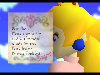
It looks like some default font for a word processing program, hence "cheap as hell". I suppose it's not inherently bad, but it's definitely a turn for the worse, I feel, coming from previous games.This font is terrific and highly legible. What criteria makes it hideous?
") Keep an eye on the official website for updates.
Keep an eye on the official website for updates. 


")


