• Hey Guest. Check out your NeoGAF Wrapped 2025 results here!

Hideous text fonts in games

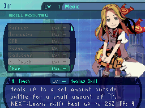
According to a response on the PS blog post for Stranger of Sword City, the font should be getting fixed for release.

"The screens here are from an early build of the game. (I couldn’t wait!) I believe the font alignment should be getting updated to show letters with a descender properly. :) Keep an eye on the official website for updates. :)"
 
I can't stand the MGS5 subtitle font
44c0a5ecb5c76480ea8f3986857e47c1.3665.jpeg

That's another one on my shit list.
 
Terranigma_00000.png


A m a z i n g g a m e, b u t t h a t s p a c i n g l e a v e s a l o t t o b e d e s i r e d.

(I believe there's a patch to fix it, mind)

Variable width fonts were created for this reason. I don't know why anyone would choose not use a VWF when the option presents itself to use one exists.
 
02e6MEh.jpg

DS System Font is notorious for games smashing the letters together in as little space as possible.

I can't stand the MGS5 subtitle font
44c0a5ecb5c76480ea8f3986857e47c1.3665.jpeg

*insert pic of FFXIII UI here*

Could one of the text and kerning geeks exlpain these, Ive seen MGSV, FF13 and DS games show up a lot in these threads and previous threads and I dot understand whats wrong with any of them. I thing MGSV subtitle font looks good, I Love all of squeenix's UI work from the PS3 on, and the DS seems like a fine compromise when working in low resolution. None of them are illegible or hard to read (In fact id say squares might be too sharp at times), why do they come up so much?
 
Only game where the font / scaling caused me to quit: Morrowind.

Sure, I now realize it can be moded - but it really was a terrible, headache inducing mess.
 
I'm almost sure that those were placeholders for the first gameplay reveal. I believe they're going to change it.

It still showed up in the gameplay videos they posted more recently, but I hope you're right. given the game isn't coming out for another 8 months, there's still plenty of time to change it.
 
Tales of Symphonia

3FakWkW.jpg


I'm kind of triggered because I absolutely adore the menus on the XIII series because they look so stylish and it's incredible functional and the fonts were very readable in my old TV.

If I remember correctly, couldn't you actually change the font in Symphonia?

Can't remember offhand any fonts I myself hated though. But I do have to agree with some of the other posts here regarding fonts that were almost illegible, like Monster Hunter 3U (on the 3DS), Xenoblade Chronicles X (mainly when playing offscreen), and Diablo 2 (the numbers 5 and 6).
 
mgsv is fine you have to think of where the fonts are used. these particular fonts in question are used in subtitles.

the large kerning makes it extremely legible and to read from a wide range of viewing configurations. reads well on a tv while sitting on a couch, and from close on a monitor.

i think its actually a very thoughtful font choice since its so different from the rest of the fonts in game. almost an emphasis on language hint hint.
 
Could one of the text and kerning geeks exlpain these, Ive seen MGSV, FF13 and DS games show up a lot in these threads and previous threads and I dot understand whats wrong with any of them. I thing MGSV subtitle font looks good, I Love all of squeenix's UI work from the PS3 on, and the DS seems like a fine compromise when working in low resolution. None of them are illegible or hard to read (In fact id say squares might be too sharp at times), why do they come up so much?

I never gave it much thought, it's always been a gut reaction. After about 5 seconds of rumination-

I guess I tend to prefer simple and clean sans serif fonts because they never call attention to themselves. They're so neutral that they're virtually invisible. The words are communicated and that's it. When it comes to subtitles and menus, that's what I want. When MGSV and FFXII go out of their way to shove these odd fonts in my face, it calls attention to them, and that comes across as a sort of... visual/mental interference. Very minor but noticeable enough to be annoying. It manifests in my mind as "Why would they want this this sucky ass font in their game???"

That's the best way I can describe beyond it "I dunno man, I just don't like the way they look OK????"
 
According to a response on the PS blog post for Stranger of Sword City, the font should be getting fixed for release.

"The screens here are from an early build of the game. (I couldn’t wait!) I believe the font alignment should be getting updated to show letters with a descender properly. :) Keep an eye on the official website for updates. :)"

If your early build screenshots (not labeled as such btw) make people go "Hmm, I'm not so sure about buying the game now" maybe you should think twice before making them public.
 
What I understand from this thread is no font is liked by anyone. Please show me examples of good fonts, since everything has already been torn apart at this point. I'm genuinely curious about this now.
I'm with you. I don't know what a good font is, I don't know what a bad font is, I don't know what's legible and what isn't, I don't what kerning is, and I don't know what tracking is. Typographic comuni-what? I couldn't tell you a thing about visual design. But I can tell you that this looks actually fucking awesome!

KyfbFTM.jpg


(Hotline Miami 2)
 
I've always thought that Naughty Dog used shit fonts and their menus look pretty bland . Kinda weird to see from a top tier dev! TLoU inventory and crafting screen was so boring looking.
 
I'm with you. I don't know what a good font is, I don't know what a bad font is, I don't know what's legible and what isn't, I don't what kerning is, and I don't know what tracking is. Typographic comuni-what? I couldn't tell you a thing about visual design. But I can tell you that this looks actually fucking awesome!

KyfbFTM.jpg


(Hotline Miami 2)
That's fine for splash screen, but put that as text you have to read in sentences and it would be absolute hell on earth.
 
Honestly i like it, it's weird and unique hence it fits the artstyle imo, especially the first screen, i imagine that character with the mask to have a weird way of talking reflected by the font.

I was willing to buy it with the masked character. All of them though? Then you're just pissing away utility with an annoying typeface.
 
The font in most of the AD&D Goldbox games was pretty difficult to read. I do find it dramatically easier on the eyes using an HQ upscaler, though it's still pretty gnarly. All caps and too much pizzazz. I suggest actually clicking the first image to get a full-sized view, since the garishness of it is minimized when scaled down and filtered.

Old game fonts were designed for CRTs. Those fonts needed to be unusually bold and small details could show blurry and be harder to see. Considering the limited 8x8 character space, more often than not uppercase characters were more readable.

Of course, there is no reason to write text in all caps any longer. Dragon Age Inquisition has almost all its text written in small caps. It is completely unreadable.
 
This and Darklands are 2 games I straight up cannot play because of the fonts. Maybe it was better on older, smaller screens, but it's straight up indecipherable for me.
Yeah, the ultima vii font is rough. There's actually a font replacement out there, which has zero character but it looks like it'd be a lot easier to read. I haven't had the chance to play with it for more than a few minutes.

vaJJ9.jpg
 
Not the look, but the size:

1010125.jpg

Yeah the text front is far too small, they need to patch it to make it bigger.

The newest Pokémon games.

may_supp_p3_5.jpg


Why would they do this? Why would they change the iconic font from previous games? The new font looks cheap as hell.

From gen 1-5 I could read the text just fine and follow the story and soak up the game lore. But with gen 6 I haven't be able to do that as easily.
 
I thought the font and especially the graphics used for MGSV and GZ titles and credits was surprisingly Hideous.
 
It's been succeeded:
Compare that to the Japanese logo, which random English (that while grammatically correct, doesn't actually describe anything in the game) aside, looks great:
(EDIT: Imgur compressed the glow into a weird stroke. Here's a link to a better version.)
  1. The English logo designer didn't realize that the Japanese characters are all aligned to a single baseline and then individually skewed afterwards. As a result, all of the bottoms of the English characters are at weird angles that takes away a lot of the cohesion the title'd otherwise have.
  2. Replaced white outer glow with white stroke and gray drop shadow that was used for Untold 1's logo. That adds needless elements and makes me wonder if Atlus USA even has access to a logo file.
  3. Just copied over the Japanese 2, not accounting for the fact that stylistically, the English and Japanese characters look pretty different.
  4. The "Untold" draws attention to itself by being a different color, even though the Japanese logo accepts the the Untold version of the series is already established by making it blend into everything else.
  5. Adds a subtitle font in a completely different style with a pointless black-to-red gradient underlines, and diamonds.
  6. Nothing's actually aligned with each other.

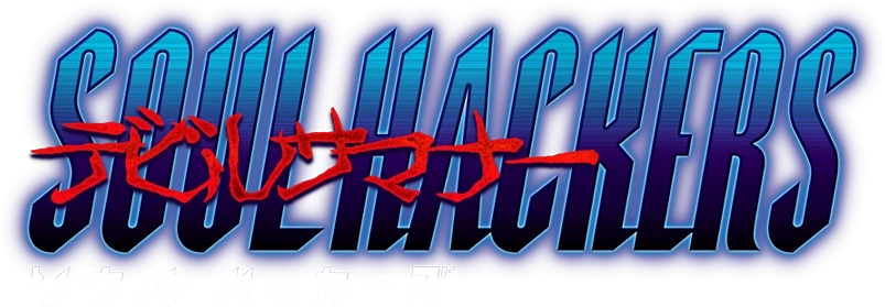
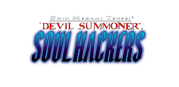
I'm sure I'm forgetting something, but I guess this isn't the first time Atlus has made an ugly localized logo:
 
Top Bottom