• Hey, guest user. Hope you're enjoying NeoGAF! Have you considered registering for an account? Come join us and add your take to the daily discourse.

Indie Game Development Discussion Thread | Of Being Professionally Poor

Status
Not open for further replies.

Moosichu

Member
Google Sketch Up if you want to kind of block things out in a quick 3d.

For just general events, order, locations, etc it's traditionally just something like Visio and a block diagram / flow chart.

Thank you! I was thinking more for 2d zelda-type overworlds. Sort of like a tile-set lite editor.
 
Milestone: Just got all 5 versions up and running. Holy shit. PC, Mac, Linux, iOS, Android. We really didn't have mobile in mind but the translation to touch is excellent. A few mobile tweaks to our physics engine and we are golden on mobile.
 
I never developed a game but watching The Raid 2 made me want to play the characters in a fighting game. Since I never did sprites I started by doing some NES style sprite because I like working with constraints and it's a way to move forward.
After two hours, I only managed to make Bat Man stance with two frames. It's gonna be very long. :')

X3P7ldJ.gif


Any advice, critic or observation is welcomed. Better see now what is wrong instead of later.

It's tough to handle with big pixels like that, but the bat looks like it's extending rather than moving.
 

-COOLIO-

The Everyman
Been busting my butt lately working on my game previously known as "Deadly Dungeoneers". It's recently been renamed "Champion Summons". I'm new to programming/game development and this is my first real attempt at a game. I'm hoping you guys will take a look and let me know your thoughts of how things are looking thus far and perhaps any pointers. I obviously have much further to go, the more I do, the more I realize I need to get done and that list just keeps getting scarier. I'm doing my best though.


Let me know what you think GAF, and try not to hold my childish art against me.

Edit: Art is a bit skewed because the game ran native 800x600 and I had to scale for 1280x720 for youtube to display properly.

looking good for a first game man, keep it up!
 
I'm not sure, but perhaps just shaving off the two pixels at the end of the bat on the second frame might help already with the extension feeling?

Yup going to do this.

By the way I have a question for more tech people. I did these sprites while cheatign a bit. A pixel = 4 pixels so the sprite is bigger. Is that a correct thing to do for higher resolution screens or are game engines capable of upscaling your 1.1 sprites without ruining them? I will probably work on Gamemaker or Construct.

Edit : I managed to somehow make him walk.

omzjX58.gif


I need to redo the bat again, and change some shaders. And I think he has very short legs when walking, but that's maybe only my eyes.
 

Mr. Virus

Member
The artists have been testing the emergency lighting in Monstrum (more here). Really like how it looks in the lower deck corridors, which are pretty dark as it is!

Main lights on.

6jTP2nql.png


Main lights off.

le56jr7l.png
 

Blizzard

Banned
The artists have been testing the emergency lighting in Monstrum (more here). Really like how it looks in the lower deck corridors, which are pretty dark as it is!

Main lights on.

6jTP2nql.png


Main lights off.

le56jr7l.png
It may depend on the monitor's gamma, or look different with fullscreen instead of small images, but I can barely see anything there even with my face up next to the monitor. That might be the goal, but I would not personally like that -- seems eye-strain-y. :p
 

Mr. Virus

Member
It may depend on the monitor's gamma, or look different with fullscreen instead of small images, but I can barely see anything there even with my face up next to the monitor. That might be the goal, but I would not personally like that -- seems eye-strain-y. :p

Yeah, they're not the best that small :(. Area's pretty dark anyway, but we're still fine tuning ha ha. Here's some full size versions that might look better:

Dark

Darker
 

2+2=5

The Amiga Brotherhood
Ok guys i made some shaders, what do you think of them? Sadly the background is not mine but from KOF XII :/
I cropped the images so everything is not too heavy.

Normal
normal.jpg


Spectrum like(8 colors + mild dithering, each sprite can have only a color + black, since the background is a single image it has a single color, but when i'll do the background it will have various elements with different colors)
spectrum.jpg


amiga like(mild dithering + 36 colors instead of 32 but whatever)
amiga.jpg


Hand drawn(+ outline)
handdrawn.jpg


Gameboy like(4 colors + a little of dithering, notice how the dithering pixels are bigger than in the other screens, to "emulate" gameboy's low res XD )
gameboy.jpg


8 colors + heavy dithering
8colors.jpg


black and white(no greys) + heavy dithering
image.jpg


I also made more common shaders like greyscale, negative etc.
 
Our Kickstarter for GunWorld launches on Friday, as well as the first public demo of the game. I feel like i'm going to have an anxiety attack. I've released a build among some friends and colleagues, and reception has been pretty positive. That's not really an indication of how the public will respond to it though. I'm already anticipating and prepared for the onslaught of "another 8-bit retro game" and "this is just like blank". It's the nature of what GunWorld is honestly. Hopefully people take the time to play the demo and can see a bit of what our vision is and why it should set it apart.

Anyone have any stories to share in relation to sharing your game with the world for the first time?
Man I wish I could make threads. Someone fucking better. I'm there Friday, yo!
 

Timeaisis

Member
Our Kickstarter for GunWorld launches on Friday, as well as the first public demo of the game. I feel like i'm going to have an anxiety attack. I've released a build among some friends and colleagues, and reception has been pretty positive. That's not really an indication of how the public will respond to it though. I'm already anticipating and prepared for the onslaught of "another 8-bit retro game" and "this is just like blank". It's the nature of what GunWorld is honestly. Hopefully people take the time to play the demo and can see a bit of what our vision is and why it should set it apart.

Anyone have any stories to share in relation to sharing your game with the world for the first time?

Congrats, man. I've been keeping up with your updates and I'm pretty excited about it. Looks to be a good time.

As for the sharing with the world, you're inevitably going to get negative reactions, it's just the nature of the beast. Try to stay positive and just be honest. Focus on what separates you from the rest of the "8-bit retro games". I don't think honesty can be overstated here.

Are you planning on providing a demo with the KS or at least some videos of gameplay? They go a long, long way, especially when a game "looks" like others (in the case of "retro") but has a whole other layer underneath. It doesn't seem like you'll have much of a problem, there, some good gifs of what some cool weapons can do and some of the platforming sections you've showed us in this thread should be enough to get people to understand the concept.

Anyway, best of luck!

Thanks for the kind words!

Yes, there will be a demo available alongside the Kickstarter as well as gameplay footage. We go into detail on the Kickstarter page about the non-linear progression of the game and what is going to be unique about it as well as familiar. The demo itself is mostly just a proof of concept to let people play around with our current mechanics and get a feel for the general challenge level of the final game. We'll be updating the demo each week throughout the kickstarter with new features and content.

Our demo is based off what we consider the Pre-Alpha stage of our game's development though, so we're a little concerned that regular folks won't understand the whole use your imagination, the game isn't done thing.

AbsintheGames said:
Man I wish I could make threads. Someone fucking better. I'm there Friday, yo!

Overwhelmed by your excitement, thanks for all the kind words in these threads. Hope you enjoy it later this week!
 
Well I'm psych'd. Just got a solid from an artist. Dude is great. He is on board and I am thankful! His concept pieces blew everything I've done so far away. Adapted to the style instantly and had a ball throwing me concept work in my minimalist style.

I am very happy he is on board. Will allow me to focus much better with less on my plate. Feels great to have a solid team with me shoulder to shoulder, huge accomplishment for me to build a strong team.
 

Noogy

Member
Hello!

Finally a bit of results, after three weeks of stead work.

A "full" working 2 minutes test zone with increasing difficulty, upgradable player ship weapon, several enemies with solo/wave semi-variable patterns. Furthermore a bit of work on the main menu (ie keyboard controls remapping).

i6q6oT6fJee2K.png


ibsyJUfGa09VWS.png

That is some excellent spritework. Easily some of my favorite generation of shooters, and I'm pretty picky when it comes pixelized ships and effects. Very nice!
 

V_Arnold

Member
So. I have a few ongoing indie projects already, why not add a third (fourth?) one to the mix?This one has no codename yet. It is going to be a space shooter that combines aRPG (Diablo-like) elements with "roguelike" elements, and adds a healthy dose of GAMBIT to the mix. If you played FFXII, you know what I mean ;)

This is a first pitch that our artist came up with a few days ago. Main ship.
(I do not think that the engine will be pure voxel-based, cause I love real curves too much to go that way. We shall see soon)

XXbJQGx.jpg


More to come as soon as I am finsihed putting together the first playable prototype.
 

12obin

Neo Member
Wow, my Unity asset already sold 100 times during the first day of the Asset Store Madness Sale. That's almost more than the first three months combined. :|
 
So. I have a few ongoing indie projects already, why not add a third (fourth?) one to the mix?This one has no codename yet. It is going to be a space shooter that combines aRPG (Diablo-like) elements with "roguelike" elements, and adds a healthy dose of GAMBIT to the mix. If you played FFXII, you know what I mean ;)

This is a first pitch that our artist came up with a few days ago. Main ship.
(I do not think that the engine will be pure voxel-based, cause I love real curves too much to go that way. We shall see soon)

XXbJQGx.jpg


More to come as soon as I am finsihed putting together the first playable prototype.

Can I ask what you used for modelling? I am doing a voxel style game but have no modelling experience.
 

Faerith

Neo Member
So. I have a few ongoing indie projects already, why not add a third (fourth?) one to the mix?This one has no codename yet. It is going to be a space shooter that combines aRPG (Diablo-like) elements with "roguelike" elements, and adds a healthy dose of GAMBIT to the mix. If you played FFXII, you know what I mean ;)

This is a first pitch that our artist came up with a few days ago. Main ship.
(I do not think that the engine will be pure voxel-based, cause I love real curves too much to go that way. We shall see soon)

XXbJQGx.jpg


More to come as soon as I am finsihed putting together the first playable prototype.

I hate to be the evil critique person, but that ship seems a little bit too close to the good old Vic Viper T310 .
You might want to ask your artist to change that.

Anyway, a Gambitsystem? So, like an AI-Player 2 that behaves like you want (and does not complain about your own weaponchoices :p) ? Sounds nice.
 

V_Arnold

Member
I hate to be the evil critique person, but that ship seems a little bit too close to the good old Vic Viper T310 .
You might want to ask your artist to change that.

Hm. I do not remember any details from shmups like this,but looking at the pictures, i am kinda seeing it. Alright, passing the info on, thanks!

Anyway, a Gambitsystem? So, like an AI-Player 2 that behaves like you want (and does not complain about your own weaponchoices :p) ? Sounds nice.

More than that, actually. Will explain once I can show you via examples.
 

snarge

Member
Yup going to do this.

By the way I have a question for more tech people. I did these sprites while cheatign a bit. A pixel = 4 pixels so the sprite is bigger. Is that a correct thing to do for higher resolution screens or are game engines capable of upscaling your 1.1 sprites without ruining them? I will probably work on Gamemaker or Construct.

Edit : I managed to somehow make him walk.

omzjX58.gif


I need to redo the bat again, and change some shaders. And I think he has very short legs when walking, but that's maybe only my eyes.

I have no advice, I just wanted to say it looks awesome! You plan on doing a Hammer Girl?
 

Faerith

Neo Member
Yup going to do this.

By the way I have a question for more tech people. I did these sprites while cheatign a bit. A pixel = 4 pixels so the sprite is bigger. Is that a correct thing to do for higher resolution screens or are game engines capable of upscaling your 1.1 sprites without ruining them? I will probably work on Gamemaker or Construct.

Edit : I managed to somehow make him walk.

omzjX58.gif


I need to redo the bat again, and change some shaders. And I think he has very short legs when walking, but that's maybe only my eyes.

The woes of the walk-cycle.
I'm not good with walkcycles, but yes, he might be one or two pixels two short, also his front leg looks longer than the uh behind leg
(which you might try to move back one or two pixels?).
Sidenote if you llike to be perfectionistic: the sword is currently clipping through the ground, so it might be better to either animate it too
(and adding some dragging-sparks) or change how he holds it.


Hm. I do not remember any details from shmups like this,but looking at the pictures, i am kinda seeing it. Alright, passing the info on, thanks!


More than that, actually. Will explain once I can show you via examples.

No prob - the Gradius series was our studybreak game back at university, so I know the VicViper quite well (ah, the good old days of having a Player 2 ;_;).

I'll be looking forward to it. =)
 
I have no advice, I just wanted to say it looks awesome! You plan on doing a Hammer Girl?

I am focusing on Bat Boy at the moment since I never did sprite work before and he is easier. But yeah hammer girl is next. With the dress or the trousers I wonder ? :p

The woes of the walk-cycle.
I'm not good with walkcycles, but yes, he might be one or two pixels two short, also his front leg looks longer than the uh behind leg
(which you might try to move back one or two pixels?).
Sidenote if you llike to be perfectionistic: the sword is currently clipping through the ground, so it might be better to either animate it too
(and adding some dragging-sparks) or change how he holds it.

I worked again on it since I last posted, here's the new one :

7RDNqui.gif


I deleted a higher level because it made impossible to transform the sprite well enough for the bat to stay on the ground. Also because I felt he was making me think of a spring. I added the left hand and redo the bat. Once again first time doing this so the result is not as great I want but it's ok for a first game/prototype. ^^
 
I am focusing on Bat Boy at the moment since I never did sprite work before and he is easier. But yeah hammer girl is next. With the dress or the trousers I wonder ? :p


I worked again on it since I last posted, here's the new one :

7RDNqui.gif


I deleted a higher level because it made impossible to transform the sprite well enough for the bat to stay on the ground. Also because I felt he was making me think of a spring. I added the left hand and redo the bat. Once again first time doing this so the result is not as great I want but it's ok for a first game/prototype. ^^


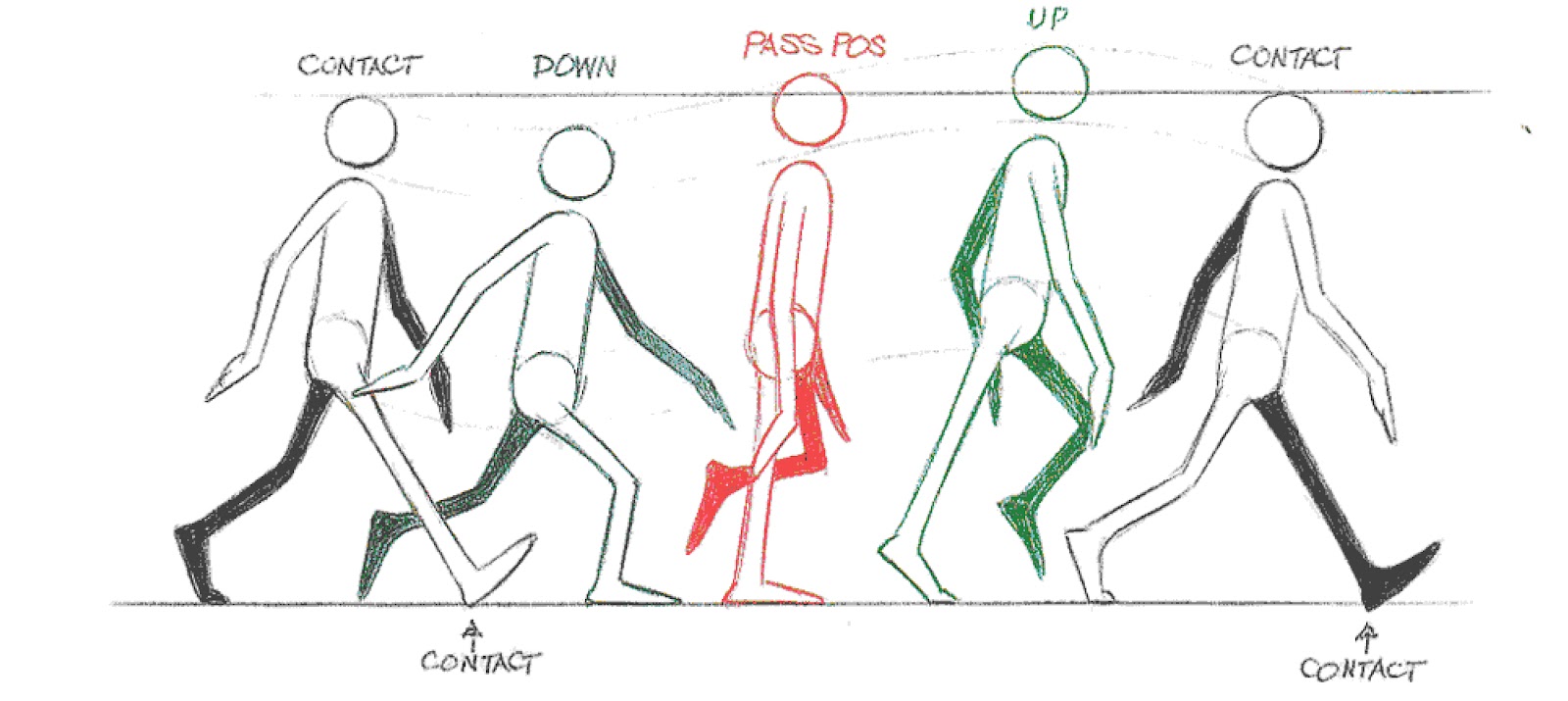
Your character falls below the ground in this animation. Also the bounce is kinda off - and you don't have an "up" position.

I'd recommend investing in the Animator's survival guide or just really deconstruction wlk cycles.

Here's one from the book - they can be extremely tough to get right.

 
Your character falls below the ground in this animation. Also the bounce is kinda off - and you don't have an "up" position.

I'd recommend investing in the Animator's survival guide or just really deconstruction wlk cycles.

Here's one from the book - they can be extremely tough to get right.

I actually used this exact image to help me. :3
What do you mean by "falls below the ground ?". For the up animation, I deleted it because the character was bouncing too much and it made the arm stretch to keep the bat on the ground. The solution would be to close the bat to the body but with so few pixels I never had a correct result when changing the angle. :/
 
So I made the jump from Visual Studio Professional 2010 to Visual Studio Ultimate 2013 mainly for the quick debugging with the Unity plugin.

Holy cow, what a pig. The UI is so outrageously ugly that I ended up spending a good 3 hours trying 3rd-party extensions and workaround to make it look (and function) more like 2010. In no particular order, my most-hated UI additions:


  • Metro/Flat UI. Seriously, this trend needs to stop, or at the very least have an option to switch it to something more aesthetically pleasing. Solid-color rectangles everywhere with small fonts isn't nice.

  • ALL CAPS MENU. Who thought it'd be a good idea to have the menus shout at you?

  • Sign-in to your Microsoft account. Just no. I don't want to "sign-in" to my IDE, and I definitely don't want my IDE synced to some service that endeavors to keep my IDE synced across multiple devices. Sometimes I have different IDE configurations for a reason.

  • New Icons: Again with the flatness. Even with third-party icon injectors, you can't get all of the icons from 2010 into 2013 (or at least, I haven't found a way yet). Some of the icons are awful in that you can't tell what they do, or can't see them properly.

  • Default Skins are extremely hard on your eyes. The Blue theme is pretty close to 2010, but I still had to change some of the colors to be less "shouty". God help you if you decide to go with the Light theme, or as I like to call it "The 'Let's make everything light gray'" theme.
Functionally it seems pretty nice, though. Git integration is kind of cool (you can see what methods are part of what commits, who committed, and what changes). I'm sure I'll dig it once I get used to it, but that stock UI is absolutely dreadful. I don't know who they have in charge of their UI, but they need a rethink.
 

desu

Member
So I made the jump from Visual Studio Professional 2010 to Visual Studio Ultimate 2013 mainly for the quick debugging with the Unity plugin.

Holy cow, what a pig. The UI is so outrageously ugly that I ended up spending a good 3 hours trying 3rd-party extensions and workaround to make it look (and function) more like 2010. In no particular order, my most-hated UI additions:


  • Metro/Flat UI. Seriously, this trend needs to stop, or at the very least have an option to switch it to something more aesthetically pleasing. Solid-color rectangles everywhere with small fonts isn't nice.

  • ALL CAPS MENU. Who thought it'd be a good idea to have the menus shout at you?

  • Sign-in to your Microsoft account. Just no. I don't want to "sign-in" to my IDE, and I definitely don't want my IDE synced to some service that endeavors to keep my IDE synced across multiple devices. Sometimes I have different IDE configurations for a reason.

  • New Icons: Again with the flatness. Even with third-party icon injectors, you can't get all of the icons from 2010 into 2013 (or at least, I haven't found a way yet). Some of the icons are awful in that you can't tell what they do, or can't see them properly.

  • Default Skins are extremely hard on your eyes. The Blue theme is pretty close to 2010, but I still had to change some of the colors to be less "shouty". God help you if you decide to go with the Light theme, or as I like to call it "The 'Let's make everything light gray'" theme.
Functionally it seems pretty nice, though. Git integration is kind of cool (you can see what methods are part of what commits, who committed, and what changes). I'm sure I'll dig it once I get used to it, but that stock UI is absolutely dreadful. I don't know who they have in charge of their UI, but they need a rethink.

Recently had to switch from 2010 to 2012 at work.

Can only agree, the metro/flat UI is such a cluster fuck ...

1. Blue theme comes at least close to 2010, even though I had to just some thing as well.
2. Shout menu was just a registry key change (YEAH!)
3. Icons, man yeah I hate them, most icons could be recovered from 2010 but the remaining ones still look like crap. Wish there were easier ways than injection icons to some resouce files to change all of them.

Well that's Microsoft ....
 
I actually used this exact image to help me. :3
What do you mean by "falls below the ground ?". For the up animation, I deleted it because the character was bouncing too much and it made the arm stretch to keep the bat on the ground. The solution would be to close the bat to the body but with so few pixels I never had a correct result when changing the angle. :/


Yeah that frame is good - did you try breaking it down into frames and then animating it? It's missing a few extra frames - as it leaves out the other side's frames for going into the UP position again. (I added them and then threw it in a gif)

1rJlx7F.gif


I opened up your image and saw that the 2nd - last frame are lower than your 1st frame by a pixel which throws everything off.

You usually want keyframes to start with and then do the in betweens.

Bounce is GOOD. It gives life to your character but also can make it feel wrong if things aren't bouncing correctly.

You picked something hard - a guy holding a bat. It's harder than your standard walk cycle.

Have you watched the raid 2?
If you study his walk he barely moves the arm holding the bat. But he still bounces, pretty heavily.


In gif form (simplified to 6 frames)

R5bjmJy.gif
 

Blizzard

Banned
So I made the jump from Visual Studio Professional 2010 to Visual Studio Ultimate 2013 mainly for the quick debugging with the Unity plugin.

Holy cow, what a pig. The UI is so outrageously ugly that I ended up spending a good 3 hours trying 3rd-party extensions and workaround to make it look (and function) more like 2010. In no particular order, my most-hated UI additions:

As someone who detests the flat Windows 8 tablet-style interface, and who upgraded to Visual Studio 2013 Express not too long ago, this subject is near and dear to my heart.

Apparently the interface was WORSE with the version before (2011 or 2012?) and 2013 is actually decent and not as bad as the normal flat tablet style. More detailed comments:

  • Metro/Flat UI. Seriously, this trend needs to stop, or at the very least have an option to switch it to something more aesthetically pleasing. Solid-color rectangles everywhere with small fonts isn't nice.
I didn't notice the fonts being very small, but I agree flatness is annoying -- at least it's not as bad a Office or Metro.

  • ALL CAPS MENU. Who thought it'd be a good idea to have the menus shout at you?
This is indeed hilarious. Thankfully there's a registry change that will fix it back. I googled it at the time, but I don't have the link on me. If you still want it, post/PM and I will find it again.

  • Sign-in to your Microsoft account. Just no. I don't want to "sign-in" to my IDE, and I definitely don't want my IDE synced to some service that endeavors to keep my IDE synced across multiple devices. Sometimes I have different IDE configurations for a reason.
Thankfully, this is completely optional. It doesn't even prompt you to sign in. I was afraid at first it would be always-online or something.

  • New Icons: Again with the flatness. Even with third-party icon injectors, you can't get all of the icons from 2010 into 2013 (or at least, I haven't found a way yet). Some of the icons are awful in that you can't tell what they do, or can't see them properly.

  • Default Skins are extremely hard on your eyes. The Blue theme is pretty close to 2010, but I still had to change some of the colors to be less "shouty". God help you if you decide to go with the Light theme, or as I like to call it "The 'Let's make everything light gray'" theme.
I forget which theme I use, but it's one of the defaults and it's not too bad, so it might be the blue one. The main irritation is I seem to recall the scroll bar slider being ALMOST the same color as the scroll bar background, making it very difficult to see.

Functionally it seems pretty nice, though. Git integration is kind of cool (you can see what methods are part of what commits, who committed, and what changes). I'm sure I'll dig it once I get used to it, but that stock UI is absolutely dreadful. I don't know who they have in charge of their UI, but they need a rethink.
I haven't messed with Git integration, but the absolute best improvement for me with VS 2013 was the better autocomplete getting support for C++. I think it's smarter about finding files and generating autocomplete stuff in general, but most of all, you can FINALLY do stuff like "buffer" and hit tab or alt-right-arrow or whatever, producing variable names like "_pXBuffer" or "_pSomeLongBufferVariable".
 
So I made the jump from Visual Studio Professional 2010 to Visual Studio Ultimate 2013 mainly for the quick debugging with the Unity plugin.

Holy cow, what a pig. The UI is so outrageously ugly that I ended up spending a good 3 hours trying 3rd-party extensions and workaround to make it look (and function) more like 2010. In no particular order, my most-hated UI additions:


  • Metro/Flat UI. Seriously, this trend needs to stop, or at the very least have an option to switch it to something more aesthetically pleasing. Solid-color rectangles everywhere with small fonts isn't nice.

  • ALL CAPS MENU. Who thought it'd be a good idea to have the menus shout at you?

  • Sign-in to your Microsoft account. Just no. I don't want to "sign-in" to my IDE, and I definitely don't want my IDE synced to some service that endeavors to keep my IDE synced across multiple devices. Sometimes I have different IDE configurations for a reason.

  • New Icons: Again with the flatness. Even with third-party icon injectors, you can't get all of the icons from 2010 into 2013 (or at least, I haven't found a way yet). Some of the icons are awful in that you can't tell what they do, or can't see them properly.

  • Default Skins are extremely hard on your eyes. The Blue theme is pretty close to 2010, but I still had to change some of the colors to be less "shouty". God help you if you decide to go with the Light theme, or as I like to call it "The 'Let's make everything light gray'" theme.
Functionally it seems pretty nice, though. Git integration is kind of cool (you can see what methods are part of what commits, who committed, and what changes). I'm sure I'll dig it once I get used to it, but that stock UI is absolutely dreadful. I don't know who they have in charge of their UI, but they need a rethink.

I hate that VS2013 seems to have the same problem I had with VS2012 where I have to reboot sometimes because I can't see anything I'm actually doing in it. Like it has issues with my graphics card.

It's less ugly than VS2012 though, they made it look more like VS2010.
 

Yeah actually I wanted to make the character from the Raid. Thanks for gif from the movie, I'll try to make it again. The legs seems rather fine for the moment but looking a the movie again, you can see my arm is way too far from the body. And I'll make him bounce once again just to see.
Damn so much time just for a walking guy. ^^'
 
Alright, well, it's kind of comforting that others dislike Visual Studio 2013 as well.

After spending much of today working on it, I finally got it into a useable state that looks as close to 2010 as I believe is currently possible. Here's a comparison, with 2013 on the left and 2010 on the right (click the image to see the full-size version):
electroflame said:

Here's a quick rundown of what I did, both for others and for future reference (as I'll have to redo all of this every time I reinstall 2013...).


electroflame said:
  • Most of the menu crap can be hidden with VSCommands. This includes toggling the ALL CAPS menu, as well as hiding some things like the Sign-In widget. Lots of options to go through if you want things customized even more.
  • VSCommands does add a StackOverflow menubar to the titlebar, as well as a toolbar. Right-click on both of these to hide them. While you're here, you should also go into Tools -> Options -> Environment -> Quick Launch and disable the Quick Launch bar in your title bar if you so wish (I have it disabled).
  • Next, you'll want to get as many icons out of VS2010 as possible. For this, you'll need a version of VSIP (Visual Studio Icon Patcher) that works with 2013. You can find one by following this post. (Note: The site it points you to is kind of scary looking, but it should be totally fine. I ran it through the anti-virus wringer and came back clean. However, if you have anti-virus, you should absolutely scan it as an added precaution.).
    • To use VSIP you'll need to have 2010 installed to get the icons (and all Visual Studio instances closed). If you don't have 2010 installed you can try the images folder that's linked to in this thread. Once you're ready, you need to run the program through Command Prompt (Shift Right-Click on the folder that it's in to get there quickly). Then you need to use the 'extract' command to get the images (if you don't have them already) and then the 'inject' command to patch VS2013. Note: If you downloaded the Images folder it needs to go in the directory where the .exe is. Unfortunately, you won't get all of the 2010 icons (I miss the save buttons the most...) but it's a good start.
  • Now you should be almost there. Next up is to get the Visual Studio 2013 Color Theme Editor extension. This will allow you to make a copy of the default Blue theme and change some things around to fit your tastes. For example, I made the title bar orange to match my taskbar color. I also changed the bar at the bottom (where "Ready" usually sits in the lower left-hand corner) to a less annoying purple color.

  • One final note is that by default Visual Studio 2013 installs all kinds of bloatware (like the Microsoft Advertising/pubCenter stuff for Windows Phones and Windows 8.1). What's crazy about this is that most of it is only useable if you're on Windows 8.1, so if you're on 7 (like I am) it will serve even less of a purpose than it usually does. The worst part is that generally you cannot uninstall it. It's supposed to show up under the Programs and Features window, but it seems to only show up under vanilla Windows 8. To actually uninstall it, you can use this fantastic command-line tool, TotalUninstaller.
    • To use TotalUninstaller, you need to first edit the config file that ships with it. By default it's set to try and find all of the bloatware that comes with 2013. You may want to keep some of these items, so double-check first. Once you're done, load it up in Command Prompt (Shift Right-click on the folder its in for fast access) and type in 'TotalUninstaller.exe /Filter' without the quotes. This should list all of the items it found installed that matched the text you put into the config file. If everything looks good and it's not detecting something that you want to keep, type in 'TotalUninstaller.exe /Uninstall' without the quotes and then it'll run through all of the uninstallers for the things it found. It may take a little while, so go enjoy a nice lunch or a frothy beverage -- you've certainly earned it by this point.
Once you're done, you may want to double-check the installed programs window and check if there's still some lingering programs that you don't want. I still had a couple left that I had to uninstall manually.

Hope this helps! I may have missed some things as I'm writing this after-the-fact, but it should be a very good outline to go by. Visual Studio 2013 is useable at last!

EDIT: Here's some extra things I've noticed, and how to fix them.

electroflame said:
  • CodeLens: This is the source control annotations above certain things (methods, mostly). They seem kind of cool at first, but rapidly begin to clutter up the editor. To disable them simply right-click on one annotation, choose Options and disable CodeLens.

  • Syntactic line compression: This may just be a part of the Productivity Power Tools extension, but it's pretty important. By default, any line that doesn't contain any alphanumerics will have it's height shrunk a bit. This makes your brackets look really weird. To turn it off go to Tools -> Options -> Productivity Power Tools -> Other Extensions and deselect "Compress lines that do not have any alphanumeric characters". I leave "Compress blank lines" checked as it doesn't look too weird and does help get more text onto the screen.

  • Line highlights: By default VS2013 has some pretty obtrusive line highlighting that VS2010 didn't. This is easily changed in Tools -> Options -> Environment -> Font and Colors. From here you'll want to have Text Editor selected in the top-most dropdown box. Then, under display items, go to "Highlight Current Line (Active)". Change the Item Foreground to Automatic to turn the highlighting off, or change it to a less obtrusive color. (As I'm using a light theme, I use RGB 249, 249, 251, with HSL (Hue, Sat and Lum) 160, 48, 235. When you're done, be sure to do the same thing to "Highlight Current Line (Inactive)".
  • Status bar: I believe that VS2013 has this disabled by default. This is the bar at the very bottom of the IDE that contains your Status, Line Number, Column Number, etc. To me, this is a pretty important thing, as it shows you a lot of info at a glance. To turn it on (or off, if you want) you can find the option under Tools -> Options -> Environment -> General -> "Show status bar".
  • Sluggish Performance: I only started to notice this after I had been using it for a while. It appears that the Microsoft Git integration either A.) leaks so performance gets worse over time or B.) gets exponentially slower as you add more files to the project. It didn't really add much for me so I disabled it, which incidentally brought back all of the performance I had lost. You can find the option to disable it under Tools -> Options -> Source Control and then using the dropdown menu set "Current source control plug-in" to "None".
    • Note: I've read elsewhere that other users have had a much better experience using external source control providers (like Tortoise for GIT), but it honestly didn't add much to the IDE for me so I just disabled it outright.
 
So, just asking, how actually good is Playmaker for Unity? I've been considering buying it from the asset store, and there's a ridiculous amount of positive reviews, but I'm hoping to get some idea of its drawbacks as well before shelling out the cash for it. It seems like a great tool for prototyping, at least.
 

mabec

Member
Add a "FoV" button and call it "Fantastic or Virid". Adding 150% bloom or the color green on everything.

(virid is everything green, google it)
 
Status
Not open for further replies.
Top Bottom