jacksepticeye
Member
Benchmarks of Redux compared to original games, someone said they were better optimized? HA!
I expect drivers that come out after launch will help
Benchmarks of Redux compared to original games, someone said they were better optimized? HA!
Jeez, that is an extremely harsh downgrade for PC...
I really miss the color shifting light. Unique look. Now it looks like COD on Xbox 360.
Redux:
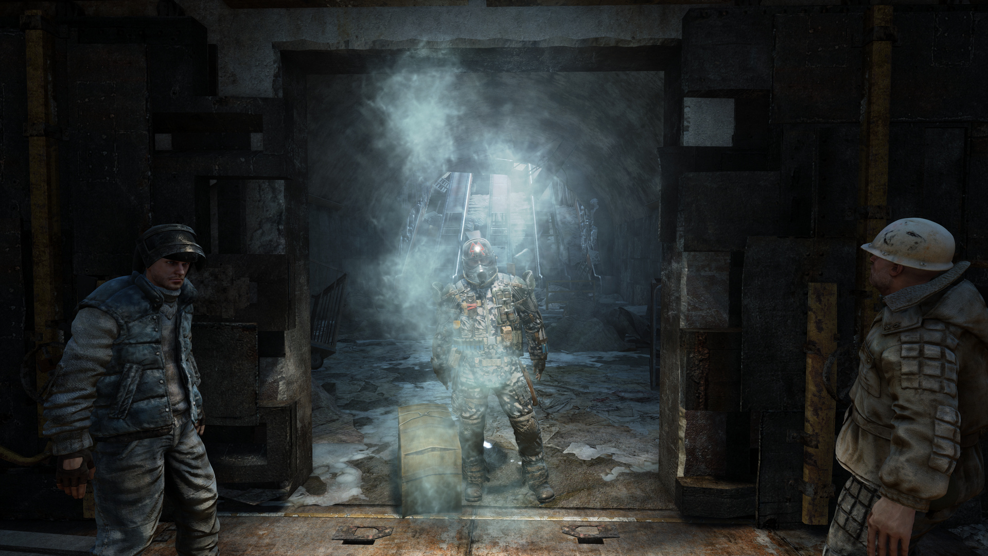
Original:
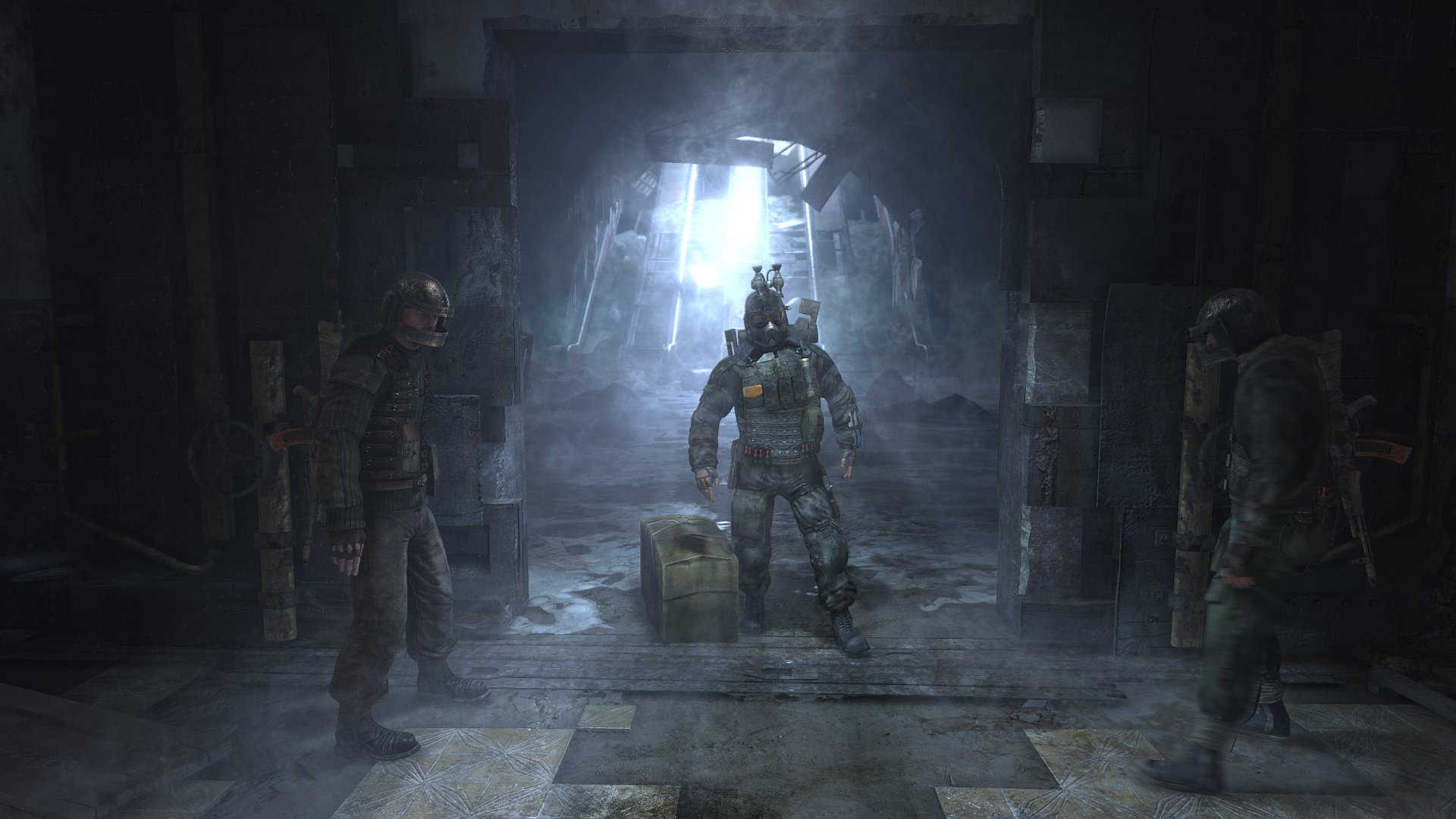
I much prefer the color in the original, but the character models in redux look better.
Redux:

Original:

Redux does look better here.
Artistically I like the look of Redux more.Redux:

Original:

Redux:

Original:


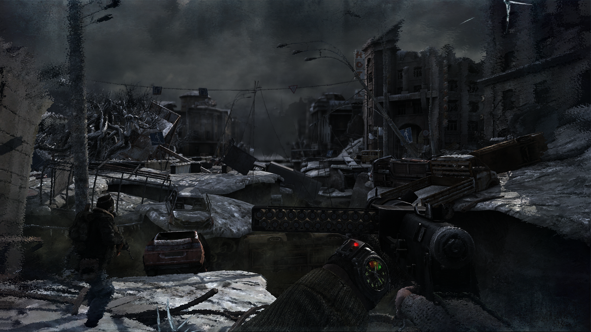
excluding some stuff from a technical perpective (particles and no volumetrics), yes, it does.
Damn, wasnt expecting a downgrade on the pc end. Some of those comparison shot/videos are pretty bad for a game thats supposed to be an upgrade.Glad i held off on that promotional deal.
I've yet to see this "downgrade", other than Last Light redux looking a bit brighter than the original.
Redux:
btw thanks to K-putt from the High Res Screenshots thread here for these pre-release shots. Did it without his knowledge, but I would imagine it is not a big deal.
I know "technically" redux is superior, with its global illumination and such. But in this area I prefer the original. It's much more suiting of a post apocalypse.Redux:

Original:

btw thanks to K-putt from the High Res Screenshots thread here for these pre-release shots. Did it without his knowledge, but I would imagine it is not a big deal.
The original atmosphere is completely fucked up in the Redux, why the hell they make this artistical choice :/
Redux:
http://abload.de/img/metro_polo_1080_4k9d70yxcr.jpg
Original:
http://abload.de/img/m35hzxtg.png
btw thanks to K-putt from the High Res Screenshots thread here for these pre-release shots. Did it without his knowledge, but I would imagine it is not a big deal.
I've yet to see this "downgrade", other than Last Light redux looking a bit brighter than the original.
Ah I missed those. Safari syndrome.Bunch of webms really showed it off in prior pages. Lots of atmosphere missing.
I know "technically" redux is superior, with its global illumination and such. But in this area I prefer the original. It's much more suiting of a post apocalypse.
The original atmosphere is completely fucked up in the Redux, why the hell they make this artistical choice :/
I agree that it's more suiting to the postapocalypthic setting, but i think it makes more sense in the Redux edition - because of snow - in the original it is only on the ground, but nowhere else.. in Redux snow is not only on the ground, but everywhere - on cars, on buildings, on signs, etc.. so maybe from a logical point it makes sense why it's so bright
If I'm honest, this thread has killed my hype for this double remaster.
I still want to get it and I really want to support 4A, but seeing these comparisons is a bit of a bummer. Still, with graphics this good, and the game running 1080P and 60 frames per second on PS4, I may just get it to get that new gen feel!
Never tried Last Light, either.
I don't really agree -- some of the assets are significantly better in Redux, but the volumetric light adds so much to the original scene.Redux does look better here.
edt: BTW, anyone recognize this scene?
I am either thinking bourbon or khan scenes going through the metro... but I forget which chapter. I want to load it up and comparison screenshot it.
Is there any truth to the rumor that the latest
Nvidia drivers improve the performance of OG last light?
I don't really agree -- some of the assets are significantly better in Redux, but the volumetric light adds so much to the original scene.
Saw it in the steam thread earlier but my googlefuu didn't turn anything up.WHere did you read this rumor?
The Metro Redux profile uses all the same bits from the last light profile btw.
One is recorded at 40 (to save filesize originally) and the other is 60.personally I think alot of the volumetric lights were overdone, I think it looks much more subtle and better in the redux version.
Saw it in the steam thread earlier but my googlefuu didn't turn anything up.
One is recorded at 40 (to save filesize originally) and the other is 60.
Idk, I think it looks much better with. Far from looking "overdone..."
Original
http://a.pomf.se/fkcvba.webm
Redux
http://a.pomf.se/jymflo.webm
I doubt it, I tried running LL with the Redux profile and got the same performance.
its overdone
One is recorded at 40 (to save filesize originally) and the other is 60.
Idk, I think it looks much better with. Far from looking "overdone..."
Original
http://a.pomf.se/fkcvba.webm
Redux
http://a.pomf.se/jymflo.webm
I doubt it, I tried running LL with the Redux profile and got the same performance.
I agree. I played through it a couple of times and felt it was a bit overdone especially indoors and in small spaces. Living quarters should not have a ton of dust in the air for no reason.
its overdone
I agree. I played through it a couple of times and felt it was a bit overdone especially indoors and in small spaces. Living quarters should not have a ton of dust in the air for no reason.
Indeed. In both books (I own audio book versions of Metro 2033 and 2034 which can be found on Amazon) there are quite a few stations far more spooky and filed with oddities than what is shown in either game..Actually... in the book, the free stations are often described as smoky and poorly ventilated.
Indeed. In both books (I own audio book versions of Metro 2033 and 2034 which can be found on Amazon) there are quite a few stations far more spooky and filed with oddities than what is shown in either game..
Still happy to have pre-ordered the redux via Steam despite some mild negative feelings towards a few of the changes.
It would make for a very trippy set of levels! Apparently the Metro 2035 book should be out before the end of the year. Hopefully the English version is available soon after the Russian release.Aye, like the Cult of the Great Worm. Not entirely surprising that their station didn't show up in the games... :-D
