You are using an out of date browser. It may not display this or other websites correctly.
You should upgrade or use an alternative browser.
You should upgrade or use an alternative browser.
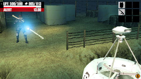
new metal gear game for PS1. screens inside.
- Thread starter Incognito
- Start date


Matlock said:"That looks as good as MGS2"
:lol :lol
wario- y dont u ruin all the fun??
Come on, we don't to do this thread again.
Bah screens aren't showing. Go here: http://www.itmedia.co.jp/games/psp/2004/mga/first/index.html#19
http://ga-forum.com/showthread.php?t=12006
Welcome to weeks ago
Thank you for rescuing me, but your troll is in another thread
Grizzlyjin
Supersonic, idiotic, disconnecting, not respecting, who would really ever wanna go and top that
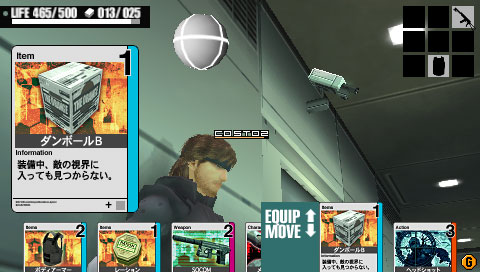
Those screens are pretty bad...and their old...and it looks better than any handheld MGS game I've ever seen...so why complain? And I don't care about the card based gameplay. If I can want Baten Kaitos, I can like this.
It might not look better than MGS2, but it sure has my interest more than The Twin Snakes...and it looks better to boot.
*runs away before the explosion*
It might not look better than MGS2, but it sure has my interest more than The Twin Snakes...and it looks better to boot.
*runs away before the explosion*
there was a thread about this before? i remember one, in paticular, where solidsnakex said acid was the second coming of metal gear solid 2.
:lol :lol :lol
damn, my memory must suck.
It's Team Kojima minus Kojima as the director. It looks as good as MGS2, it just doens't have any color tint which is one thing they should add to it.
:lol :lol :lol
damn, my memory must suck.
True...Some people should start their PSX again just to see what we were playing 6 years ago.dark10x said:Pretty bad looking, but they look more like caps from a field rendered PS2 title than a standard PSX game.
but it sure has my interest more than The Twin Snakes...and it looks better to boot.
LMAO,I hope that was a joke.There is no way you could think that looks better than TTS.

ourumov said:True...Some people should start their PSX again just to see what we were playing 6 years ago.

Oh wait, that looks better.
")
but it sure has my interest more than The Twin Snakes...and it looks better to boot.

HalfPastNoon said:there was a thread about this before? i remember one, in paticular, where solidsnakex said acid was the second coming of metal gear solid 2.
"It's Team Kojima minus Kojima as the director. It looks as good as MGS2, it just doens't have any color tint which is one thing they should add to it."
:lol :lol :lol
damn, my memory must suck.
Woo : Doves :: Kojima : Green
Lord Error
Insane For Sony
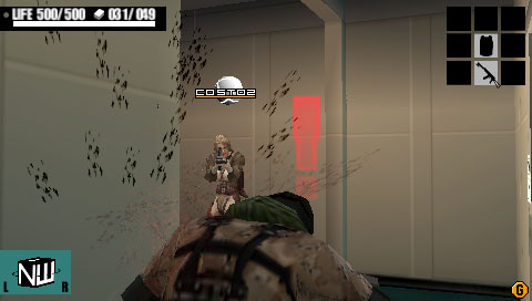
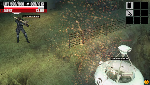
I have seen these exact same screens couple of weeks ago, except that they were regular framebuffer caps, and looking much better. This looks like someone took those original images, scaled them down in photoshop to 50% and then enlarged them back to their original size.
*edit*
An example of original screen, in the original PSP resolution. Most of the pictures from that link don't work anymore, but these seem to be there still:
*edit*
An example of original screen, in the original PSP resolution. Most of the pictures from that link don't work anymore, but these seem to be there still:
Marconelly said:I have seen these exact same screens couple of weeks ago, except that they were regular framebuffer caps, and looking much better. This looks like someone took those original images, scaled them down in photoshop to 50% and then enlarged them back to their original size.
The ones that Wario links to look identical.

---also, you bring up pictures that don't even relate to the thread.
Lord Error
Insane For Sony
If by that you mean "they don't look like shit", then I agree. They are all from MGS:A, however.---also, you bring up pictures that don't even relate to the thread.
*edit* as opposed to your Crash 3 picture?
Lord Error
Insane For Sony
Matlock, I honestly don't know what to tell you. Are you really that blind to think that pictures I posted are not:After you say that, you post up pictures that don't even relate to what you're talking about, in fact, it looks like you posted a pre-rendered sequence.
a) realtime
b) from MGS:A
c) direct frame buffers
?

Agent Dormer
Dirty Drinking Smoker
I think Kojima stated in an interview that the team working on this title was younger and hipper - and also not as good. :|
Lord Error
Insane For Sony
It's pretty obvious...It does look like the pictures from Game Informer were resized.

eso76
Member
If they really were resized to 50% and then scaled back to the original size...why would the hud look so detailed and relatively hi res ? while those fonts are indeed blurrier than the official SS, they don't appear nearly as low res as the game itself.
Anyway, you'll be playing this on such a small monitor, resolution shouldn't matter too much.
Anyway, you'll be playing this on such a small monitor, resolution shouldn't matter too much.
Forsete
Member
I copied this image into Photoshop
http://pspmedia.ign.com/psp/image/article/547/547240/metal-gear-acid-20040913093754170.jpg
Then applied De-Interlace (Odd Fields, Interpolation)
End result..

http://pspmedia.ign.com/psp/image/article/547/547240/metal-gear-acid-20040913093754170.jpg
Then applied De-Interlace (Odd Fields, Interpolation)
End result..
SiegfriedFM
Member
De-interlaced, DUH! Look at the first picture. You think the cards would be that blurry, regardless of the 3D graphics quality?
Oh well, trolls are hungry, someone better feed them...
Oh well, trolls are hungry, someone better feed them...
The fonts are visibly missing lines, making some letters near impossible to read. It's obviously a result of deinterlacing the image (which in turn is equivalent to vertically resizing by 50% and then back up).If they really were resized to 50% and then scaled back to the original size...why would the hud look so detailed and relatively hi res ?
Gamespot has the pics too.
http://www.gamespot.com/psp/strategy/metalgearsolid/screenindex.html
Gameinformer owned. Can't even put up pics correctly
http://www.gamespot.com/psp/strategy/metalgearsolid/screenindex.html
Gameinformer owned. Can't even put up pics correctly
eso76
Member
Fafalada said:The fonts are visibly missing lines, making some letters near impossible to read. It's obviously a result of deinterlacing the image (which in turn is equivalent to vertically resizing by 50% and then back up).
Yes, they do miss lines. Still they don't look as low res as the rest, but upon further examination that's obviously because these screens were reduced in vertical res only. Or, well, deinterlaced.
The game will probably look more like the official screens