You are using an out of date browser. It may not display this or other websites correctly.
You should upgrade or use an alternative browser.
You should upgrade or use an alternative browser.
Summer Anime 2017 |OT| More streaming services than shows to watch
- Thread starter TUSR
- Start date
- Status
- Not open for further replies.
hosannainexcelsis
Member
Tell me more!
Sure.
I brought up Hand Shakers earlier but I don't intend to claim that Princess Principal is as visually repugnant as that series I only drew the comparison because both shows feel like they utterly fail to provide visually cohesive worlds. Where as Hand Shakers takes that in the most garish possible direction, Princess Principal instead opted to aim for a far more washed our variation on the same.
If anything, Princess Principal's major visual problem is that it is too cohesive. It has a very narrow color range - lots of blacks and yellow-reds - and thus can feel a bit monotonous in how invariable the color palette is. I would prefer a color design with more spice.
Due you notice anything that stands out in the below shot:
I don't know about you, but my eye gravitates first to that ruby red sofa, then those green and purple rocks, and finally to that blood-red valve in the top right hand corner. Why? Because they're completely incongruous with the other colours in the shot. There's a strong tonal affinity between the colours of the characters clothes, an affinity which extends to most of the background art such as the brick walls and glass cases. There's no good reason for the sofa, rocks, and valves to be in their own separate colour universe - they aren't plot or character relevant, so what's going on with them? It just reveals that the image is nothing but different layers of visual art, created by different people, slapped together by yet another person and apparently not colour corrected by any kind of colour editor.
My eye first gravitates to the black blindfold myself. At any rate, your color criticisms of this shot seem misplaced to me. The red of the couch and the valve, while a bit stronger in shade, still match with the red of the brick wall and the general red hue of the setting. The green and purple rocks provide a moment of relief from the overpowering red which I appreciate, while still being muted enough that they don't really stick out in the overall image. While the production here isn't as highly refined in composite as the highest-tier of anime, such as Bungo Stray Dogs or Fafner Exodus, I can't see the color design as incoherent.
There are plenty of other visual issues worth discussing beside colour. Take, for example, the very first shot of the entire series:
What's with all this Crest of the Stars-esque shit digital noise? I don't understand why the art director thinks 19th century photography = a blurry, vaseline smeared mess? Obviously some of the photographs were not as sharp, and you certainly have imperfections in lenses and other artefacts, but they don't resemble this visual garbage. Why are you trying to hide your art under so many bad layers?
Oh well, at least this shot above is a little better, because it at least attempts to more accurately portray a family potra-
Oh dear, what's going on in here? If this opening sequence is attempting to emulate old time photographic conventions with any kind of verisimilitude then they should not employ jarring modern techniques like zooms and canted angles. Pick one visual style - don't attempt to mix and match in such a sloppy manner.
This is being too much of a pedant. While this expository sequence, as well as the brief memory flashbacks of Ange later on, uses artifacting to create an early 20th century ambiance, it seems silly to criticize it for one shot that may not be "historically accurate" in terms of what an early 20th century filmreel would have looked like as it describes a steampunk fantasy world. Moreover since this particular character is important to the story, being, I believe, the princess involved with the spy agency, it makes sense to single her out with the strikingly different shot to indicate her importance. Plus this shot is swept away with flames that burn it up, which is a visual technique that also would come from outside the "world" of an actual filmreel. If you need a real-world analogue, imagine that we're looking through the lens of a camera which is pointed at a separate projection on the wall as the film is being burnt up.
I brought this particular shot up earlier, but now that I'm being more critical I want to explain what's wrong with it. Clearly the imagery of a women perched atop a ledge that overlooks a sprawling a metropolis is reminiscent of Ghost in the Shell, especially as the women here also jumps off her perch in what appears to be an extremely reckless manner. What this particular re-creation fails to get right, however, is just about every element of what makes Oshii's shot powerful. Lets take a look at the original:
Did Oshii take out a patent on women falling from a building? If anything, this sequence riffs more on Gravity Rush, the video game, than Oshii's Ghost in the Shell movie. The character isn't supposed to feel threatened by gravity - she's in control of it due to the Cavorite orb she's using. This is establishing Ange as a self-confident character who can freely move through the insubstantial city.
Why does the character and the background art look like they're from two different worlds which shall never meet? (this is a huge issue in numerous scenes).
I don't think this is an issue in the image you highlight, but as I alluded to earlier I do think the composite is lacking polish in integrating different elements.
Why is half her face out of focus?
You might not have noticed this, but applying this kind of depth-of-field effect on facial closeups has actually become a common photography technique in current anime productions with some photographic ambition, such as Showa Genroku Rakugo Shinjuu S2 and Konosuba S2 at Deen or Sound Euphonium S2 and A Silent Voice at KyoAni. While I don't know the specific reason for using it in all circumstances, the interviews with KyoAni staff I've read say that they often use depth-of-field to create a hazy atmosphere, to make an image feel less solid and more touched with nostalgia or a heightened emotional state. That would fit with this image, in which Eric is getting emotional upon hearing Ange narrate her past tragedy.
Why is the one moving chair that they had to animate in this scene a completely different visual design to the all the static background chairs?
There probably wasn't an attempt to closely coordinate chair design between the animators and background artists in this scene, but then it's not that unusual to have different kinds of chairs in the same room.
Why employ all this horrendously busy wallpaper in your background art?
I've seen wallpaper with similar styles in early 20th century homes, so I assume it's another attempt to evoke the time period.
Are they in some 90's 1st person maze game?
I can't understand what you're talking about here.
The rim lighting here is disgustingly ridiculous. Are they on stage?
Yes, they are on stage. Metaphorically, at least. I, at least, appreciate the rim lighting that was present through this entire climatic scene. I think it's particularly effective in a shot like this:

Gross, purple lens flares are distracting.
Personal preference, of course, but I can see the reasoning for a disquieting lens flare like that in the shot in which
Ange murders Eric
I'm not going to say the production of Princess Principal is flawless, as it certainly is not, but I do think many of the criticisms you make here are unreasonable.
Crimson_Echidna
Banned
The Melancholy of Haruhi Suzumiya Season 1 (2006) - chronological order
I just finished my binge watching and now I get what you were saying about the pacing. With the chronological order the season peaks halfway through with the climactic episodes TMOHS Part IV (knife girl) and VI (the dream and the). The episodes 7 to 13 were enjoyable but nothing really huge happens in them. The broadcast order makes more sense with Part VI as the last episode.kiss.
Bruh, if you're going to watch it chronological, you should've watched both seasons together. That's the way to go.
Yeah but that is like a brilliant deconstructed subversion of the boob grope trope.
/s
Is it? Does not feel very different from other recent seasons to me.anime is dead this season
Is it? Does not feel very different from other recent seasons to me.
I think it's personally better than the last one by quite a bit.
It's been a long while since people started reducing their backlog anyway.
Not enough arcade sticks, haha
Gamers 01
This is kinda bad but this season is so dire I might just continue watching it just to see if we see anything other than Arc System Works games
Not enough arcade sticks, haha
hosannainexcelsis
Member
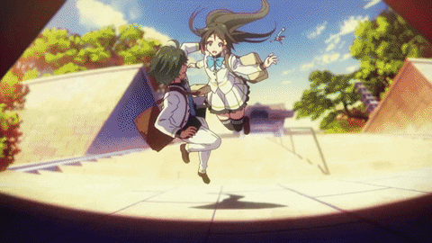
Princess Principal Ep. 1
Why couldn't they just have made the team older or every other character more stylised? It drains tension from otherwise good scenes and makes the whole thing feel very odd in places (the Agnes/Eric tension). Goddammit moe
I confess that I have a soft spot for Kouhaku Kuroboshi's designs, so I'm not going to complain about Princess Principal using them even if there's a clear incongruity between them and the more realistically designed side characters.
Cornbread78
Member
Whenever I hear "Aho" now all I can think about is that stupid parrott from Beck
Joe Molotov
Member
Gamers 01
me irl
me irl
So I sat down and really looked at the Kekkai Sensen S2 PV. I had seen it earlier but a few things bugged me and I never got around to verifying if my reactions were accurate or not until now. So first off, the character designs have been tweaked.
I'm curious though how the storyboarding is going to be affected as the original season had so much of her personal flair. I'm not sure how successful Takayanagi is going to be trying to replicate that especially considering how shitty of a director he normally is. I still don't know how this dude got this job.
It mostly has to do with the eyes as they have thicker outlines now and the colorings are a bit flatter.


The background art is surprisingly close to Kimura's level despite the switch. It's still not to his caliber but that was always going to be the case when it was announced he was gone. They're clearly aiming for the same general style, just without the Matsumoto eccentrics.

I'm curious though how the storyboarding is going to be affected as the original season had so much of her personal flair. I'm not sure how successful Takayanagi is going to be trying to replicate that especially considering how shitty of a director he normally is. I still don't know how this dude got this job.
hosannainexcelsis
Member
So I sat down and really looked at the Kekkai Sensen S2 PV. I had seen it earlier but a few things bugged me and I never got around to verifying if my reactions were accurate or not until now. So first off, the character designs have been tweaked.
It mostly has to do with the eyes as they have thicker outlines now and the colorings are a bit flatter.
The background art is surprisingly close to Kimura's level despite the switch. It's still not to his caliber but that was always going to be the case when it was announced he was gone. They're clearly aiming for the same general style, just without the Matsumoto eccentrics.
I'm curious though how the storyboarding is going to be affected as the original season had so much of her personal flair. I'm not sure how successful Takayanagi is going to be trying to replicate that especially considering how shitty of a director he normally is. I still don't know how this dude got this job.
In this case we actually know how Takayanagi got this job: Nightow requested him because he was impressed with Takayanagi's work on the Trigun anime.
MetroidPrimeRib
Banned
Part I
Part II
Kizumonogatari III - The Cold Blooded
I believe when it comes to Kizumonogatari and the long, long wait for it that this is the part that people were really waiting for. The years long wait for Araragi vs Kiss-Shot Acerola Orion Heart-Under-Blade. Two beings so powerful in universe that a close second doesn't even come close to existing - aside from Oshino Meme, perhaps. A key question throughout Kizu is then of course how did Kiss-Shot even lose to begin with if she is so powerful? I think people familiar with her character probably know half of the answer, but people familiar with Oshino Meme's character might be able to guess the other. While the setup seems odd at first, the reasoning behind it all is perfect. It works so well retroactively and as a starting point. Kiss-Shot by her nature wants to die. Araragi by his nature won't let her. It's as simple as that.
Lets not mince words here - this movie is absurd. The level of violence specifically is absurd. Mortal Kombat 9/X level fatalities and X-Rays absurd. Whats so gruesome about this fight is that unlike when Goku and Vegeta fight each other, Kiss-Shot and Araragi don't have defense equal to their strength and speed. When Goku punches Vegeta, he bleeds a bit and gets a bruise. When Kiss-Shot punches Araragi, he liquefies. And then immediately is fine because of the regeneration that would make Wolverine blush. What you have here are two monsters ripping each other apart like never ending paper that bleeds. The absurdity is only elevated by the literal Looney Tunes sound effects present. Araragi gets his his face slapped off and his skull rolls off his head. He then runs around like a headless chicken while Kiss-Shot chases him while holding her dress up, then his head comes back as a baby and morphs into his regular head. Ok, maybe its more like Itchy and Scratchy then Looney Tunes. Kiss-Shot runs Araragi's face into the wall while a chainsaw noise plays, then spins and tosses his body and the force makes his torso spin around and disconnect from his legs. Then his legs run around by themself. His hand gets knocked off and is connected by only one red string, and it swings around like one of those gummy hands. It is the epitome of absurdity. For such a serious fight, its hilarious. I think because the fight is set in an empty stadium with the sound of crowds cheering and Kiss-Shot finally getting to enjoy herself for once in hundreds of years, it can be both. The fight means very different things to Araragi and Kiss-Shot, and to Hanekawa. For Kiss-Shot its one final bout of entertainment she's longed for. For Araragi its his own hardline moral stance forcing him into this situation. For Hanekawa its a horrifying show of Araragi being ripped apart over and over and over again. And it mixes all three of these viewpoints well. And it goes without saying that the entire thing looks jaw-droppingly amazing. There's a specific scene my Kou Yoshinari that is just... indescribable. Just watch it.
Aside from the fight, there's a scene near the beginning with Kiss-Shot explaining her past with her first thrall that is animated in a sketchbook like manner that bares some similarities to the Onimonogatari OP. When Araragi discovers Kiss-Shot eating a human body, the human body and head look straight up awful Berserk CGI tier. Since this movie looks so good otherwise, one has to assume that is 100% on purpose and is supposed to mirror the shock and denial Araragi feels about seeing a dead human, but I'm not sure if that landed for me. There's also a really long and rather uncomfortable sequence of Araragi being a shithead pervert. But he gets the shit beaten out of him after!
Kizumonogatari ends as it begins. With Kiss-Shot lying on the floor dying, with Araragi having to make the choice to leave her or save her. The ending itself is actually rather sad, or perhaps bittersweet. Neither of the two characters get a good deal in the end, but knowing how things proceed after you can come to terms that Araragi made the right choice. It is essentially saving someone from suicide, and those who survive suicide attempts always come to the conclusion that they would have deeply regretted going through with it. Kizumonogatari is what a prequel should be. I believe you could watch this at any point - first, after Bake, after Nise, before Owari, after Owari and it would work. Hell you could probably just watch these movies alone for the animation if you want. But the real value of Kizumonogatari is that it adds to the series. Shinobu, Araragi, Hanekawa and Oshino aren't complete characters without this. No matter where you watch this (except first I suppose) it will likely recontextualize those characters. If you thought Hanekawa was the best character before, then you should probably watch this.
Part II
Kizumonogatari III - The Cold Blooded


I believe when it comes to Kizumonogatari and the long, long wait for it that this is the part that people were really waiting for. The years long wait for Araragi vs Kiss-Shot Acerola Orion Heart-Under-Blade. Two beings so powerful in universe that a close second doesn't even come close to existing - aside from Oshino Meme, perhaps. A key question throughout Kizu is then of course how did Kiss-Shot even lose to begin with if she is so powerful? I think people familiar with her character probably know half of the answer, but people familiar with Oshino Meme's character might be able to guess the other. While the setup seems odd at first, the reasoning behind it all is perfect. It works so well retroactively and as a starting point. Kiss-Shot by her nature wants to die. Araragi by his nature won't let her. It's as simple as that.


Lets not mince words here - this movie is absurd. The level of violence specifically is absurd. Mortal Kombat 9/X level fatalities and X-Rays absurd. Whats so gruesome about this fight is that unlike when Goku and Vegeta fight each other, Kiss-Shot and Araragi don't have defense equal to their strength and speed. When Goku punches Vegeta, he bleeds a bit and gets a bruise. When Kiss-Shot punches Araragi, he liquefies. And then immediately is fine because of the regeneration that would make Wolverine blush. What you have here are two monsters ripping each other apart like never ending paper that bleeds. The absurdity is only elevated by the literal Looney Tunes sound effects present. Araragi gets his his face slapped off and his skull rolls off his head. He then runs around like a headless chicken while Kiss-Shot chases him while holding her dress up, then his head comes back as a baby and morphs into his regular head. Ok, maybe its more like Itchy and Scratchy then Looney Tunes. Kiss-Shot runs Araragi's face into the wall while a chainsaw noise plays, then spins and tosses his body and the force makes his torso spin around and disconnect from his legs. Then his legs run around by themself. His hand gets knocked off and is connected by only one red string, and it swings around like one of those gummy hands. It is the epitome of absurdity. For such a serious fight, its hilarious. I think because the fight is set in an empty stadium with the sound of crowds cheering and Kiss-Shot finally getting to enjoy herself for once in hundreds of years, it can be both. The fight means very different things to Araragi and Kiss-Shot, and to Hanekawa. For Kiss-Shot its one final bout of entertainment she's longed for. For Araragi its his own hardline moral stance forcing him into this situation. For Hanekawa its a horrifying show of Araragi being ripped apart over and over and over again. And it mixes all three of these viewpoints well. And it goes without saying that the entire thing looks jaw-droppingly amazing. There's a specific scene my Kou Yoshinari that is just... indescribable. Just watch it.


Aside from the fight, there's a scene near the beginning with Kiss-Shot explaining her past with her first thrall that is animated in a sketchbook like manner that bares some similarities to the Onimonogatari OP. When Araragi discovers Kiss-Shot eating a human body, the human body and head look straight up awful Berserk CGI tier. Since this movie looks so good otherwise, one has to assume that is 100% on purpose and is supposed to mirror the shock and denial Araragi feels about seeing a dead human, but I'm not sure if that landed for me. There's also a really long and rather uncomfortable sequence of Araragi being a shithead pervert. But he gets the shit beaten out of him after!


Kizumonogatari ends as it begins. With Kiss-Shot lying on the floor dying, with Araragi having to make the choice to leave her or save her. The ending itself is actually rather sad, or perhaps bittersweet. Neither of the two characters get a good deal in the end, but knowing how things proceed after you can come to terms that Araragi made the right choice. It is essentially saving someone from suicide, and those who survive suicide attempts always come to the conclusion that they would have deeply regretted going through with it. Kizumonogatari is what a prequel should be. I believe you could watch this at any point - first, after Bake, after Nise, before Owari, after Owari and it would work. Hell you could probably just watch these movies alone for the animation if you want. But the real value of Kizumonogatari is that it adds to the series. Shinobu, Araragi, Hanekawa and Oshino aren't complete characters without this. No matter where you watch this (except first I suppose) it will likely recontextualize those characters. If you thought Hanekawa was the best character before, then you should probably watch this.


It's just like in one of my favourite hentais !
Also
I'll have to rewatch some scenes and maybe the entire last arc of Owari but at this point I disagree Kizu can be watched whenever. I'd imagine before time travel arc would be the last moment for it andI'm not even sure if I wouldn't recommend starting the entire series with it.
Also
Oshino too stronk. Nerf pls.
I'll have to rewatch some scenes and maybe the entire last arc of Owari but at this point I disagree Kizu can be watched whenever. I'd imagine before time travel arc would be the last moment for it andI'm not even sure if I wouldn't recommend starting the entire series with it.
MetroidPrimeRib
Banned
I swear, Hanekawa's bosom is at least two sizes bigger than before...
Its from Ararararararagi's perspective!!!!
Was his Trigun episodes that good?In this case we actually know how Takayanagi got this job: Nightow requested him because he was impressed with Takayanagi's work on the Trigun anime.
MetroidPrimeRib
Banned
We all know the strongest characters are Oshino Meme, Kaiki, Kagenui and Gaen but they never try. They'd find a way to beat Kiss-Shot. Hanekawa will get there one day.
hosannainexcelsis
Member
Was his Trigun episodes that good?
I haven't seen Trigun so I can't say. People really like his Cardcaptor Sakura episodes which were made around the same time though.
AquaWateria
Member
Didn't realize there would be a season 2 of Kekkai Sensen.
Valdfellgar
Banned
Was his Trigun episodes that good?
Just looking it up quick he worked on Episodes 3 & 13 as Storyboard/Episode Director and then 21 and 26 as Assistant Director.
I'm rewatching it now, only on Episode 9, but I do remember 3 being one of the better looking episodes.
Cornbread78
Member
Gal Girlfriend 1
This is some carefully cultivated trash that has grown to the point it has left our atmosphere and is now rotating the sun. Basically it's some cosmic level trash.
Pretty fair description imo...
Moral Panic
Member
Wow this season is trash.
MetroidPrimeRib
Banned

Cornbread78
Member
Genshiken ep.7
This girl pisses me off to no end. Leave the poor otaku's alone man.. How can he grow Genshiken with her annoying personality around!

One is a recap episode and the other is not great....the CCS work is the notable stuff.Was his Trigun episodes that good?
Dedication Through Light
Member
Dive!! Episode 2
Good focus on the characters postures, great shots all around especially the post shower scene.

Otherwise, the coach is really growing on me, probably best of the female coaches in all the boys sports with femManagers/Coaches thus far. Shes passionate and she actually really cares.
I think my favorite character will probably end up leaving as I dont think he seems as passionate enough or hopeful for the club's increasing seriousness. Oh well.
OST is still really good.
Yoichi is becoming a favorite too.

Good focus on the characters postures, great shots all around especially the post shower scene.
Otherwise, the coach is really growing on me, probably best of the female coaches in all the boys sports with femManagers/Coaches thus far. Shes passionate and she actually really cares.
I think my favorite character will probably end up leaving as I dont think he seems as passionate enough or hopeful for the club's increasing seriousness. Oh well.
OST is still really good.
Yoichi is becoming a favorite too.
Crimson_Echidna
Banned
Rage of Bahamut: Genesis, Completed - This ultimately ended up being a mixed bag, which is disappointing because I really was enjoying the first half of he series. I'd say by far the strongest element is the dynamic between Favaro and Kaisar; Favaro being your typical 80's anti-hero who is snarky and reluctant to do a go and Kaisar being the classic Knight Errant who has a hard-on for chivalry and honor. It doesn't break new ground, but the show does a good job actually demonstrating why these two our friends and how strained their present friendship is.
So when the show was focusing on their bromance and the cat and dog hijinks, and wacky adventures, it was awesome. But then it got weighed down with a really really dumb and convoluted plot about a war between Angels and Demons and how Amira finds herself thrust in the middle of it. And also how the King has a massive Oedipus Complex and is scared of Jeanne D'Arc usurping the thrown.
The second half was just a complete train wreck, totally betraying the awesome amount of production that was put into this series. And I think that is why I came out of this so disappointed; it felt like real effort was put in to make this show amazing, but the story got too convoluted for it's own good.
----
It was good while it lasted; Funimation's dub of MHA Season 2 is going on a two-week hiatus and will no longer be same week.
mrpallyguy
Member
Gamers Ep 1
Personally I found it funny but man he is fucked socially super hard.
Personally I found it funny but man he is fucked socially super hard.
Cornbread78
Member
Gamers ep.1
The rest was pretty meh, but I'll give it a few more episodes. At least the MC gave a surprising answer at the end...
Ok, the part above made me laugh way harder than it should have; it was totally me playing CoD with some of my hardcore buddies...

The rest was pretty meh, but I'll give it a few more episodes. At least the MC gave a surprising answer at the end...
AquaWateria
Member
So is there nothing to watch this season? Wow...
We got next season right.
Although I do have a huge backlog anyway.
Hellwarden
Member
So is there nothing to watch this season? Wow...
Oh there's stuff to watch, but most of the big shows have been grabbed up by Amazon.
Which leaves people with the option of recommending Amazon or well...
Admiral Woofington
Member
So is there nothing to watch this season? Wow...
the fantasy restaurant show is enjoyable.
Tsureruze Children is a relatively short show as well each episode. Diabeetus in a bottle.
Mahoujin Guru Guru has the showings of an AOTS.
Fate Apocrypha is dumb fun.
And then Made in Abyss and Princess Principal seem like they might run away with the most GAF praise as long as they don't drop the ball I guess, but I'm waiting on it to get further on before I watch them.
Dedication Through Light
Member
So is there nothing to watch this season? Wow...
Dive!!
Knight's & Magic
7O3X
Hitorijime my Hero
Re:Creators
Boruto
Puzzle & Dragons X
Monster Hunter Stories Ride On
Monster Strike
Plenty of stuff to watch
Galaxy Tylor shit
That thread was right. Modern anime sucks.

I called this the moment I saw those awful character designs for the new protagonists, but I still held out a glimmer of hope that it'd turn out to be decent at least... guess I won't even bother with the first episode, then.
Gyaru something - #1
This isn't even the entertaining kind of trash. I'm out.
Short show with cat - #1
I can't for the life of me understand why a 3-minute short series would resort to narrated exposition to explain the black cat was a boy-turned-cat by magic (or whatever), and starting the show with the whole cast already acquainted to each other when the audience is still completely out of the loop makes no sense.
NTR yuri - #2
Oh, the drama! So the bold girl is into some sort of abusive relationship with her boyfriend (that doesn't even matter anyway), and vents her frustration on the bashful girl by doing lewd lesbian things with her!
Again, this doesn't even work as an entertaining trash show, so... dropped.
hosannainexcelsis
Member
Red Garden 16
Kou Matsuo is the only director I know of in the anime industry who records the voice actors for his shows prior to the animation being worked on - usually for Japanese animation it's the other way around. It allows him to capture a more natural flow of conversation by having animators time themselves to the voice actors' delivery instead of the voice actors having to time their delivery to the animation. This works best when the animation is actually able to keep up with the voice acting, such as in Kurenai, but even in such a mediocre Gonzo production as Red Garden the advantages of Matsuo's method are apparent in an episode like this. There were a number of intimate, high-tension conversations, and the rawness of the voice acting helped sell the pain of the conflicts taking place during them. The conversation between Claire and her father at the beginning particularly stood out in this regard, as Claire was constantly talking over her father due to not wanting to hear his justifications for his behavior. Having characters talk over each other instead of patiently waiting their turn is something made easier in animated works by pre-recording.
Kou Matsuo is the only director I know of in the anime industry who records the voice actors for his shows prior to the animation being worked on - usually for Japanese animation it's the other way around. It allows him to capture a more natural flow of conversation by having animators time themselves to the voice actors' delivery instead of the voice actors having to time their delivery to the animation. This works best when the animation is actually able to keep up with the voice acting, such as in Kurenai, but even in such a mediocre Gonzo production as Red Garden the advantages of Matsuo's method are apparent in an episode like this. There were a number of intimate, high-tension conversations, and the rawness of the voice acting helped sell the pain of the conflicts taking place during them. The conversation between Claire and her father at the beginning particularly stood out in this regard, as Claire was constantly talking over her father due to not wanting to hear his justifications for his behavior. Having characters talk over each other instead of patiently waiting their turn is something made easier in animated works by pre-recording.
Cornbread78
Member
Konbini Kareshi ep.2
Still not sure on this show. It's very laid back, almost to a point of boredom, but it has a certain charm to it like the above scenes.. Tge show can also be very pretty at times, despite the washed out look it goes for at tines...
I just hope they take time to develope the characters and their motivations over the next few episodes to keep me engaged because tgey really haven't expanded the characters yet, just their interactions...
Very Good tier:So is there nothing to watch this season? Wow...
Made in Abyss
Welcome to the Ballroom
Aho Girl
Tsuredure Children
Worthwhile tier:
Gamers
Restaurant Isekai
Isekai tier:
Smartphone Isekai
Then of course the saviour of anime My Hero Academia is still going.
I'm just really happy we finally have a season this year that isn't just fully reliant on sequels.
Dedication Through Light
Member
Konbini Kareshi 2

Best.
Liked this episode a lot, Towa is really the best one but Im just said if were gonna be somewhat done developing his relationship. I liked how he and class rep with the help of their friends could work through differences in the most realistic manner possible
Best face walking in on his brother
Admiral Woofington
Member
So you're lying to yourself?Gamers Episode 1
That was honestly pretty enjoyable. Will definitely keep watching.

Me during the Destiny 2 beta when I'm posting pictures to Twitter during a match.
#hottestoftakes
In this case we actually know how Takayanagi got this job: Nightow requested him because he was impressed with Takayanagi's work on the Trigun anime.
I'm down for anyone Nightow personally recommended... even if that's someone's relatively minor work almost two decades ago haha.
Just looking it up quick he worked on Episodes 3 & 13 as Storyboard/Episode Director and then 21 and 26 as Assistant Director.
I'm rewatching it now, only on Episode 9, but I do remember 3 being one of the better looking episodes.
I'm not sure how much involvement he'd have on episode 26 since my knowledge of animation production is limited but that's one of my favourite finales. Doubt he is the main reason it is though.
So you're lying to yourself?
#hottestoftakes
I can't tell if you are saying that I'm lying to myself that I enjoyed the show, or that I'm lying to myself about Destiny 2 having pretty scenery.
Cornbread78
Member
Tokyo Ravens ep.20
----------------------------------------------
Destiny 2 is quickly becoming the new Mass Effect: Andromeda here at GAF. This means nothing nice is allowed to be said about it without being followed up with multiple posts of trolling the game..
Dammit. That was terrible, just not fair at all. How does a pleasant SoL summer festival episode turn into that? I was not expecting that twist at all and that ending.....fuuuuuuuccckkk!

----------------------------------------------
I can't tell if you are saying that I'm lying to myself that I enjoyed the show, or that I'm lying to myself about Destiny 2 having pretty scenery.
Destiny 2 is quickly becoming the new Mass Effect: Andromeda here at GAF. This means nothing nice is allowed to be said about it without being followed up with multiple posts of trolling the game..
I have no idea if that's the case here, but it certainly fits my narrative, so I'm rolling with it, lol
- Status
- Not open for further replies.