Super Mario Galaxy 1 + 2 missing checkerboard/dithering effect on Switch 2 (comparison inside)

It literally says Wii at top of the screenshots. Which is obviously not accurate. It's clearly running the game via emulation at a much higher native resolution and thus looks far different than it would have on the Wii.
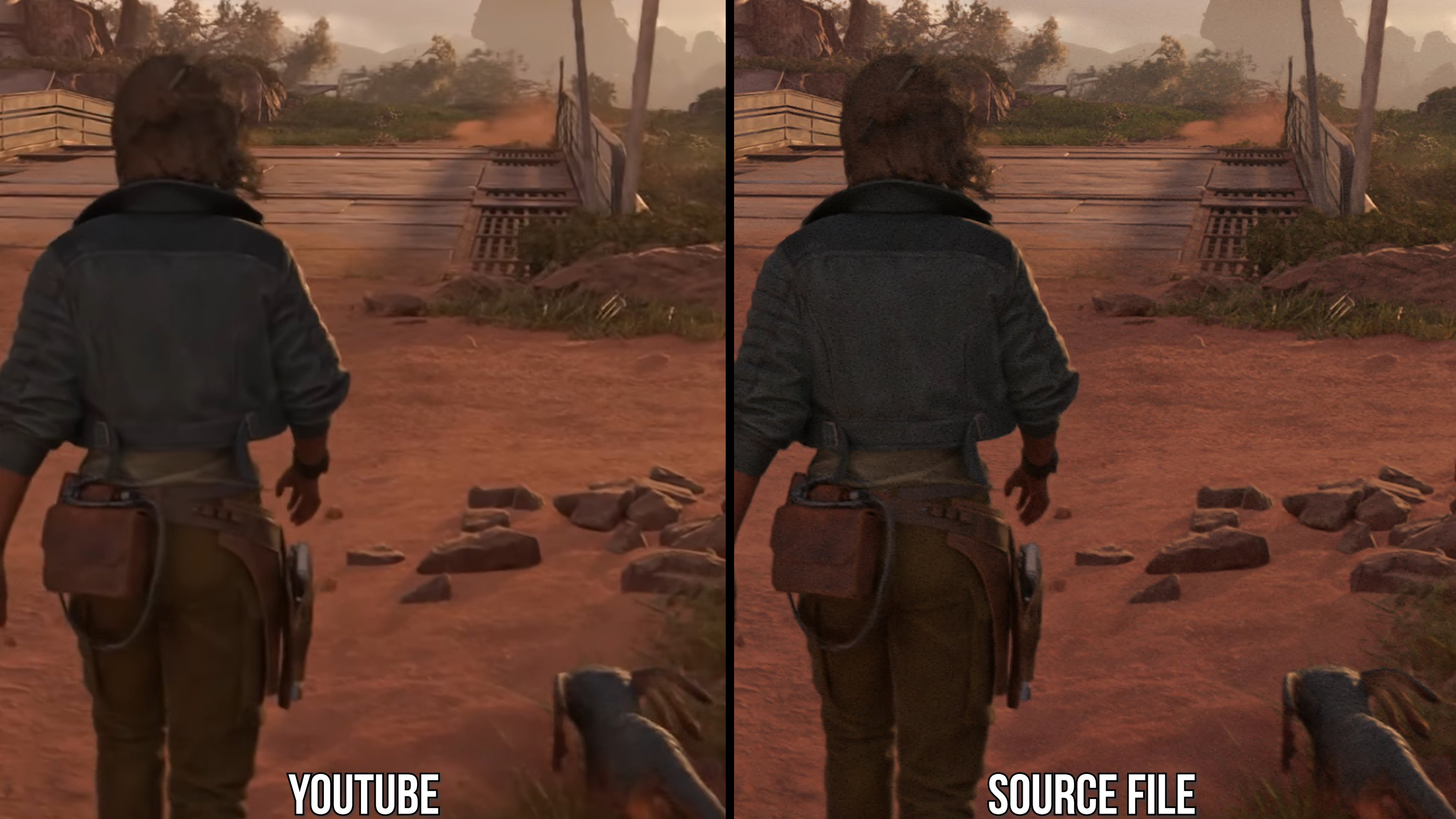
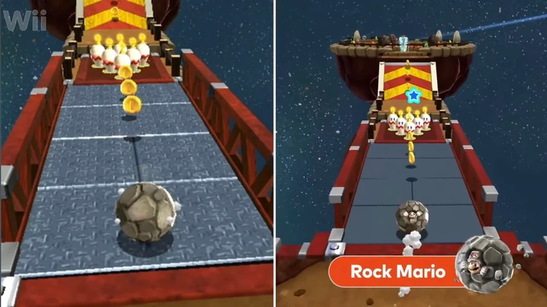
Again, only says Wii, so JUST the Wii version as the "(1080p)" automatically means it is not running on a Wii.
 
Last edited:
Right but one would think if they just ported and upscaled the wii game...then it would just look the same as the emulated?...
Maybe? Emulation is messy and tricky, and depends how it's being emulated. These are likely done similar to the 3D All-Stars Collection from 2020 where Sunshine and Galaxy were a mixed combination of emulation and porting, with visual changes layered over the top.
 
Last edited:
I'm presuming the screenshots from the Switch version are Youtube screenshots. Youtube compression will nuke fine detail like this.

IrWyP5mZhE2jnQUr.jpeg


Wait for a direct feed screenshot comparison. We have very few good screenshots to properly judge. One of the few I can find on Nintendo's site, which is also only 720p, shows the pattern is still there on the sky:

bnkkmqnuliy3mb7ccely.jpg
GIF by Tokkingheads
 
Again, only says Wii, so the Wii version as the "(1080p)" automatically means it is not running on a Wii.
Exactly, so it's not running on the Wii. It's emulation with changes to the native resolution, at the very least. As you've just indicated.

As i've said we should wait for DF comparisons since this whole thing seems a bit convoluted and screenshots may also have been ripped from YouTube, which as we all know would heavily degrade image quality.
 
Last edited:
Same crowd that watches frame time graphs and scream UNPLAYABLE if it jumps above 16.6ms or framerate dips into the 50s for even a second
not to be old-man posting but I played Shadow of the Colossus on PS2 at probably 12fps and it was glorious. When you truly love video games the technical stuff (to a point) just doesn't matter.
 
I always assumed that was something they had to implement for whatever reason because the Wii had poor hardware.

I kind of like the removal of it. The only annoying thing is that it's supposedly still there in some places (?).

I'd prefer if it was consistent.
 
Do we know who the dev team was behind this one? I wonder if they're working with Forever Entertainment like they did on the DKC Returns remaster.
 
Do we know who the dev team was behind this one? I wonder if they're working with Forever Entertainment like they did on the DKC Returns remaster.
Nah, this would be EPD internal with NERD helping with the emulation and maybe outsourced external contract work for textures, but not being completely worked on by a non-Nintendo studio like Luigi's Mansion 2 HD or DKCR HD. Forever, Tantalus, etc are no doubt already busy on some other graphical remake of an old game.
 
Last edited:
Galaxy 2 is, hands down, the greatest 3D platformer in existence. Can't wait to re-play it.
i couldnt get into it back in 2010 i just was over Galaxy and had other interests. I was certainly over the Wii by then, I never cared for the Remote + nunchuck interface. Excited to give it it's due finally! And it has double the stars to collect of the other 3D Marios. Crazy!
 
Last edited:
That's a win. There is nothing worse than dithering effects being plainly visible on modern TVs. Which is exactly what happens with the abysmal transparency effects used on Switch on a large number of games.
 
When you port a game to another system, stuff is going to be lost in translation. Especially when you bring over a game from very old and weird hardware that had functions that don't exist 1:1 in current ones. It's ultimately up to the dev if they want to find some way to retain it (Night Dive works very hard on this) or leave it out as it is superfluous or they think it looks better without.
 
Dosen't matter. People will still buy it even if it's $70 and missing that thing. Even if it was priced at $80 wouldn't matter.
 
Last edited:
The bee level might be the most egregious example because they were clearly going for a honeycomb/sunflower/wicker aesthetic in the original, but even the steering helm (one of the things you most frequently see) having it while the textures around it don't shows how deliberate these patterns are
ZBLb5xzTqacRs9Uu.jpg


For the most part I think they did it to make textures look less blurry, but doesn't look like that's the only reason. Mario always loved his funky patterns, so maybe it's a bit of a nod to that and the pixel look as well
LzoI95PJNUwfBHoU.jpg
kWmrQaHgJYOEhoQs.jpg


Ofc as does Persona and many other Japanese games or anime
MRcNB5x1bWQQYgWx.png


And just recently Bakeru had some cool stylistic textures
tCjubLrowuQuAxCl.jpg


it's supposedly still there in some places (?).
Yeah that toy galaxy's wallpaper also still seems to have it
vlEiAe1ykLrCspAy.png

its like saturn era of dithering, I remember Bayo 3 transparencies effects has tons of those.
What you mean is probably alpha dithering which indeed can be pretty ugly. In this case here it's (at least partially) intentional to give textures some flair
 
Last edited:
Top Bottom