TheDinoman
Member
SSB 3DS/Wii U's menus are a terrible clusterfuck, WTF happened here, Michiko?
I mean, Brawl and Uprising have the same general aesthetics, but let's look how neat and tighty they are in comparison to Smash 4's.

What I like about Brawl's menus is how clear everything is. Everything you need to know is in clear sight. Another thing I appreciate is how the more important modes are emphasized in size. Obviously the multiplayer and singleplayer modes are the core experience of the game and the modes you'll pay attention to the most, so they have the largest icons while the more minor stuff like the Vault and Options are smaller and located in the corner.
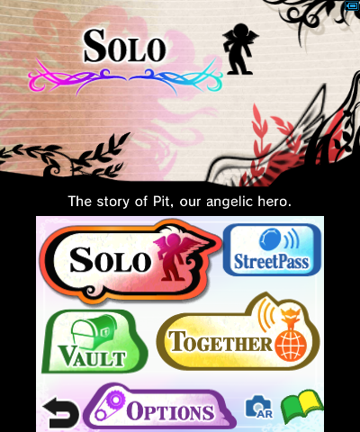
A similar thing with Kid Icarus Uprising's menu, where the Solo and Together modes have the bigger icons.

I mean, Brawl and Uprising have the same general aesthetics, but let's look how neat and tighty they are in comparison to Smash 4's.

What I like about Brawl's menus is how clear everything is. Everything you need to know is in clear sight. Another thing I appreciate is how the more important modes are emphasized in size. Obviously the multiplayer and singleplayer modes are the core experience of the game and the modes you'll pay attention to the most, so they have the largest icons while the more minor stuff like the Vault and Options are smaller and located in the corner.
A similar thing with Kid Icarus Uprising's menu, where the Solo and Together modes have the bigger icons.


