• Hey, guest user. Hope you're enjoying NeoGAF! Have you considered registering for an account? Come join us and add your take to the daily discourse.

The Legend of Zelda: Skyward Sword |OT| Home of Punkin' Chunkin' Champion 2011

Bisnic

Really Really Exciting Member!
Hollywood Duo said:
Damn, do you know which ones?

Twilight Princess Symphony, Wind Waker symphony, Skyward Sword theme that you already heard 100 times, Gerudo Valley, Great Fairy Fountain, Kakariko Village, Legend of Zelda theme and a medley of Zelda musics from different titles. At least 3 of them last a good 8-10 mins each.
 

GJS

Member
Hollywood Duo said:
Damn, do you know which ones?
Yep.

1. The Legend of Zelda 25th Anniversary Medley
2. Kakariko Village Twilight Princess Theme
3. The Wind Waker Symphonic Movement
4. Gerudo Valley
5. Great Fairy’s Fountain theme
6. Twilight Princess Symphonic Movement
7. The Legend of Zelda Main Theme Medley
8. Ballad of the Goddess from Skyward Sword
 

Anth0ny

Member
GJS said:
1. The Legend of Zelda 25th Anniversary Medley
2. Kakariko Village Twilight Princess Theme
3. The Wind Waker Symphonic Movement
4. Gerudo Valley
5. Great Fairy’s Fountain theme
6. Twilight Princess Symphonic Movement
7. The Legend of Zelda Main Theme Medley
8. Ballad of the Goddess from Skyward Sword

So I listened to this album 10+ times while studying yesterday and today, and I think it's time for some impressions.

I've mentioned it earlier in the thread, but I'll say it again. I haven't gotten goosebumps listening to music in a while. I did while listening to this. Zelda music is some seriously powerful stuff (at least for me), and it lends itself to an orchestra perfectly.

That being said, I can't help but be a little disappointed in some of the choices (or lack there of) of music that was orchestrated. I'll say it right now: the Wind Waker track sounds great, but I honestly prefer the sound of them in the game over the orchestrated versions. Dragon Roost Island sounds weird coming from an orchestra.

In stark contrast, the Twilight Princess track was far and away my favorite. SWEET JESUS. The music in that game benefits from an orchestra so god damn music it's ridiculous. I had a serious Conan the Barbarian vibe from the orchestrated version of Hyrule Field. It sounded fantastic, and it's going to be hard going back to that game and hearing the non-orchestrated tracks.

Kakariko and Great Fairy's Fountain sounded good. Neither really benefit from an orchestra, but I ain't complaining.

Now... Gerudo Valley. I really like it, and reponse it's gotten on GAF has been pretty positive too. However... I never really felt that song benefited from an orchestra. And it doesn't. It's a neat remix, I guess. Gerudo Valley sounds infinitely better in it's original form from Ocarina of Time. That guitar makes the song.

Ballad of the Goddess sounds amazing, and is a new classic Zelda song. So damn good.

Finally, what they forgot.

1. A Link to the Past

Dark World and the intro was in there. Good stuff. However, they somehow, some way, managed to ignore the one song in the Zelda franchise that I personally think benefits from an orchestra more than any other. Hyrule fucking Castle. Such a powerful theme, and it's a recurring theme in the series! I was waiting, and waiting, and waiting... and nothing. Very disappointed with that omission.

Also missing: Dark Mountain, Lost Woods, Time of Falling rain. I'm not sure why Wind Waker and Twilight Princess got their own track over Link to the Past. That soundtrack being orchestrated would have been immaculate.

2. Majora's Mask


Now this is a little personal bias, as it's my favorite game of all time. But it would have been nice to have at least one track from the game. Clock Town? Stone Tower Temple? Majora's Theme? No? Nothing.

3. Zelda II

Where the EFF is the dungeon theme? That shit is iconic. Thank God for Smashing Live. See how great that sounds? I'll just pretend this track is part of the album ;)

Other notable omissions: Zelda 1 Dungeon theme, Zelda II battle theme, Kokiri Forest, Song of Storms, (hell, Ocarina of Time should have had it's own track, way too many to list here).

All in all, it's still a fantastic album. Listening to it as I type this! It's just a shame that they were only able to replicate a fraction of the magic. Hopefully they do it again for the 50th anniversary! :lol
 

Kard8p3

Member
Anth0ny said:
So I listened to this album 10+ times while studying yesterday and today, and I think it's time for some impressions.

I've mentioned it earlier in the thread, but I'll say it again. I haven't gotten goosebumps listening to music in a while. I did while listening to this. Zelda music is some seriously powerful stuff (at least for me), and it lends itself to an orchestra perfectly.

That being said, I can't help but be a little disappointed in some of the choices (or lack there of) of music that was orchestrated. I'll say it right now: the Wind Waker track sounds great, but I honestly prefer the sound of them in the game over the orchestrated versions. Dragon Roost Island sounds weird coming from an orchestra.

In stark contrast, the Twilight Princess track was far and away my favorite. SWEET JESUS. The music in that game benefits from an orchestra so god damn music it's ridiculous. I had a serious Conan the Barbarian vibe from the orchestrated version of Hyrule Field. It sounded fantastic, and it's going to be hard going back to that game and hearing the non-orchestrated tracks.

Kakariko and Great Fairy's Fountain sounded good. Neither really benefit from an orchestra, but I ain't complaining.

Now... Gerudo Valley. I really like it, and reponse it's gotten on GAF has been pretty positive too. However... I never really felt that song benefited from an orchestra. And it doesn't. It's a neat remix, I guess. Gerudo Valley sounds infinitely better in it's original form from Ocarina of Time. That guitar makes the song.

Ballad of the Goddess sounds amazing, and is a new classic Zelda song. So damn good.

Finally, what they forgot.

1. A Link to the Past

Dark World and the intro was in there. Good stuff. However, they somehow, some way, managed to ignore the one song in the Zelda franchise that I personally think benefits from an orchestra more than any other. Hyrule fucking Castle. Such a powerful theme, and it's a recurring theme in the series! I was waiting, and waiting, and waiting... and nothing. Very disappointed with that omission.

Also missing: Dark Mountain, Lost Woods, Time of Falling rain. I'm not sure why Wind Waker and Twilight Princess got their own track over Link to the Past. That soundtrack being orchestrated would have been immaculate.

2. Majora's Mask


Now this is a little personal bias, as it's my favorite game of all time. But it would have been nice to have at least one track from the game. Clock Town? Stone Tower Temple? Majora's Theme? No? Nothing.

3. Zelda II

Where the EFF is the dungeon theme? That shit is iconic. Thank God for Smashing Live. See how great that sounds? I'll just pretend this track is part of the album ;)

Other notable omissions: Zelda 1 Dungeon theme, Zelda II battle theme, Kokiri Forest, Song of Storms, (hell, Ocarina of Time should have had it's own track, way too many to list here).

All in all, it's still a fantastic album. Listening to it as I type this! It's just a shame that they were only able to replicate a fraction of the magic. Hopefully they do it again for the 50th anniversary! :lol

It's a shame they didn't put the hyrule castle theme on there especially since they played it at the concert.
 
Zelda II's dungeon theme is so awesome that I find myself disappointed every time I enter a new dungeon for the first time in a new game expecting, hoping, praying to hear it crop up.
 
zoner said:
So has anyone said how much room the motion plus is going to generally use for this game in terms of how much and how far you'll be swinging? I just thought about the fact that I'll be playing this at a desk, and that might present a problem.

I don't know if any Wii game has literally been impossible to play with just wrist movements, unless it was something really goofy like WarioWare. There's no way M+ sword controls will require more than more than a foot of "swinging room".
 

Glix

Member
Joe Shlabotnik said:
Yeah I cancelled it a while ago because of that and went straight to the sweet nectar of the Nintendo World Store (still hoping for a Saturday event release). It will probably not ship until Monday from Amazon.

DUDE!! They were giving out Tanooki suits this weekend. I can't believe I missed it, I'm devastated.
 

JohngPR

Member
felipepl said:
Some Dolphin shots from our Euro version:

irY2U23qBZY7m.png


i1gg26JrVlEkX.png


iGZ3DGwyhLYCi.png

Thanks for these...the game looks awesome.

Is that water color look in the background just on the Dolphin version with AA, or does that look like that normally?
 

Aeana

Member
Joe Shlabotnik said:
I don't know if any Wii game has literally been impossible to play with just wrist movements, unless it was something really goofy like WarioWare. There's no way M+ sword controls will require more than more than a foot of "swinging room".
They don't. The only "exaggerated" movement I find myself making is when you hold the sword up. It is kind of iffy in terms of recognizing that. For regular combat, I just move my wrists and little else (thrust aside where you actually do have to move your arm forward a little bit).
 

Glix

Member
Joe Shlabotnik said:
I don't know if any Wii game has literally been impossible to play with just wrist movements, unless it was something really goofy like WarioWare. There's no way M+ sword controls will require more than more than a foot of "swinging room".

Only very certain non essential things might be a little annoying like rolling bombs. I have played the demo sitting on a couch with a coffee table in front of me and its fine. Reclining and playing is not really viable however.
 

BY2K

Membero Americo
Anth0ny said:
1. A Link to the Past

Dark World and the intro was in there. Good stuff. However, they somehow, some way, managed to ignore the one song in the Zelda franchise that I personally think benefits from an orchestra more than any other. Hyrule fucking Castle. Such a powerful theme, and it's a recurring theme in the series! I was waiting, and waiting, and waiting... and nothing. Very disappointed with that omission.

Doesn't the concert start with Hyrule Castle?
 

Aeana

Member
JohngPR said:
Thanks for these...the game looks awesome.

Is that water color look in the background just on the Dolphin version with AA, or does that look like that normally?
That's how the game looks normally. It seems to be an effect that works in conjunction with the depth of field, so anything that is too far away gets filtered like that. I think it is pretty awesome.
 

Glix

Member
Aeana said:
They don't. The only "exaggerated" movement I find myself making is when you hold the sword up. It is kind of iffy in terms of recognizing that. For regular combat, I just move my wrists and little else (thrust aside where you actually do have to move your arm forward a little bit).

I find that it works better if you just point the wiimote upward. If you lift your arm above your head, it almost never works for me.
 

Aeana

Member
Glix said:
I find that it works better if you just point the wiimote upward. If you lift your arm above your head, it almost never works for me.
I actually got really frustrated with it last night during a particular boss fight. It just wouldn't recognize it reliably and I ended the fight with a sore arm. That's the first time in over 20 hours that that's happened to me; hopefully it won't happen again.
 

Dark Schala

Eloquent Princess
Aeana said:
They don't. The only "exaggerated" movement I find myself making is when you hold the sword up. It is kind of iffy in terms of recognizing that. For regular combat, I just move my wrists and little else (thrust aside where you actually do have to move your arm forward a little bit).
You have the game already? Lucky! :O

The control scheme doesn't sound bad when you describe it like that ('cept for the holding the sword up thing which I found strange to see in the E3 videos at the time). I know you said you liked the watercolour look (and I think it looks great in those Dolphin shots), but what do you think of the animations and expressions? Fluid and meshes with the artstyle well?
 

Red

Member
ShockingAlberto said:
Majora's Mask had a pretty annoying opening because you can't save and you have to wait until the actual end end of the three days with no ability to get to the end faster even if you've done everything.
Yes. One of my few problems with the game is the time investment each session takes. You need to dedicate a block of time to clear certain missions and dungeons, because otherwise events will reset. That's one of the reasons it's difficult to replay, especially for people with busy schedules.
 

Red

Member
felipepl, why so little AA in those shots? And what build are you using?

Nevermind, I see the info in the Dolphin thread. Same settings Thoraxes stumbled on, good choice. Two things though:

1. Is the slighshot/bow properly aligned in the full game using that build?
2. Try enabling AA! I can run 4x internal res @ 1920x1080 and still pile 8xAA on top of that in DX11. I'd love to see some "perfect" shots.
 
Metroid Killer said:
The worst offender to me was the fact that you had to go through Faron Woods 3 times before getting access to the dungeon. Once to save Malon, then work your way through it all again as wolf link searching for the bugs, and then one more time as Link. Too much repetition.
Well if consistently travelling through the same areas was annoying in TP, I believe SS is an even worse offender. Like I was saying, I agree that TP had fat that needed to be trimmed but I believe it's blown out of proportion and I think the difference between SS and TP's intro are a little overstated since they are quite a bit similar.

Seeing as the boring town stuff is the best part of the game I'm going to disagree. And being dropped into a town with a real time timer of a moon coming down on your head is being dumped right into the action.
I enjoyed MM's level of depth in sidequests and figuring everything out but tbh it's intro is an even worse offender than TP, imo. It doesn't explain much and it puts you in an endless loop requiring you to figure out the exact right times to be in the exact right place. For a newcomer who doesn't know what is going on it's going to take a while to get to the first dungeon. I'm more than positive there is a significantly higher amount of players who never made it to the first dungeon before quiting in MM than TP. However, if you know what you're doing the intro section goes by really quick.
 

Anth0ny

Member
ShockingAlberto said:
Majora's Mask had a pretty annoying opening because you can't save and you have to wait until the actual end end of the three days with no ability to get to the end faster even if you've done everything.

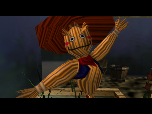
Scarecrow.jpg


Majora's Mask has no flaws, guys. Stop trying!
 

TDLink

Member
Anth0ny said:
Majora's Mask has no flaws, guys. Stop trying!

Lack of dungeons is one flaw it has that it unfortunately can't get rid of. That being said it is still my favourite Zelda pre-Skyward Sword (haven't played SS yet).
 
Hell, even kid Link putting on the masks was effed up.

And I know I'm going to get a lof flack for this, but from what I've seen so far of SS (walkthrough) , I'm not liking the artstyle. The music isn't so great either besides a few tracks here and there. I'm also not liking the structure and layout of the land below Skyloft.

Maybe my opinion will change when I actually get to play the game.

P.S. I'm hoping Zelda WiiU will go back to realistic graphics, but with a more creepy/bizarre artstyle.
 

TheExodu5

Banned
Does MotionPlus work on Dolphin? I would definitely much rather play this on Dolphin.

Jason's Ultimatum said:
And I know I'm going to get a lof flack for this, but from what I've seen so far of SS (walkthrough) , I'm not liking the artstyle. The music isn't so great either besides a few tracks here and there. I'm also not liking the structure and layout of the land below Skyloft.

I'm not liking the artstyle either. It's very inconsistent, and messy in parts...at least from what I've seen in video reviews.
 

Red

Member
TheExodu5 said:
Does MotionPlus work on Dolphin? I would definitely much rather play this on Dolphin.
Perfectly.

Also really disagree with you guys on the visuals. I think it looks great. Best looking Zelda to date.
 

Aeana

Member
Jason's Ultimatum said:
Hell, even kid Link putting on the masks was effed up.

And I know I'm going to get a lof flack for this, but from what I've seen so far of SS (walkthrough) , I'm not liking the artstyle. The music isn't so great either besides a few tracks here and there. I'm also not liking the structure and layout of the land below Skyloft.

Maybe my opinion will change when I actually get to play the game.

P.S. I'm hoping Zelda WiiU will go back to realistic graphics, but with a more creepy/bizarre artstyle.
Man, I disagree. I think it has the best music since OoT at the very least. I am continually impressed, and thankful that someone other than Minegishi was given a chance. I don't know who did SS's music but it is obvious to me that it isn't him.
 
TheExodu5 said:
I'm not liking the artstyle either. It's very inconsistent, and messy in parts...at least from what I've seen in video reviews.

Overall, I like the style, but I agree that it is inconsistent. Some things just look out of place.

Oh, and yes it M+ does work with Dolphin.
 

Kard8p3

Member
Aeana said:
Man, I disagree. I think it has the best music since OoT at the very least. I am continually impressed, and thankful that someone other than Minegishi was given a chance. I don't know who did SS's music but it is obvious to me that it isn't him.

Seems Hajime Wakai did a good deal of the music. Kondo only composed one track and that's the one that plays during the intro. Then Yokota handled the orchestration.
 

jarosh

Member
the mechanics and ideas surrounding the (item spoiler)
time orb
are pretty damn clever and unique. kudos to whoever came up with that.
 
The visual style is definitely awesome but I'd like to hear from you guys what you deem inconsistent. I certainly haven't noticed anything out of place.
 

Peterthumpa

Member
Crunched said:
felipepl, why so little AA in those shots? And what build are you using?

Nevermind, I see the info in the Dolphin thread. Same settings Thoraxes stumbled on, good choice. Two things though:

1. Is the slighshot/bow properly aligned in the full game using that build?
2. Try enabling AA! I can run 4x internal res @ 1920x1080 and still pile 8xAA on top of that in DX11. I'd love to see some "perfect" shots.
There's no AA in those shots, only internal resolution set to 4x native. AA messes up with the DoF.
 

Red

Member
felipepl said:
There's no AA in those shots, only internal resolution set to 4x native. AA messes up with the DoF.
I'm using the same config except with 8xAA, and though I only have the demo to try, there hasn't been any issue with DoF breaking.
 
Glass Rebel said:
The visual style is definitely awesome but I'd like to hear from you guys what you deem inconsistent. I certainly haven't noticed anything out of place.

The most noticeable is how objects such as character models, enemies, grass, do not blend into the painting. They are sharp while the environment textures remain blurry.

For example:

iGZ3DGwyhLYCi.png


It looks like Link, the deku baba, and the blades of grass are just really nice stickers on top of a painting.


If they had made the immediate area around the player look more detailed or sharp, it would blend with close objects as well.
 

Red

Member
TheCongressman1 said:
The most noticeable is how objects such as character models, enemies, grass, do not blend into the painting. They are sharp while the environment textures remain blurry.

For example:

http://i.minus.com/iGZ3DGwyhLYCi.png[IMG]

It looks like Link, the deku baba, and the blades of grass are just really nice stickers on top of a painting.


If they had made the immediate area around the player look more detailed or sharp, it would blend with close objects as well.[/QUOTE]
The immediate area is a bit more sharp.
 
TheCongressman1 said:
The most noticeable is how objects such as character models, enemies, grass, do not blend into the painting. They are sharp while the environment textures remain blurry.

For example:

http://i.minus.com/iGZ3DGwyhLYCi.png[IMG]

It looks like Link, the deku baba, and the blades of grass are just really nice stickers on top of a painting.


If they had made the immediate area around the player look more detailed or sharp, it would blend with close objects as well.[/QUOTE]

Oh, you meant the Dolphin shots. I'm playing it on a 720p LCD so the difference isn't that noticeable.

Edit: How many dungeons are there?
 

Caelus

Member
When playing on the Wii the immediate objects do blend in because of the low resolution, but dolphin sharpens everything which makes it look quite weird, but that effect looks better on my TV.
 

Big One

Banned
Protip: That's not how the game looks like on the Wii.

Dolphin has some problems with the game's graphics. Give it some time.

Glass Rebel said:
Edit: How many dungeons are there?
There's seven
 

jarosh

Member
Glass Rebel said:
The visual style is definitely awesome but I'd like to hear from you guys what you deem inconsistent. I certainly haven't noticed anything out of place.
you haven't? plenty of textures are not in the same painterly impressionistic style of the rest of the game but instead have a more generic cartoony style. and the painterly shader they use on some of the floors and walls (this is seperate from the textures AND the dof effect) is also not consistently applied to every surface. it seems somewhat arbitrary. then there's of course the characters, which (understandably) have their textures drawn with sharper lines and once again have the more generic cartoon look, completely forgoing the impressionistic style. i wish they could have found a better compromise there, but that was probably difficult without sacrificing detail, so i can understand that design decision.
 
Top Bottom