You are using an out of date browser. It may not display this or other websites correctly.
You should upgrade or use an alternative browser.
You should upgrade or use an alternative browser.
Torment: Tides of Numenera Kickstarter by InXile [Complete; $4.3 million funded]
- Thread starter Perkel
- Start date

Mister_Bubbles
Member
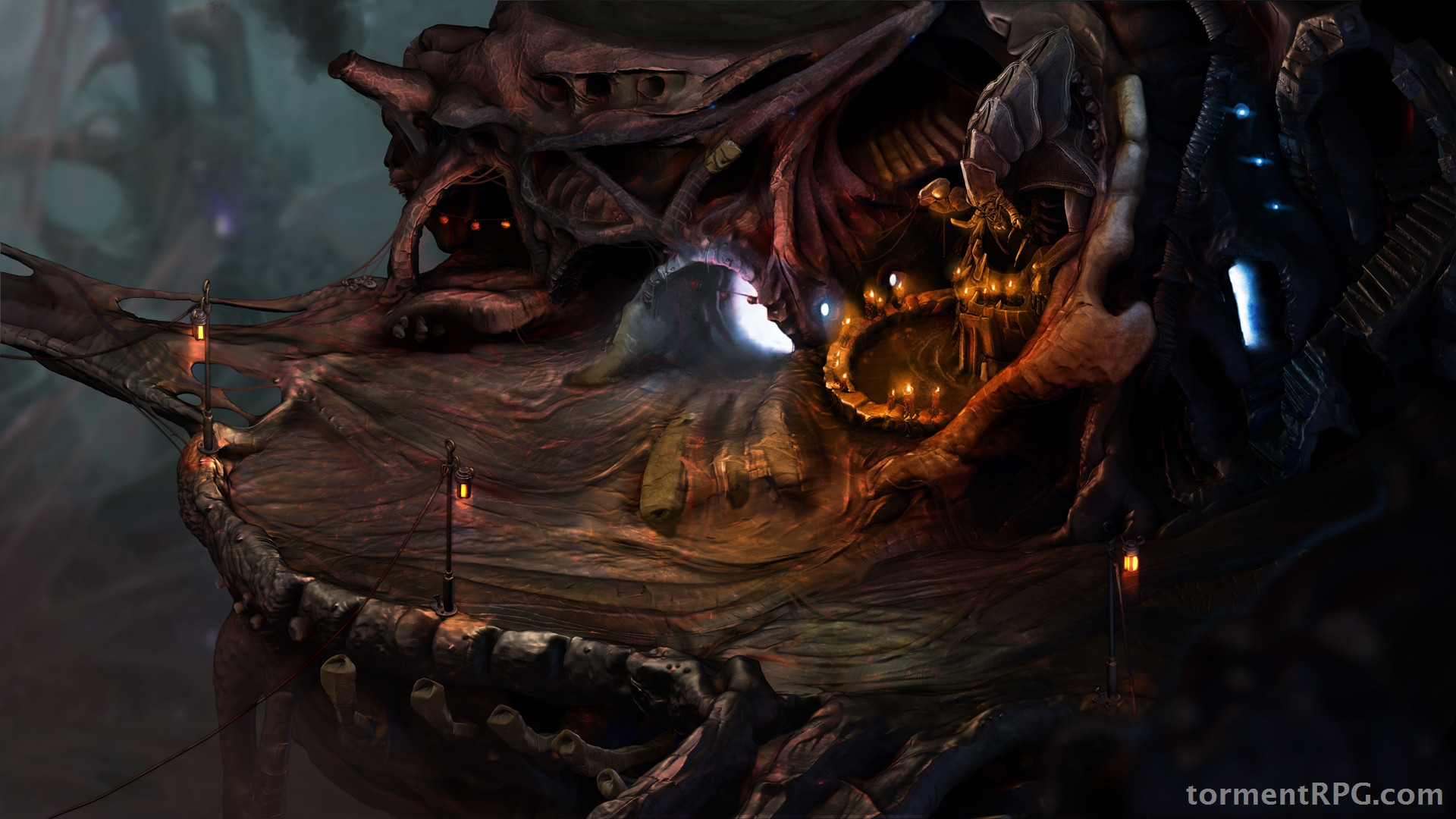
Suitably creepy.
Is it just me, or is it also kinda blurry? I suppose that'll be the 'work in progress' part.
Is it just me, or is it also kinda blurry? I suppose that'll be the 'work in progress' part.
indigo-cyclops
Member
Yes! Yes! Looks amazing, damn.
Basileus777
Member
Suitably creepy.
Is it just me, or is it also kinda blurry? I suppose that'll be the 'work in progress' part.
Well, it is a 600x337 image.
Mister_Bubbles
Member
Well, it is a 600x337 image.
Aye.
With those lamps swaying and flickering that scene's going to be very atmospheric.
With those lamps swaying and flickering that scene's going to be very atmospheric.
I bet ya those lamps won't be animated. flickering, sure
April fools! The game is actually going to be in ASCII.
...
I haven't read anything by Rothfuss. The kickstarter update almost made me order his first book, but the reaction here is giving me second thoughts.
...
I don't know why people here don't seem to like him, but I'd vouch for exactly the opposite...
My recommendation would be you read the books. It's the best fantasy I've read in a while. His prose is delicious, intricate, captivating. The guy is a master of his craft, and I have anything but good words about his work. His character development reminds me of Robin Hobb, which is another writer you should definitely check out (her farseer trilogy particularly), if you like stories written from a first-person view where the author manages to keep it consistent, credible, and engaging.
I think this is very hard to do, because the writer has to "think" like the characters do during the whole thing, and it's very easy to stray from that path and add stuff that doesn't make sense in the context of the character.
Rothfuss is magnificient at this.
Seriously, who posts only a SD image? What is this, 1998?(Waiting for the fullsized image)
Seriously, who posts only a SD image? What is this, 1998?
I believe that's called "teasing".
WorstUsernameEver
Member
I honestly have no idea how some of you guys can judge that screenshot given it's super-tiny.
Hi-res version here.
I find it... okay-ish. It's compelling but I, perhaps, expected something more.
For comparison's sake, Project Eternity's one blew me away -- this, not so much.
Mister_Bubbles
Member
I find it... okay-ish. It's compelling but I, perhaps, expected something more.
I think the fact that in terms of colour, aside from the blue lights, the screen literally only uses variations of brown does not help to create an inspiring environment. It looks moody and atmospheric, no doubt, but it doesn't inspire excitement or intrigue which are really the moods they need to be invoking.
Hopefully this is just the 'unfinished' version that Avellone saw, and there's still a final pass on details to come.
I think the same, Project Eternity's one was really perfect.For comparison's sake, Project Eternity's one blew me away -- this, not so much.
Mister_Bubbles
Member
I reckon if they'd just released this:

It would have been better. Focuses on the interesting part of the screen, and has the most colour balance.
It would have been better. Focuses on the interesting part of the screen, and has the most colour balance.
Ciastek3214
Junior Member
It would have been better. Focuses on the interesting part of the screen, and has the most colour balance.
Blue and orange.
I like it. It's an early screen shot and it shows a dark, colorless area, so it should be of no surprise that it pales in comparison to the very bright, colorful waterfall image of PE (which without doubt, is one of the most beautiful screen shots ever). It's very atmospheric and that is what counts. 3D could have never been this good.
Mister_Bubbles
Member
Blue and orange.
Aw yeeaah!
The update's out:
http://www.kickstarter.com/projects/inxile/torment-tides-of-numenera/posts/442434

")
Arozay
Member
I like the organic look of it. I'd almost expect it to pulsate.
I'm pulsating
I'm pulsating
post vid
Thats....thats not quite what I had in mind......

The Project Eternity waterfall screenshot looks a lot better to me.
looks great to me. The Project Eternity screenshot shows us a more interesting area of the game, this is just a section of a cave with a statute in it, but I do love the art direction they seem to be going for. For promotional purposes, you probably want a screenshot of a nice-looking exterior area with lots of small details that catch the eye, there isn't really much going on here.
Kind of odd really that they picked this as the first picture to show us from the game. Artistically I'd say it's very promising and on the same level as the one from PE.
Kind of odd really that they picked this as the first picture to show us from the game. Artistically I'd say it's very promising and on the same level as the one from PE.
Thats....thats not quite what I had in mind......
The Project Eternity waterfall screenshot looks a lot better to me.
Would that not be because of the setting it took place in?

Not sure what some people expected...looks pretty in line with the concept pieces to me...

Would that not be because of the setting it took place in?
I hope so.
Man, that PE Waterfall™ screenshot really is something else. Perfect hype image.
I hope so.
Man, that PE waterfall screenshot really is something else. Perfect hype image.
It's true, though I'd say this kind of setting certainly fits a Planescape/Torment sort of game a lot more. It is perhaps not the best 'first shot', but seems fitting to me, artistically.
Not sure what some people expected...looks pretty in line with the concept pieces to me...
they switched the blue lights for orange ones. No buy
I hope so.
Man, that PE Waterfall screenshot really is something else. Perfect hype image.
It looks way better than this for sure. They will probably improve on it.
Dwight Schrute
Member
Looks awseome !
I remember the huge freak out on initial PE character art, it's good to give feedback and all, but some people seem to jump to conclusions and expect stuff this early is super finalized and representative of the whole game.
I personally think it is exactly what I was hoping/expecting from a screenshot of the game.
I personally think it is exactly what I was hoping/expecting from a screenshot of the game.
AstroZombie
Banned
Textures are low-res, but I like it.
Not sure what some people expected...looks pretty in line with the concept pieces to me...
There's a pretty big difference in color palette between the two. The concept art has more purple and blue in it, while the 2D screenshot heavily relies on an overall brown.
The former looks almost ethereal; the latter looks muddy and heavy.