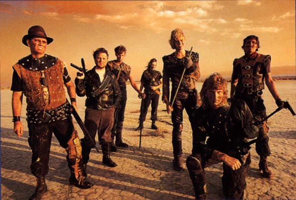
Pretty much how I feel, but thankfully since this is a Kickstarter there will be room for some movement I hope. Or maybe they just wanted to reveal the most boring stuff first, get it out of the way. Change a few of the accessories and that might be a cool cover for SWAT 5 though.I'm mostly kinda disappointed by the excessively restricted palette and the lack of more distinctive/wacky elements, although I guess they are showing the desert rangers first and foremost after all.
You are using an out of date browser. It may not display this or other websites correctly.
You should upgrade or use an alternative browser.
You should upgrade or use an alternative browser.
Wasteland 2 Kickstarter project by inXile entertainment [Ended, $3 Million Funded]
- Thread starter duckroll
- Start date
Mainly the colour pallet of nothing but hues of brown.

Eh, I dont think you need to worry about that. Wasteland was a very colorful game, and I doubt that this will be very different.
Its just a concept art about how a classic post apocalyptic scene in this game might come across. There are more inventive ways to do that, but I think this one is perfect fine for what it is.
I'm mostly kinda disappointed by the excessively restricted palette and the lack of more distinctive/wacky elements, although I guess they are showing the desert rangers first and foremost after all.
We dont need to worry about missing wackiness here, it has been acknowledged that this is an important part of the Wasteland universe.
lmao, the main guy there does resemble Dudebro
Let's all hang Jocchan for creating that perception.
But seriously, I doubt there's anything to be concerned about there. Remember that the game will be isometric and so the characters won't really look like that. It's just a single piece of early concept art to get a general feel for the Desert Rangers specifically.
B_Rik_Schitthaus
Banned
Seriously guys.
It's one piece of concept art.
Seriously.
As I said, not judging the whole thing just from this.
I just hope this was a mood piece and not in anyway a goal for the final games visuals.
The original Wasteland was neon green and pink, and still looks interesting due to it, that should at least translate to 2 not being brownscale.

If you think about it too the cover of Wasteland could be argued to be boring in this same sense (though it's one of my favorite covers of all time). I think it's mostly the "dudebros comin atcha" that rubs me the wrong way. Very uncreative presentation (in pretty start contrast to say the WL cover -- they should just riffed on that for the early art).

bonesmccoy
Banned
The post-pic discussion... :0
W2's aesthetics will more than likely resemble that of the Fallout universe.
The palette from the original game is from 1988 guys, when people had between a whopping 4 and 16 colours to work with. And no, the bright greens and blues and pinks *do not* make it 'still look interesting today', they make it look dreadful.
There's definitely a difference in tone and general aesthetics between Fallout and Wasteland, but I think they'll catch that to a large degree. They do seem pretty cognizant of the fact that while the two share quite a few similarities, there are also some differences.
And Fargo has said this in the Gamebanshee interview:
So he's aware it needs to stand out from the herd, and even from Fallout. He wants it to be similarly unique and evocative as Fallout in art style and tone, but not identical.
And Fargo has said this in the Gamebanshee interview:
GB: There are quite a few differences between Wasteland and Fallout, but due to the fact that the latter was a spiritual successor of the former, they oftentimes get construed as near-identical post-apocalyptic games. Do you think it's important to retain the Wasteland identity in the sequel and perhaps even try to push the game further away from the Fallout formula to ensure its uniqueness?
Brian: I think there might be varying opinions on what the formulas were for each and how they might be different. Wasteland excelled at many things like tactical combat, interesting situations that did not have clear cut correct solutions and it continued to surprise you along the way. Not only with those elements not be lost they will be expanded upon. We have the advantage of hindsight now since we can clearly see what things people reacted well to. We were flying blind while we made the first game. Fallout excelled in many of the same things but it really shined in tone and style. We need to make sure that we have an interesting art style and vibe. If there is any feeling that you have seen something a hundred times before you lose interest pretty quickly.
So he's aware it needs to stand out from the herd, and even from Fallout. He wants it to be similarly unique and evocative as Fallout in art style and tone, but not identical.
B_Rik_Schitthaus
Banned
The post-pic discussion... :0
W2's aesthetics will more than likely resemble that of the Fallout universe.
The palette from the original game is from 1988 guys, when people had between a whopping 4 and 16 colours to work with. And no, the bright greens and blues and pinks *do not* make it 'still look interesting today', they make it look dreadful.
You are beyond wrong on the highlighted.
Really there's not much point arguing about this, I hope the next thing they release shows more of a distinctive visual style.

Pachterballs
Banned
MW?? + dude bro????
U lot are cray
U lot are cray
I thought the same thing.STALKER was the first thing to come to mind, personally.
Looks pretty great IMO, agree on the color palette and lack of wackiness, but it sets up the Rangers as major badasses and it manages to get me real excited about playing them.
Don't worry, guys, I'm sure the game will have color.
I don't know if this been posted but there's a RPS interview with Chris Avellone about W2 and Obsidian in general: http://www.rockpapershotgun.com/2012/04/07/interview-obsidians-chris-avellone-on-wasteland-2/
edit: sorry, dp
edit: sorry, dp
StoppedInTracks
Member
Same, don't want to be a downer but if I saw this and was told it was COD MW4 I would believe it.
Yeah there's Cpt. Price in the center and Ghost next to him...
...are you fucking kidding?
If you don't like that image remember that it's specifically the Desert Rangers.
And it says nothing about what an isometric game will actually look like, in the end. The style of the game will demand much different visuals than what you can get from that sort of concept art. Planescape: Torment's cover with Nameless One's leering blue mug - or that alternative with the various 3D models - didn't indicate what the game itself was like visually, and I imagine it's similar here. It just helped to establish the strange, eerie tone.
Speaking of Torment, that game was - and still very much is - visually brilliant:


Doesn't that game still look absolutely incredible? I would honestly be happy with visuals on that level with these Kickstarted cRPGs. That'd be even better than what I'm hoping for.
Fargo said:Lastly, I am very excited to release the first official piece of Wasteland 2 concept art. We asked the very talented Andree Wallin to help us establish the look and feel of the Desert Rangers.
And it says nothing about what an isometric game will actually look like, in the end. The style of the game will demand much different visuals than what you can get from that sort of concept art. Planescape: Torment's cover with Nameless One's leering blue mug - or that alternative with the various 3D models - didn't indicate what the game itself was like visually, and I imagine it's similar here. It just helped to establish the strange, eerie tone.
Speaking of Torment, that game was - and still very much is - visually brilliant:
Doesn't that game still look absolutely incredible? I would honestly be happy with visuals on that level with these Kickstarted cRPGs. That'd be even better than what I'm hoping for.
charlequin
Banned
You are beyond wrong on the highlighted.
I honestly don't know who I disagree with more, the dude wailing on Wasteland's art style as dated and ugly or you for saying the concept art looks like MW4. As far as I'm concerned you're both crazy.
If you don't like that image remember that it's specifically the Desert Rangers.
And it says nothing about what an isometric game will actually look like, in the end. The style of the game will demand much different visuals than what you can get from that sort of concept art. Planescape: Torment's cover with Nameless One's leering blue mug - or that alternative with the various 3D models - didn't indicate what the game itself was like visually, and I imagine it's similar here. It just helped to establish the strange, eerie tone.
Speaking of Torment, that game was - and still very much is - visually brilliant:
Doesn't that game still look absolutely incredible? I would honestly be happy with visuals on that level with these Kickstarted cRPGs. That'd be even better than what I'm hoping for.
That would actually vastly exceed my expectations in terms of visuals.
the best game ever it was brown
Actually Quake has very beautiful browns, they aren't as washed out as the ones from the canonical "brown game".
Kabuki Quantum Lover
Member
I should ask Fargo how gender may play into this (if at all). I'd love to wreak havoc on the Wasteland with a team of Black Widow Females.
HP_Wuvcraft
Banned
$2,184,800!
And PayPal has 3k to go before hitting $50k!
And PayPal has 3k to go before hitting $50k!
B_Rik_Schitthaus
Banned
Yeah there's Cpt. Price in the center and Ghost next to him...
...are you fucking kidding?
You seriously don't see Modern Warfare in this?

MightyHedgehog
Member
If the artstyle follows in the spirit of the original's tone and animated portraits, I think I'll be okay. It would have to be much more in line with sci-fi/fantasy art of the 70s and 80s, in general. Even in the event that it does end up being clamped to a narrow palette and hyper-realistic detail, I hope for a skin option for a more true-to-the-original visual vibe...they've even put up an optional 8-bit version in one of the forum polls, so it seems quite possible on just a cosmetic level, at least. Also, I like the new concept piece. It's got a desperate, ragtag sort of group feeling, which describes WL1's feel for parties and how skills and combat works...but it's hopefully just highlighting just that sort of feeling and not indicative of the final game's overall look.
AlimNassor
Banned
Same, don't want to be a downer but if I saw this and was told it was COD MW4 I would believe it.
What? How could you think it was? Looks like something out of Mad Max if anything. i'm surprised people are are so negative about the art style. All it showed was a bunch of badass rangers at night in what appears to be a sandstorm
B_Rik_Schitthaus
Banned
What? How could you think it was? Looks like something out of Mad Max if anything. i'm surprised people are are so negative about the art style. All it showed was a bunch of badass rangers at night in what appears to be a sandstorm
I've said many times I'm only judging this piece and am not setting my feeling in stone on the final game.
Ninja Scooter
Member
I like it. Looks like a nice, realistic blend of cowboy and military. Last I checked the Modern Warfare games didn't have soldiers wearing cowboy hats and rodeo jackets, or have ninja looking soldier chicks.
Vulcano's assistant
Banned
Just backed this and Stoic's Banner Saga!
We live in an amazing world. A world where we get to CHOSE which games get madeCan't stop lovin' it.
IMO, this is one of the most important steps away from the quasi-Hollywood's-old-studio-model that the industry has taken.
The only thing even REMOTELY Call of Duty in that is the guy in the middle. Otherwise, we've got a cowboy, a long-haired woman in a (gas?)mask, a man with a spiked helmet and a Helghast. Not exactly posterboys & girls for Call of Duty.I'm kind of on the hater train for the MW feel they seem to be going for. You'd think with all his complaining about sameness and lack of creativity/vision at the big publishers Fargo would go with a direction that wouldn't be right at home in Dudebro.
But w/e still have confidence in the team and I guess since all the kids today like this shit it means more money for inxile which is probably good as long as the actual game is good.
Besides, it's not like Wasteland, Fallout etc. are pinnacles of style. If anything, their artstyles ARE somewhat boring (though, for a reason, much like movies like The Road and such).
ZombieSupaStar
Member
You are beyond wrong on the highlighted.
Really there's not much point arguing about this, I hope the next thing they release shows more of a distinctive visual style.
I dunno man, I actually prefer the c64 wasteland vs the Edward Scissorhand's color palate of the dos version.
what I find even more ridiculous is that everything realistic has become "dudebro" somehow.

I mean I can understand how dumbed down gameplay can be labeled as pandering to dudebro audience. But artstyle? There is nothing more derivative than aping what was done in previous decades.
I mean I can understand how dumbed down gameplay can be labeled as pandering to dudebro audience. But artstyle? There is nothing more derivative than aping what was done in previous decades.
ZombieSupaStar
Member
these wasteland 2 threads are gonna be fun up to release. Carnival of Stupid: On the Road Edition.
So a bunch of people wearing a ridiculous mix of cowboy gear and military hardware, standing in front of fire and heavy smoke at night, is somehow NOT the epitome of 80s post-apocalyptic style?
they don't look ridiculous, so no.
they don't look ridiculous, so no.
In what world is wearing a fringe jacket under a tactical vest not ridiculous? Oh right, the 80s.
In what world is wearing a fringe jacket under a tactical vest not ridiculous? Oh right, the 80s.
*rolleyes*
HP_Wuvcraft
Banned
A world where we get to CHOSE which games get made
Well, no. We get to chose if we want to fund them. Shafer, Weisman, and Fargo are choosing what games get made.
*rolleyes*
Yes, exactly. The fuck does anyone get Modern Warfare out of this?
well, I was talking about cheesiness mostly. Yeah, they both don't look realistic but rangers pic definitely lack cheesines. And I'm happy about this because cheesiness is Fallout's territory.
haha
Yes, exactly. The fuck does anyone get Modern Warfare out of this?
haha

That would actually vastly exceed my expectations in terms of visuals.
Yeah it would be tough to match Torment's inspired visuals, but I think they can manage to make it impressive.
There's this Czech RPG that is a nice-looking modern isometric game:
http://neogaf.com/forum/showthread.php?t=469264
Not sure what the budget was on it but I can't imagine it was too high; it's an indie game from a relatively unknown dev. Smaller team sizes can lower a budget substantially, particularly if they take salary cuts as Fargo was saying the inXile guys would. This is their team: http://www.inquisitor.cz/?page=team
I love that concept art. I'm not understanding the MW comparisons. They seem a rag tag team equipped with non-standardized equipment. Cowboy hats, and bike helmets with nails protruding are not what I imagine when I think of Modern Warfare. The first thing that I thought was Mad Max as someone already said. The muted tones in a desert setting are expected if they're going for a realistic look.
I love that concept art. I'm not understanding the MW comparisons. They seem a rag tag team equipped with non-standardized equipment. Cowboy hats, and bike helmets with nails protruding are not what I imagine when I think of Modern Warfare. The first thing that I thought was Mad Max as someone already said. The muted tones in a desert setting are expected if they're going for a realistic look.
Yep, like it too. Not too sure why its aggravating some people that much, especially when its only one part of the presented world.
B_Rik_Schitthaus
Banned
I love that concept art. I'm not understanding the MW comparisons. They seem a rag tag team equipped with non-standardized equipment. Cowboy hats, and bike helmets with nails protruding are not what I imagine when I think of Modern Warfare. The first thing that I thought was Mad Max as someone already said. The muted tones in a desert setting are expected if they're going for a realistic look.
There was no MW comparison.
07:18 PM
Same, don't want to be a downer but if I saw this and was told it was COD MW4 I would believe it.