That mitigates the problem, but it still gives the same feeling IMO. Seems like it's something that's blatantly 'unfinished'. Besides that, you see it 10seconds out of the day because you've been working around it, that's not a fair counter-argument.
First of all, you said you've never used it so what are you basing this "feeling" on? Screenshots and videos? Second, as Mr_Zombie said, it's not that I rarely see Metro because I'm actively avoiding it, I actually like it, but I rarely see it because I only need to use it as a launcher maybe 2 or 3 times a day and for that purpose I'm in and out of it in about 2 seconds.
I have the same resolution, and I only use 11 pinned programs. I prefer it that way. You'd essentially remove the option of 'never combine, always show labels' by having so many pinned programs to your taskbar.
And aside from those 11 programs, how often during the course of a typical day are you launching other programs?
Trudge through the start menu? Could you give me a comparison as to how the W8 Start screen is less of a trudge? I've seen the pictures on high resolution screens, and the amount of icons makes it a huge trudge IMO. How is this any different from the normal start menu > all programs feature?
It's less of a trudge because everything is 1 click away. I don't know which pictures you've seen but if your Start screen is even somewhat organized it's much faster to find the program you want than having to click through folders.
This picture is from the earliest public build but as an example:
Now on my screen I have 1 extra row but the same number of columns. Even in that picture and keeping in consideration that they have a number of double wide tiles they have 42 apps visible. Add in the extra row that I see and fill in the blank spaces they have and you'd have 63 visible tiles. So if you have 11 of your most used programs pinned on the taskbar, 63 or more
other programs are 2 clicks of the mouse away. I have mine organized by type.
Social | News | Graphics Programs | Games | Utilities
After a few days the position of the live tiles becomes second nature so I can launch something in less than a second: Windows Key > Click
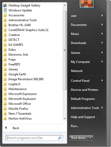
Compare that to this:
On that you have 24 folders visible, so less than half, and you also have things you're looking for hidden inside folders so you need to click the folder to see the programs. Not only that but how often is your program nested inside 3 other folders? EA > Bioware > Mass Effect > Mass Effect.exe
That's a trudge. As you say, you can just start typing the name of the program and then launch it, but that works just as well in the new Start screen so it's a wash in terms of how long it takes to launch something. However, what if you can't remember the name of the program? Not only that but what if the program is some small utility that you can't even remember the name of the company? So now you're randomly clicking on folders from companies you don't instantly recognize hoping to stumble on the program you're looking for. With the new Start screen you right-click and select All Apps and you get something like this:
Everything you have installed. MUCH faster at finding that little used app you can't remember the name of.
Not only that but I haven't even touched on the benefits of live tiles. I'll briefly say that one great thing is all the info is, well, live. So when I open my start menu to launch and app I also instantly see other information I might find useful being displayed in real time on each tile.
Less intrusive, and most of all not completely out of line with the desktop design.
It's not out of line. Sure, it works brilliantly as a tablet ecosystem, but it works just as well for the desktop. Yes, it takes up your screen, but it's better organized and easier to use than the Start menu. Once you get used to how it functions it just becomes another task you do on your computer. It's not intrusive.