You can do the same in 8? I'm not sure what you're getting at. I'm addressing most of the complaints in this thread that are in relation to the removal of the Start menu. You, as per usual, are trying to confuse the issue and move the goal posts.
All the solutions you are giving are slower and more cumbersome than using the Start screen. I do have my 19 most used programs pinned to my taskbar. When I need to launch something else I hit windows or click the lower corner and click the tile. It's fast and easy. It's certainly not broken or unusable as so many people seem to claim it is. It's not perfect either but it'll be improved.
I can see them without scrolling. I don't actually HAVE 91 tiles on my screen but I COULD. Look at that screenshot I posted, he's at 1920x1200, like me, and he can go into settings and add another row if he wants. Now count it. 13 single spaced tiles x 7 rows are visible. That's 91.
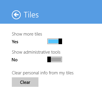
EDIT: In case you don't know about that setting: