You are using an out of date browser. It may not display this or other websites correctly.
You should upgrade or use an alternative browser.
You should upgrade or use an alternative browser.
WWDC13 Thread of iOS 7 & Mac OS X 10.9, where a whole new world's developing
- Thread starter celebi23
- Start date
Vibration patterns and the like are also on ios6. Maybe even 5?More vibration stuff (this is in Notification Centre)

Synth_floyd
Banned
I really hope you can add color to some of those pages of nothing but white.
http://9to5mac.com/2013/06/10/welcome-to-ios-the-first-install-gallery/
SO MUCH white.
http://9to5mac.com/2013/06/10/welcome-to-ios-the-first-install-gallery/
SO MUCH white.
It has to do with the wifi hardware being able to support WiFi-direct.The one iOS7 quirk I'm trying to figure out is why the 3rd gen iPad isn't getting AirDrop, but the Mini is.
Anyone got any insight into that omission? 3rd gen iPad can't be that stale.
What? One thing I love about my nexus 4 over my 4s is lightflow changing the led for what kind of notification I have.

This this real? If so.
Kung Fu Jedi
Member
It has to do with the wifi hardware being able to support WiFi-direct.
Yep, this is it exactly. Bummed that my iPad 3 won't get it, but this explains why.
I'm usually all over the betas, but this beta 1 is not for me.
Let devs start to churn out some updated apps first, let Apple iron some kinks, then I'll jump aboard.
I bet this will be one of the most modified iOS releases from the first beta to GM.
Don't know what you're basing this on. The apps work fine, the new menus are working fine in the apps I've tested and everything else looks as it always does.
It's remarkably snappy and stable too for a first beta.
Treefingers
Member
What phone are you using?Don't know what you're basing this on. The apps work fine, the new menus are working fine in the apps I've tested and everything else looks as it always does.
It's remarkably snappy and stable too for a first beta.
NekoFever
Member
Any screenshots? I'm curious because unless I get the next iPhone on day one I'm probably going to be running this on my 4 for a while.Also, almost ALL of the transparency is missing from iPhone4.
How's everyone's battery mileage on the beta? Mine seems to be chewing through the battery pretty quickly.
Very bad for me. Noticeably worse than previous betas.
What phone are you using?
5.
iOS7 to me feels more bloated than iOS6. Everything seems to take up more space, with larger fonts and more space between elements, making it less space efficient. I like that you can have more apps per folder, but if you have to scroll past the first 9 (previously showed 12? I think) then the point of the folder falls to me.
Treefingers
Member

The feature is real but that's a simulated version of it. I haven't seen footage of it in action looking like that.This this real?
Keylime
ÏÎ¯Î»Ï á¼Î¾ÎµÏÎγλοÏÏον καί ÏεÏδολÏγον οá½Îº εἰÏÏν
Only bugs I've noticed is that the bluetooth indicator got crazy huge at one point while I was pairing to my car, the title bar in my emails had overlapping text at one point, and my corporate account calendar events don't show up in today view...they are in the calendar, and I know the today view knows about them because it shows my tomorrow preview as having meetings...but doesn't show them for today.
- Love the new lockscreen
- iTunes Radio isn't doing it for me (with a Premium Spotify sub, I still can't justify using this even as an iTunes Match sub)
- Command Center rocks
- Parallax background is neat and smooth
- Safari tabs are nice to close with this new swipe gesture
- Safari browsing a little weird at the moment. I'm a big "tap the time at the top of the screen to get to the top of the page" guy, and the first tap expands the address bar, and the second tap does the scrolling
- App opening/closing animations are nice
- Unlocking phone and having apps pop in should be a bit faster, like a second delay right now from when I can start tapping stuff
- Multi-tasking interface is nice
- Opening the music app that is currently playing music is a bit less obvious now, but still present. Need to tap the title/artist/track name which will do it vs. tapping the app icon itself next to the volume slider like you used to. No indication as to which app is currently playing which I'm not sure matters.
Overall happy with it all. Very refreshing change to the experience without dramatically changing the world.
It works really well. That video doesn't seem like a dramatization to me at all after playing around with it myself for like 20 minutes.The feature is real but that's a simulated version of it. I haven't seen footage of it in action looking like that.
jts
...hate me...
Hey, not all apps work fine you know. And sometimes all you need is one app to not function properly to be screwed.Don't know what you're basing this on. The apps work fine, the new menus are working fine in the apps I've tested and everything else looks as it always does.
It's remarkably snappy and stable too for a first beta.
If Clear doesn't work, my life is ruined!
Also some stuff seems to be missing, some menus are not are not updated, etc.
The LED changing color and parallax wallpaper is tacky? I can sort of understand the parallax wallpaper as being gimmicky, but having a LED that you can customize is super useful.This this real? If so. <tacky.gif>
Technosteve
Banned
Imessage no work
Keylime
ÏÎ¯Î»Ï á¼Î¾ÎµÏÎγλοÏÏον καί ÏεÏδολÏγον οá½Îº εἰÏÏν
Imessage no work
Been working fine on my end, both to iOS and non-iOS devices.
Noticed that the "delivered" tag didn't show up right away once, but other than that the service is completely functional on my end, at least.
jts
...hate me...
That's some good work with improvements across the board.http://dribbble.s3.amazonaws.com/users/40806/screenshots/1109343/attachments/140168/Redesign_iOS7_Big.jpg
from http://dribbble.com/shots/1109343-iOS-7-Redesign
where are Apple's designers?
Only the compass is not as good, IMO, for the simple fact that it resembles more of a switch than a free roaming compass. Looks cool though.
That's some good work with improvements across the board.
Only the compass is not as good, IMO, for the simple fact that it resembles more of a switch than a free roaming compass. Looks cool though.
The reason that the new icons of apple look weird is because apple is not using shadows.
FYI, for iPhone 4:
- Dynamic wallpaper is not available on iPhone 4.
- Blurred layers are not available on iPhone 4.
- Parallax scrolling is not available on iPhone 4.
- Letterpress text is not available on iPhone 4. (not sure what this refers to)
- Weather conditions are not animated on iPhone 4.
- In this seed, GPS-based location is non-functional on iPhone 4.
and in general
- The new Siri voices are not in this seed.
- The Nike + iPod app is not included in this seed.
Sorry but the new look is just so disjointed... again. Ive, stick to industrial design. I'm hoping the icons and general look are just a proof of concept and not the final design because it's just terrible. Padding is off, thin fonts don't work at such small sizes, etc. All the ground work design standards they laid since the first iphone and osx has been thrown away in 7. Buttons no longer look like buttons, for example.
I'm all for skumorphism going the way of the dodo, but they really need to keep a standard going. Every icon looks like it was designed by a different team.
I'm all for skumorphism going the way of the dodo, but they really need to keep a standard going. Every icon looks like it was designed by a different team.
minor effort
Banned
I just noticed the Voice Memos app is gone.
I don't actually care. I just noticed that it's gone.
I don't actually care. I just noticed that it's gone.
In the release notes, this is a "Known Issue." Some other stuff is missing too--I'm sure it's just part of them rushing to beta.I just noticed the Voice Memos app is gone.
I don't actually care. I just noticed that it's gone.
Treefingers
Member
I agree that shadows seem to have a lot to do with it, but I also think a lot of the icons are just plainly half-assed.The reason that the new icons of apple look weird is because apple is not using shadows.
I also think it's a mistake to throw away everything for the sake of it, including the UI icons from before that worked and looked just fine. Something like this:
(from http://dribbble.com/shots/1109500-iOS-7)
would achieve what they're going for so much better, imo.
Like, why change the signal bars to circles? everyone knew what they meant and they looked fine. I'm just baffled at a lot of the design decisions.
Phoenix
Member
I agree that shadows seem to have a lot to do with it, but I also think a lot of the icons are just plainly half-assed.
I also think it's a mistake to throw away everything for the sake of it, including the UI icons from before that worked and looked just fine. Something like this:
would achieve what they're going for so much better, imo.
Like, why change the signal bars to circles? everyone knew what they meant and they looked fine. I'm just baffled at a lot of the design decisions.
Totally agree. The thin blue lines look a cheap thememaster theme. Just rubs me the wrong way.
Burger
Member
Any screenshots? I'm curious because unless I get the next iPhone on day one I'm probably going to be running this on my 4 for a while.
Look at dat dock. Ugly as sin.
You can see on the photo sharing pane there is transparency, but it's not blurred like iPhone 5.


infiniteloop
Member
Played around with Mavericks this morning, its really Lion Part III as expected, although I dont think its as big an update as Mountain Lion was from Lion.
Overall, seems pretty stable.
Grey linen seems to be gone completely the login screen in particular looks really plain and ugly without it.
Pretty much all the goofy looking apps have been changed other than Game Center. Notes looks off without the lined yellow paper. Hopefully these apps will change over the course of the beta.
The dock looks shit when moved on to the left hand side. Hopefully a plist/tweak can change this.
iBooks isnt in this beta.
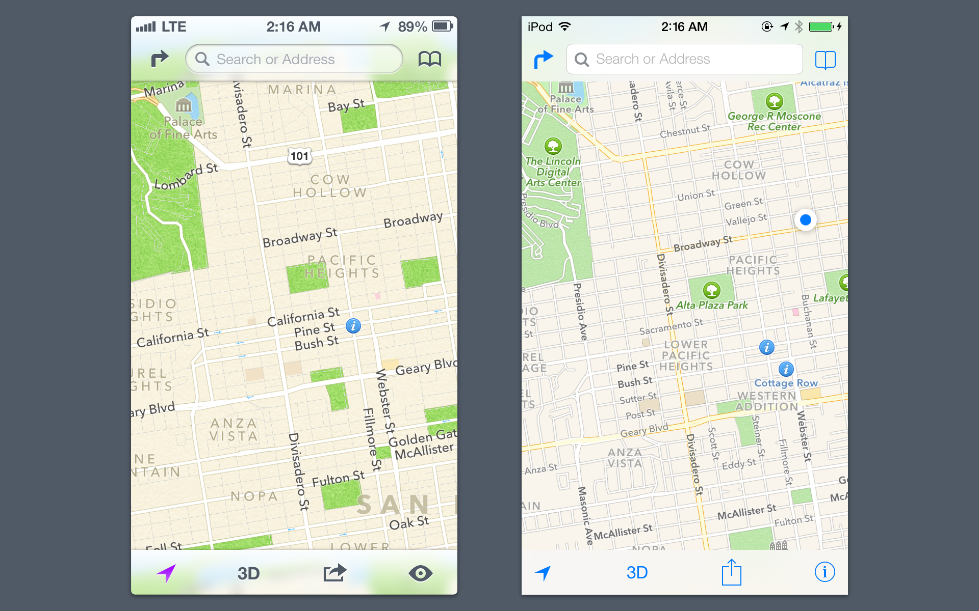
Maps is pretty plain, was hoping for a better way to flag wrong info, but its the same report a problem system from iOS
Overall, seems pretty stable, but nothing that makes me want to make it my main OS right now.
Overall, seems pretty stable.
Grey linen seems to be gone completely the login screen in particular looks really plain and ugly without it.
Pretty much all the goofy looking apps have been changed other than Game Center. Notes looks off without the lined yellow paper. Hopefully these apps will change over the course of the beta.
The dock looks shit when moved on to the left hand side. Hopefully a plist/tweak can change this.
iBooks isnt in this beta.
Maps is pretty plain, was hoping for a better way to flag wrong info, but its the same report a problem system from iOS
Overall, seems pretty stable, but nothing that makes me want to make it my main OS right now.
I'll be curious to see how opinions change as the days go by and people get used to the new look. I reset the home screen layout from my usual layout just to see what the new OS is like stock.
The longer I have it like this the more I prefer the look of the home screen to the look of my screens with the old heavier app icons.
The longer I have it like this the more I prefer the look of the home screen to the look of my screens with the old heavier app icons.
There is one thing missing that has always bugged me about iOS, and it doesn't look like it was added this time around...the ability to place the icons in different areas of the screen.
Is it too much to ask to be able to arrange the icons on your screen so you can see your wallpaper a little? It's something that I do on my Vita, and it would be nice to be able to do it with my phone as well.
/rant
Now that I got that out of the way, it'd be nice to hear from more people who are on the beta. I'm considering making the jump so I could play around with it. The only thing holding me back is that I am worried my apps won't work with it yet.
Just curious, but how would you get new apps if you are on the beta? Do you just go to the app store, or do you have to do it through iTunes?