• Hey, guest user. Hope you're enjoying NeoGAF! Have you considered registering for an account? Come join us and add your take to the daily discourse.

WWDC13 Thread of iOS 7 & Mac OS X 10.9, where a whole new world's developing

KingKong

Member
Played around with Mavericks this morning, it’s really Lion Part III as expected, although I don’t think it’s as big an update as Mountain Lion was from Lion.

Overall, seems pretty stable.
Grey linen seems to be gone completely the login screen in particular looks really plain and ugly without it.
Pretty much all the goofy looking apps have been changed other than Game Center. Notes looks off without the lined yellow paper. Hopefully these apps will change over the course of the beta.
The dock looks shit when moved on to the left hand side. Hopefully a plist/tweak can change this.
iBooks isn’t in this beta.
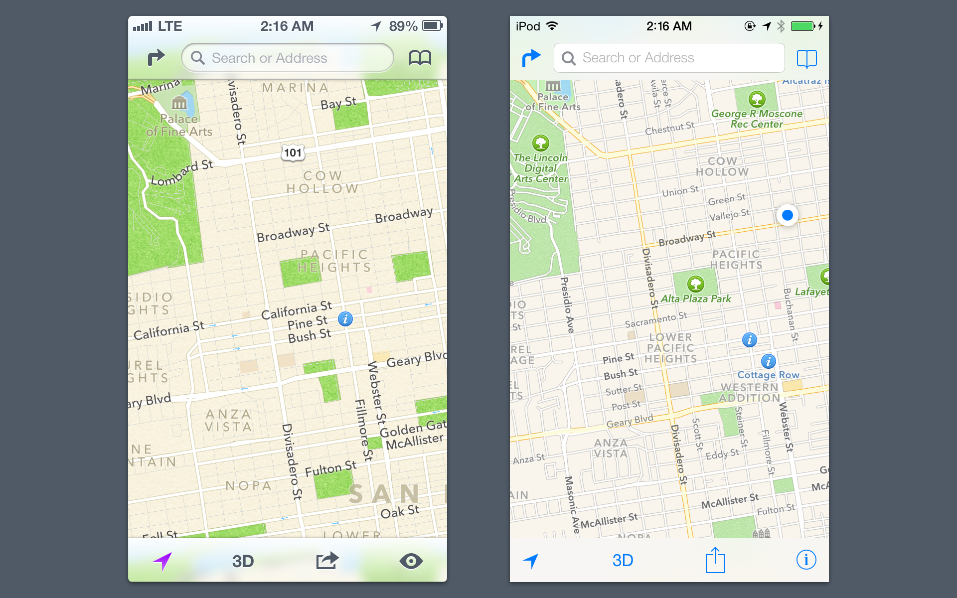
Maps is pretty plain, was hoping for a better way to flag wrong info, but it’s the same report a problem system from iOS

Overall, seems pretty stable, but nothing that makes me want to make it my main OS right now.

Wait what did they change about the dock? Left side dock is the best
 

Tunesmith

formerly "chigiri"
There is one thing missing that has always bugged me about iOS, and it doesn't look like it was added this time around...the ability to place the icons in different areas of the screen.

Is it too much to ask to be able to arrange the icons on your screen so you can see your wallpaper a little? It's something that I do on my Vita, and it would be nice to be able to do it with my phone as well.

/rant

Why not leave a page empty if you want to see the wallpaper?
 

Lord Error

Insane For Sony
iOS7 to me feels more bloated than iOS6. Everything seems to take up more space, with larger fonts and more space between elements, making it less space efficient. I like that you can have more apps per folder, but if you have to scroll past the first 9 (previously showed 12? I think) then the point of the folder falls to me.
Agree with all of this. It's pretty ironic that it feels more bloated when it looks so much simpler and cleaner. However, it's undeniable that the OS has slowed down a bit compared to iOS6. Keyboard in particular is not as responsive.
 

iNvid02

Member
just installed it, i guess crunchnjelly got the UDIDs sorted - thanks!

love the direction they went in, although it feels really slow on my 4S atm

first bug was a pretty big one, phone would just lock itself and return to passcode screen after unlock. had to reboot
 

Menelaus

Banned
The first impression I get on my 4s is...there's no design language. Take the Message app, for example. It's the only app, so far as I can tell, where multiple UI elements each have their own weight and momentum. Instead of being a cool effect that you see throughout the OS, it's a weird one-off and very jarring.

The parallax on the icons is a silly gimmick and I wish you could turn it off.

The command center is extremely cluttered on the 4s screen.
 

CodonAUG

Member
There is one thing missing that has always bugged me about iOS, and it doesn't look like it was added this time around...the ability to place the icons in different areas of the screen.

Is it too much to ask to be able to arrange the icons on your screen so you can see your wallpaper a little? It's something that I do on my Vita, and it would be nice to be able to do it with my phone as well.

/rant

The idea is that you are not suppose to be staring at your desktop. The phone is a tool that is pulled out when you need it. If you want to stare at photos there is a photo app.
 

DarkJC

Member
Agree with all of this. It's pretty ironic that it feels more bloated when it looks so much simpler and cleaner. However, it's undeniable that the OS has slowed down a bit compared to iOS6. Keyboard in particular is not as responsive.

It's the first beta and in development. All logging has been turned up to maximum. This isn't the time to be comparing performance.
 

RubxQub

φίλω ἐξεχέγλουτον καί ψευδολόγον οὖκ εἰπόν
Battery life seems the same to me on the 5...but that's with no scientific measurements and less than 24 hours of time with it.

May be that people are using it more heavily since there is a new toy to play with?

Definitely isn't noticeable to me if it is sucking more power at this point.
 
Couple more notes:

-The cool animation when sending iMessages (where the blue surges through the keyboard to make the bubble) isn't turned on yet

-Skype currently is not compatible with iOS 7, it crashes when trying to sign in

-Making custom wallpaper is a fucking nightmare. Since it does the parallax scrolling now, it zooms in on your image so that it has the proper "depth" when you view it from the sides. This makes creating custom wallpapers that fit around your apps or sit on your dock either impossible or just the biggest pain in the ass imaginable. It doesn't matter how you set the image when you make it your homescreen or your lockscreen, it just zooms in on it and fuck it up. Hopefully this is something they can tweak going forward - obviously I understand WHY it does it, but it's just a major hassle now.
 

JonCha

Member
Anyone know what this case is? Never seen it before:

whatis.png
 

Certinty

Member
Got iOS 7 on my 4S.

Haven't had any major bugs yet but it's slow at times.

Since it's bearable though I'll be sticking with it I think, just looks so much better than previous versions.
 
Had iOS 7 for half a day, battery life was horrendous and my phone kept restarting.

Back in good Ol' 6.1.4

In case anyone else is seeing this: I had the exact same issue, restored a second time and all is well. Only possible difference is I had installed the SDK and Mobile Device Installer. The first time around I think iTunes failed to restore properly and redoing it with the same backup worked like a charm.
 

chidrock

Member
The idea is that you are not suppose to be staring at your desktop. The phone is a tool that is pulled out when you need it. If you want to stare at photos there is a photo app.

Personalization...it's not to stare at the picture. It's just to make the phone feel a little more my own. Same principle applies with the wallpaper on a desktop. People don't usually sit there and look at it, but they still change it. People also like to change icons on their phone to set up themes as well. It’d be nice to do some of this without having to jailbreak your phone.

It’d be nice to have the ability to set up the icons at the bottom of the screen and have a picture I took on a family trip or something else that has meaning to me set up at the top where it can catch my eye for a second.

It’s not as bad as it used to be though; the more I think about it, the more the opening of the lock screen has helped with this. Being able to cover the whole screen and not just a strip in the middle is a big change.
 

pxleyes

Banned
Anyone ever run into an issue where you get a (-1) error upon install of a beta? Tried just about everything imaginable with the same results.
 

KanyeEast

Banned
iOS 7 looks absolutely shit on iPhone 4. They just want you to get a new iPhone those greedy bastards. If a phone can play 3d games like Infinity Blade i see no reason it cannot show transparant menu. Thank god i have a iPhone 5.
 

jediyoshi

Member
Haven't been keeping up with reactions/reports, but after just seeing the promo it looks pretty nifty. Pretty much incorporates everything I jailbreak my iphone 5 to do
 

Talon

Member
iOS 7 looks absolutely shit on iPhone 4. They just want you to get a new iPhone those greedy bastards. If a phone can play 3d games like Infinity Blade i see no reason it cannot show transparant menu. Thank god i have a iPhone 5.
I'll take "What is a Beta?" for $500, Alex.
 

Particle Physicist

between a quark and a baryon
Spotlight is here. Notification centre is pull down from off screen, spotlight is activated by pulling down on the main screen.

I hope I'm not late.

Edit: good job rubix. I was busy eating my pound of bacon.

Easy access to spotlight was one of the big things I wanted. I use spotlight all the time in OSX.. now I will in iOS as well :)
 

RubxQub

φίλω ἐξεχέγλουτον καί ψευδολόγον οὖκ εἰπόν
Weird change: group texts don't show you who was on the message without tapping on the "contacts" touch point on the top right of the iMessage.

Didn't even realize it was a group text I replied to until someone else random replied...looked like it came from my cousin.

Not a fan of that adjustment, methinks.
 

Tunesmith

formerly "chigiri"
Parallax scrolling is super evident with the built in dynamic wallpapers. Lockscreen is sexy now.

It seems it uses an images extra height / width outside of 1136x960 to scroll with, what I mean is, the more you have excess the more it scrolls around.
 

Ollie Pooch

In a perfect world, we'd all be homersexual
I agree that shadows seem to have a lot to do with it, but I also think a lot of the icons are just plainly half-assed.

I also think it's a mistake to throw away everything for the sake of it, including the UI icons from before that worked and looked just fine. Something like this:

ios7-maps.png

(from http://dribbble.com/shots/1109500-iOS-7)

would achieve what they're going for so much better, imo.

Like, why change the signal bars to circles? everyone knew what they meant and they looked fine. I'm just baffled at a lot of the design decisions.
The "share" button looks so amateur, same as any of the home screen icons with circles in them. The proportions are all off. Apple's ones, I mean.
 

NekoFever

Member
Does Notification Center still have the Twitter/Facebook buttons? I haven't seen them in any of the screens but I find them really useful.
 

CrunchinJelly

formerly cjelly
Does Notification Center still have the Twitter/Facebook buttons? I haven't seen them in any of the screens but I find them really useful.

No widgets at all.

No share, no weather, no stocks.

Or at least, I can't find a way to enable them. It's a really weird omission. I looked in the release notes and there was nothing for notification centre.
 

Mafro

Member
No widgets at all.

No share, no weather, no stocks.

Or at least, I can't find a way to enable them. It's a really weird omission. I looked in the release notes and there was nothing for notification centre.
Stocks is still there but turned off by default. Really annoyed they've removed the Facebook and Twitter widgets as I used them a lot, hopefully they might add them back in.
 
Personalization...it's not to stare at the picture. It's just to make the phone feel a little more my own. Same principle applies with the wallpaper on a desktop. People don't usually sit there and look at it, but they still change it. People also like to change icons on their phone to set up themes as well. It’d be nice to do some of this without having to jailbreak your phone.

It’d be nice to have the ability to set up the icons at the bottom of the screen and have a picture I took on a family trip or something else that has meaning to me set up at the top where it can catch my eye for a second.

It’s not as bad as it used to be though; the more I think about it, the more the opening of the lock screen has helped with this. Being able to cover the whole screen and not just a strip in the middle is a big change.

/shrugs I've personalized my phone to where I do have a blank 'home screen' and a second screen for where my apps are. Have been doing this since ios 5 actually and the phone definitely tells others that it's mine.

(home)


(page 1)


Once I do upgrade later this year, luckily I'll be able to cull my apps even moreso.
 

Link

The Autumn Wind
Sure it is. Once you discover it, it conceptually makes sense, and the animation supports it. Notification Center was never obvious before iOS7, where they added the arrows as hints.
I also think it's a poor design choice. Not sure why they didn't leave Spotlight to the left like it's always been.
 

Smeghead

Member
Been using it most of the day on my iPhone 4, some thoughts:

- Functionality overall is improved. Multitasking is nice seeing a preview of each app and discarding an app is faster as well. The actual selecting of an app is faster, but swiping left to right is a bit slower than iOS 6. Whether thats because it's a beta or because my phone is relatively old.

- I quite like the way the apps look when your'e actually in them, but i'm not entirely sold on the home screen and some of the icons. Maybe it's because i'm missing out on all the snazzy effects, but some of it looks like ass. The dock bar is terrible, as is grouped apps icon, sticks out like a sore thumb and the fact that it's missing the transparency is horse shit. I hope it's changed for release.

-The quick select menu is pretty good, it's been a long time coming and should have been included sooner really. That type of shit has been standard in Android for ages. One caveat is that it's missing a quick select for cellular toggle, so i have to go through the shitty menus as always the activate 3G which is a pain in the ass. Hope fully those 5 icons are interchangeable come release.

-The safari app is great. Appreciate the added space now that the bottom bar tucks away when your browsing, as well as the one search/address bar at the top. Nice and streamlined. In saying that they seem to have chosen a bizarre look for the way you switch between multiple web pages. They've supposed to simplified things, yet they have this shitty tilt shift effect that runs like shit and looks like ass all in one. The OG one in iOS 6 was a lot better than this.

Overall it runs a half second slower than iOS 6, but now where near as bad as iOS 4 on 3rd gen iphone. If it runs like this when release hits then i'm gonna give it a miss.

Also Bejeweled doesn't seem to run on this beta as well, which is annoying.
 

Link

The Autumn Wind
You can get to it from any homescreen. It's also consistent with most apps where the search field is hidden at the top and you have to pull to get to it.
Valid reasons, but when you already have Notification Center coming from the top, it's a bit convoluted. Seems to be a complication Apple is usually good at avoiding.
 
Top Bottom