• Hey, guest user. Hope you're enjoying NeoGAF! Have you considered registering for an account? Come join us and add your take to the daily discourse.

WWDC13 Thread of iOS 7 & Mac OS X 10.9, where a whole new world's developing

Guess Who

Banned
A quick question that I hope someone can answer: for the tools/apps that are accessible via the control centre (flashlight, camera, calculator), do they exist as separate apps accessible from the home screen - or can you only access them via the control centre?

Camera/calculator/clock are all just links to the apps, which exist on the home screen as always. The flashlight is a toggle exclusive to Control Center, though, not an app itself.
 

SnakeXs

about the same metal capacity as a cucumber
Call me crazy but they changed/improved the way Word files are rendered, at least in Quick Look. Very nice.
 

Maximus.

Member
Running ios7 on a 4s and it works fine! All my apps seems to be working fine. The OS is laggy and music on the lock screen is buggered. My main issue is that my phone gets real hot and the battery gets drained super fast. Otherwise it's pretty cool!
 

Synless

Member
Running ios7 on a 4s and it works fine! All my apps seems to be working fine. The OS is laggy and music on the lock screen is buggered. My main issue is that my phone gets real hot and the battery gets drained super fast. Otherwise it's pretty cool!
I can second this. I have had zero crashes and it is pretty smooth overall. Phone gets far warmer then it used too. I have had some weird glitches as well.
 
I was remembering back to the time I upgraded my iPhone 3G to iOS 4 and how horrendous of an experience that was, I wonder if it's going to be like that on the iPhone 4... Just to be safe I think i'll hold off on the final release and see how people react to it.
 

Maximus.

Member
I can second this. I have had zero crashes and it is pretty smooth overall. Phone gets far warmer then it used too. I have had some weird glitches as well.

I'm going to give it a full test drive tomorrow. I think lowering my brightness and some other settings will help keep the battery going. It's funny going into an app like what's app and seeing the old keyboard and buttons. Such a stark difference. Also the colors and icons look great when on the actual device. Its something you have to see to appreciate.
 

Phatcorns

Member
Just FYI for anyone interested. I tried this out on an iphone 4 and it's so unresponsive that it's almost unusable. If you are really interested in trying it, go for it, but you'll probably quickly go right back to ios 6. (Oh and for the love of god remember to backup first. I lost all my data. I suppose I could go back to a backup from March, but haven't decided yet)

But even without the slowdown, the OS itself is disappointing. Perhaps it needs the graphical features that you'd get from a 4s or 5, but there is no contrast anymore and the usability for someone who has never used ios before has gone way down.

One quick example is just the simple unlocking of the screen. Before it was very clear that you slide that little block from left to right across the little bar it sits in. Now, it's just "slide to unlock" For someone who has never used an iphone before what does that mean, slide left, right, up, down? And slide what, exactly?

I don't know, that's not a big deal for us, but I feel like a huge appeal of the iphone is how immediately obvious and intuitive everything is for newcomers and people my parent's age.

EDIT: And let me stress I know that the unresponsiveness is probably completely due to it being a beta so I'm not faulting it for that, but I did end up reverting because of it.
 

Fuchsdh

Member
The removal of actual buttons to me seems like the most headdesk idiotic idea in the entire OS. Sorry, it doesn't matter that we've had buttons in computing for decades, they're still useful, especially when you have to actually poke at stuff on your screen to see if they do anything.
 

Tunesmith

formerly "chigiri"
One quick example is just the simple unlocking of the screen. Before it was very clear that you slide that little block from left to right across the little bar it sits in. Now, it's just "slide to unlock" For someone who has never used an iphone before what does that mean, slide left, right, up, down? And slide what, exactly?

It's slightly less obvious than pre-iOS7 I agree but the text still has the pulsating 'left-to-right' animation indicating you should slide it in that direction, additionally you can now slide anywhere on the screen.
 

javac

Member
The clock & calendar don't need to access the internet though, I think that's the main reason they haven't done it with the weather.

I haven't really been keeping up with the thread so forgive me for my lack of knowledge but couldn't the icon revert back to the stock 'design' when it can't access the internet and only display the actual weather when it gets access? Isn't that how most Android Weather apps and widgets work?
 
I agree with the head-scratching involved when thinking about the removal of buttons and slide to unlock.

When my iOS friends pick up my new android phone and the lock screen illuminates they say "Now what do I do." then "Where do I slide."

Also, I watch my nephews and this new generation of toddlers that can fly around an iPad. They know to touch buttons and work their way around the OS.

I think these two changes are geared towards people who are stale with iOS and not going to have a good impact on people that are new to iOS.
 
It's slightly less obvious than pre-iOS7 I agree but the text still has the pulsating 'left-to-right' animation indicating you should slide it in that direction, additionally you can now slide anywhere on the screen.

XDKAVy7.gif


But yes, having the whole screen available to unlock the phone does help (and actually looks pretty good). I just wish I could disable the lockscreen entirely on the iPad. It's such a useless feature.
 

Nicktendo86

Member
So I saw ios7 in the flesh for the first time today. Some guy in Starbucks in canary wharf, London had it on his iPhone 5. I must I didn't like the look anymore in person than the screenshots...
 

Tunesmith

formerly "chigiri"
This is the first thing I thought when I saw it at the presentation, "Oh, you slide UP now to unlock." They need to change this.

If you're completely new to how iOS works, you'd be going through the 'Hello' boot-up configuration sequence, at which point this UP-sliding confusion that you're making a big deal out of doesn't exist. Maybe they'll add an additional accentuated arrow animation to the unlock sequence, who knows. I personally don't see this as an issue however.
 

SnakeXs

about the same metal capacity as a cucumber
This is the first thing I thought when I saw it at the presentation, "Oh, you slide UP now to unlock." They need to change this.

Sad to say nearly everyone who I've showed it to has been confused at the lock screen. Getting rid of the Notification Center and Control Center arrows might do it, or adding a subtle control to cling on to while sliding.
 

EmSeta

Member
XDKAVy7.gif


But yes, having the whole screen available to unlock the phone does help (and actually looks pretty good). I just wish I could disable the lockscreen entirely on the iPad. It's such a useless feature.

Agreed, I tried iOS7 on a friend's phone and the lock screen stumped me. I mean there's an arrow pointing up, for crying out loud.
 

Nicktendo86

Member
I found it even more confusing during the 'Hello' sequence. iirc the instruction to slide was white-on-white
A lot of the os seems to be white on white or light colours on light colours anyway. In trying to revamp the os they seems to have thrown the baby out with the bath water. I'm sure a lot will be fixed before the proper release though.
 

Laekon

Member
If you're completely new to how iOS works, you'd be going through the 'Hello' boot-up configuration sequence, at which point this UP-sliding confusion that you're making a big deal out of doesn't exist. Maybe they'll add an additional accentuated arrow animation to the unlock sequence, who knows. I personally don't see this as an issue however.
The tutorial in Windows 8 doesn't seem to stop people from saying they can't get to the start screen.

The colors pallet in ios7 might lead me to jail break my iPad. It just seems like an android theme for teen girls. It would be nice if they built in different theme pallets.
 

OneEightZero

aka ThreeOneFour
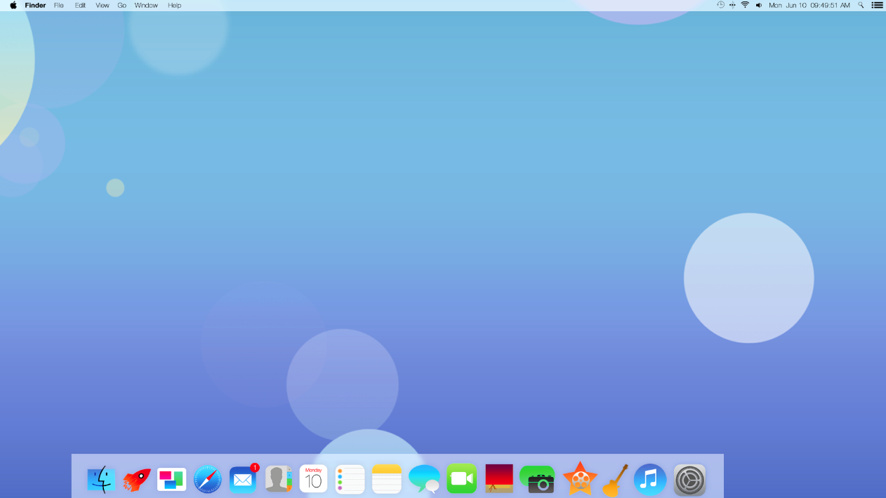
I understand why, but I wish OSX Mavericks had taken more of the focus than iOS7.

OSX needs an interface lift that makes it unique. Removing skeuomorphism is a good start, but I want more. A new overall look for the OS, Finder design, iconography, etc. The core look from Cheetah to now has not been altered significantly and it is longer overdue than iOS.

I want something new that makes me excited to use the OS again.
 

Guess Who

Banned
OSX needs an interface lift that makes it unique. Removing skeuomorphism is a good start, but I want more. A new overall look for the OS, Finder design, iconography, etc. The core look from Cheetah to now has not been altered significantly and it is longer overdue than iOS.

OS X looks today looks very different from Cheetah, the changes were just more subtle and gradual over time. As a reminder, Cheetah looked like this:


Shit, Lion changed the appearance of nearly every control in the OS:

WEamDbV.png
Z6dQjMw.png


No more pill buttons, significantly lighter or removed drop shadows, a less glossy and more modern finish on just about everything.
 

caramac

Member
In a time when high resolution displays that are capable of showing great detail are commonplace it seems a bit strange that user interfaces are seemingly going for less detail more simplistic designs.
 

derder

Member
I'm backpacking Europe and I need to decide between the 11.6" or 13.3" macbook air. Anyone here have any opinions? I want as small and light as possible.
 

rezuth

Member
I'm backpacking Europe and I need to decide between the 11.6" or 13.3" macbook air. Anyone here have any opinions? I want as small and light as possible.
If that's your only criteria then you answerd yourself already. I would for for the 13" extra screen space and battery life.
 
I'm backpacking Europe and I need to decide between the 11.6" or 13.3" macbook air. Anyone here have any opinions? I want as small and light as possible.

If you really want it as small and light as possible then obviously the 11.6" version would serve you best but the longer battery life on the 13.3" may be worth it for someone who's traveling.
 

The Real Abed

Perma-Junior
You laugh, but I like SOME of those ideas. But no. Not those icons. No. Please. No. But the overall idea works. At least a new typeface for Retina displays would be nice.

Probably still a WIP. They should copy the 10.9 folder design.

launchpad-transparent-folders.png
I like how it looks in Mavericks, but I wouldn't want it in iOS like that anymore. I like how it looks now in 7 where it doesn't displace the icons on the homescreen...

Folders look so much better in iOS6
...I just wish they'd add a 4th row. I like that it's 3 wide, but why not 4 high so it at least holds the same amount per page that the older folders did. But I guess it's because it now shows the icons exactly how they'll look in the folder. Would be nice if folders with more than 9 icons would cycle through each page in the icon so I could tell what was buried in them.
 

mattiewheels

And then the LORD David Bowie saith to his Son, Jonny Depp: 'Go, and spread my image amongst the cosmos. For every living thing is in anguish and only the LIGHT shall give them reprieve.'
Where's a good place to check and see if new beta versions of 7 have come out?
 
I understand why, but I wish OSX Mavericks had taken more of the focus than iOS7.

OSX needs an interface lift that makes it unique. Removing skeuomorphism is a good start, but I want more. A new overall look for the OS, Finder design, iconography, etc. The core look from Cheetah to now has not been altered significantly and it is longer overdue than iOS.

I want something new that makes me excited to use the OS again.
New looks don't really do anything but make a person see something as new for about a day. iOS 7 is already uninteresting apart from the functional changes and usability improvements.
 

mrkgoo

Member
You laugh, but I like SOME of those ideas. But no. Not those icons. No. Please. No. But the overall idea works. At least a new typeface for Retina displays would be nice.


I like how it looks in Mavericks, but I wouldn't want it in iOS like that anymore. I like how it looks now in 7 where it doesn't displace the icons on the homescreen...


...I just wish they'd add a 4th row. I like that it's 3 wide, but why not 4 high so it at least holds the same amount per page that the older folders did. But I guess it's because it now shows the icons exactly how they'll look in the folder. Would be nice if folders with more than 9 icons would cycle through each page in the icon so I could tell what was buried in them.

I have an iPhone 5 so my folders are 4 high ;)

But yeah, while I appreciate the matching of the icon, 9 apps seems a bit uninformative. I was fine with that being the icon, but having to scroll through pages in a folder? I arrange apps by pairs on the screen when I can, so this might throw me somewhat. Ah well, will just have to figure a new way to arrange.


I wonder what they will do for iPad. Stick with the 9 to be visually similar?
 

sc0la

Unconfirmed Member
The reason the folders only show 3x3 now is that is all that is displayed in the preview, it always bugged me how thd first icon of the second row became the last icon of the first row when the folder opens. There is no object constancy and this is highly disorienting.

One solution is to leave the 4x3 or even make it 4x4 but just make the preview icons be the top left 3x3. Still they did it for a reason that makes sense, it just feels like a step backwards in a way. The multiple pages within a folder should alleviate this however.
 

dmshaposv

Member
XDKAVy7.gif


But yes, having the whole screen available to unlock the phone does help (and actually looks pretty good). I just wish I could disable the lockscreen entirely on the iPad. It's such a useless feature.


The arrow thing needs to be addressed. EVERY single person I let to use my phone with ios7, tried to swipe up to unlock.
 

mrkgoo

Member
The reason the folders only show 3x3 now is that is all that is displayed in the preview, it always bugged me how thd first icon of the second row became the last icon of the first row when the folder opens. There is no object constancy and this is highly disorienting.

One solution is to leave the 4x3 or even make it 4x4 but just make the preview icons be the top left 3x3. Still they did it for a reason that makes sense, it just feels like a step backwards in a way. The multiple pages within a folder should alleviate this however.

4x4 leaving 3x3 is not a good idea, I reckon. That's disorienting also.

I wonder if it may just be better if the folder pops up that displays the icon preview, and then you just scroll a 3-wide list?

I just don't like the idea of pages of apps WITHIN pages of apps. It makes it kind of too maze-like to drill too deep.

What's next? Folders in folders?


And yeah the slide to unlock needs an arrow. As mentioned, this us all great for existing users, but will be a barrier for new users. I understand that the whole point is that they are addressing the notion that users (and lets face it, there are a LOT of users of iOS) no longer need the same 'training', but you do need some basic discoverability and informative cues.

Also 'slide' us now a misnomer - you're not sliding anything! It's more like swipe to unlock. Too bad they didn't patent that.

They just need an arrow head that moves with the response. Like the rest of their buttonless buttons. Seriously - that slide to unlock button was one if the hallmark features of iPhone. It is often the first introduction to iOS, setting up the rest of the UI, and it was the first thing Steve jobs showed in the unveil.

In thus vein, I guess the removal if the button IS indicative if the rest if the UI, but there needs to be some 1:1 response as you slide. Wait, is there? Do the words disappear under your swipe as you slide?

Edit: oh, disregard, I guess it does slide in response. The screen slides.

Meh, maybe it's ok then. The response might be enough to teach people. Like the screen rubber bands if you try up. But then, I suppose you should ditch the control centre arrow.
Nah, it really needs SOMETHING.
 
The arrow thing needs to be addressed. EVERY single person I let to use my phone with ios7, tried to swipe up to unlock.
It's confusing enough that it makes me question the design talent of everyone involved. It's really bad. But maybe it's a situation where this OS was only seen by people working on it, and their eyes were on this project for so long that they never thought twice about it.
 

Tunesmith

formerly "chigiri"
It's confusing enough that it makes me question the design talent of everyone involved. It's really bad. But maybe it's a situation where this OS was only seen by people working on it, and their eyes were on this project for so long that they never thought twice about it.

Have raised it with Apple on my end, I'm fairly sure it'll get addressed in some way for release. I have a feeling this was an unintentional side-effect of allowing the control center to be accessible (via toggle) on the lockscreen.
 

LCfiner

Member
My first thought when they showed the ios7 video on Monday was "oh, they changed the slide to unlock action to upward..."

super confusing. the L-R shimmer across the "slide.." text is not enough info to know what to do with that arrow button directly below it. the old button was obvious. now it's not.

I hope it gets fixed. It's a poor choice now
 

rezuth

Member
It's confusing enough that it makes me question the design talent of everyone involved. It's really bad. But maybe it's a situation where this OS was only seen by people working on it, and their eyes were on this project for so long that they never thought twice about it.

I think its more or less from the fact that they did all this work in an extremely short period of time that certain elements got overlooked. They more or less were rushing to have something out by WWDC so people could start with the app development.
 

sc0la

Unconfirmed Member
4x4 leaving 3x3 is not a good idea, I reckon. That's disorienting also.

I wonder if it may just be better if the folder pops up that displays the icon preview, and then you just scroll a 3-wide list?

I just don't like the idea of pages of apps WITHIN pages of apps. It makes it kind of too maze-like to drill too deep.

What's next? Folders in folders?
I agree, it's not ideal. Unfortunately there isn't an obvious answer. Best I can think of is probably a three wide set of apps 4 or 5 rows tall max. You are still hiding apps from view in preview but at least you have object constancy with the folder preview and there is no pagination or hidden apps once you are in the folder.
 
Top Bottom